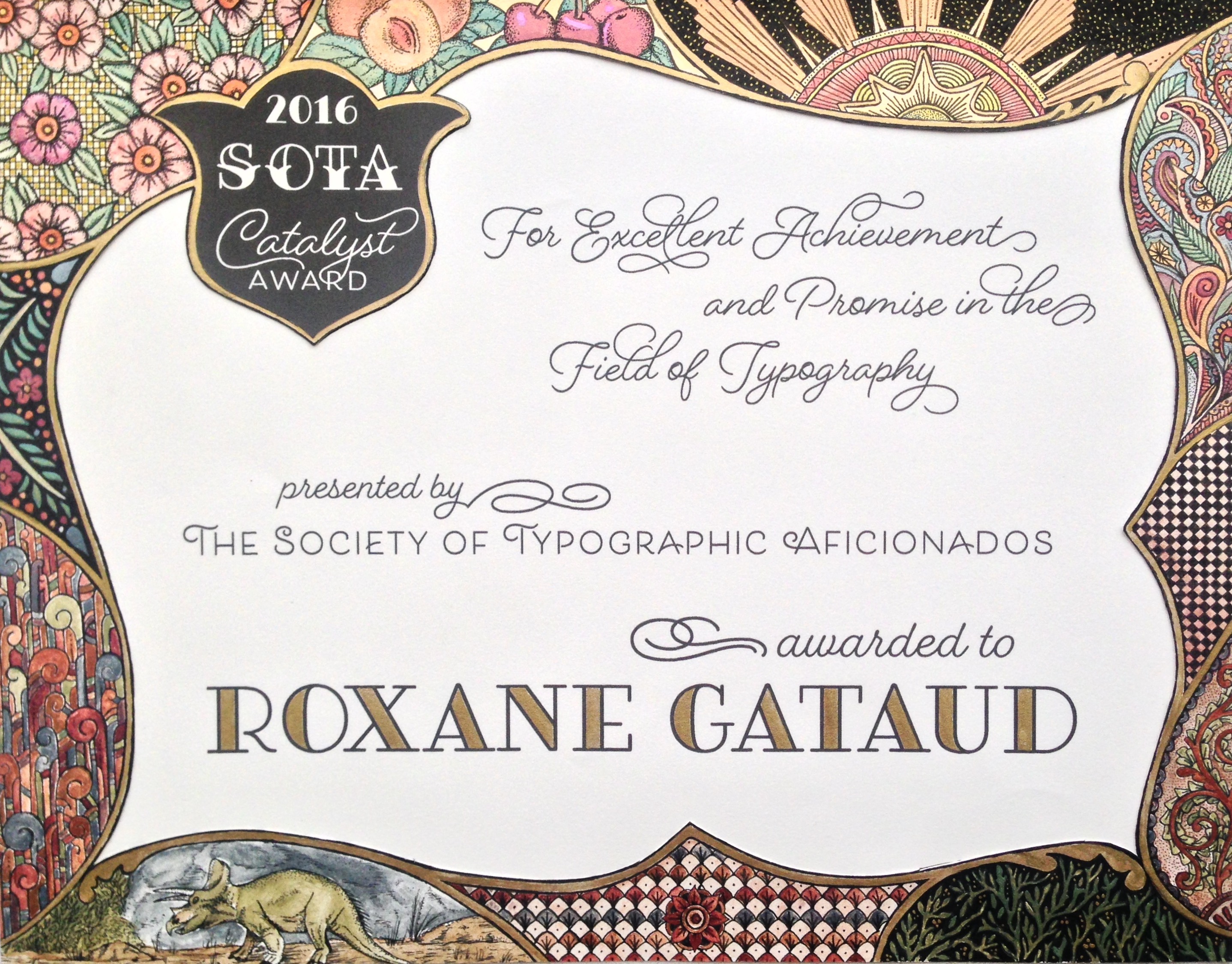
A few days ago, I had the honor to be awarded by SOTA (Society of Typography Aficionados). On the 26th of August, I stood on stage during TypeCon to receive the 2016 Catalyst award and then present my work.
I wanted to write a bit about the certificate I received, because first, it was designed by another Alphabette: Laura Worthington, and second, it’s just gorgeous.
Look at this:

Isn’t it just great ?
Laura did this ALL BY HAND, I am so impressed.
Just a quick line about it: Laura explained to me how she stalked me on social media to find some aspects of my personality. She chose to draw fruits to recall my collection of fruit stickers, patterns for my collection of vintage parisian floor tiles (#passionvieuxcarreaux on my instagram), and of course a dinosaur.
Colors + gold (she used shell gold to paint it. It’s 24 karat gold mixed with a binding agent ✨), and this amazing type, all done by hand. What she didn’t know about me is that I absolutely love when typefaces have their top « regular » and bottom part ornamented as you can see in the « SOTA » word. As I don’t know the proper word for this style, I call them « typefaces with fancy socks ». So I am delighted to have also a sample of this style on my certificate.
Thank you so much Laura, I absolutely love it.
