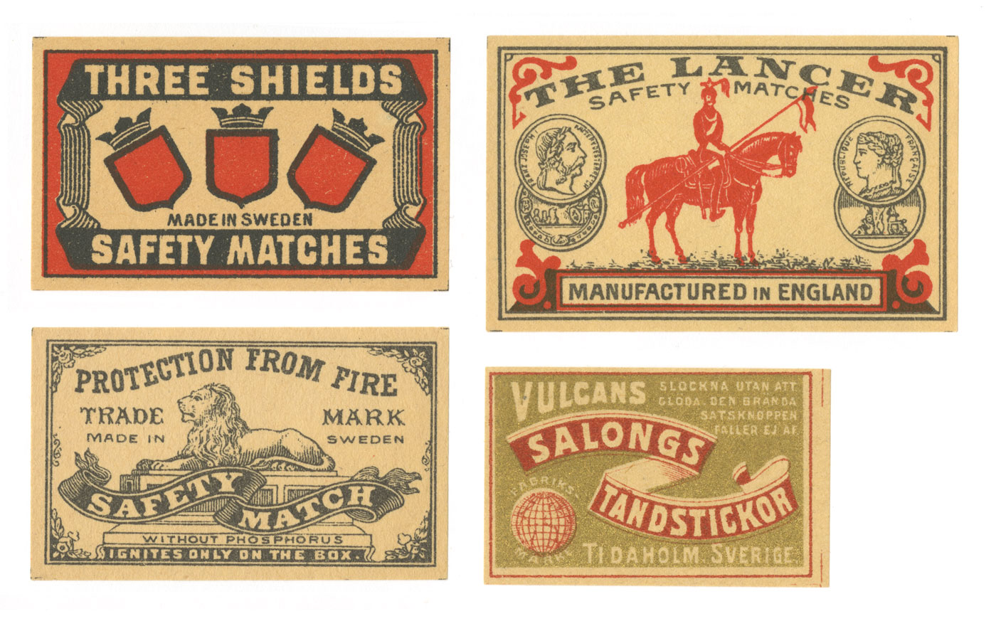
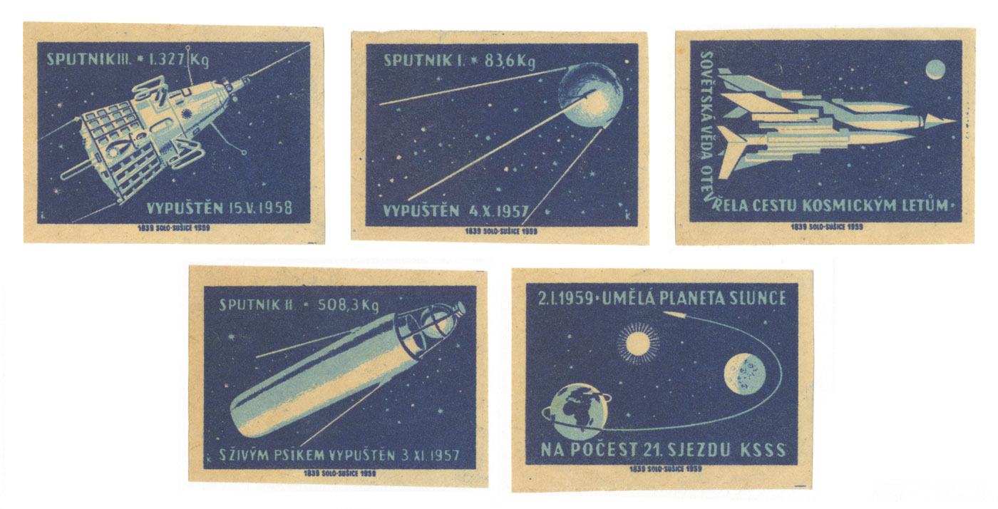
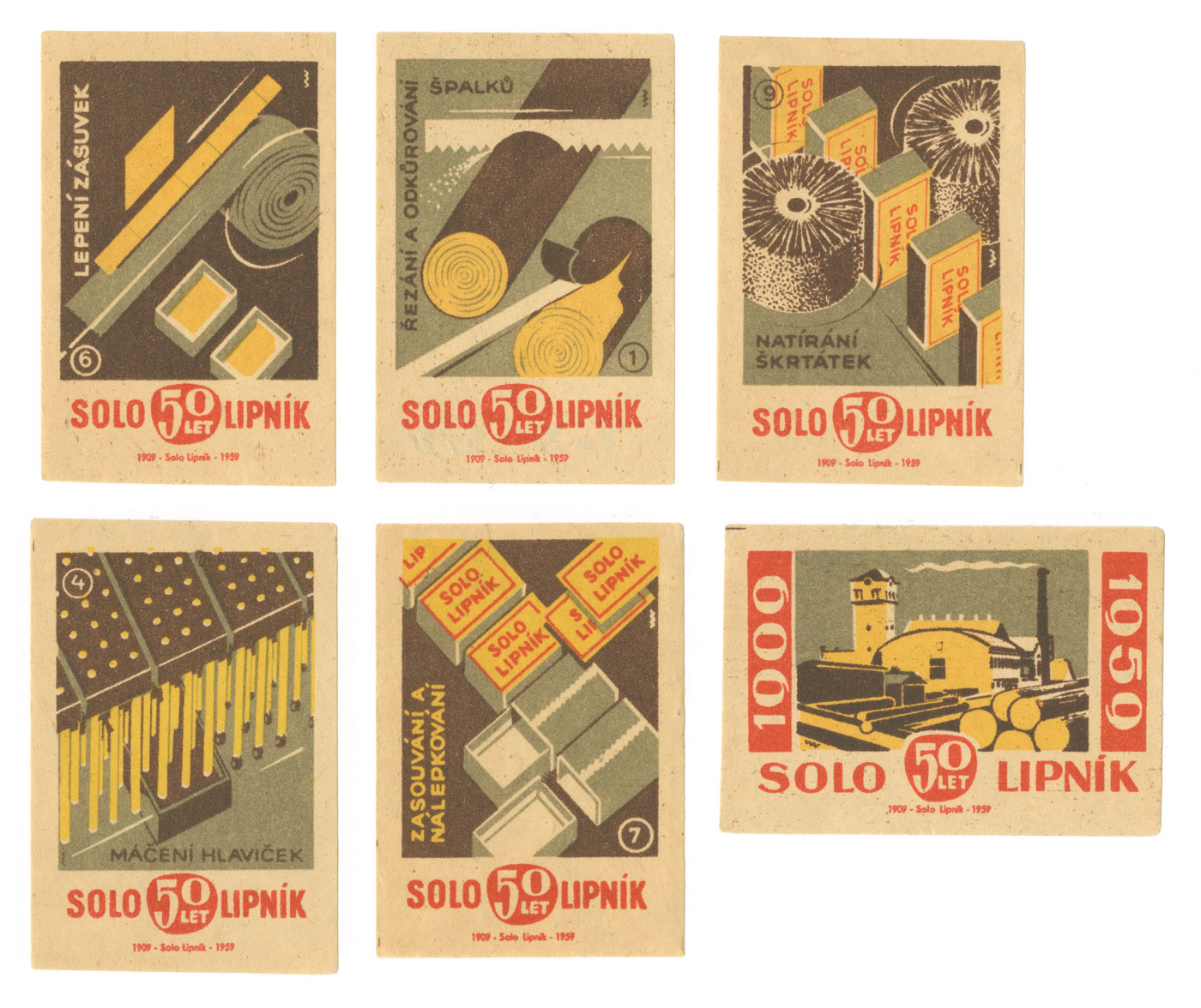
Matchbox labels are the perfect thing for a typographic treasure hunter on a budget — they’re miniature in size, relatively cheap, and their lovely designs are hard to resist.
In the mid–19th to the mid–20th century, these little matchboxes with promotion space were a very important part of the industries. On these tiny panels were advertisements for pretty much everything including (but not limited to) opera companies, fashion companies, public-service announcements as well as political campaigns.
The first safety matches began to be manufactured in Sweden around 1845 and quickly became well known around the world. Since Sweden was the sole manufacturing country for a long time in the beginning, you can see influences of Swedish design even after they started being manufactured in other countries.
Often, as the Hunter Oatman-Standford article states in Collectors Weekly, some of the most stunning designs come from socialist states in Eastern Europe. They feature a bright, clean modernism despite their bureaucratic messaging.
During multiple road trips across the States, I started collecting a lot of matchbox-related items including these gems. I recently found out there was a word for the hobby of collecting such things — phillumeny. Perhaps that makes me a phillumenist. These little panels are truly remarkable pieces of typography and design since they pack such a visual punch in a tiny little space.


