For this third interview in the series, Sol chose Mariko Takagi (see here the concept and first interview with Alice). The idea of Alphabettes all around the world was a part of Sol’s reason to want Mariko to be interviewed, “visiting” different continents.
I met Mariko when she was giving a talk in AtypI, and I was fascinated by her ‘Hanzi Graphy’ exhibition. Her research in fields unknown to me made choosing questions for her to be quite easy. For this interview about research, symbols and identity, I suggest to make yourself a cup of green tea (preferably with ginger), read on and enjoy the Autumn/Winter crawling in (depends on where your located, could also be summertime!)
The warmup
Write three sentences about you
– I am a German-Japanese, living in Hong Kong, where I teach typography and book design.
– In my previous work as an author and designer of books, I wrote about aspects of Japanese culture.
– Since my PhD on Japanese typography, I realised that I am mostly interested in writing systems: the Japanese (sino-japanese Kanji, Hiragana, Katakana), Chinese characters (Hanzi) and Latin letters.
What is your soundtrack while working?
My work consists of mainly three different activities: teaching, researching and designing. At this moment, based on my role as an assistant professor, I spend most of my time teaching and doing research. While I read, write or work with students, I need silence. When I do design, I enjoy listening to podcasts (recently to lecture recordings at MIT, “Introduction to Psychology”). To support my research, I have started to learn calligraphy and I found out that listening to music works best for me in this context. (Currently the new album by Karmin.)
Name three locations: a current location, a location you love, and a fantasy location
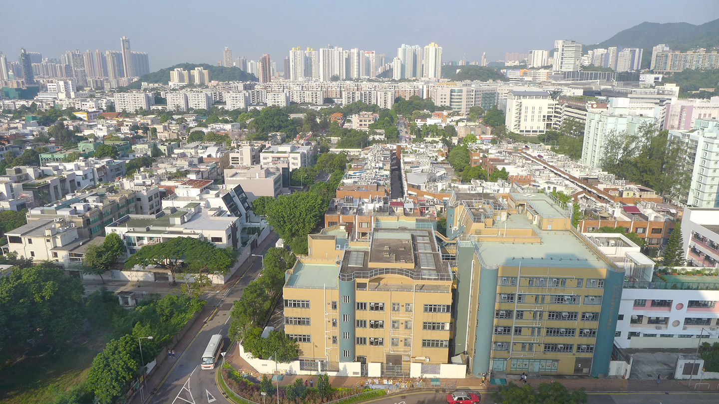
Current location: Hong Kong
A location I love: Düsseldorf, Germany and Tokyo, Japan (Love? Rather home)
A fantasy location: Seoul, South Korea
Your favourite glyph to design and the most challenging one?
I relate this question to the typeface I worked on during my studies at Reading. I found the curves of the “s” (both upper and lower cases) very challenging. I like the lowercase, two story “a”. For Japanese the Hiragana with their curves are difficult in general, but か (ka) was the biggest challenge to me, while the Hiragana よ (yo) was my favourite.
What is something you did that you are proud of?
To “be proud of” is a quite difficult concept to me. I seldom use this term…
I feel happy and satisfied, when my students discover their own way and expression in typography and when they create a work that shows a connectivity between concept and design.
I feel satisfied when I look back to books that I have published (as author and designer) and most of the work I created for clients, as they show the different steps of my path way. My aim is to do my best I can in each stage I am currently in. To define the next stage is always challenging.
Maybe to “be proud of” feels too much as a looking back at the end of a journey and I still hope to learn and gain new insights.
The visual
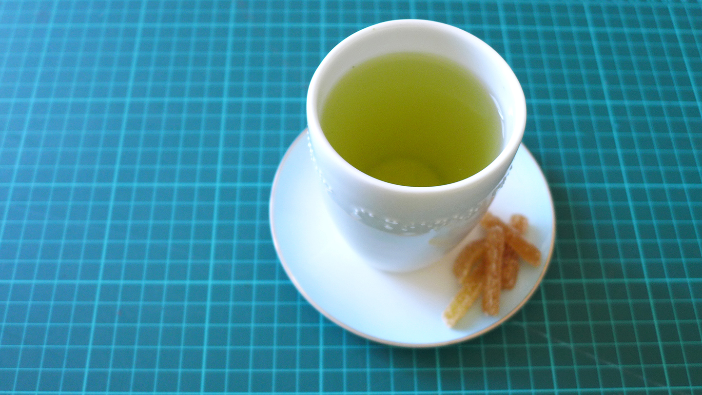
A photo of your favourite beverage, and something to eat with it
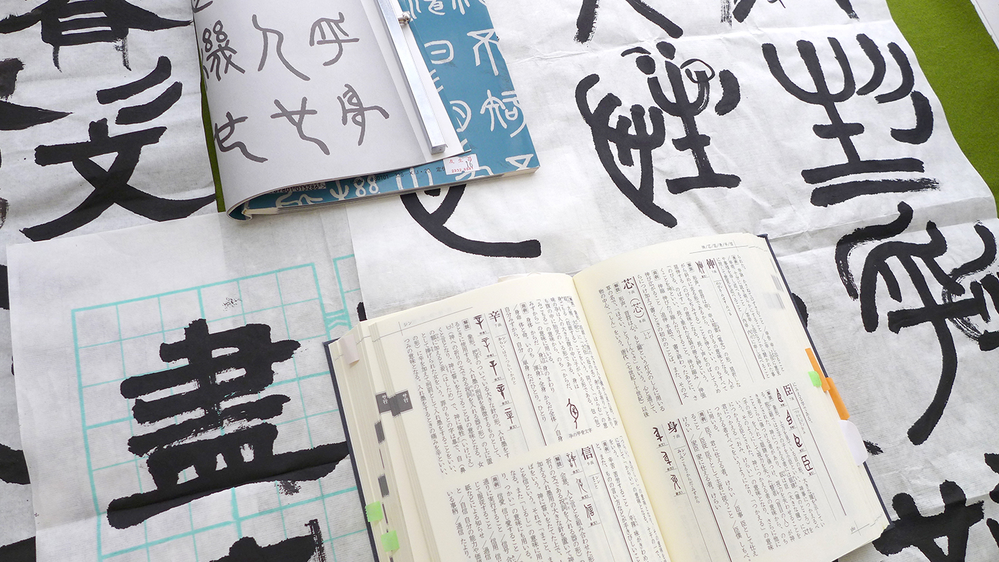
A photo of your type drawing process
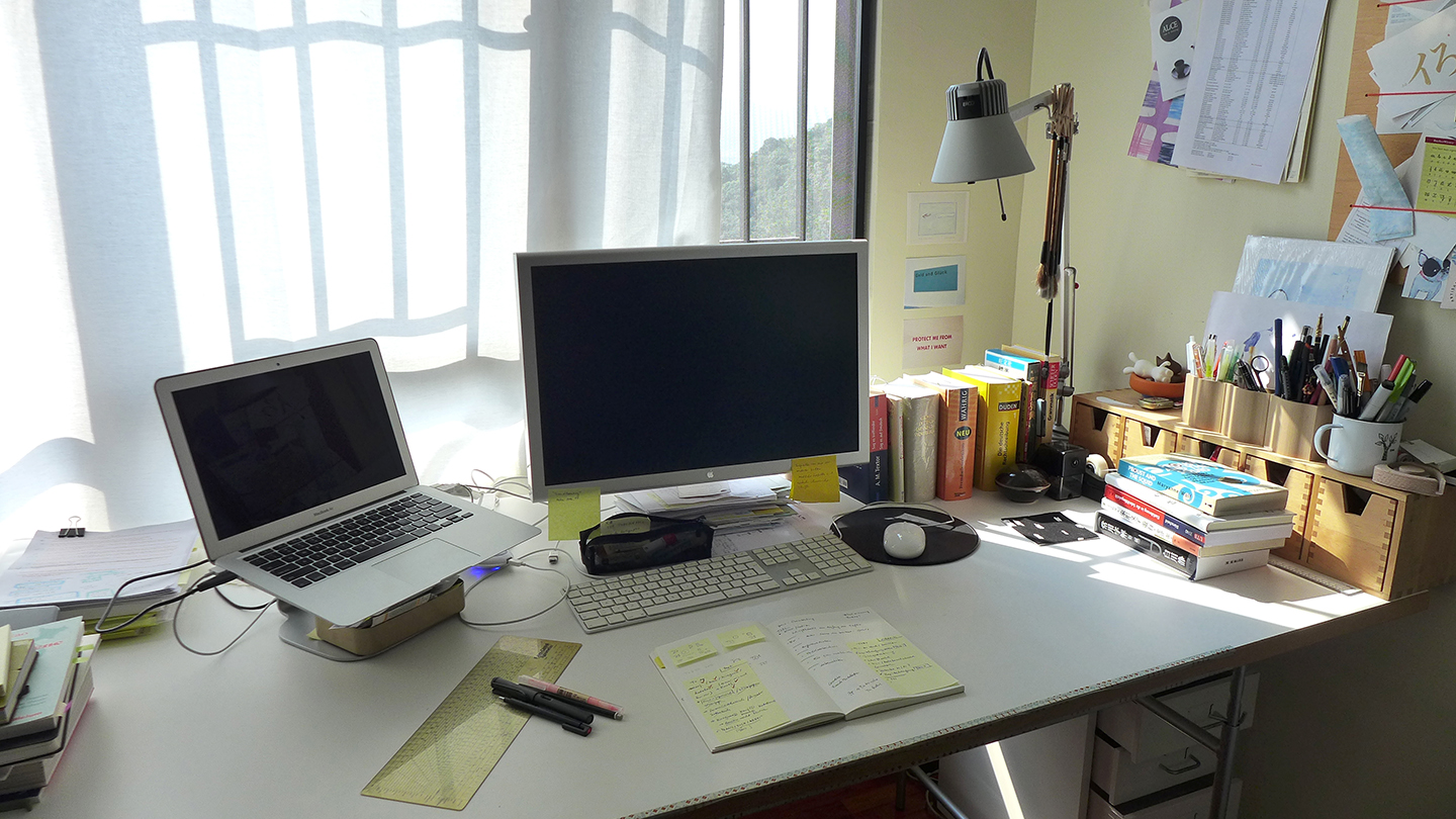
A photo of your desk, working space
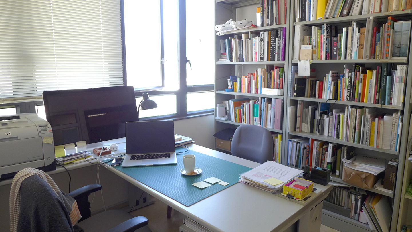
I have two working spaces, one at the university and one at home. These two spaces are great to allocate different types of work. At university, I give tutorials to small group of students, prepare my classes, do administrative work and have meetings with my research assistants. At home, I work on my research: the publication of my doctoral thesis (hopefully done by end of 2015), papers, but also on my personal book projects and projects for clients.
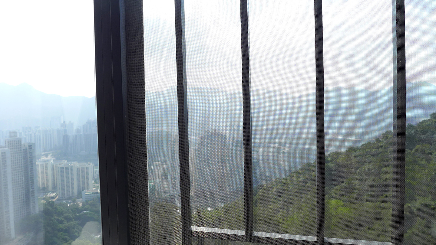
What do you see from your window?
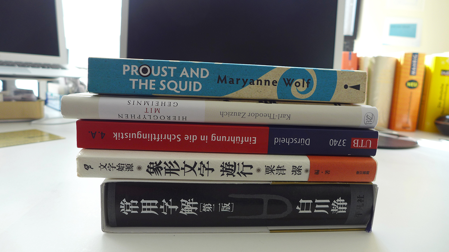
A pile of books, both professional and others
The longer bits
The first question is from Sol:
״What do you think about western designers making Chinese or Japanese typefaces and vice versa?״
Let me answer this question from a historical point of view. The Japanese knowledge in technology and design of typefaces is originated in the work of Western scholars at the American Pressbyterian Mission Press in Shanghai. Japan was isolated from most foreign influences for almost 250 years. After opening the borders in the mid of the 19th century, Japan needed to catch up with the modern societies by adopting their knowledge in sciences, technologies and industrialisation. The knowhow of letterpress and printing was one matter of this. In the year 1869 Motogi Shouzo invited William Gamble, the sixth director of the American Pressbyterian Mission Press, for 4 months to Japan to learn from him each single step, from the production of letter cutting to printing and to book binding. William Gamble came with a whole equipment of a work and some Kanji-types that he cut before. Those were in the style of Mincho faces and became the reference of Motogis typeface designs. Nowadays Mincho faces are the most common style for typesetting text for uninterrupted reading.
I do not have a strong opinion about western designers making Chinese or Japanese typefaces and vice versa. But I think the position of an non-native designer can provide an important and interesting point of view on a writing system and by this can give a native designer an important impulse. Akira Kobayashi is a successful representative of the other case, namely a Japanese designer creating Latin letters.
Probably the first question that comes to mind when people hear about you- and still I haven’t found too many of your thoughts on it while doing the research for this interview: How would you describe your life being German-Japanese living in Hong-Kong? Do you feel that one of the cultures is more prominent in your identity? While having these two “identities”- do you feel that they are being blended in a way, creating something unique or do they both exist on their own?
These are all quite essential questions and not easy to answer. (I frequently ask myself those questions…) I will need to answer this from two different views, the professional and the personal.
First the professional: When I moved to Hong Kong I was still working on my PhD. I was reading theories in cultural studies at that time and I tried to relate it to writing systems. Moving to a Hanzi (Chinese characters) culture, in which I could interpret the meanings of characters (based on my Japanese Kanji knowledge) but could not turn it into phonetics, was an eye-opening experience. Basically I could read a bit, but not talk. I could communicate by written language, but not by spoken language. This was almost opposite to what foreigners experienced in Japan. (I read reports of people lived in Japan and attained simple conversation skills but felt impossible to learn the writing system.) The Cantonese language knows 9 different tones. For a non-musical person like me, this is a huge barrier. However, as Hong Kong is an international city, I can easily survive by English and reading some Chinese characters. Relating this to cultural studies I could understand how one can either identify with a culture or feel excluded due to a writing system.
Now to the personal view. To have two cultural identities was a challenge when I was a child. During my first nine years of education I attended a Japanese school in Germany and for the last 4 years I changed to a local German school. In both systems I knew that I was different to my classmates. As an adult I see the benefit in this. I have access to two cultures and I think I can blend well in different cultural contexts. Both cultures, the German as well as the Japanese, form my cultural identity and in the meantime I enjoy my status as an “in-between”.
Could you share with us a bit about Hanzi Graphy book and Hanzi Graphy exhibition you wrote and created? What were the changes needed in working on two completely different mediums featuring the same topic?
The idea for Hanzi Graphy was initiated by my doctoral thesis on Japanese typography. One aspect of my thesis was the description of the Japanese writing system. When I came to Hong Kong, I searched for references that explain the Chinese writing system and its visual form in micro typography. I couldn’t find any references written in English. There are plenty of books on Japanese micro typography, but solely available in Japanese. Based on my own interest, I started this research topic. The research I did on the Japanese writing system before helped me a lot and I worked for two years closely together with my research assistant So Lai Ping, who helped me to read Chinese references on the writing system.
To allocate time and energy to research while teaching 3 courses and doing the daily jobs of an academic is a difficult task and requires a good time management. In order to keep up with the research, I used the deadlines given by conferences (in order to present the topic) and the exhibitions to set myself milestones. Furthermore the exhibition was important in regards to finding methods of visualising complex content in an attracting way. To showcase micro typographic details is anyway not a commonly seen subject of an exhibition and I wanted to understand, how people react to it and how I can get their interest. To me it was a typographic experiment.
While for the exhibition I needed to find ways of letting the visitors interact with the exhibits and how the rather two-dimensional media can be displayed in a space, for the publication I wanted to find methods to provide additional information through the visualisation that goes beyond the text. Writing the book and designing it was an important step to me as well. It is my first book publication in English and on typography.
You are interested in showing letters to the wider public, and not just Type specialists. What were your initial thought before the exhibition and were they different after? What was the objective of the exhibition?
My intention was to look at typography as a research matter on the one hand and to apply typographic design to visualise complex information on the other. As you named it in your question, I didn’t want to address solely the small group (especially in Hong Kong) of type specialist, but I wanted to reach an audience interested in language, writing culture and design in general. One of my objectives was to make Chinese characters accessible without teaching the language and to bridge between Latin letter based culture and Chinese character based culture of writing, by showing similarities and differences according to their typographic representations.
One Cantonese teacher, who educates Asian adults in language and writing, came to the exhibition. The teacher visited me first by herself and prepared a working sheet for her students. When she came with her students, I gave the group a tour explaining each exhibit and after this the students were asked to complete the questionnaire provided by their teacher. The students told me later that some of the exhibits helped them to understand the concept of the Chinese writing system better. It was interesting to see this and at the same time a surprise that my exhibition became the source for an exercise to a Cantonese class.
You started the MA at Reading after you received your PhD and after many years of teaching. How was it like to become a student again? How did it feel to be practicing typeface design other than researching it?
To do the MA in Reading, I had a deal with my employer, the Academy of Visual Arts of Hong Kong Baptist University. The university wanted me to stay as a staff, and offered me to keep my job and to receive a “leave on duty”, which meant that I needed to spend the semester breaks in Hong Kong and fulfil 50% of my teaching duties. This was a challenge as I could only focus on my studies during the time of the semester in Reading.
Despite this dual life, it was great to be a student again. After teaching for 10 years, it was good to see other teacher’s teaching methods and styles, which was very inspiring. I enjoyed going to the archive and library. During the time at Reading I recognised that my interest in research and writing is stronger than the desire to design. This was even a surprise to myself, but an important insight.
In many of your books you were explaining Japanese culture and Chinese characters to westerners. Have you/ will you be doing this the other way around as well?
At this moment, my answer is no. But as I have not discovered my final destination, I can only give the answer according to my current understanding.
You can see Mariko’s work here.
Next interviewee …
Mariko is nominating the next lady to be interviewed:
From my perspective of a typographer and educator (and as it seems that we have many things in common), I would like to nominate Shelly Gruendler. I am very curious about her motivation to found Type Camp as an alternative concept of teaching typography.
My question to Shelly is “Have you met at the Type Camp a genius in type design or typography? If yes, please share the story.”
On a personal note: researching for those interviews is incredible. I get to have an “official” excuse to dig into what the virtual sphere has to tell about the talented ladies. I am having a hard time deciding how I can compress all I have to ask in five questions so I am trying to ask about different areas of life and work rather than going too deep into one topic. Luckily, so far the ladies didn’t spare any details and allowed us to really get a good insight on their actions and thoughts. And I always ask something personal, which I am grateful for getting answers to.
Mariko is always on the go, planning her next research, exhibition, book. I really admire this, and the fact that she is searching for different topics and areas to work on. I think this is requiring a lot of energy, that she sure has. I like the idea that type design expands beyond type, and the action of putting letterforms and symbols in the spotlight for people who are not usually interested in it. And a last note- Mariko deciding that she is writing and designing books, bringing to life an exhibition and just doing it – is something I am definitely taking with me from this interview.

