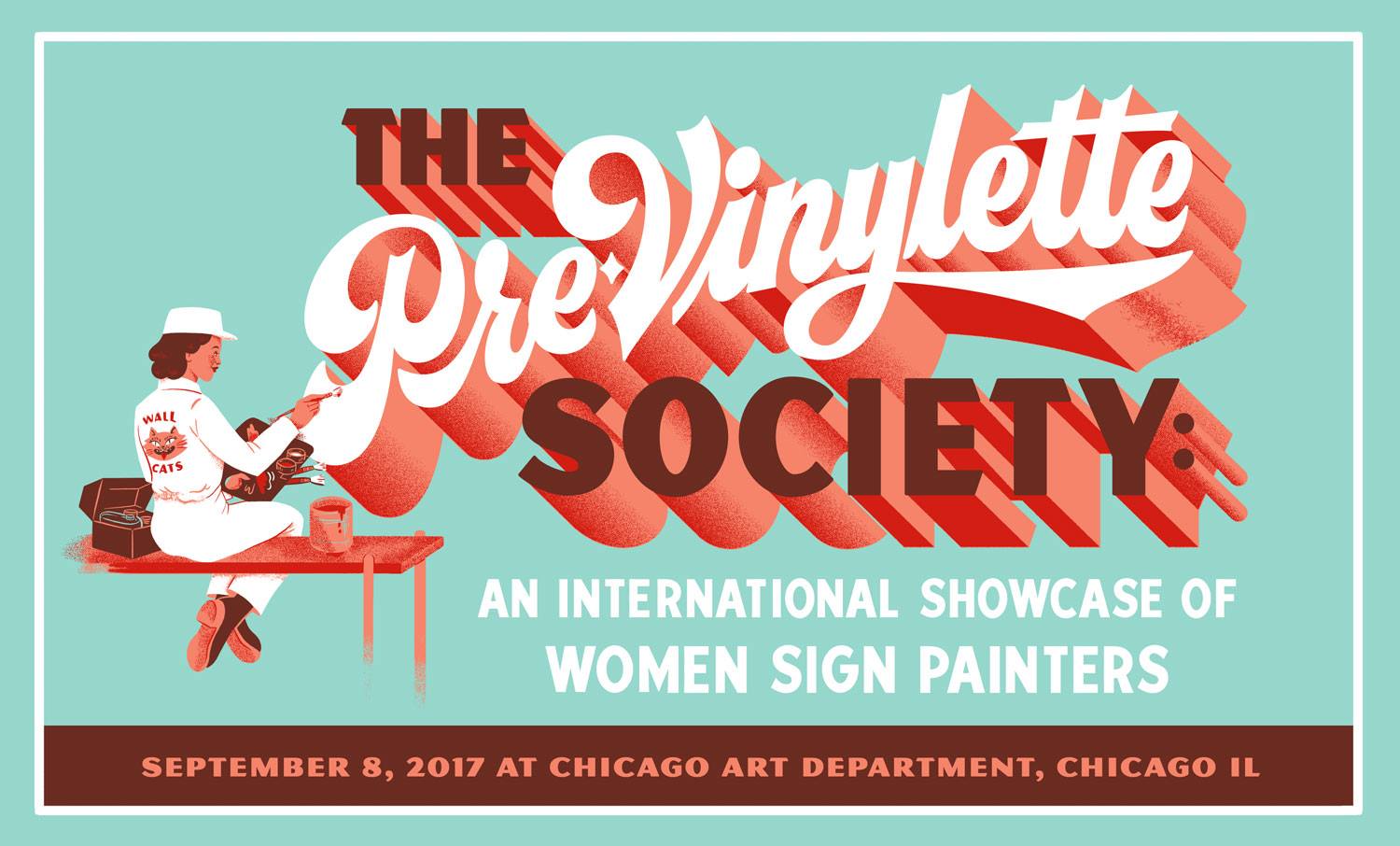
If you happen to be in the Windy City over the next few weeks, you’re going to want to head over to the Chicago Art Department to check out The Pre-Vinylette Society: An International Showcase of Women Sign Painters. Opening on Friday, September 8, the exhibition features the work of over 60 women sign painters from the United States, the UK, Canada, New Zealand, Australia, Scotland, Ireland, and Norway.
Author Archives → Amy Papaelias
Facing Our Fears:
Teaching Type on the Web
This article is based on the presentation, “Web typography is just typography, sort of,” part of the Type@Cooper West Lecture Series at the San Francisco Public Library, on July 18, 2017. Watch a video of the talk or keep reading.
RIP Margo Chase 1958–2017
I was very sad to hear about the sudden passing of designer Margo Chase. As a teenager in the 90s, it’s hard not to recognize Chase’s impact on the visual language of popular culture in those formative years (Buffy the Vampire Slayer! Dracula! Madonna!). Her lettering, logos, and typefaces are emblematic of an era where forms were being developed and explored that truly expressed digitality. If you’re not familiar with Chase’s work, check out these short interviews on Lynda.com, especially Logos and lettering, which includes some discussion of her early influences and process, and Gothic design where she talks about her cover design for Letter Arts Review, and her typefaces (thanks Typographica for the link). Some nice tributes can be found on Brand New, Graphic Design USA, Art Chantry’s Facebook post, Richard Lipton’s instagram post, The Dieline, among many others.
Margo Chase is an inspiration to all designers. As the founder of her own agency AND an accomplished acrobatics pilot, Alphabettes salutes this pioneering woman who left a mark on our profession.
Alphabettes Variety Show: we’re back!
UPDATE! Couldn’t make it to the live variety show or just want to relive the whole thing? Here’s the recording (listen on the site or download):
mixlr.com/alphabettes/showreel/alphabettes-variety-show-at-typographics-2017/
Here are a few fun highlights, captured on twitter:
Live at the @alphabettes_org variety show: @RoxaneGataud talking with @fontnerd. pic.twitter.com/3gU9e7jqDF
— mekka blue (@mekkablue) June 15, 2017
People are now sketching for the Alphabettes header competition, and so can you! Send/submit/tweet your designs! Bianca is the jury. pic.twitter.com/RCopr31R5c
— Alphabettes (@alphabettes_org) June 15, 2017
@alphabettes_org And all of this before lunch! pic.twitter.com/BdzLWLOYMI
— Indra Kupferschmid (@kupfers) June 16, 2017
Thanks for listening!
Takeaways on Teaching Type
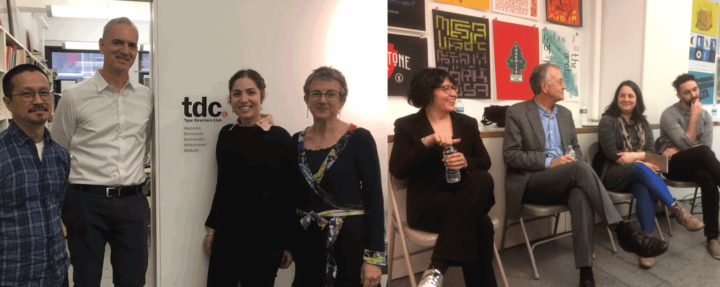
This past weekend, I had the pleasure to participate in Teaching Type: A Panel Conversation on Typography Education, organized by Design Incubation, and hosted at the Type Directors Club in New York. The event attracted a range of attendees: educators, typographers, type designers and even a few students and recent graduates. Armed with only the most comfortable of metal chairs, we set out on a 3-hour journey to explore best practices of typography curricula today.
♥♡♥♡♥♡♥
In an attempt to distract myself from stress-watching CNN or eating an entire bag of cough drops (they’re candy-ish), I’m spending this Valentine’s Day on the hunt for typefaces with interesting ♥ or ♡. Here’s what I’ve found so far (with a little help from some friends):
Bickham Script by Richard Lipton: ♥ and ♡ are sort of, um, oblique.
Continue reading
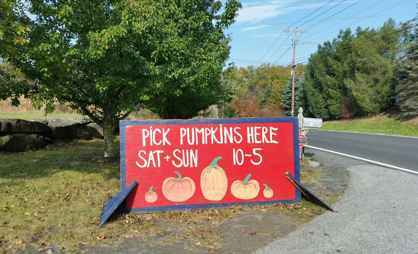
The Perfect Pumpkin Patch Signs
Autumn is serious business around here. During decorative gourd season, signs sit at every intersection directing weekenders and leaf peepers to the best apples, pumpkins and cider donuts in town. Most signs are pretty unremarkable. Except for these.
Hand painted with a distinct lettering style and wacky colors, they’re noticeable and lovely and always brighten my day.
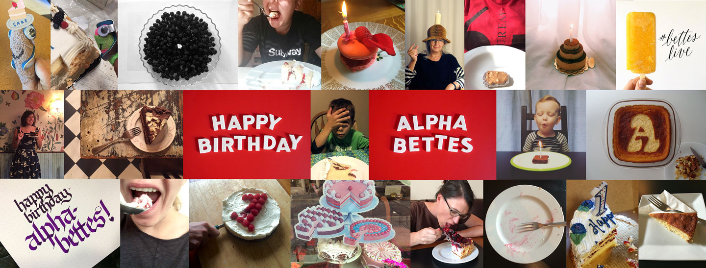
Happy 1st Birthday, Alphabettes
This week, Alphabettes.org turned one. Blogs, they grow up so fast! We’re celebrating with cake.
We wanted a place on the internet to publish our own thoughts and writing, so we did what any self-respecting, overcommitted people do: we started a new side project. Within two weeks of registering the domain name, the site was live. Scrappy and minimal, the original design worked (through many late night, trans-Atlantic sessions of reckless-intermediate theme editing), but we quickly began feeling some growing pains. One year later, the site boasts around 145 posts (and 25 headers), most of which feature previously unpublished content.
Greetings from Newburgh, NY
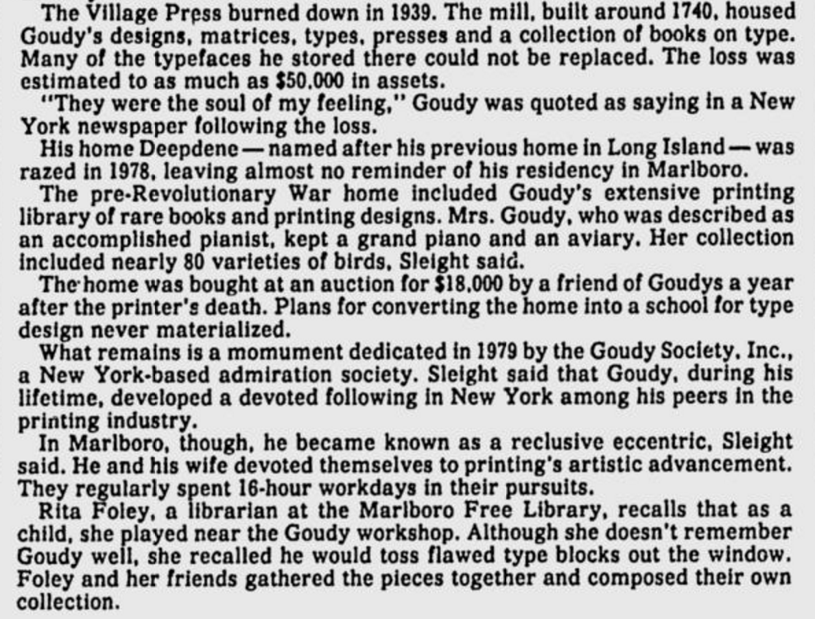
It’s no surprise that we type folk like hanging out in old cemeteries but it’s an extra treat when these cemeteries include the memorials of long-deceased type heroes. I’ve always known that Frederic and Bertha Goudy lived and worked in nearby Marlboro, New York. This excellent silent film on Type Culture shows Fred Goudy at Deepdene, their home and workshop. The Goudys’ workshop, an 18th century mill, burned down in 1939 (along with many of his type designs and fonts) and the home was torn down in the 70s, so there’s not much left to see on the Old Post Road property. However, I recently discovered this blog post from the Marlboro Free Library. Part of the library’s Goudy collection includes a photo of a memorial tablet in Newburgh, a small city on the Hudson river that has seen better times (but is trying hard to make a comeback). Although this probably requires some confirmation, according to this 1986 newspaper article, Fred and Bertha’s “mingled ashes” are buried beneath. Wow!
Here’s a screenshot from the article, with some lovely details about Fred tossing type out the workshop window.
My 2¢: Take a Penny, Leave a Penny
Since the design and lettering of the ‘lowly’ American penny has already been well-documented and researched by honorary Alphabette Tobias Frere-Jones, I’ve settled on an even lowlier topic: the penny tray. If you’re American, or have spent time in the clusterfuck that is currently the United States, then you know what I’m talking about. Found at the cash registers of gas stations, diners, and other small businesses, the object serves as a convenient place for customers and cashiers to dispose of, or acquire, a penny or two (but c’mon deadbeat, don’t even think of taking more than a few).
The basic tray features the phrases “LEAVE-A-PENNY / TAKE-A-PENNY” in subtly extruded shouty-caps that flank the top and bottom of the main bowl. A promotional logo adorns the front of the tray, promoting things like a local newspaper, state lottery, or community bank.