Alternatives to Gill Sans

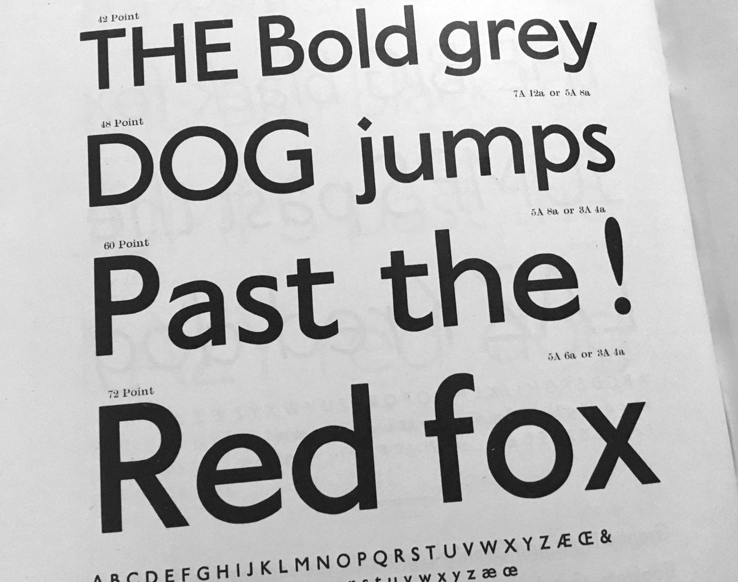
Granby by Stephenson Blake (1930). From: Specimen of Printing Type, Stephenson Blake / The Caslon Letter Foundry Sheffield, 1953

If you are looking for a humanist sans-serif with a slight English flair, here are some less overused and ambivalent alternatives:

Agenda, Greg Thompson, Font Bureau
Apres, David Berlow, Font Bureau
Astoria, Alan Meeks, Alan Meeks Collection
Bliss, Jeremy Tankard, Jeremy Tankard Typography
Cronos, Robert Slimbach, Adobe Type
Documenta Sans, Frank Blokland, DTL
Dover Sans Text and Display, Robin Mientjes, Tiny Type Co
Edward, Hendrik Weber, formally Ourtype
Granby, Stephenson Blake, Elsner + Flake, Scangraphic
Halifax, Dieter Hofrichter, Hoftype
Johnston, Edward Johnston, David Farey, ITC
(Johnston) Underground, Edward Johnston, Richard Kegler, P22
London, Henrik Kubel, A2-Type
Mallory, Tobias Frere-Jones, Frere-Jones Type
Metro Office, Akira Kobayashi, Linotype
Mr. Eaves, Zuzana Licko, Emigre
New Atten, Miles Newlyn, Newlyn Type
Relay, Cyrus Highsmith, Occupant Fonts
Rowton Sans, Julien Priez, Hugo Dumont, Jérémie Hornus and Alisa Nowak, Font You
Seravek, Eric Olson, Process Type
Today Sans, Volker Küster, Elsner + Flake
Yoga Sans by Xavier Dupret, Monotype
Zeitung, Akiem Helmling, Bas Jacobs, Sami Kortemäki, Underware

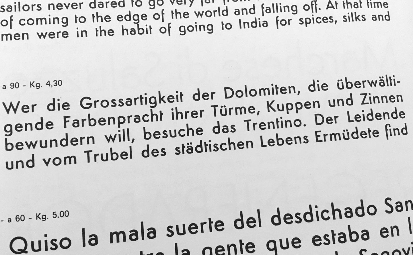
Alternatives to Prokyon

Semplicità by Alessandro Butti (1930). From: Campionario caratteri Nebiolo, ca. 1962

Spurless humanist sans-serifs were all the rage in the early 2000s, but not anymore. If you still really have to use one, try one of these:

Aad, Aad van Dommelen, Font Font / Monotype
Aller Typo, Marc Weymann, Dalton Maag
Barmeno, Hans Reichel, Berthold
Branding, Alfonso García, Daniel Hernández, Luciano Vergara, Latinotype
Beau Sans, Panos Vassiliou, Parachute
Bega, Sabina Chipară, Diana Ovezea, Fontstore/ITF
Co, Bruno Maag, Ron Carpenter, Dalton Maag
Conto, Nils Thomsen, Type Mates
Dax, Hans Reichel, Font Font / Monotype
Daxline, Hans Reichel, Font Font / Monotype
Diodrum, Jérémie Hornus, Clara Jullien, Alisa Nowak, Indian Type Foundry
Etelka, František Štorm, Storm Type Foundry
Generis, Erik Faulhaber, Linotype
Karbon, Kris Sowersby, Klim
Kuro, Jonathan Hill, The Northern Block
Legal, Hellmut Bomm, Linotype
Netto, Daniel Utz, Font Font / Monotype
Phoenica, Ingo Preuss, Preuss Type
Ribera, Jörn Oelsner, URW
Ringo, Łukasz Dziedzic, Typoland
Sari, Hans Reichel, Font Font / Monotype
Signa, Ole Søndergaard, Font Font / Monotype

Oof, I think that’s more than you ever want to use in this century. Better try a less modisch humanist sans of which there are plenty of.

Alternatives to DTL Fleischmann

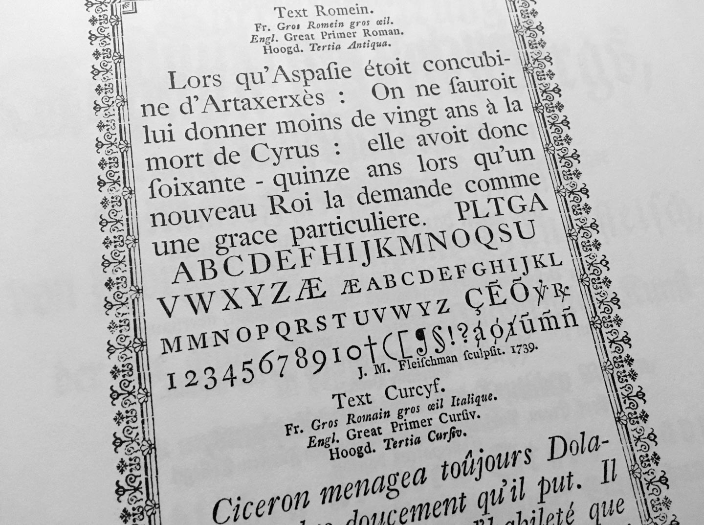
From: Atlas zur Geschichte der Schrift. Das 18. Jahrhundert. Technische Hochschule Darmstadt, 1995

The typefaces of punchcutter Johann Michael Fleischmann have inspired many to design close and not so close revivals of classic Dutch old-style text faces. (A typeface of similar colour and sparkle is the one you are reading right now here on the blog – Dover Text by Robin Mientjes – although she took inspiration from Caslon’s typefaces more than from Fleischmann.)

Adobe Text, Robert Slimbach, Adobe
Berlingske Serif Text, Jonas Hecksher, Playtype
Ehrhardt, Adobe, Monotype
Equity, Matthew Butterick, MB Type
Eudald News, Mário Feliciano, Feliciano Type Foundry
Expresso, Mário Feliciano, Feliciano Type Foundry
Farnham, Christian Schwartz, Font Bureau
Fleischmann BT Pro, Johann Fleischmann, Charles Gibbons, Bitstream
Freight, Joshua Darden, Garage Fonts
Glosa, Dino dos Santos, DS Type
Garvis, James Todd, James Todd Design
Guyot, Ramiro Espinoza, ReType
Janson, Scangraphic
Janson Text, Miklós Kis, from Adobe, Monotype, URW
Kis, Miklós Kis, Bitstream, ParaType, RMU
Kis Classico, Miklós Kis, Franko Luin, Linotype
Mercury, Tobias Frere-Jones, Jonathan Hoefler, Hoefler & Co
Pradell, Andres Balius, Typerepubic
Quercus, František Štorm, Storm Type Foundry
Rosart, Jacques-François Rosart, Katharina Köhler, Camelot
Tyrnavia, Miklós Kis, Gábor Kóthay, T-26

Treats treats treats!

If you, like me, need some last minutes gifts or just want to make some sweet treats for the dark times, we have collected some traditional regional recipes to celebrate winter solstice.

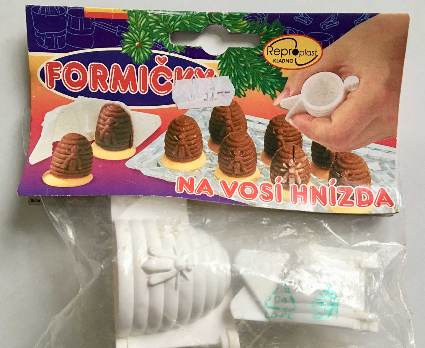
Discussion starter was this curious apparatus I once bought in the Czech Republic but never got around to try to use. Veronika Burian was able to identify them as the iconic Vosí Hnízda – Czech rum beehives – she knew and helped with translation of the recipe: “1 žloutek = 1 egg yolk. The last 4 things are for the filling, and 240 gr of crumbled biscuits, not flour. They are super lecker!”
Continue reading

This post has no title and no real point but comments are open

Bless you, native English speaker. Your life is so easy. You don’t have to decide, reason, argue, or fight about many things other languages have to reason, argue, and fight about or for. No diacritics, no accents (unless creätively imported by intellectual pedants), no problems properly composing or displaying your language’s letters and glyphs on paper or screen. No inner struggle whether to duz or siez someone (informally or formally saying “you”, which implies complex conjugation, different grammar and spelling), nor whether you are in the right position or have the right age “to offer someone the Du” (to offer that from now on they can address you informally, usually sealed with a handshake or a kiss) and, oh yeh, how to address students?!

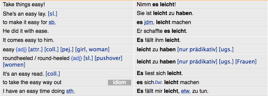
You do not have to heatedly debate on a national level and in national periodicals which version of gender-specific words should be used if they have male and female versions or which artificial compound neologism could be introduced now to solve the eternal debate of Kanzler oder Kanzlerin or KanzlerIn or Kanzler*in or Kanzler_in or Kanzler/-in. Du hast es leicht, you have it light … (WTF online-dictionary!)

This is me whining about German. What is weird in your language that other languages don’t have to worry about?

Remember December: We are being read!

Traveling is one of the best things in life and something I will remember 2017 for (just like my fellow Alphabettes as we have seen in the past December posts so far). Not only do we get to see friends from afar, document funky lettering, foreign scripts, or drink crazy cocktails, we can also exchange PRESENTS!

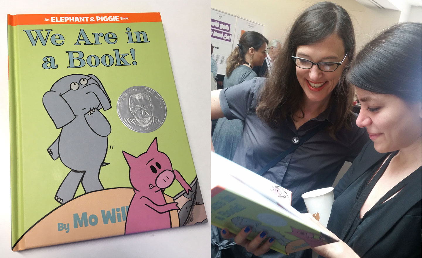
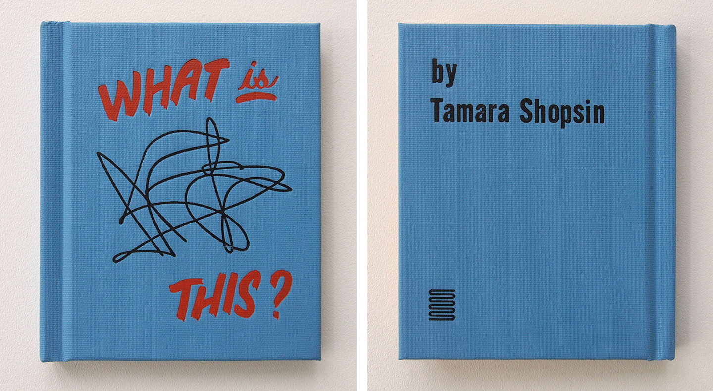
Let me show you both the best book and most touching gift I got this year:

Elephant, Piggie, Indra and Sahar (plus Marina and a bit of Matthew Carter in the background)


Continue reading

First/early female typeface designers

Every other month the question about who was the first female typeface designer comes up. From my armchair research, for up to the 1950s, so far we know of

  • Hildegard Henning, Belladonna, Julius Klinkhardt, 1912
  • Elizabeth Colwell, Colwell Handletter, ATF, 1916
  • Maria Ballé, Ballé Initials, Bauersche Gießerei, date unknown, 1920s?
  • Elizabeth Friedländer*, Elizabeth, Bauer, ±1937
  • Ilse Schüle, Rhapsodie, Ludwig & Mayer, 1951
  • Gudrun Zapf von Hesse, Diotima, Stempel AG, 1952–54 (Ariadne ’53, Smaragd ’54 …)
  • Anna Maria Schildbach, Montan, Stempel AG, 1954
  • (That is women credited with a typeface’s design. Many have worked in drawing offices and type production but remained unknown. And post-metal type design is another blog post.)

    I have been talking a lot about this with Dan Reynolds, who is researching 19th century type making in Germany for his Phd (this is such a brief generalization of his topic that he will probably kill me). After the war, West German type foundries published a couple of typefaces designed by women, but of pre-war typefaces Dan could so far not find more than the two mentioned above — Belladonna and the Elizabeth types. (It’s debatable whether the Ballé initials count since they were “not actually cast as foundry type, but rather electrotypes mounted on metal”, as some sources state.) While the idea that Anna Simons might have designed some of the Bremer Presse types is intriguing, it seems that this was just a 1980s American speculation, not actually a fact.

    Last weekend, Dan visited the printing museum im Leipzig and writes:
    “I finally made it to the exhibition from Jerusalem, which exhibited work from Moshe Spitzer, Franziska Baruch, and Henri Friedlaender. That exhibition included Stam, a Hebrew typeface designed by Franziska Baruch for Berthold in the 1920s. Baruch left Germany for Palestine and died in Israel in 1989. She had a career as a designer in Germany in the 1920s and ’30s, and then in Palestine and Israel after that. Much of her graphic design for the State of Israel and for her Israeli clients was significant; however, she never wrote about her work.

    While it was not mentioned in the exhibition, I suspect that Baruch was commissioned to design Stam by Oscar Jolles, who was Berthold’s director in the 1920s. Jolles was a prominent figure in the Berlin Jewish community, and Berthold’s publication of Hebrew type specimen took place during his tenure. Jolles died in 1929, but like Baruch’s mother and sister, his wife and daughter were all murdered in 1943, albeit in different death camps.”

    I believe Liron worked on this exhibition and its original catalog? Does any of you type history or Hebrew researchers have more info on Franziska Baruch and her typeface Stam? I had never heard of her. Glad we can add another name to our Olden Type list.

    * There is a documentary about Elizabeth Friedlander that just came out and will be shown in London on October 20. If you are in the area, this is worth watching.
    Continue reading

    Cold type vs. hot typesetters

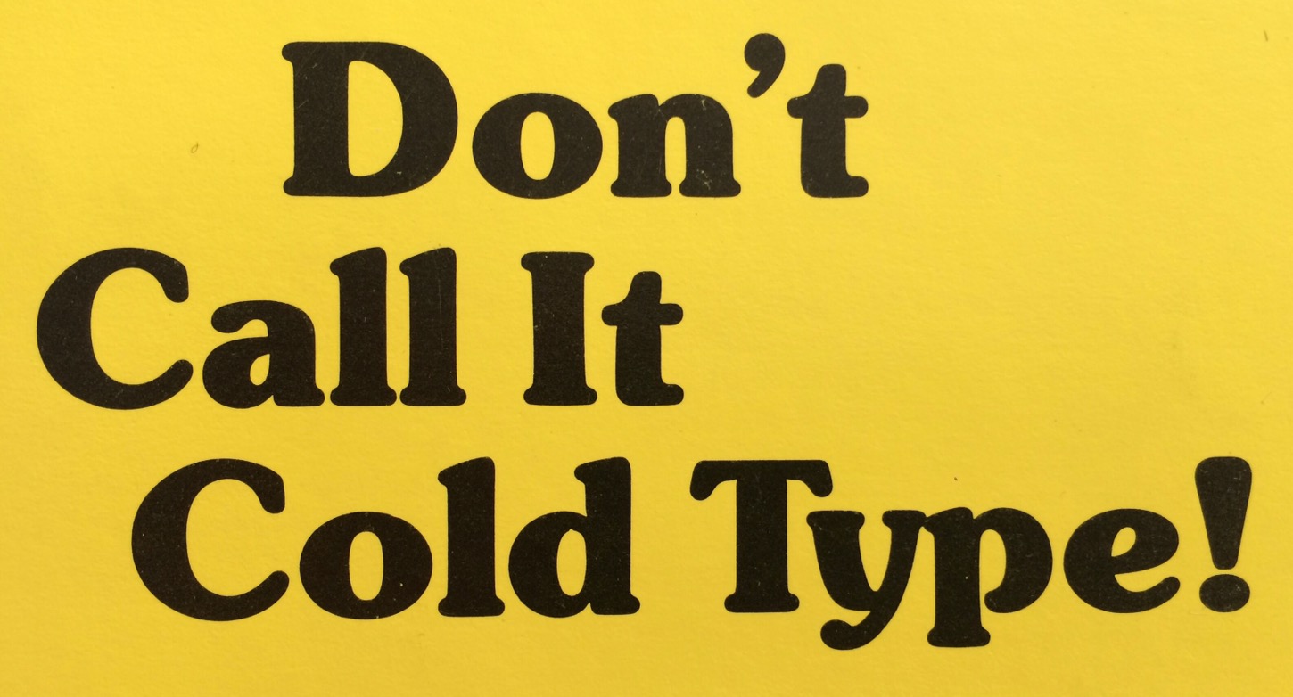
    I learned about the term ‘cold type’ quite late into my fascination with phototypesetting. And when I did it was straight from its biggest critic, Frank Romano, author of a book with the title

    The term had been popular in English (only) in the 1960s and ’70s amid the changes from the then prevailing mechanical ‘hot’ metal typesetting, like Linotype or Monotype, that involved live typecasting, to ‘cold’ photographic systems and computer-based typesetting. But my qualms are more about what cold refers to in relation to hot here.

    In the common sense it means typesetting without the casting of metal. Now that all composition and design is done with cool digital tools, we hardly ever have to differentiate between this anymore. What I would love to make clearer though and distinguish between is the difference between foundry type and hot metal typesetting. Especially non-native English speakers tend to throw all metal type into the hot metal melting pot, but nein:
    Foundry type is traditional metal type of individual sorts (letters) for hand composition, once cast by a type foundry but usually used cold, then taken apart again and reused.
    Hot metal type refers to typesetting machines that involve a casting unit that compose and cast individual sorts or a line of type on the fly, e. g. Linotype, Intertype, Monotype or Ludlow systems; hot to luke warm when handled right after casting and molten down again after use.
    It gets real balmy though now that most metal type used in letterpress print shops these days is actually cold ex-hot-metal Monotype for hand composition.

    So maybe we should not use the thermal terms at all and be more specific in what we mean. Or at least only use hot metal for the mechanical typesetting systems. Or only when we’re referring to genuinely hot typesetters.*
    Continue reading

    Caster Masters

    I recently attended the American Typecasting Fellowship conference in the finger lakes region in upstate New York. If you think this is something that mainly attracts men over 70 you are completely right. Nevertheless, the number of women in attendance who are active in type casting more than doubled this year (~3) compared to 2014.

    I’m very glad I got to know the awesome Jessie Reich for instance. She recently graduated from Wells College’s great book arts program and now works at the Bixler Letterfoundry in Skaneateles, NY, once a week running the Monotype Super Caster as well as her own letterpress and design practice Punky Press Studio.

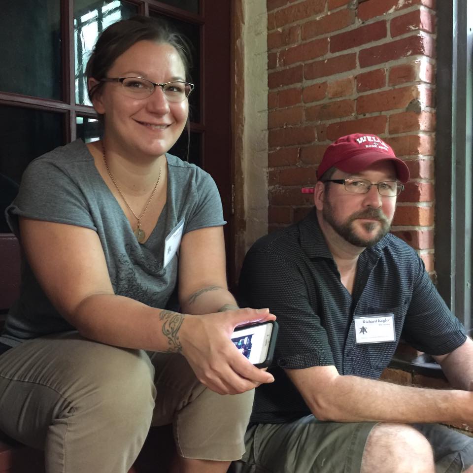
    Jessie Reich and Richard Kegler, co-organizers of the event.

    Jessie Reich and Richard Kegler, co-organizers of the event

    Continue reading