Font Reviews 2024: Tegner

Designed by Linda Hintz
Distributed by Future Fonts

This review was originally written in Catalan. Catalan-speaking territories are sometimes called the Països Catalans (Catalan Countries), a denomination based on cultural affinity and common heritage. The English version of the review is below.

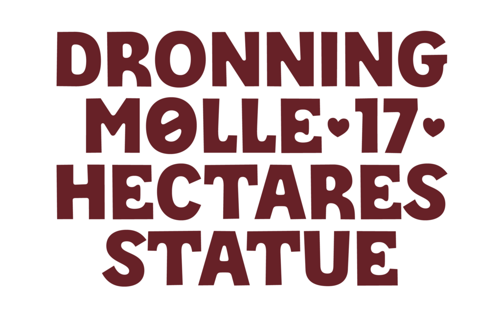
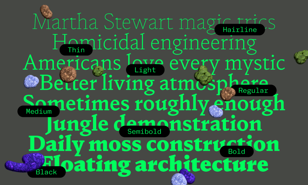
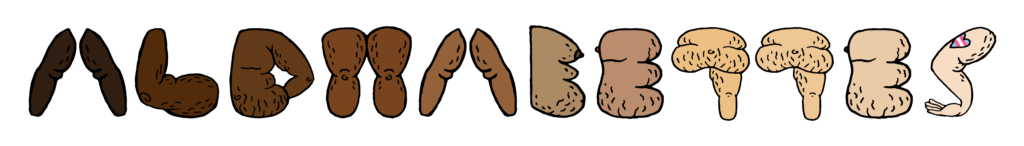
Per a mi, Tegner* és la definició de simpàtica en forma de tipografia: té una personalitat encantadora i accessible que sembla somriure’t des de la pàgina. Dissenyada per Linda Hintz, Tegner aconsegueix equilibrar la juganeria amb una sofisticació moderna i càlida, fent que sigui alhora amigable i elegant. Això es deu a les seves corbes inesperades, subtils asimetries i detalls que es perceben gairebé naturals. A més, combina minúscules d’estil unicase amb majúscules més petites, fletxes, animals i molt més. És una tipografia que et convida a explorar, com si et digués: “Creem alguna cosa divertida junts.”

* Tegner va néixer inspirada per una visita al Rudolph Tegner Museum. Un pòster d’una exposició a l’Independent Artspace Den Frie de Copenhaguen, datat de l’any 1911, mostrava una lletra única que ressonava amb la cruesa arquitectònica de formigó del museu.

Continue reading

Font Reviews 2024: Butik

Designed by Anna Štepanovská
Distributed by Rosetta Type
Typeface family: 3 widths + 9 weights. 27 static fonts + 1 variable font

This text was originally written in Catalan. The Catalan ce trencada (Ç ç), which literally means ‘broken ce’, can be used before the vowels a, o, u (+ accented derivatives), at the end of a word, or before ‘s’ in plural words (e.g. falçs).
The English version of the review is below.

Quina delícia!
Butik està plena de detalls que em fan que m’agradi tant. A Butik el que veiem és que no es tracta només de donar forma a les lletres, sinó de crear formes plenes de significat i personalitat. Anna Štepanovská combina influències de l’ornamentació manierista, Herb Lubalin i Josef Týfa per dissenyar una família tipogràfica completament nova i moderna. Les formes semi-serifades, com la n i la v i la U, i les prominents trampes de tinta defineixen la seva personalitat. Notareu terminals de bola delicades i traços sortints generosos en els pesos més lleugers, mentre que els pesos més gruixuts veiem contraformes petites i terminals de bola grans. És una tipografia que sap com fer una entrada triomfal. I els extres: Les lligadures decoratives, els traços ornamentals i les alternances ofereixen un potencial creatiu immens.

Com diuen a la presentació de Rosetta, Butik no és només una tipografia; és un autèntic terreny de joc per als dissenyadors.

Continue reading

Font Reviews 2024: NaN Druid

Designed by Anna Khorash & Reymund Schröder
Engineering: NaN Team
Additional Engineering: Igino Marini
Distributed by NaN
Typeface family: NaN Druid Serif (9 weights) + NaN Druid Sans (9 weights). 18 static fonts + 2 variable fonts (weight axis).

This review was originally written in Catalan, a language spoken by 9.2 million worldwide.
The English version of the review is below.

NaN Druid és una crida al teu ull, en la versió serif combina la delicadesa amb l’estètica del brutalisme, cosa que m’agrada molt. El pes més atrevit d’aquesta subfamília és una mica experimental, amb talls asimètrics i detalls angulars, i familiar alhora, perfecte per a projectes que necessiten una certa personalitat, pero sense ser molt cridanera.

Continue reading

Exhibition: Same Bold Stories? Type Design by Women and Queers in the 20th and 21st Centuries

photo by Simon Malz

Same Bold Stories? Type Design by Women and Queers in the 20th and 21st Centuries
Exhibition at the Klingspor Museum, Offenbach am Main, Germany
July 19—November 24, 2024

A Quick Intro

In July, I had the chance to attend the opening of Same Bold Stories?, an exhibition that explores the question: Where are women’s voices in type design that complement the existing history?

While conversations about women in type design are becoming more common, exhibitions on this topic are still pretty rare. That’s why it’s so important to acknowledge and appreciate this effort. The exhibition was developed in collaboration with the Klingspor Museum (Dr. Dorothee Ader, Valerij Ledenev, Tatjana Prenzel), design studio Turbo Type (Laura Brunner, Leonie Martin), and the feminist collective +FEM (Kristina Mukhacheva, Naomi Rado). The opening took place on July 19, and I was lucky to be there. The feedback has been very positive, with media describing it in fitting words like “Fat, brave, and cheeky!” (hr2-Kultur Review) and “Arial, Bold, Times New Roman – Queer and Feminine Font Design” (Deutschlandfunk Kultur Interview). The exhibition runs until November, with various events planned. You can check the details here.

Continue reading

Thoughts on the 7CIT

Este artículo está también disponible en español

The Congreso Internacional de Tipografía (International Congress of Typography & Type Design) takes place every two years in Spain, in the Eastern city of Valencia. It is a very special conference in our country because, in addition of being the first main event in type, it is the only one that covers typography and type design from three different perspectives: education, research and design. As a result, researchers, educators, students, graphic and type designers meet to exchange their knowledge and share common interests. In this occasion two Alphabettes members, Laura Meseguer and María Ramos, were in Valencia taking notes of every talk and have eagerly reported their experience in an informal conversation. Laura was not only an attendee but she also took part of the TypeCrit session helping novel type designers to develop their skills.

Continue reading

Reflexiones sobre el 7CIT

This article is also available in English

El Congreso Internacional de Tipografía se celebra cada dos años en la ciudad de Valencia (España). Es una conferencia importante, porque además de ser el principal evento sobre tipografía en nuestro país, es el único que cubre la disciplina desde tres perspectivas distintas: la educación, la investigación y el diseño. Con motivo del evento, investigadores, profesores, estudiantes, profesionales del diseño gráfico y de la tipografía se reúnen para intercambiar conocimientos e intereses. En esta ocasión dos miembros de Alphabettes que estuvieron en Valencia, Laura Meseguer y María Ramos, han decidido compartir su experiencia a través de este blog con esta conversación informal. Laura, además de asistir al congreso, también formó parte del programa aconsejando a jóvenes diseñadores en sus proyectos tipográficos en una de las sesiones del TypeCrit.

Continue reading

Laura Loves Lettering on Book Covers

This post is about sharing my love for lettering on book covers that I’ve discovered and some collected over the last few years. That’s the easy part, but making a selection is quite hard, because there are lots of them I love. I hope you will enjoy it. I will start with two fabulous books I got in Warsaw.

Polish

‘artur conan doyle’, book cover by Andrzej Czeczot, 1959. ‘Niepokonane’ book cover by Aleksander Stefanowski, 1964.

Continue reading