Around this time last year, I accidentally got really involved in US presidential candidate Bernie Sanders’s unprecedentedly large texting program. When he suspended his campaign, 30,000 volunteers had sent 259 million texts, and among them were tens of volunteers, including me, who’d been spending tens of hours a week to help run the program: making materials, training new texters, answering questions on Slack in real time, double checking texts on the backend. And on that day in April, all of those people suddenly had a lot more free time. Continue reading
Author Archives → Victoria Rushton
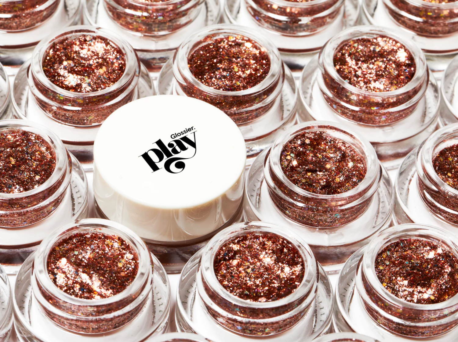
Playing With the Glossier Play Logotype
I really like trying to reverse engineer the ways people have taken type into their own hands. Often it’s something simple, like adding an outline to make it heavier, or adding flourishes that don’t exist in the original typeface. Sometimes it’s several things. It soothes me, like taking a simple machine apart, seeing how it works, then knowing how to put it back together. I also sometimes like to redraw logotypes and typefaces to see if I can improve upon them, for similarly cathartic reasons. I mostly keep quiet with this, because being like, “HERE’S how I would’ve drawn this BETTER THAN YOU,” while knowing next to nothing about the client, their vision, or any number of constraints that inevitably exist behind the scenes, almost always makes you sound like the biggest tool.
THAT SAID. I’ve gotta talk to someone about the logotype for the new Glossier brand, and I don’t have a therapist rn.

Courtesy of Glossier
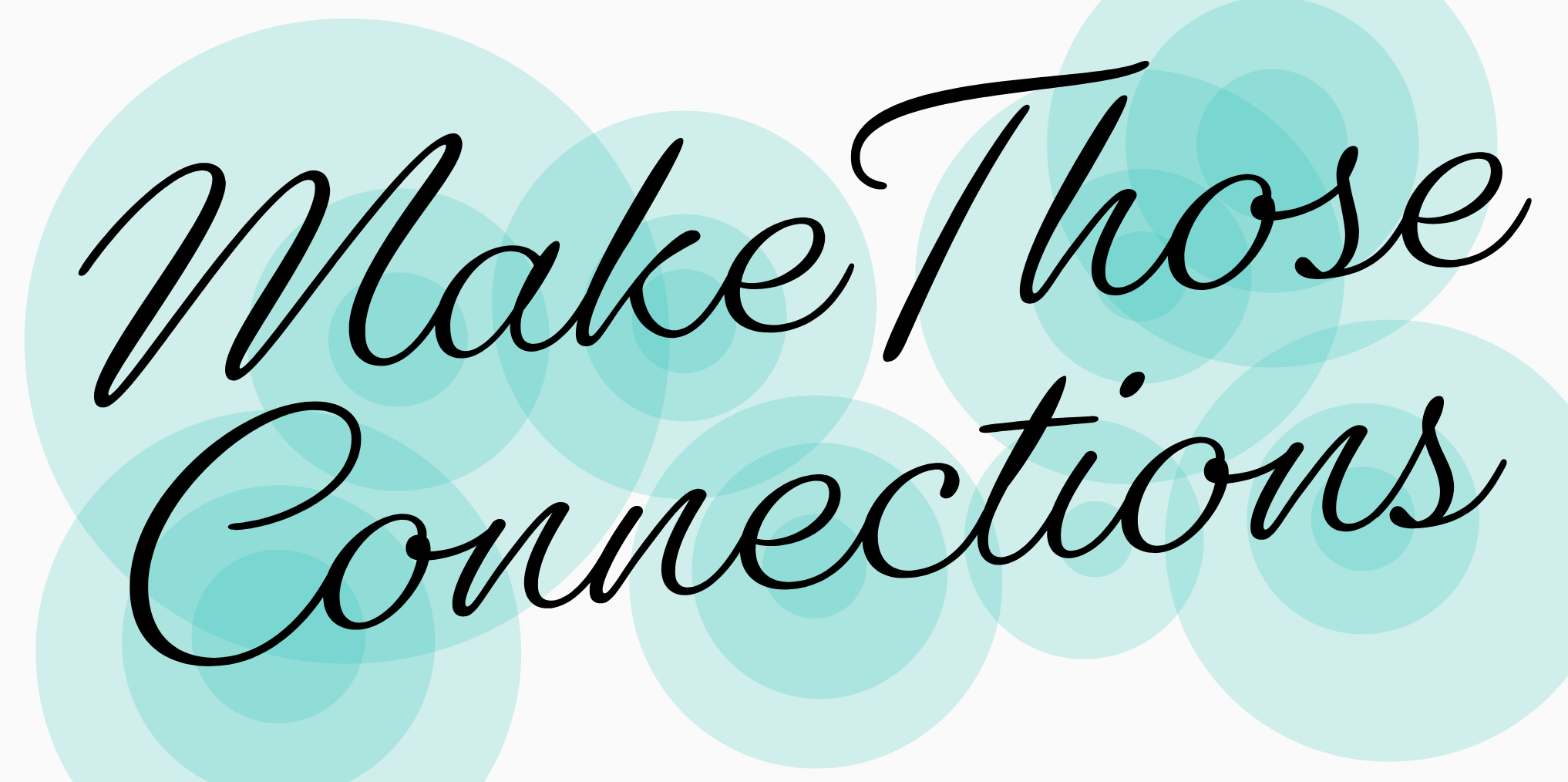
Make Those Connections
This is the transcript of my talk at Typographics last June about the making of my (now-released) typeface, Gautreaux, edited for clarity in this medium. You can watch me in all my nervous glory here, but I wanted to make the written version available for anyone who’d find that useful. Enjoy!

Hi! I’m Victoria and I’m a type designer. I have a learning story for you about a script typeface. I happen to really like hearing people tell their learning-to-do-things stories, which is convenient for me because mainly the only stories I have so far are learning-to-do-things stories, so I guess I’m just interesting like that. I came to fonts via script lettering, and so I’m really into coming up with projects that help me to understand their distinctions and overlap. This one is about exploring what it takes to make some lettering into a font, the things that work and the things that break, and whether you want to make a font that obscures the clues that it is in fact a font, or as I ended up doing, tackle hug those issues into a chokehold. I’m going to talk to you about this one script font, right here, I’m sure you guessed. I’m going to tell you how I started, what I set out to do, and then about all the details I’ve screwed up and then fixed. Okay, here we go. Continue reading
Dear Alphabettes:
Who is a type master?
Dear Alphabettes,
Currently I am a graphic design student, and recently I was working on a group project highlighting a “type master” in history. Much to my surprise, there were no women on the list of “masters” to choose from. Our teacher said we could do our project on a woman type designer if we could find one who made substantial contributions to the world of type. After research, we chose Carol Twombly. When I asked my teacher if she would be added to the list for future classes, he said he doesn’t feel her contributions warrant the title “type master”. Is he right? If not, can you provide me with a poignant argument in favor of Twombly?
Thanks!
Alicia
Hi, Alicia!
The first time I read your email, I had to close the tab and take some deep breaths. I don’t know why it struck a particular nerve – I’m newish here but I’m already pretty used to the work of highly accomplished women being underestimated, undervalued and dismissed. C’est la vie, am I right?
At Alphabettes, we made a quick list of women designers we think deserve to be called “type masters.” But you know what, Alicia? I hate that we felt the knee-jerk reaction do that. The issue, as I’m sure you know, is not that only white men do good work, it’s that people in positions of power consistently fail to see the problem in excluding the work of women and people of color from what they deem worthy. Hitting your teacher with a bunch of women designers (lists of whom are already out there tenfold) and good reasons to include them (same) isn’t going to change his mind. It is absolutely on him to reflect on why his list of who counts as a “master” skews so male and so white, and feel a duty to do better by those of his students who are not white men.

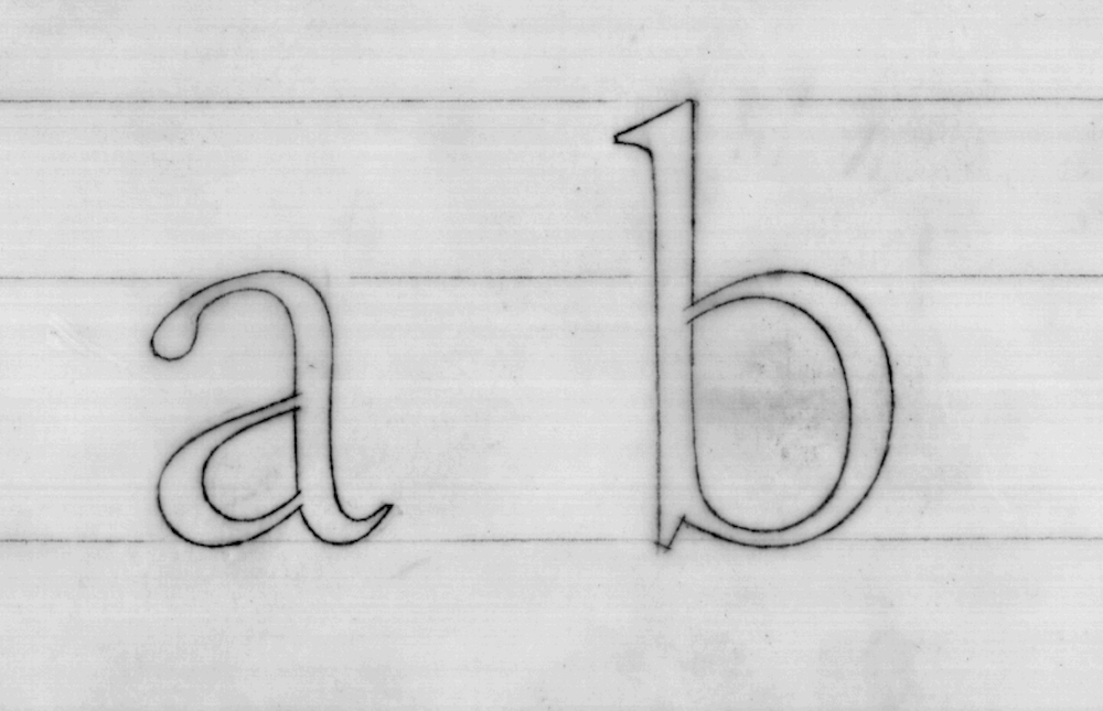
Adobe Caslon drawings by Carol Twombly, via Adobe
Your teacher has already seen your group’s presentation on Carol Twombly’s work. I could recall her accomplishments, but if he wasn’t asleep while you were talking (and for the entirety of his career as a designer or educator, tbh) he already knows she was more prolific and influential in only eleven years than most type designers hope to be.
By all means, discuss the structural inequalities that resulted in an all-male “type masters” list with your fellow students. Rally any other professors and professionals in your circles who see this as the belittlement of Twombly’s contributions that it is. But if that isn’t enough, who am I to convince your teacher? I’m a type designer with three years’ experience at a respected foundry. Important people in the industry admire my work and believe in my potential. Some of them are on his list of “type masters.” I bet you if I called them up, they would all vouch for Twombly’s mastery. I’m sorry I can’t give you something more inspiring or helpful or poignant to tell him, but if your teacher doesn’t already believe Carol Twombly is a type master, it won’t ever be enough to hear it from me. Wait, that’s actually kinda poignant.
All my best,
Victoria
Do you also have a question about outstanding designers, the universe, or everything else? Tweet at us @alphabettes_org and if the answer doesn’t fit into a tweet, we may reply here.
Gingerbread Advent Calendar
This time four years ago, I was scrambling to finish the semester’s final projects in my senior year of college. In other words, highly suggestible to distractions. I was chatting with my mother on the phone, already a distraction, and she mentioned in passing the idea of making advent calendar numbers out of gingerbread. To which I was like, I will drop everything to complete this task IMMEDIATELY.
I’ve done it again every year, always drawing my own brand new set of numbers and executing them in cookie and icing. For the fifth year, I thought I’d tell you all about my Type A bullshit tips and tricks and secrets for how to do it from start to finish, should you wanna plan to decorate cookies for your roommates or family this year, or have an outing to avoid.

Another Lettering Video
Some very sped-up drawing, for your vector-scrutinizing pleasure. My favorite parts, if you can catch them, are when I realize halfway through that the ascender tops are leaning the wrong way, and when my boyfriend’s iMessage pops up with some solicited feedback that the “a” and “l” are too close together.
Music is Jenny by the bird and the bee.
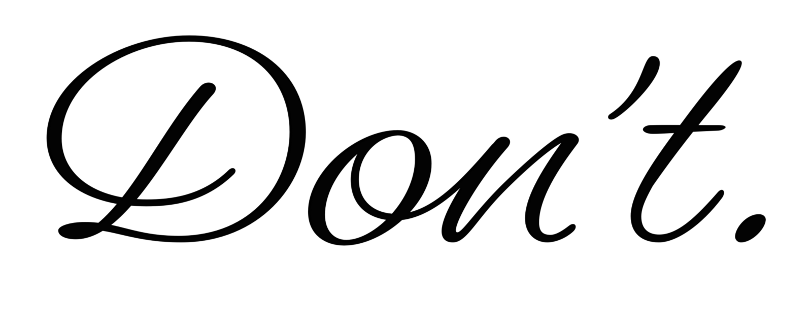
Type and Gender Stereotypes
Here’s the deal with describing type or lettering as feminine or masculine:

This is my simple request. If you already have an inkling about why this might be an issue and think it’s a reasonable request you can handle, awesome, no homework for you today. But if not, take my hand.
