In the Middle of Nowhere

L1040374_wp

In the middle of nowhere – an encounter First published in 2008 at SLANTED

I’m now on my way to Roquefort, after a halfway sleepless thundery night in a tent on the French Atlantic coast. I couldn’t tell if this is the place where the famous French cheese by the same name originates, but I do know that it is the place, central in the southwest of France where I will soon meet the man whose works I have studied, and come to appreciate, for some time now: his name is Jack Usine.

Continue reading

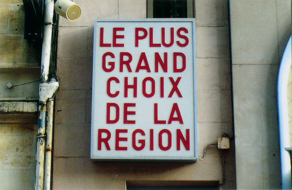
Choosing from Plenty

A Monday morning 7:30 am contemplation about fonts: I think, for the past two or three years, we (finally) see a shift towards choosing a fitting typeface from all offers out there, and not just the fonts we have already licensed previously. The latter was the prevailing situation in analog type days and whenever we had to work with typesetting studios or printers before PDFs. But it was also common in digital desktop publishing for a long time that you would use what you have rather than getting a new typeface for every job (because, amortization, familiarity, etc.).

My stance has changed when I started working more with fonts on the web, or more specifically, renting them from services. No point in licensing those in advance and then using them for everything for years (you can do that with self-hosting webfonts and one-time licenses though). Similar with all the rentable desktop fonts available now. Think what you want about the trend towards renting — incremental licensing vs. one-off licensing — but I’d be happy if we see more variety and more fittingly chosen typefaces this way. Of course, font renting models are not guaranteeing the perfect type decisions, maybe they even promote clumsy choices by people who don’t yet have a good grasp of how-to. But at least they don’t foster the lazy use of much seen staples because of cost, when the cost relates to time, and not just the number of typefaces.

Impractical Thoughts on Paying for Practical Typography

Unless you’ve been living in a secluded yurt for the past few days (although you’d probably still be checking your phone, don’t lie), I’m likely not the first person to tell you about Matthew Butterick’s Practical Typography, a new read in a long line of essential reads on typographic rules. Butterick’s writing is especially refreshing and particularly useful for explaining these sometimes confusing and cryptic details to the novice or the first-year design student.
Continue reading

The Type Conference Fee is Too Damn High

With type conference season in high gear, designers everywhere are uttering sighs of disbelief at the prohibitive costs of getting one’s geek on.

The discussions over conference fees, travel and hotel expenses are understandable. And given the variety of international type conference options available these days (ATypI, TypeCon, TYPO, Ampersand, TypeTalks, ICTVC, Typography Day, Granshan, Kerning, oh, and this), how does one even chose what is worth attending?
Continue reading