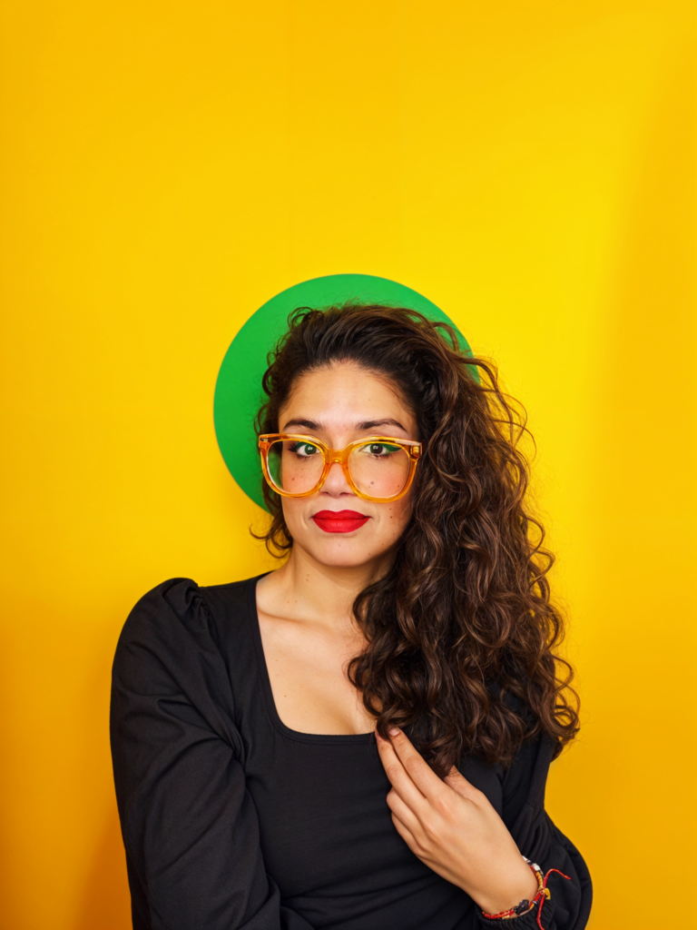
Sandra García is a type designer based in Mexico City, half of TipasType (who recently released Sandhouse), co-author of Elementype, prolific user of reaction emoji, and now, podcast host to the brand new TypoDcastMx. She answered a few questions about this new endeavor in Español and English.
Continue readingCategory → Interviews
A Letterpress Calendar for 2024
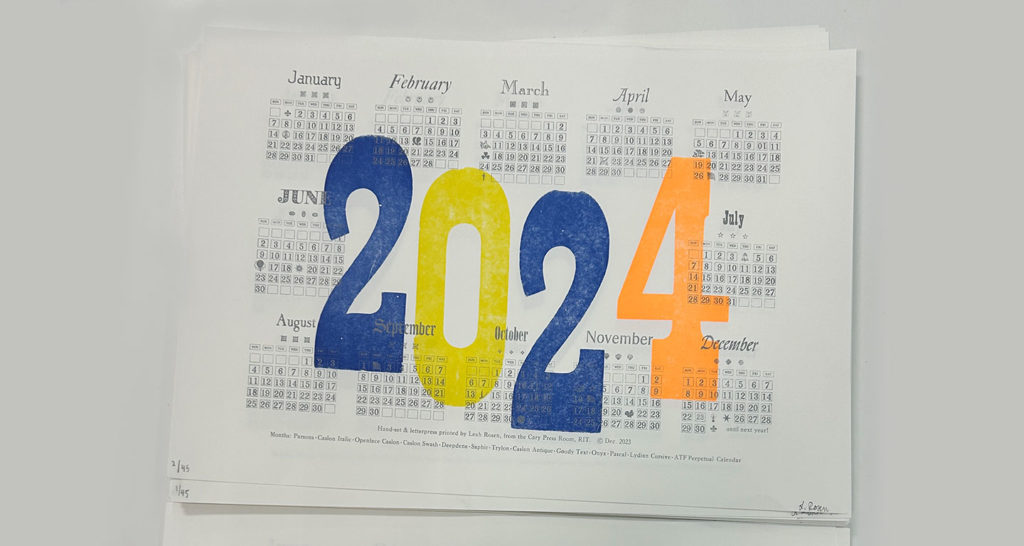
Leah Rosen is a fourth year Industrial Design and Psychology student at the Rochester Institute of Technology, in Rochester, New York, USA. Since 2020, she has been a Student Assistant in the RIT Cary Graphic Arts Collection. Her roles vary from setting up the new Cary Pressroom, shelving rare books and handling archival items in the collection. This year Leah was also the Teaching Assistant in RIT’s Letterpress Printmaking course. She initiated a personal letterpress project. Despite her busy schedule, she was not discouraged to dedicate a significant amount of time and effort to typesetting and printing a calendar for 2024. She shares her process, challenges, and some valuables lessons. The outstanding outcome speaks for itself.
The 2024 letterpress Calendar by Leah Rosen.
Continue readingVery Cool Thing: Words on Type
The last time Lisa Huang shared a Very Cool Thing on Alphabettes, she published her research on Noto Sans Nüshu script, and the community of women behind it. Two and a half years later, Lisa is back to answer some questions on her newest Very Cool Thing, Words of Type.
Tell us about your new project and Kickstarter campaign!
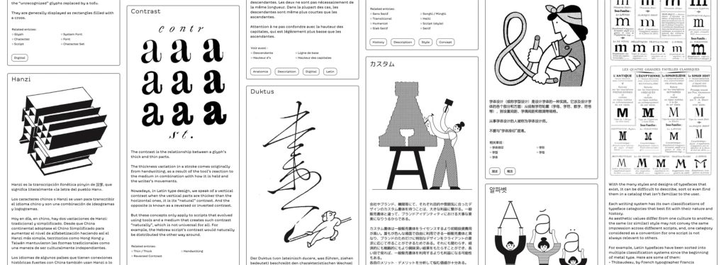
Words of Type is an encyclopedia of typography, with each term illustrated, described and explained into multiple languages. Each term is explained in concise and straight forward terms to be easily understood, and illustrated by multiple artists to bring visual variety and fun. To bring the various typographic cultures closer together, there will be not only terms from Latin typography, but also those of other writing systems. To give a (literally) better access to typographic knowledge, it’s going to be a website that gives free access to everyone, everywhere. And it will grow and evolve over time, with more languages and words.
Leaving a Mark: Ezhishin Interviews
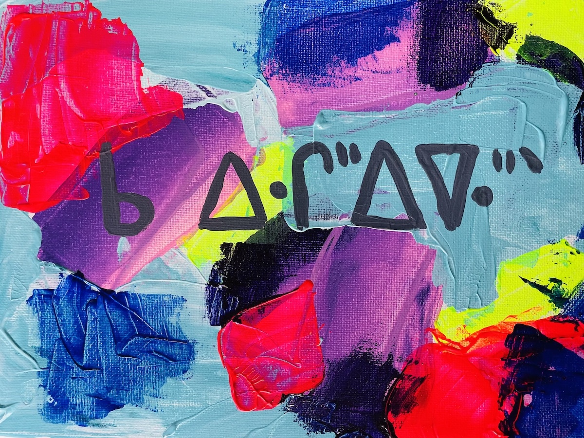
Next month, the Type Directors Club will present Ezhishin, a conference focused on Native North American typography. From Friday November 11 – Sunday November 13, the virtual conference will feature the voices and work of Native North American type designers, lettering artists, design educators, printers, researchers, and more. This Q&A with four the Ezhishin presenters, Violet Duncan, Jessica Harjo, Monique Ortman, Sadie Red Wing, and Kathleen Sleboda, highlights some of their ways of working, recommended readings, and what leaving a mark means to them.
Violet Duncan
Violet Duncan is Plains Cree and Taino from Kehewin Cree Nation. Touring nationally and internationally since 1991, she has performed for audiences across the United States, Canada, and Europe through work as a Native American dancer, hoop dancer, choreographer, storyteller, and author. Violet is a former “Miss Indian World”, representing all Indigenous people of North America. After becoming a mother of 4 and seeing the need for Native representation in literature, she took it upon herself to author three award-winning children’s books: I am Native, When We Dance, and Lets Hoop Dance! She has recently joined the family of Penguin Random House with two new children’s books and a middle school novel coming out 2023/24. Violet is the Creative Director of Young Warriors, where she aims to create space for programming of Indigenous performance and practice.
Workspacing, part 1
An inspiring workspace isn’t easy to create. And yet, after we get our act together and design a space that is right for us, we know that our work will be better. We will be more motivated, our mind will be clearer. This workspace will allow new ideas to flow and focus time to be cultivated.
When thinking of a type designer’s desk, we may have a few images in mind: the messy, crazy-artist desk with ink all over and paper flying around. But at the same time, we may imagine the ultra-organised designer where every file is cataloged in a neatly labeled folder, a huge monitor and the newest tech gadgets.
Out of pure curiosity and an unmet wish to be a fly on some Alphabette’s walls, I’ve set out to explore some of our workspaces.
Feel free to reach out to any of them, ask questions and share what you thought.
Let’s begin!
Continue reading
Nunca dejes de pintar: Una entrevista a Alina Kiliwa
To read this post in English, keep scrolling or go here.
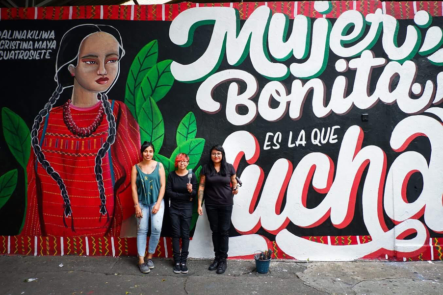
Alina es una pequeña gran fuerza de la naturaleza. Su trabajo, como artista de la rotulación, se extiende a lo ancho y largo de su natal México.
Preserva la tradición del rótulo vernacular, típico del paisaje urbano de la Ciudad de México, combinándolo con mensajes poderosos que buscan la conciencia social o simplemente alegrar el día a día de los transeúntes que logran toparse con alguno de sus trabajos, pues los rótulos de Alina, van desde piezas personales hasta muros que coquetean con el graffiti.
El amor, el respeto y la igualdad son el tipo de temáticas que Alina considera básicas en nuestra sociedad y que busca plasmar en sus mensajes. Forma parte del movimiento Paste Up Morras, una comunidad de mujeres que pegan en las calles propaganda ilegal con temas como el feminismo, la igualdad y el respeto. Creada por y para mujeres que se sentían inseguras en el medio de street art o graffiti ilegal, prácticas estigmatizadas en nuestro país. Salir en grupo se ha convertido en una experiencia segura para sus integrantes y ha generado alrededor de esta actividad una comunidad de artistas, que se desarrollan con mayor seguridad y confianza. De la mano con esto, también ha creado un proyecto que aborda frases en apoyo a la mujer a partir de reflexiones propias y escuchando a otras mujeres hablar sobre los distintos tipos de discriminación que han sufrido. Así, las calles de nuestra ciudad se han ido llenando de expresiones que invitan a la reflexión, manifestando un sentido de unidad femenina, una bocanada de aire fresco en una sociedad donde los temas y políticas de igualdad y derechos para la mujer se mezclan día a día con la injusticia social, los feminicidios y la impunidad.
Graphic memory & transferable drawers — Talking with Elena Veguillas
After a long break, we are returning with the interview series. I am well aware that life is busy and that you probably feel like there is much to do in all areas in life. It’s rare to see someone focusing only on one thing, and structuring the days with a single repeating activity. It is the combination of different activities that make our lives unique and interesting, and so very often, we clearly see how one action in our days affects the other in a big pile of, well, life.
Elena’s name pops up whenever someone mentions writing, research, design, and publishing. She is a woman of many traits that made me fascinated by how in reality this works for her.
Soundtracks & comfort zones — Talking with Luisa Baeta
It has been about 20 months since the last interview in this series was published. Since then, many things have happened & a lot has changed. Returning to this format is incredibly comforting to me. The familiar structure, the visual glimpse into one woman’s life, the personal questions that get such honest replies.
Luisa is a person you want to both hear and read. You don’t want to miss a word, since they are all clear and make you think. Walking with her on the streets of Thessaloniki some years ago, I was lucky to find a friend so soon after meeting in person for the first time. The ease and sincerity of her thoughts are very much apparent in this interview. I urge you to find few quiet moments to read, drink something relaxing (hot chocolate? something stronger perhaps?) and let it sink in slowly, along with this interview.
Expanding on Infini, with Sandrine Nugue
Sometimes, parts of what you write for a specific article gets left on the editing room floor. Those bits might be the most interesting parts, that simply don’t necessarily fit perfectly into the story. Sometimes it’s the predefined word count which is forcing one to leave it out. But the interest stays, and the will to dive deeper into the thoughts and process behind one typeface does not leave. This is the story of Sandrine Nugue’s Infini, a typeface she designed after winning a commission from CNAP (National Center of Visual Arts) in France, and is available for free, to everyone.
I followed up with Sandrine and asked more questions, based on her original replies. This typeface is so nicely explained, with the process shared and great images, that I encourage every reader to take a quick journey into a typeface that is both here and there, present and past, serious and lively.
Letters in Letters A chat with Carolyn Porter
If you have been following my interview series here on the blog, you might already know that there is a well-defined structure for those conversations. Today, I want to share an interview done in a different way. It will be quicker, a bit more friendly and not any less personal. Carolyn recently published a typeface and a book, and those two were good enough reasons to sit down and enjoy a virtual conversation about the process.