Alphabettes News — November 2015

And just like that the last month of the year is here, and that means it is time for November’s news roundup. And we have got it all this month—conference talks, interviews, awards and more.

Verena Gerlach at BITS MMXV
Verena Gerlach was one of the speakers at the Bangkok International Typographic Symposium MMXV, where she spoke about treating the city as an inspiration for her work.

Martina Flor, Stephanie Rieger, Marcy Sutton, Steph Troeth speak at Beyond Tellerrand Berlin 2015
At the Berlin edition of Beyond Tellerrand last month, speakers included Martina FlorStephanie RiegerMarcy Sutton and Steph Troeth. You can hear all the talks from the conference on Vimeo.

https://vimeo.com/144596065

Continue reading

A Review of the Book “365typo”

365typo_cover_highres

365typo: 365 stories on type, typography and graphic design, published in collaboration with the Association Typographique Internationale (ATypI), is a new annual trade book (loosely in the tradition of the Penrose Annual), featuring a collection of articles about type and typography written by several different contributors from December 2013 to June 2015. The idea is to publish a new book each year, providing a snapshot of the industry for that period.
Continue reading

Alphabettes News — October 2015

In this edition of Alphabettes in News we pick up on some slack from September, show you a variety of great work by women designers, and bring to you the opportunity to learn more about their research and hear their opinions about typography and type design.

Dyana Weissman completes thirteen years at Font Bureau
Dyana Weissman, whose Benton Modern Display is a personal favourite (she designed the extension with Richard Lipton), completed thirteen years of working at Font Bureau last month, where, she says, some of her favourite clients have been Adidas, Marie Claire magazine, TIME magazine, and Korn Design.

Continue reading

Kerning Conference in Faenza, Italy

I just finally watched this great little video re-cap from Kerning conference in June this year where, among others, Laura Worthington and I had great fun to speak at. The conference takes place every year in the small town Faenza in the north of Italy, close to Bologna and Rimini. You should really really consider going next year!

Not only is the town and location charming, the organizers super nice (and professional), the programming always thoughtful with great talks, and the Italian weather excellent, the food … oh my, and an Aperol spritz at the end of a warm sunny day in Italy is pretty unbeatable. I recommend adding a day or five around the conference for some trips, for instance to visit Bologna, or Florence, or Venice — all not too long train rides away — or the amazing Tipoteca Italiana type museum in Cornuda. (For the very curious, I wrote a personal post about my trip this year on my own site, but kind of too goofy to post it here or to link to.)

If you’re still not convinced, check out these photos that really capture the spirit of this small, friendly event. And then I’ll see you there next year!

Moskau, Moskau … *

From our mobile conference report correspondent:

Everybody should visit Moscow! I was lucky to recently spend 4,5 days in this fantastic city, and in fantastic company.

The occasion of my visit was Serebro Nabora, a typography conference organized by Gayaneh Bagdasaryan with the help of other local type people like Maria Doreuli or Ilya Ruderman. It was the third installment of the event, this year luckily not in freezing late November as the years before. And girl was the weather perfect! Bright 22–25 picture-book degree sunshine end of September — a time in late summer that apparently Russians as well as German denote as “old women’s summer” — бабье лето. More similarities in the two languages unfolded which I couldn’t make out in the stream of charming-sounding Russian around me before but then heard in every second sentence: the German word Schrift, a term that English is sadly missing, is also used in Russian (but with just one character for “sch”): шрифт.
Continue reading

Alphabettes News — September 2015

Welcome to the first edition of what hopes to be a monthly roundup of women making news in the world of type design, typography and lettering. To not miss any exciting news from the months before September, this time we’re turning the clocks back a little, so sit back and catch up on the amazing things these ladies have been up to this year.

Ruxandra Duru’s report Type Foundries Today goes live on Typographica
Last month, Ruxandra Duru’s census and accompanying analysis of contemporary type foundries based out of Europe, the Americas, Australia, and New Zealand was released by Typographica. This report is a timely first step in understanding the nature of the type business better, and a must-read.

Mary Catherine Pflug wins four CSPA Collegiate Gold Circle Awards
Mary Catherine Pflug has bagged not one, but four, CSPA (Columbia Scholastic Press Association) Collegiate Gold Circle Awards for the campus magazine, The Independent; including one for “General use of typography throughout magazine.”

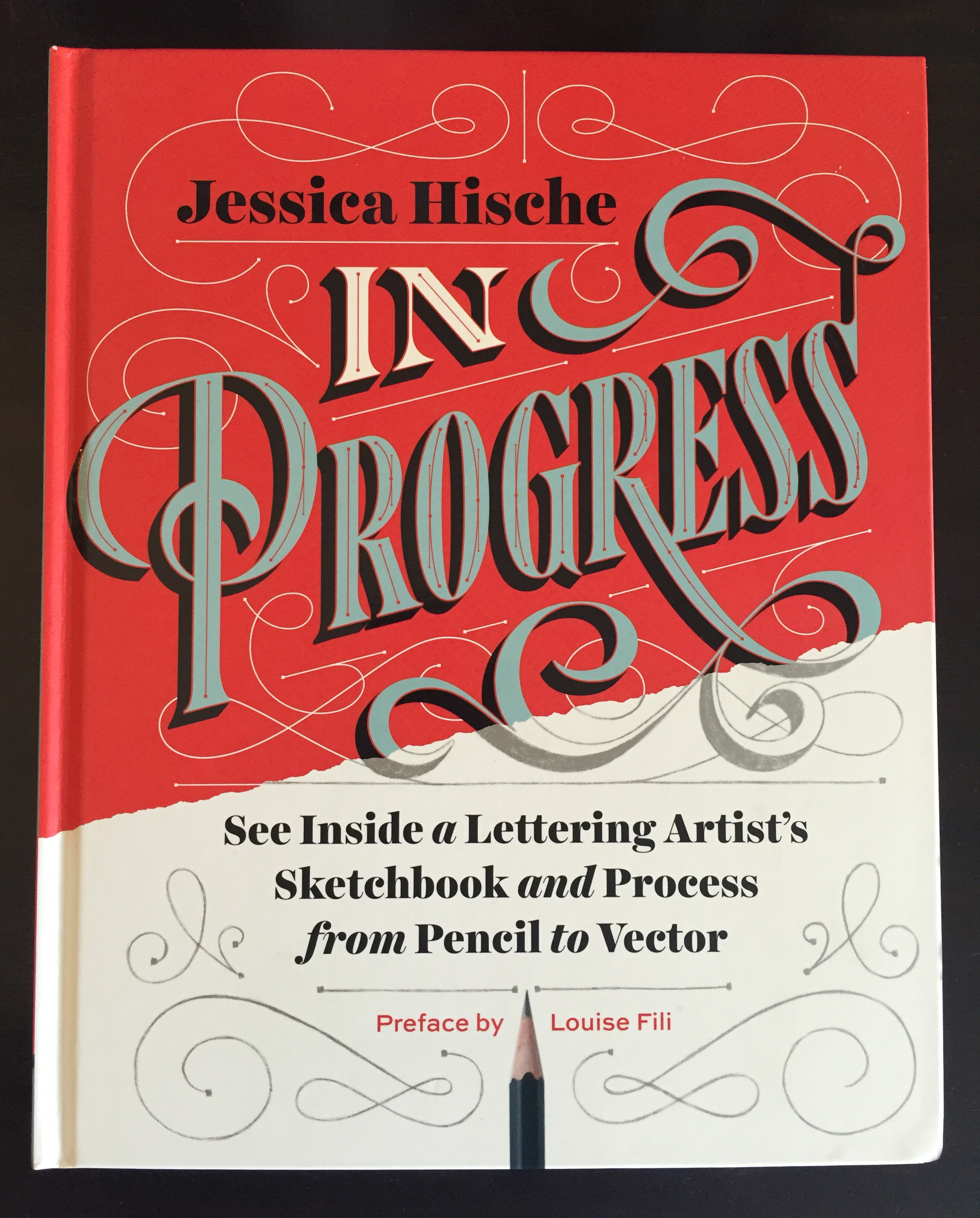
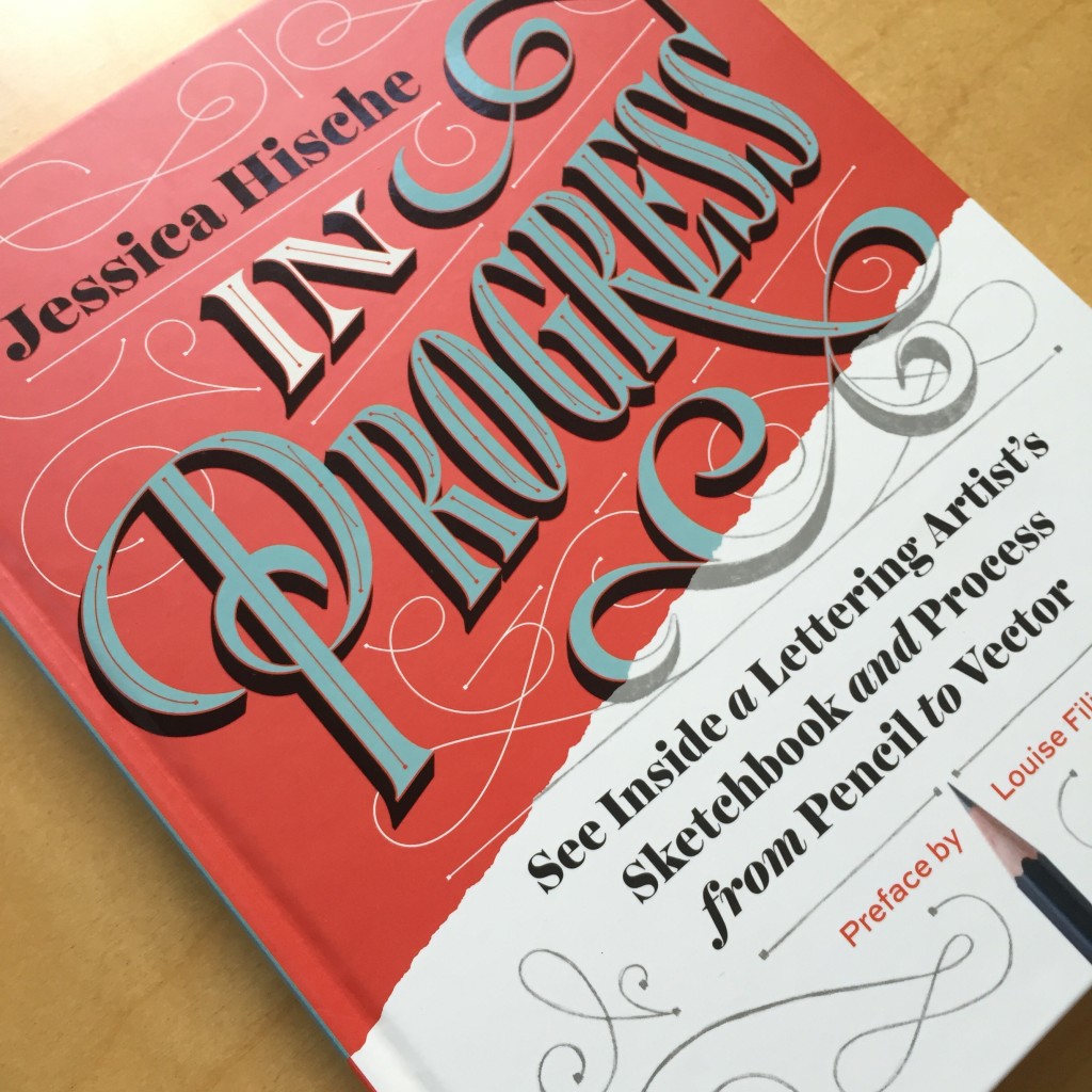
Jessica Hische’s book In Progress is out
If you dig hand lettering, chances are you already know that Jessica Hische’s book In Progress hit the shelves this September. Read more about the book in Shauna Lynn Panczyszyn’s review, or get yourself a copy.

IMG_7537

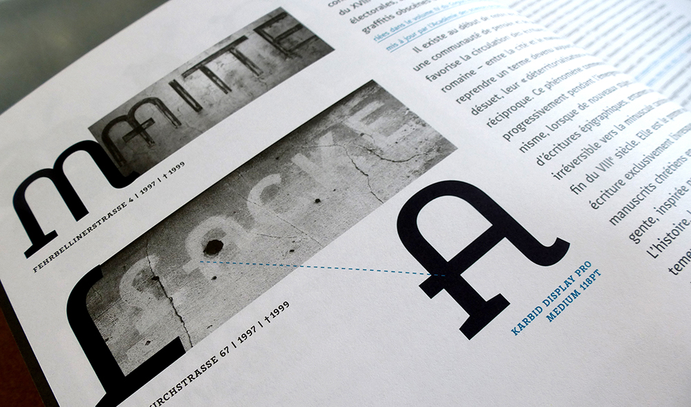
Verena Gerlach is September’s Creative Character…
Read Verena Gerlach’s interview in which she speaks about her work as a typeface and graphic designer, FF Karbid in particular, and about the arts and culture scene in newly-reunited Berlin in the early nineties when she was a student.

Karbid_book25

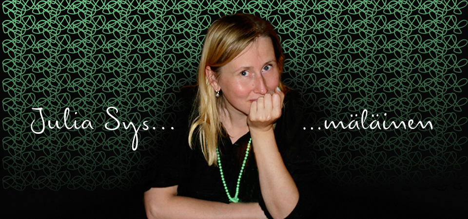
…and Julia Sysmäläinen was May’s
Julia Sysmäläinen, probably best known as the designer of FF Mister K, talks, among other things, about her love for language and how being fluent in more than one language and script has influenced her work in this great Creative Characters interview.

Juliasys

Isabel Urbina Peña’s launches Yes, Equal
Late in August, Isabel Urbina Peña launched Yes, Equal, a directory of sorts of women creatives. Next time you hear a conference organiser bemoaning the very limited number of women they can invite to their event, you know where to point them to.

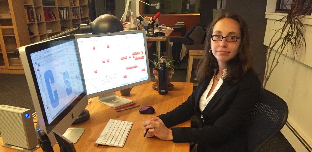
Nadine Chahine becomes Monotype’s first female director
With her promotion to UK Type Director, Nadine Chahine became the first woman to hold this position at Monotype.

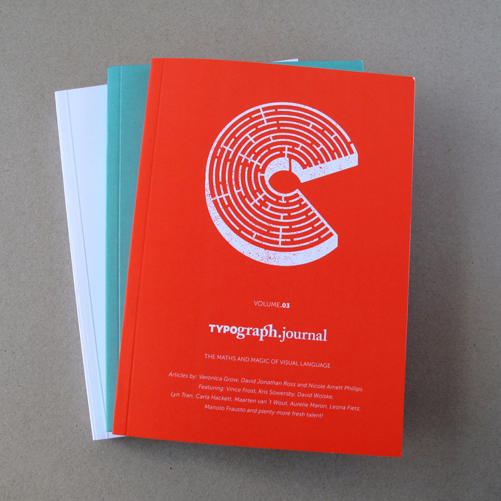
Nicole Arnett Phillips launches the third volume of Typography.Journal
Typography.Journal, a boutique print journal, is the brainchild of Nicole Arnett Phillips, aka Typograph.her. Its third volume, which explores the intersection of maths and magic in visual communication, is now available for purchase.

Typography.Journal

Rebecca Bartola receives the first TDC Beatrice Warde Scholarship
Rebecca Bartola, who is an American student currently studying at Central St Martins, London became the first recipient of the TDC Beatrice Warde Scholarship this July. Check out her work here.

The Ruq’ah Project by Zeynep Akay

Check out The Ruq’ah Project by Zeynep Akay, documenting the research and making of a typeface inspired by Ruq’ah, a common style of Arabic handwriting, to be added to the Google Webfont Library. It’s not always easy to allow the world to peek behind the curtain of one’s process but Zeynep is determined to partake in what she is calling “immersion therapy”.

I will open my process, my most unrefined drawings, my kookiest ideas, my most embarrassing failures to the snarkiest, most passive aggressive comments on the internet.

We’ll be right here, watching — and cheering — along.

Goodbye to the Master of the Univers

This past week Adrian Frutiger (24.05.1928–10.09.2015) passed away after a life full of passion for typography and type design. This is the second great loss for the type community this year — he followed another type legend, Hermann Zapf, who died in June. In the 1950s, when he designed the famous font family UNIVERS, he could barely imagine that today such ornamental, playful initials would be used in a daily newspaper. He accompanied my life as a designer from the beginning of my studies in the ’80s, and I always loved the rhythm of UNIVERS — even today, and going forward. Farewell and have a good last journey.

Adrian Frutiger - Master of the Univers