Mentorship update: June 29, 2019

For the past three months we have been making progress behind the scenes of our new and improved mentorship programme.

This is taking some time because sorting out our online privacy policy is more complicated than we anticipated. We want to make sure we are respecting your personal information. Our legal team is on it and we will be ready to go soon!

The Alphabettes mentorship program team

Conferences 2018

We’re a few months into 2019, but it’s never too late to look at how women were represented at conferences last year. Especially since there were a couple of standout events.

We salute those type conference organizers who decided to use their 2018 chapter as an opportunity to improve their speakers lists towards gender equality and elevate women’s voices. We can’t wait to see this dedication continue to inspire others.

In order of percentage of female speakers:

100% Ladies, Wine & Design Berlin Conference, DE – Berlin
85% Women in Print, UK – Birmingham
73% Tipografía México, MX – Monterrey
71% Script, print, and letterforms in global contexts: the visual and the material, UK – Birmingham
61% (+38.89%) DiaTipo, BR – São Paulo
50% (0%) Typographics, US – New York City
49% [.01% gender fluid] (+6.06%) TypeCon, US – Portland, OR

44% Ampersand, UK – Brighton
41% (+4.5%) ATypI, BE – Antwerp
39% (+5.10%) Typo Berlin, DE – Berlin
36% Dynamic Font Day, DE – Munich
31% EDCH, DE – Munich
30% Type Drives Culture, US – New York City
28% (-5.56%) BITS, TH – Bangkok
27% Typofest, BU – Sofia & Plovdiv
26% (+16.31%) Typo Labs, DE – Berlin
25% (+12.5%) Kerning, IT – Faenza
25% (+25%) Robothon, DL – The Hague
24% Fontstand Conference, HR – Zagreb
8% All Eyes On Type, NL – Rotterdam

Continue reading

Freda Sack (1951–2019)

Portrait of Freda Sack

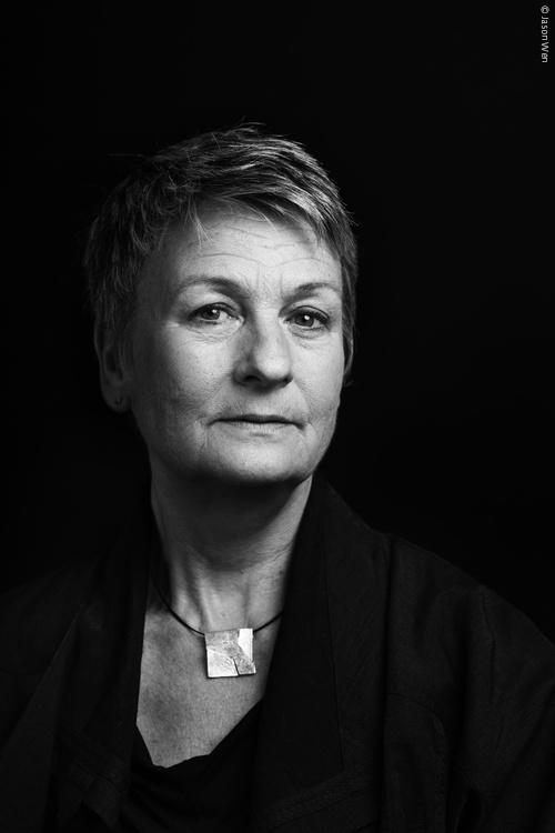
Freda Sack. Photo: Jason Wen

Freda Sack was a type designer and typographer who took an important lead in shaping the professional craft of type design and, through her work with the International Society of Typographic Designers (ISTD), helped to improve standards and to enhance educational opportunities in the field of typography. For anyone who did not meet her in person, you will almost certainly have met her typefaces, not least through the role her work played in giving typographical shape to the commercial landscapes of the UK and beyond.

A love of letterforms acquired during Freda’s time at Maidstone College of Art led her to an interview with Mike Daines, manager of the type studio at Letraset. He remembers, ‘a shy 21 year old, partly hidden by a long fringe’ who wanted to work on typefaces, but first had to gain union membership by starting as a photographic retoucher. An enduring character trait of Freda was her fiercely quiet determination and so she spent several months retouching, or as she puts it, ‘ruining her eyesight’ after which she was finally able to graduate into her five-year ‘apprenticeship’ into type design and stencil cutting.

Her freehand stencil-cutting skills and accuracy for interpretation are the stuff of industry legend. As her former colleague David Quay recalls, she had the remarkable ability to look at any letter or alphabet and say immediately what was, ‘badly drawn or too heavy, too wide or narrow within half a gnat’s whisker! An uncanny skill I have never seen in another type designer.’ For Freda, however, it wasn’t just about sharpness of eye. As she put it, ‘That would only mean I might be able to see something was wrong, but wouldn’t necessarily know how to make it right. What is important is to have the understanding of the structure and proportions of the letterforms, and the ability to know when a curve or a shape is ‘wrong’, and what is needed to correct it. This, I believe, is a direct result of an innate relationship with letterforms gained from analysis and then the physical process of creating them (hand/eye/brain). The ‘right’ shapes become learned in the process. I think that’s why I tend to still hold a pencil when art directing, or even just talking about type – the tactile memory is important.’

As her reputation and portfolio of designs grew so did her opportunities and international standing. A position from 1978–80 with Adrian Williams at FONTS/Hardy Williams Design added to her repertoire a series of text faces for the German foundries Stempel and Berthold, and also Linotype, in addition to corporate commissions for the British Post Office and Renault. Returning to Letraset in 1980, though this time working from their London studio, she was involved in the development of a range of new digital types and in the development of the Ikarus digital design software, travelling to Hamburg to work at URW with the developers to help make the systems more visually intuitive and user-friendly for type designers.

Continue reading

Thoughts on ATypI Working Seminar Colombo

ATypI Working Seminar Colombo 2019 written on a banner with some branding design

The 9th ATypI Working Seminar was held in Colombo, Sri Lanka on the 22-23rd of March. This seminar comes 27 years after the previous one, held in Budapest in 1992. Sri Lanka becomes the first country to host it where Latin letterforms are not used in its primary languages of communication. English is, of course, an official language spoken and used along with Sinhala and Tamil, but only these last two are national languages. This is significant because it shows that ATypI recognises the importance of engaging with voices from countries who may not have the resources to attend the main conference in countries where the cost of conference tickets, flights and stay as well as currency exchange rates along with visa regulations make attendance difficult.

Continue reading

24-hour Hangout for International Women’s Day 2019

Most of our Alphabettes-related schemes start like this: someone suggests something crazy, logistically nightmarish or technologically complex and instead of doing the sensible thing (taking time to think it through), we forge ahead.

So tomorrow, Friday, March 8, 2019, International Women’s Day we’re planning a 24-hour Google-Hangout-session and you’re all invited. (Well, roughly Friday, depending on where in the world you are). We’ll start earliest Friday morning 00:01 EST (that’s 6am central European time, get your converter tables out!) and we’ll continue until 23:59 EST.
Join in when it’s convenient, leave when you need to, and check back in later. What will we talk about? Who will be there? Where will we be BROADcasting from? We don’t know yet!

All done! Thanks for joining us!

Rather than provide you with another list of typefaces by women (there’s plenty of those lists already), or spout the historical and contemporary contributions of women in type and the lettering arts (we do that a lot and many others do, too), we thought it’d be fun to have real conversations about our daily life, work, location and whatnot, answer questions or show you what we are occupied with. (Video possible but just audio is fine.)

Keep an eye on this spot and Twitter for the link or any updates and help us spread the word! WOMEN = FUN
 

* Participants must follow our code of conduct.

WOMEN = FUN

A visit to the Islamic Arts Museum Malaysia

Even though I had lived in Kuala Lumpur for about 8 years previously, I had never visited the Islamic Arts Museum before. That was a time of my life before I started really getting into typography. In fact, until my friend, Sareh Heidari, told me about the museum, I didn’t even know it existed. But it’s now one of my favourite museums, and I’m so glad it’s almost in my backyard (almost, sort of).

Islamic Art Museum Malaysia

Islamic Art Museum Malaysia

The temporary exhibition I managed to catch was Al-Tibb: Healing Traditions in Islamic Medical Manuscripts, which really showcased the Islamic Golden Age.

Continue reading

Treats treats treats!

If you, like me, need some last minutes gifts or just want to make some sweet treats for the dark times, we have collected some traditional regional recipes to celebrate winter solstice.

Discussion starter was this curious apparatus I once bought in the Czech Republic but never got around to try to use. Veronika Burian was able to identify them as the iconic Vosí Hnízda – Czech rum beehives – she knew and helped with translation of the recipe: “1 žloutek = 1 egg yolk. The last 4 things are for the filling, and 240 gr of crumbled biscuits, not flour. They are super lecker!”
Continue reading

Our 2018 (Type-Centric) Holiday Gift Guide

calligraphic gift tag sample

Ho Ho Holler type friends,
The holidays are fast approaching and we ’bettes wanted to give you some gift inspiration for the festive season.

I (Nicole Arnett Phillips) am particularly enamored with this amazing new project by Aussie letterer Jess Cruickshank, her Christmas Calligraphy Drive is an effort to raise funds for the Asylum Seeker Resource Center. Through this website, you can order gift tags personalized with names written in beautiful calligraphy. This lovely penmanship is for a great cause, 100% of gift tag sales will be donated. But shipping is in Australia only (unfortunate for those of use further afield)!

Continue reading

Tooting some horns: new type releases!

Self-promotion can feel somewhat gross but who doesn’t love touting the accomplishments of others? The past several months have seen a bevy of new typeface releases by many talented folks, but perhaps you haven’t heard about all of them yet? In no particular order, let the horn-tooting begin. Drumroll, please!

Pigeonette sample
Pigeonette (Future Fonts)
by Ro Hernández

Pigeonette “combines the sketchiness of handwriting with the open spacing and charmingly awkward proportions of typewriters in a not-quite-monospaced design with a comfortable reading texture.” Started as Hernández’s graduation project, it’s now getting its wings on Future Fonts. Throw it some bread while support for central European languages and Cyrillic is still in the works.

Continue reading