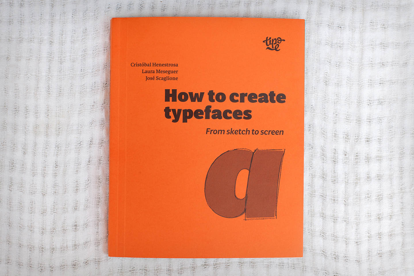
New & novice type designers rejoice! Tipo e has published an eagerly-awaited English translation of Cristóbal Henestrosa, Laura Meseguer and José Scaglione’s wonderful 2012 guide, Cómo crear tipografias. Del boceto a la pantalla. This little tome combines just about everything a type designer needs to know into one invaluable, condensed resource.
Category → News & Notes
Type at the New York Art Book Fair at MoMA PS1
Every year, Printed Matter and MoMA choose a sticky weekend in late September to host the New York Art Book Fair at PS1. Between the insane crowds of mostly white people and the heat and the exhaustive, never-ending booths of vendors, everyone leaves traumatized. Which is why it took me six years to go back. But I did, for the love of typography.
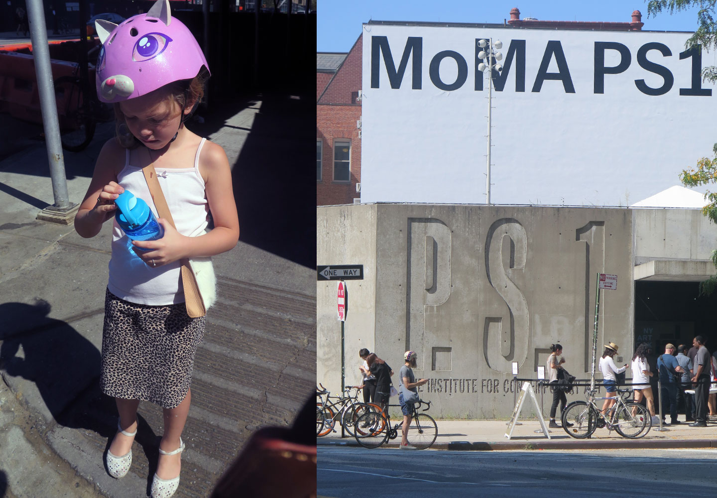
I took my intrepid companion, a seven year-old Goth kid who’s really into personal expression, named Francesca. She rides on the back pegs of my bike, and as we came over a small bridge in Queens, we took in the Manhattan skyline and its wavy heat currents. I said, “isn’t living in New York City great?!” … to a native New Yorker, who was like “sure.”
The Pre-Vinylette Society
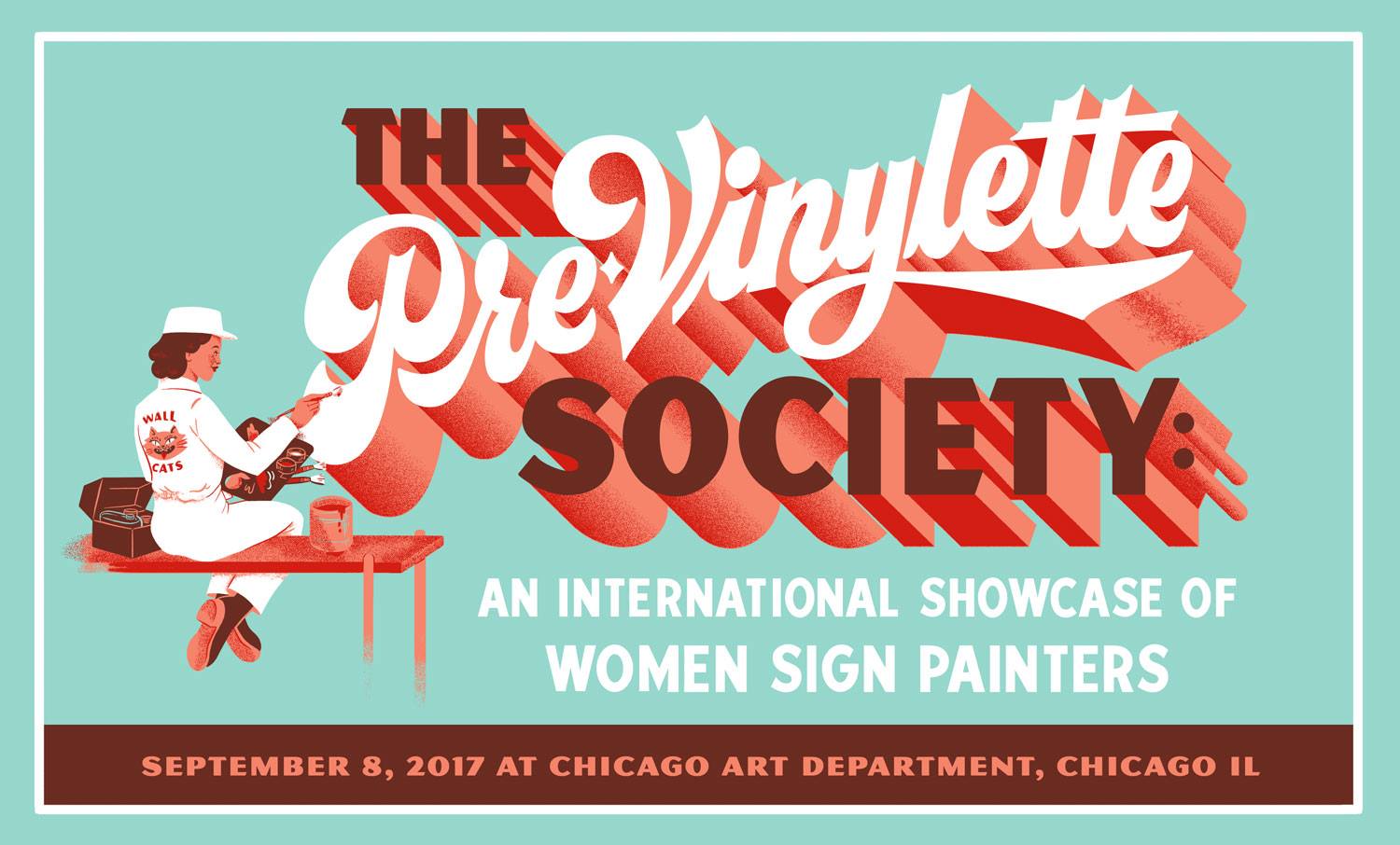
If you happen to be in the Windy City over the next few weeks, you’re going to want to head over to the Chicago Art Department to check out The Pre-Vinylette Society: An International Showcase of Women Sign Painters. Opening on Friday, September 8, the exhibition features the work of over 60 women sign painters from the United States, the UK, Canada, New Zealand, Australia, Scotland, Ireland, and Norway.
Film review: Graphic Means
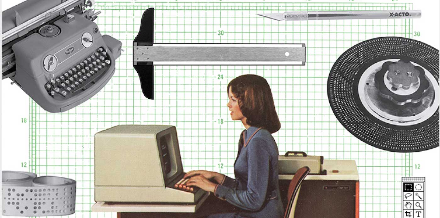
A detail from the Graphic Means official poster.
If you were a part of this era, but especially if you weren’t, you must see Graphic Means.
These days, it is easier to find information regarding printing in 15th century Europe than graphic design processes in the United States during the 1970s and ’80s. The latter, the focus of Graphic Means, was a major transition for the design and printing industry as centuries old procedures and machinery made way for photographic processes and eventually digital technology. This dramatic shift has not been well-documented, perhaps due to the quick speed of the conversion or that it is still in recent memory.
RIP Margo Chase 1958–2017
I was very sad to hear about the sudden passing of designer Margo Chase. As a teenager in the 90s, it’s hard not to recognize Chase’s impact on the visual language of popular culture in those formative years (Buffy the Vampire Slayer! Dracula! Madonna!). Her lettering, logos, and typefaces are emblematic of an era where forms were being developed and explored that truly expressed digitality. If you’re not familiar with Chase’s work, check out these short interviews on Lynda.com, especially Logos and lettering, which includes some discussion of her early influences and process, and Gothic design where she talks about her cover design for Letter Arts Review, and her typefaces (thanks Typographica for the link). Some nice tributes can be found on Brand New, Graphic Design USA, Art Chantry’s Facebook post, Richard Lipton’s instagram post, The Dieline, among many others.
Margo Chase is an inspiration to all designers. As the founder of her own agency AND an accomplished acrobatics pilot, Alphabettes salutes this pioneering woman who left a mark on our profession.
Exhibition Review: The Calligraphy Revival 1906–2016
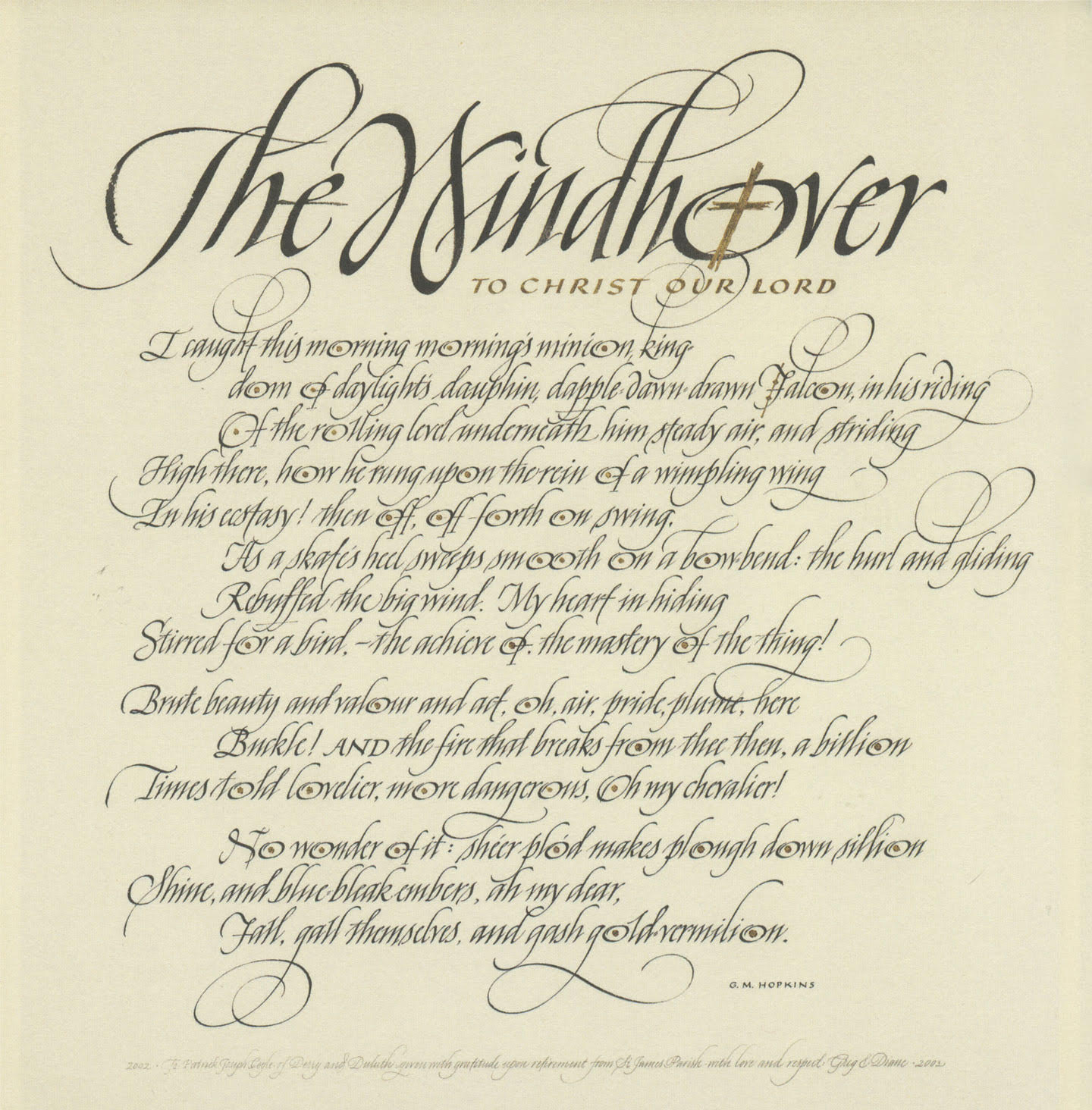
Diane von Arx, United States, 2002
The Grolier Club’s exhibition The Calligraphy Revival 1906–2016 (May 17 – July 29, 2017; 10am–5pm Mon–Sat; free admission) is a unique opportunity for anyone interested in applications of western letterforms to experience firsthand the breadth of calligraphy’s beauty as well as its utility. The exhibition, curated by Jerry Kelly, features works by a diverse range of calligraphers. It runs the gamut from art to design to handwriting and often defies categorization.
Alphabettes Variety Show: we’re back!
UPDATE! Couldn’t make it to the live variety show or just want to relive the whole thing? Here’s the recording (listen on the site or download):
mixlr.com/alphabettes/showreel/alphabettes-variety-show-at-typographics-2017/
Here are a few fun highlights, captured on twitter:
Live at the @alphabettes_org variety show: @RoxaneGataud talking with @fontnerd. pic.twitter.com/3gU9e7jqDF
— mekka blue (@mekkablue) June 15, 2017
People are now sketching for the Alphabettes header competition, and so can you! Send/submit/tweet your designs! Bianca is the jury. pic.twitter.com/RCopr31R5c
— Alphabettes (@alphabettes_org) June 15, 2017
@alphabettes_org And all of this before lunch! pic.twitter.com/BdzLWLOYMI
— Indra Kupferschmid (@kupfers) June 16, 2017
Thanks for listening!
❤️📻❤️📻❤️📻❤️📻❤️📻❤️📻❤️📻❤️📻❤️📻❤️📻❤️📻❤️📻❤️📻❤️
Typographic Potential of Variable Fonts
This article is based on the presentation What The Government Doesn’t Want You to Know About Variable Fonts delivered at ISType conference in Istanbul. It’s a summary of my personal thoughts on recent developments that might have an effect on responsive typography. It is also a collection of references to inspiring projects and experiments some of my colleagues have been doing. It touches on a few concepts I found necessary to explain but it shouldn’t be considered an in-depth report on those. Continue reading
Takeaways on Teaching Type
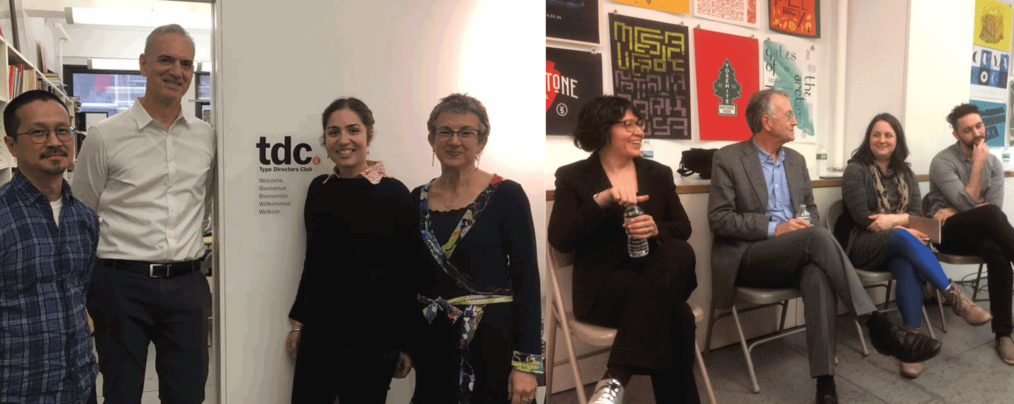
Left: The organizers! Dan Wong, Doug Clouse, Liz DeLuna, and Aaris Sherin, photo courtesy of Liz DeLuna; Right: The panelists! Juliette Cezzar, John Gambell, Amy Papaelias, Thomas Jockin, photo courtesy of Nina Stössinger
This past weekend, I had the pleasure to participate in Teaching Type: A Panel Conversation on Typography Education, organized by Design Incubation, and hosted at the Type Directors Club in New York. The event attracted a range of attendees: educators, typographers, type designers and even a few students and recent graduates. Armed with only the most comfortable of metal chairs, we set out on a 3-hour journey to explore best practices of typography curricula today.
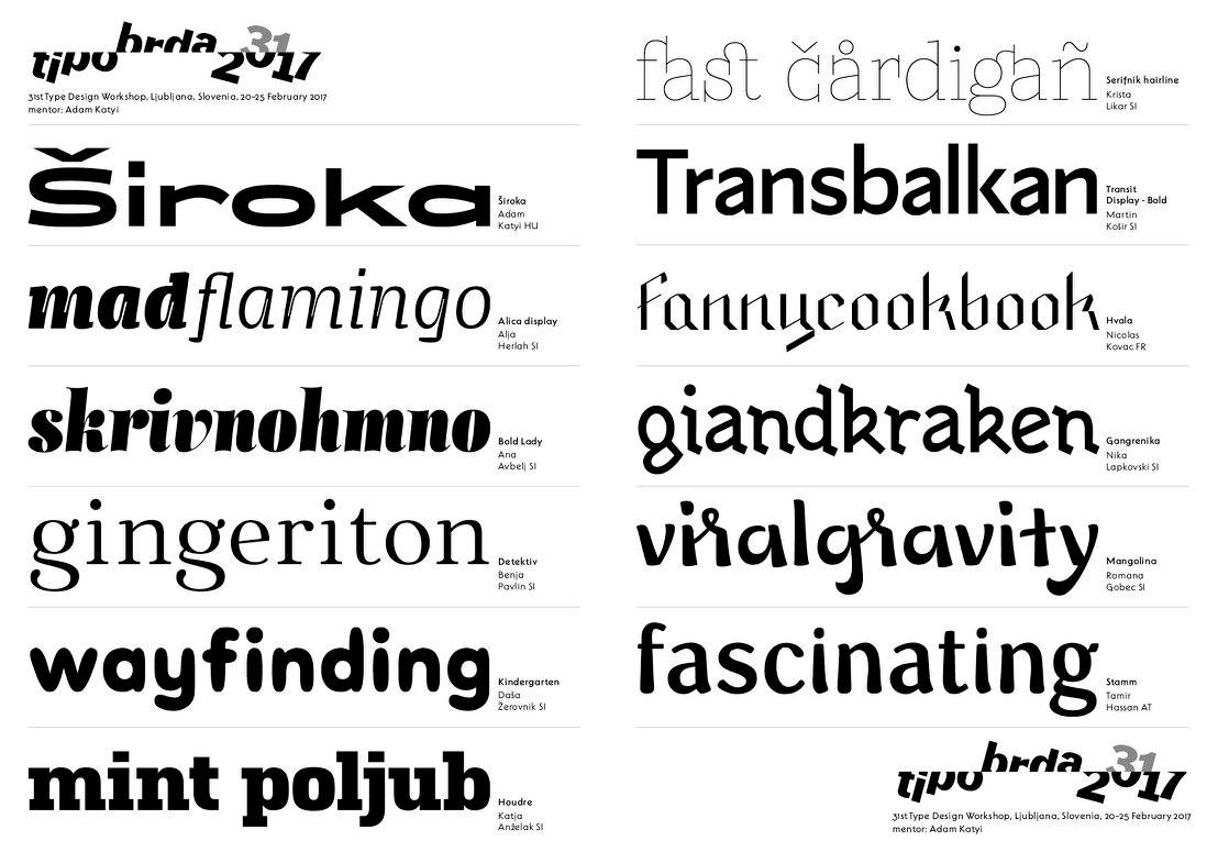
Type Days Ljubljana 2017
We are Alja Herlah and Krista Likar, enthusiastic and passionate type designers from Slovenia. As members of the TipoBrda society, we got the opportunity to organize a type design workshop. Type Days 2017 – a one week long workshop – was already the 31th type design workshop organized by Tipo Brda in Slovenia. It took place in Ljubljana in the House of Reading and Writing, Vodnikova domačija Šiška. This year, we invited a guest mentor Adam Katyi, Hungarumlaut, who shared a lot of valuable tips and guidelines he learned while studying at the Type and Media program in The Hague.