Rounding up the busy summer months with two news posts in a row, here’s what happened in September:
New releases
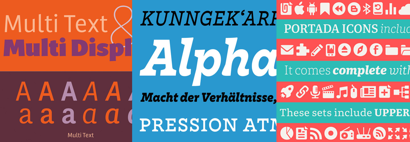
After being in the works for a while, Laura Meseguer released Multi, a sans-serif family with text and display styles in seven weights for the display and three for text, all with their italics, exclusively available through her, and soon through Type-Ø-Tones’ brand new website. Check out the extensive minisite.
Also long awaited, Nina Stössinger finally released Nordvest, her slab serif with horizontal stress she talked about at Typographics in June. Available at Monokrom.
Portada is the latest typeface by Veronika Burian and TypeTogether, a sturdy serif and “a comprehensive type family for screens” (including a free icon set).
Two Alphabettes released sticker packs for the new iMessages in iOS 10:
Nö by Ulrike Rausch is a set with 50 lovely ways to say “no”. We could all use some of that sometimes. Happy Hauntings by Shauna Lynn Panczyszyn has Halloween-themed illustrations and lettering.
Presentations
Ulrike is on a roll, she also gave a talk about OpenType-features at TYPODay in Cologne.
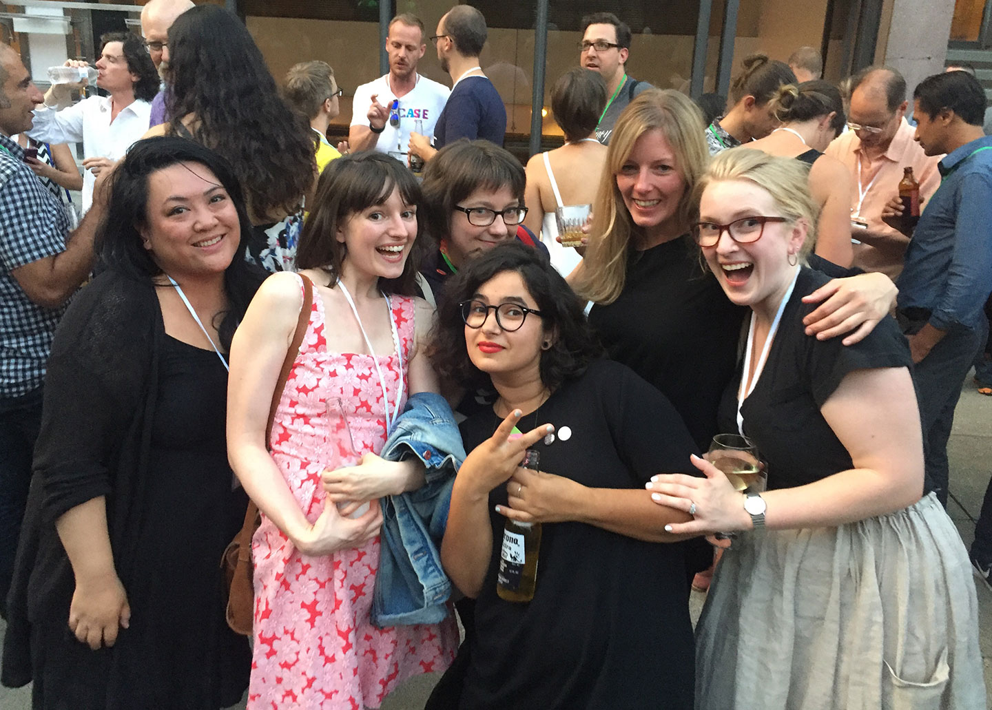
It was a great month for talks as anyone who has been to the ATypI conference in Warsaw knows. There were lots of women speaking, giving workshops, moderating (among others Verena Gerlach, Joyce Ketterer, Aoife Mooney, Ann Bessemans, Indra Kupferschmid, Alice Savoie, Dorine Sauzet, Catherine Dixon, Laura Meseguer, Petra Cerne Oven, Veronika Burian, Sonja Knecht, Bianca Berning, Martina Flor, Briar Levit, Gloria Kondrup, Viktoriya Grabowska, Carima El Behairy, Sofie Beier, Mariko Takagi, Rathna Ramanathan, Aleksandra Samulenkova, Sue Walker) and organising (including Marina Chaccur and Tamye Riggs) and our favourite interviewer Liron Lavi Turkenich conducted video interviews onsite. You can read our ATypI review here.
More news from ATypI
Also in Warsaw, the update to the OpenType specification was announced, it now allows for OpenType variable fonts. Bianca Berning was part of the working group that made it happen.
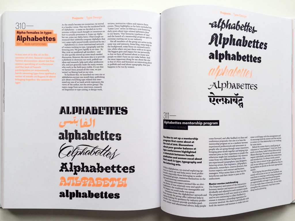
ATypI saw the release of the new 365Typo book, edited by Linda Kudrnovská. There are 78 contributors, 27 of them women, including Bianca Berning, Ann Bessemans, Veronika Burian, Petra Cerne Oven, Marina Chaccur, Catherine Dixon, Shelley Gruendler, Julia Kahl, Sonja Knecht, Indra Kupferschmid, Krista Radoeva, Ksenya Samarskaya, Nina Stössinger and Liron Lavi Turkenich. Many others are mentioned or have their work featured in the book, like Alice Savoie, Erin McLaughlin, Heidi Rand Sørensen, Andrea Tinnes, María Ramos, Jessica Hische and Luisa Baeta. The book also includes articles about Alphabettes and one about our mentorship program.
Spread from 365Typo. Photo by Marina Chaccur
Tânia Raposo is the new Type@Cooper West Program Coordinator.
Millie HMK, a script typeface Lila Symons designed for Hallmark Cards, was recognized at AIGA Kansas City’s Twelfth Annual Design Awards for Outstanding Achievement in Typeface Design.
Print Mag’s Best New Typefaces of 2016 (so far) includes Bely, Nordvest, William Text, Kopius, Equitan Sans and Slab.
And finally …
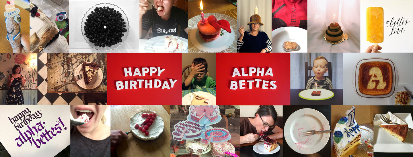
Alphabettes.org turned one year old on Sept 10. We celebrated with a design refresh thanks to Nicole Dotin and Amy Papaelias — new fonts, new features (like search, featured posts, and a footer). And we celebrated with cake of course!