Playpen Sans, espontaneidad y tecnología en una sola fuente

This font review was originally written in Spanish. English translation below.

En el mundo de las tipografías, hay fuentes que intentan imitar la escritura a mano, pero pocas lo logran con la naturalidad y el encanto de Playpen Sans. Diseñada por la española Laura Meseguer y el equipo de Type-together encabezado por Veronika Burian y José Scaglione, esta fuente no solo captura la esencia de lo orgánico y lo humano, sino que también ofrece la precisión y versatilidad de una tipografía digital profesional. Playpen Sans es una solución ingeniosa para quienes buscan un equilibrio entre la espontaneidad de la escritura manual y la consistencia de lo digital.

Imperfección controlada

Imágenes tomadas del sitio web de Type-Together

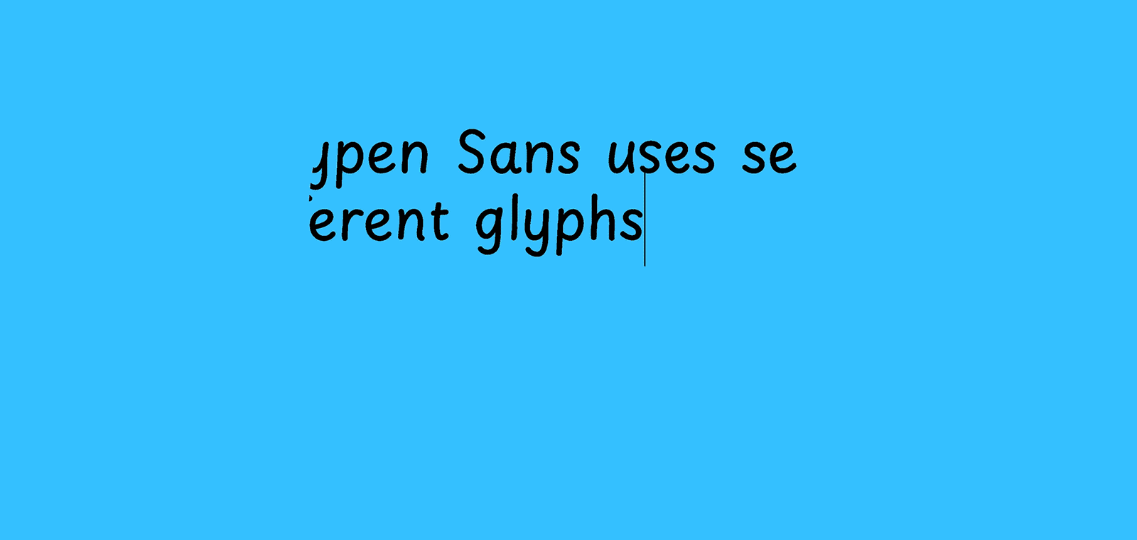
Uno de los mayores desafíos al crear una fuente que imite la escritura a mano es lograr que parezca auténtica sin perder la funcionalidad. Playpen Sans resuelve este problema con una solución ingeniosa: incluye siete versiones de cada carácter y un sistema integrado que “baraja” estas alternativas para evitar repeticiones, esta característica me recordó un proyecto que siempre traigo en la mente, diseñada por Alejandro Lo Celso la fuente Artl Lanzallamas de la fundidora Argentina Pampatype. Esta característica de tener varias alternativas que cambian según vas escribiendo hace que el texto tenga inconsistencias naturales, como si realmente hubiera sido escrito a mano, pero sin sacrificar la coherencia visual.

Imágenes tomadas del sitio web de Type-Together

La familia tipográfica cuenta con ocho pesos, unas versión variable que tiene un eje de peso y soporta más de 150 lenguas basadas en el alfabeto latino. También incluye emojis tipo sticker, perfectos para dar un toque lúdico y animado a diseños informales. Personalmente, me encanta este detalle, ya que me imagino escenarios donde estos emojis se puedan utilizar en entornos de enseñanza-aprendizaje, libros o cuentos de lectura infantil.

Imágenes tomadas del sitio web de Type-Together

Playpen Sans fue diseñada pensando en no diseñadores y en contextos donde la informalidad y la cercanía son clave. Es perfecta para tarjetas de felicitación, invitaciones, señales casuales, materiales educativos y, por supuesto, libros infantiles, cómics y novelas gráficas. Su versión como fuente variable añade una ventaja adicional para diseñadores y desarrolladores que buscan control total, ahorro de datos y calidad de diseño.

Si buscas una fuente que transmita calidez, diversión y un toque humano, Playpen Sans es una elección que no te decepcionará, además la puedes adquirir de forma gratuita en el sitio web de Google Fonts.


Playpen Sans

In the type world, some fonts try to imitate handwriting, but few achieve the naturalness and charm of Playpen Sans. Designed by Spanish designer Laura Meseguer and the Type-together team led by Veronika Burian and José Scaglione, this font not only captures the essence of organic and human elements but also offers the precision and versatility of a professional digital typeface. Playpen Sans is an ingenious solution for those seeking a balance between the spontaneity of handwriting and the consistency of digital typography.

Controlled Imperfection

One of the biggest challenges in creating a font that imitates handwriting is making it look authentic without losing functionality. Playpen Sans solves this problem with an ingenious solution: it includes seven versions of each character and an integrated system that “shuffles” these alternatives to avoid repetition. This feature reminded me of a project I often think about: Artl Lanzallamas, a font designed by Alejandro Lo Celso from the Argentine foundry Pampatype. Having multiple alternates that change as you type gives the text natural inconsistencies, as if it were truly handwritten, without sacrificing visual coherence.

The typeface family comes in eight weights, a variable version with a weight axis, and supports over 150 Latin-based languages. It also includes sticker-like emojis, perfect for adding a playful and lively touch to informal designs. I love this detail, as I can imagine scenarios where these emojis could be used in teaching and learning environments, children’s books, or storybooks.

Playpen Sans was designed with non-designers in mind and for contexts where informality and approachability are key. It is perfect for greeting cards, invitations, casual signs, educational materials, and, of course, children’s books, comics, and graphic novels. Its variable font version is an added advantage for designers and developers seeking complete control, data savings, and superior design quality.

If you’re looking for a font that conveys warmth, fun, and a human touch, Playpen Sans is a choice that won’t disappoint. Plus, it’s available for free on the Google Fonts website.

Font releases and reviews from 2024

Reflecting on the past year, we can say the number of new typeface releases was remarkable. The type market has become more diverse and competitive than ever, with new fonts hitting the scene every day. Both amateur and professional designs are eager to be in the spotlight so they can really be seen. In this hectic landscape, we find it valuable to offer insights that help identify excellence and merit within the crowd. This includes evaluating proficiency in crafting letters, the overall quality of the font, and the contributions that a new typeface brings to the table.

Continue reading

Font Reviews 2024: Playwrite

Designed by Veronika Burian, José Scaglione
Available at Google Fonts
Font family: 4 weights for every handwriting model. 68 handwriting models from 40 countries.

This font review was originally written in Spanish. In Colombia alone, there are more than 43 million native Spanish speakers. English translation below.

Las fuentes tipográficas suelen pasar desapercibidas, pero su impacto es profundo. Como demuestra Playwrite, pueden trascender su función estética para convertirse en puentes educativos. Detrás de cada trazo de lápiz hay un mundo de conexiones neuronales, memoria y creatividad. Aunque vivimos en una era digital, aprender a escribir a mano sigue siendo un pilar formativo esencial. El desafío surge cuando cada región del mundo enseña este arte con estilos y métodos distintos. La solución llegó de la mano de Playwrite. Diseñada por Typetogether y disponible en Google Fonts, Playwrite es más que un conjunto de letras. Es una herramienta pedagógica que se moldea a las particularidades de más de 40 países, desde la cursiva vertical de Francia hasta la escritura simplificada de Finlandia.

Continue reading

Font Reviews 2024: Atlas Mono

Designed and distributed by Giulia Boggio

This font review was written in English and translated into Dutch, a language spoken by about 30 million people worldwide.

Giulia B. is a multimedia designer based in London (UK), focusing mainly on type, graphic, and web design.

Monospaced fonts are a personal favourite and I had to shine a light on this editorial fixed-width for our Alphabettes Font Reviews 2024 segment. Sometimes, it seems that typefaces these days are by default superfamilies, covering every possible weight, width, style, optical size, and taking on any possible typographic application they face. Well—let’s flip that coin for a second and focus on this striking single-style design.

Atlas Mono, monospaced, Giulia Boggio, font review
Continue reading

Font Reviews 2024: Lock

Designed by Mark Bloom and Diana Ovezea
Distributed by CoType
Typeface family: 4 sub-families, 6 weights. 24 fonts

This text was originally written in Romanian, the official language of Romania and Moldova, spoken by 25 million people. The English version of the review is below.

Lock, creat de Mark Bloom & Diana Ovezea, este prima superfamilie tipografică în catalogul CoType Foundry, îmbinând stilurile serif și sans-serif, alături de varianta stencil.Conceput ca un sistem unitar, și nu ca stiluri separate, Lock echilibrează contrastul și coeziunea, fiind o alegere versatilă pentru designerii care caută flexibilitate și impact vizual.

Continue reading

Font Reviews 2024: Henmania

Designed by Bea Korsh
Distributed by Future Fonts

This font review was written in English and translated into Portuguese (BR—below). The Museu da Língua Portuguesa, in São Paulo, is the venue of diverse exhibitions with hands-on activities about Linguistics and Portuguese language developments.

Fellow Type@Cooper alumni Bea Korsh probably graced us with the freshest type release of 2024. Where to start? That I’ve never seen anything like it. Or the fact version 0.1 already has 70 interlocking ligatures. Or maybe the foresaw standalone Inline style—that’s simply dazzling. Let’s take it from the top, Henmania is a stencil typeface with meshed warped strokes and a slightly forward-leaning feel planned to grow to a 5-weight family—a playground of pure creativity!

Continue reading

Font Reviews 2024: JOC Display

Designed by Sabina Chipară
Distributed by Type-Ø-Tones

This font review was originally written in Spanish. There are more than 45 million speakers in Argentina. Guarani and Quechua are other important languages in this country. The English translation of the review is below.

Joc Display es una tipografía que propone mucho juego y está inspirada en formas geométricas. Es perfecta para crear patrones y composiciones que necesitan impacto. Podríamos argumentar que nada supera a esta categoría tipográfica para diseñar títulos o encabezados. Su diseño incita a explorar y experimentar al momento de usarla. Considero que su propuesta osada y personal la vuelve perfecta para logotipos y aplicaciones de gran formato. 

La estructura y forma de sus signos se desprende de los bloques de madera que fueron el centro de la exposición de Sara San Gregorio: Juguetoría. A l’alçada del Joc curada por Helena Ayuso Moli y Anna Roigé Barrull en el Centro de Arte La Panera de Lleida, España. La exposición proponía a los niños de 5 a 9 años crear sus propios juguetes combinando esos bloques de madera. La lógica propuesta por este juego y sus formas han sido traducidas por Sabina para crear JOC. El espíritu del diseño gráfico de principios de los años 70 también es una gran influencia en las formas geométricas que caraterizan a esta tipografía.

Continue reading

Font Reviews 2024: Kalnia Glaze

Designed by Frida Medrano
Available at Google Fonts
Font family: 7 weights. 7 static fonts + 1 variable font.

This font review was originally written in Spanish, the official language of 20 countries. English translation below.

¿Kalnia Glaze es Color Font o fuente Variable? La respuesta es, Sí.

Frida Medrano, diseñadora gráfica originaria de Monterrey, Nuevo León, México, es una de las figuras más destacadas en el mundo del diseño tipográfico. Especializada en tipografía y conocida por su enfoque innovador, Frida ha logrado combinar de manera magistral la tecnología y el diseño, llevando sus creaciones a nuevos horizontes. Su trabajo con fuentes variables y su investigación para optimizar gráficos entre impresión y web reflejan no solo su talento, sino también su profunda pasión por el diseño.

Continue reading

Font Reviews 2024: AM Majella

Designed by Valentina Casali
Distributed by CAST

This font review was written in English and translated into Portuguese (BR—below). Portuguese makes use of five diacritics: the cedilla (ç), acute accent (á, é, í, ó, ú), circumflex accent (â, ê, ô), tilde (ã, õ), and grave accent (à) to mark the contraction of two consecutive vowels in adjacent words (crasis).

Valentina has been on my radar for a while. It’s no secret how much I hate working on connected scripts, so I will forever be amazed by people who can do it well. Combine that with gorgeous ornamental lettering and sharp letter carvings, and you would be crazy not to watch her work. First, was Pritzious, conceived during the Type Design Expert Class at the Plantin Institute of Typography in Antwerp (2021–2022), and now she is back with AM Majella—a revival of the homonymous wood typeface, Majella (released by Xilografia di Verona between 1937-1939). 

Continue reading

Font Reviews 2024: Bizzarri

Designed by Diana Ovezea
Distributed by Blast Foundry 
Typeface family: 6 weights, 2 styles (upright + italic), and 2 optical sizes. 24 fonts

This text was originally written in German, a language with more than 90 million speakers worldwide. The English version (Thank you Dan Reynolds!) of the review is below.

Ich hasse einkaufen. Ausgenommen Schriften.

2021 bin ich via Future Fonts über die Schrift »Bizzarri« von Diana Ovezea/Blast Foundry gestolpert und war sofort schockverliebt. Wenn ihr eine ausgefallene Schrift sucht, die eigenständig, eckig, laut, egozentrisch und detailverliebt um die Ecke kommt, dann liegt ihr mit der »Bizzarri« auf dem richtigen Kurs.

Continue reading