Since the design and lettering of the ‘lowly’ American penny has already been well-documented and researched by honorary Alphabette Tobias Frere-Jones, I’ve settled on an even lowlier topic: the penny tray. If you’re American, or have spent time in the clusterfuck that is currently the United States, then you know what I’m talking about. Found at the cash registers of gas stations, diners, and other small businesses, the object serves as a convenient place for customers and cashiers to dispose of, or acquire, a penny or two (but c’mon deadbeat, don’t even think of taking more than a few).
The basic tray features the phrases “LEAVE-A-PENNY / TAKE-A-PENNY” in subtly extruded shouty-caps that flank the top and bottom of the main bowl. A promotional logo adorns the front of the tray, promoting things like a local newspaper, state lottery, or community bank.
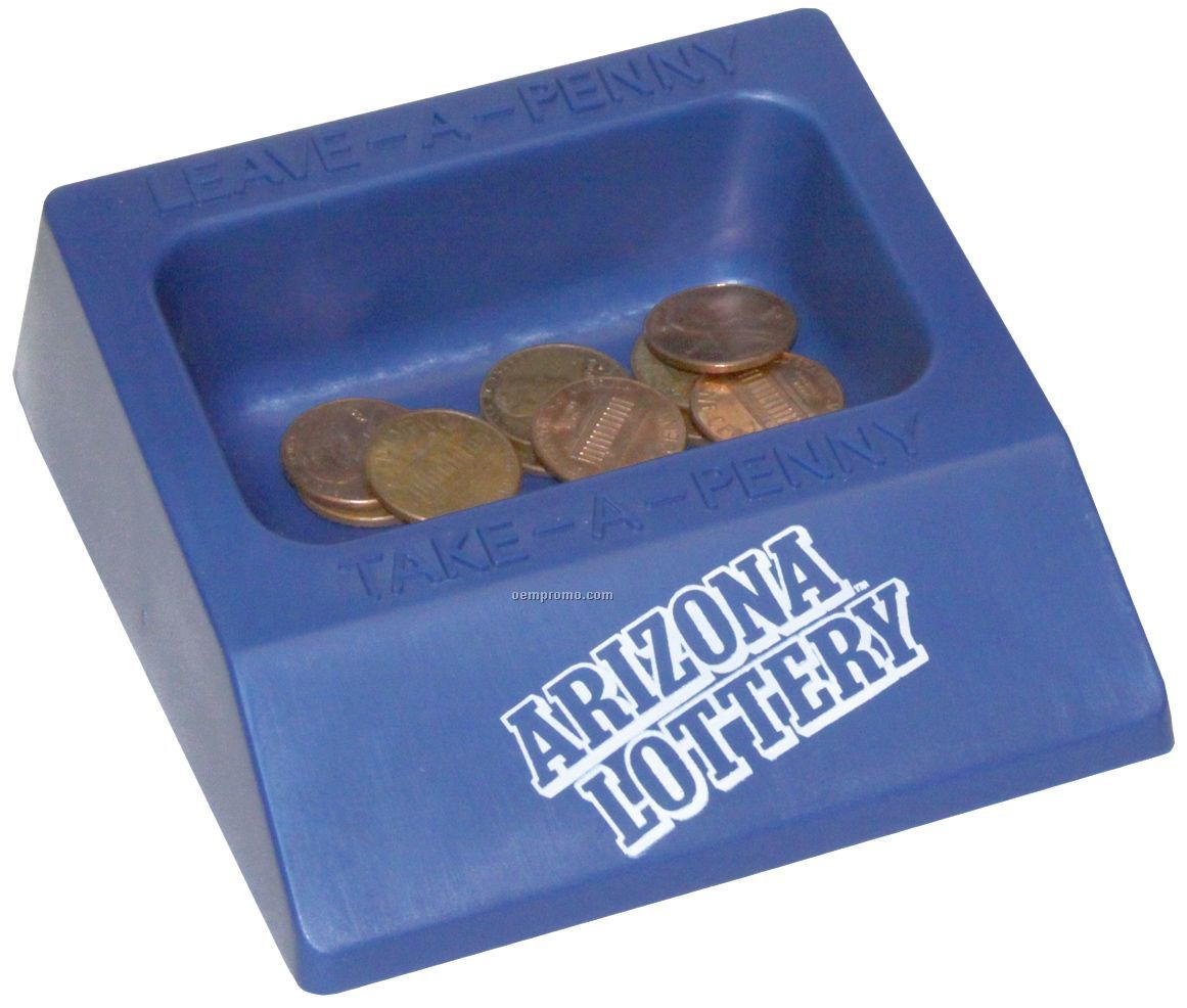
Pretty standard-looking penny tray