Nina (Sometimes, Despite Everything) Loves Bad Design

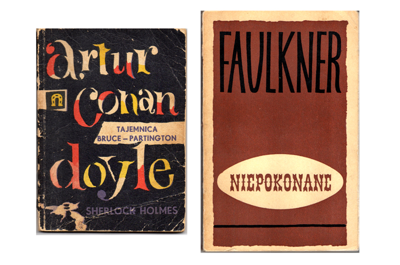
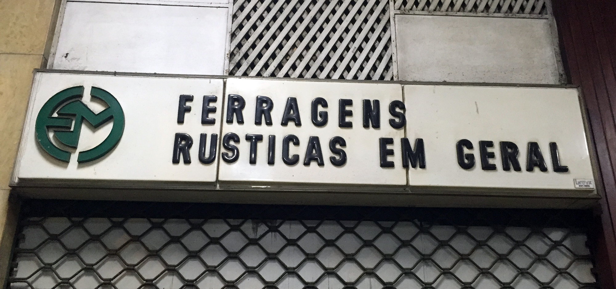
I had one hell of a hard time deciding what to write about. I considered writing about specimen books or lettering manuals, flea markets or abandoned factories, house numbers or old advertising signage, puns or portmanteaus or the state I go into when I draw type at night; things that capture me completely and fill me with deep joy and sometimes make me feel like I have little pink hearts bubbling out of my ears.

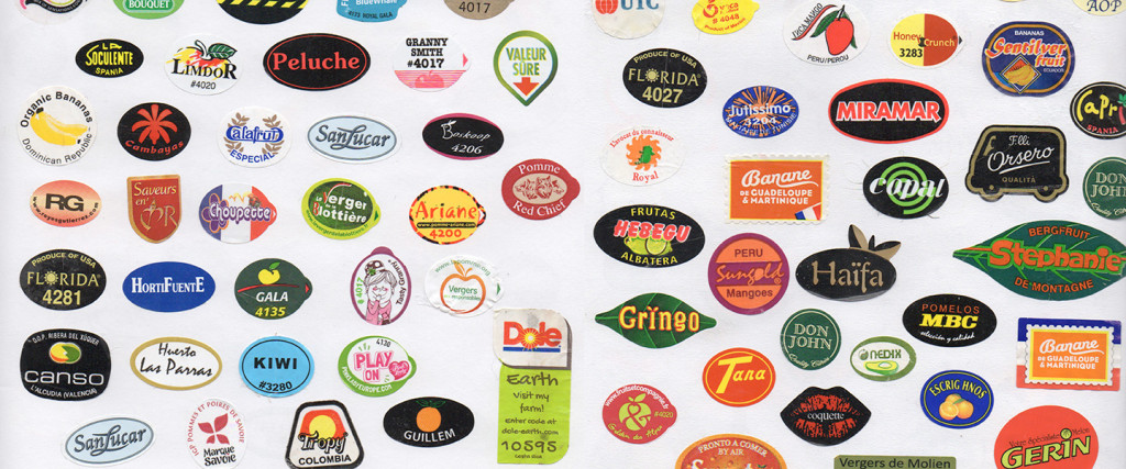
But I also love just looking: at tiny, unremarkable, mundane things; and even weird or bad design that only makes limited sense outside its target audience. And, I may not be part of that audience, especially when I’m traveling (which I love for this reason, too: an outside look at things). I often get a kick out of the amazing, impenetrable kind of bad we often overlook.
So I decided to write about Sant’Anna.
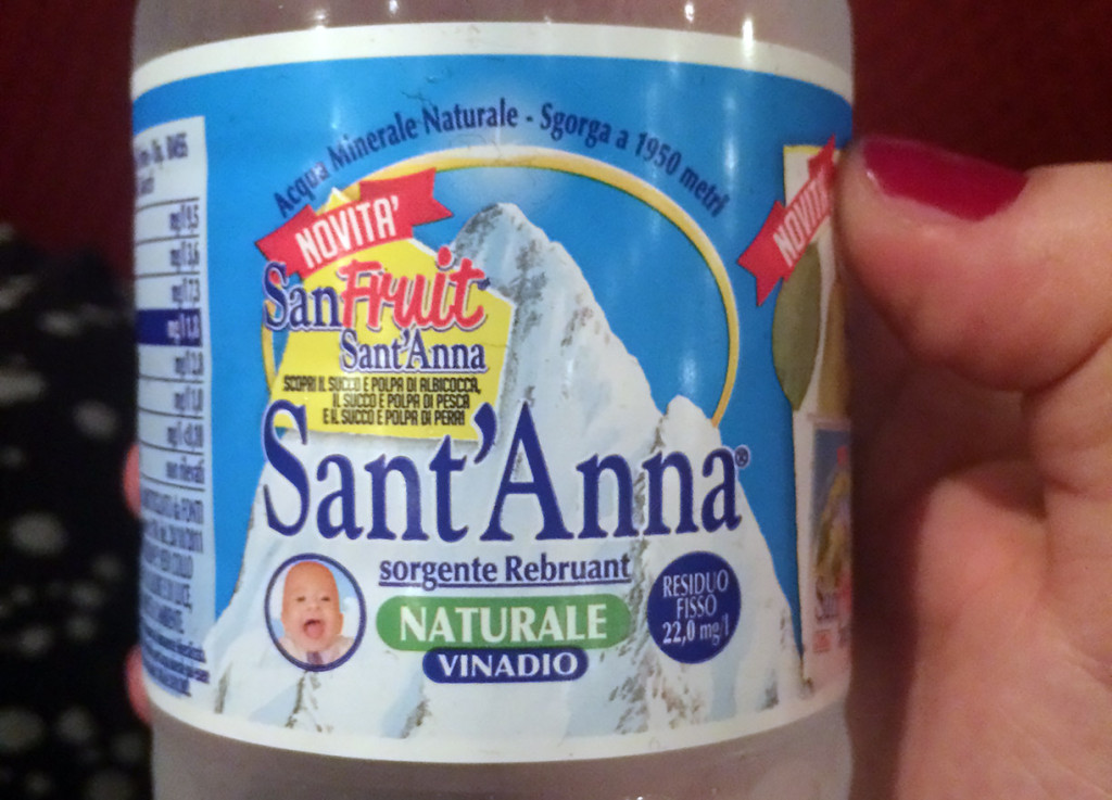
SantAnna_photo

Wait what?

Continue reading

Roxane Loves Fruit Stickers

« Every designer should collect things » said Véronique Vienne, in a talk she gave in Amiens (France) back in 2013, when I was still studying typeface design there. This had quite an impact on me. At that time, I had already started collecting the tiny (and annoying) stickers you find on fruits and vegetables. Suddenly I didn’t feel like a weirdo anymore.

I don’t remember exactly why I started keeping them, and I still don’t know what attracts me most about the tiny sticky pieces: seeing them on the fruits or stocking them in my notebook, all together.

Picture01

Continue reading

Laura Loves Lettering on Book Covers

This post is about sharing my love for lettering on book covers that I’ve discovered and some collected over the last few years. That’s the easy part, but making a selection is quite hard, because there are lots of them I love. I hope you will enjoy it. I will start with two fabulous books I got in Warsaw.

Polish

‘artur conan doyle’, book cover by Andrzej Czeczot, 1959. ‘Niepokonane’ book cover by Aleksander Stefanowski, 1964.

Continue reading

Dyana Loves Garbage

Finding the divine in the details—what others overlook—is not so much an amusing pastime, but a constant state of being. When out on a hike, I often stop to question a seemingly meaningless feature. What species of moss is this? Why does this look like a witch’s hat? Who lives in this hole? The answers can be fascinating.

Living in a city, one might find charming little doodads in the gutter and under hedges as well. The metal numbers and letters on telephone polls—what’s the deal with those? In the same week, I found two that had liberated themselves somehow. For years, I’ve been accumulating these letters, or odd bits that look like letters. Some as possible solutions for future typeface projects, others just for the sake of the collection.

Continue reading

Eleni Loves the Handwriting of Greek Notaries

The beautiful handwriting of a notary on an officially stamped paper clearly states it: 1 bed in two colours, 4 cushions, 2 duvets, 12 bed sheets, 1 mosquito net, 2 tablecloths, 12 towels, 1 bedside table, 1 table and 1 sofa was all it took for my great great great grandmother to convince her husband to marry her. What a funny way to declare eternal love! However, contrary to what one might have wished, their love did not last forever. A second letter, written 24 years later, reveals that her late husband made sure to be remembered, leaving her with an exorbitant debt to pay back to the government.

Alas, these family letters were not the most authentic samples of love … but maybe the couple would be happy to know that their great great great grandchild is now in love with every single word that is written in them. I, thus, declare that I am in love with these letters, not because of the content—which I actually find highly entertaining—but because of the unique, elegant and impossible to decipher samples of Greek notaries’ handwriting. Enjoy!

Image 1 and 2: Saturday 2nd of April 1846. Marriage contract of my great great great grandmother. Written in Greek Polytonic.

gamos
gamos

Continue reading

Elena Loves Pigeons

Declaring my love for pigeons is not an easy task. It was not easy to accept it in the first place. But one day I looked back I realised that my friends were right, I have a thing for pigeons. And this thing has a name: Peristerophilia. (With the exception of labeorphilia – love of beer bottle labels, I believe this loveletter-philia to be unique in having a name, whether that is something good or not, well, I really can’t say).

Was this love for pigeons triggered by my grandfather’s love for pigeon keeping? Back in the 60s my grandfather, Bibiano, used to breed pigeons in the attic and participate in competitions that consisted in, basically, many good looking male pigeons (at least if you are a female-pigeon) trying to conquer the female pigeon in dispute, and of course, bring her back. Cachorro, my grandfather’s palomo, was a winner, irresistible for all pigeon-ladies and Bibiano’s reason to be proud.

In my mother’s family archive, an old box full of old pictures, ephemera and other artefacts, there is still a copy of Bibiano’s membership card of the Spanish federation of pigeon keeping (Federación Española de Colombicultura).*

Bibiano

Continue reading

Luisa Loves (Erm… Kind Of) Rio’s Old Acrylic Signs

A hardware store in Copacabana.

A hardware store in Copacabana.

Love is a strong word, but I’ll admit I have a fondness for them. In truth, I grew up in Rio and I can’t say I ever paid much attention to this kind of acrylic signs. Now, having lived in London for almost a decade, whenever I visit I stay with family in an upper-class neighbourhood where they hardly exist. A few days ago I went to the grittier neighbourhood of Copacabana and had an almost Proustian experience as I found myself surrounded by these old signs; with their cheap plastic appearance and soft edges, they formed the typographic landscape of my childhood. Although I can’t say they are exactly beautiful, I suddenly found them oddly charming. They were the letterforms of local popular commerce in 1980s Rio, the letterforms of hardware stores, florists, barbers and fishmongers, cheap-looking and anonymous, often considered ugly and vulgar. Today they are slowly disappearing, and the city doesn’t mourn the loss.

I decided to write my love letter to them, in spite of all the mixed feelings about their aesthetic value, and tried to find out more. I daydreamed about finding an old factory with stacks of old acrylic letters in different styles, dusty and forgotten…

Continue reading

ECS Loves Vintage Italian Fashion

I’ve long loved the vintage femininity of mid-century European fashion. The silhouettes, the careful accessorizing, and most importantly, the thousand-yard glare beaming from a heavily-lined eye have always been an inspiration to me. An old friend of mine peddles these gorgeous pieces most weekends at the Brooklyn Flea, and one weekend, she brought a stack of these Italian Fashion magazines from the 50s. This one, Eva, is from 1951 and features a scripty lettering that perfectly matches the clothing’s aesthetic: custom, curvy, sharp and stabby at just the right points.

eva_cover cover_details

The cover features a few different lettering styles, but what mostly grabbed my attention was the script. It’s used throughout the issue, and creates a nice ‘voice’ for many of the headlines.

Continue reading