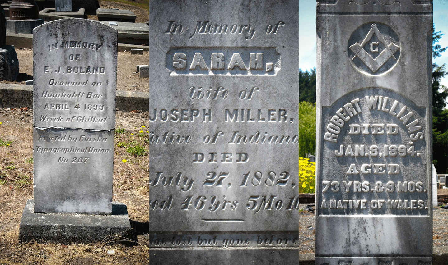
Alessia Loves Pagina

After graduating from the MA in Typeface Design at the University of Reading, I decided to buy myself a present: all the seven issues of Pagina.

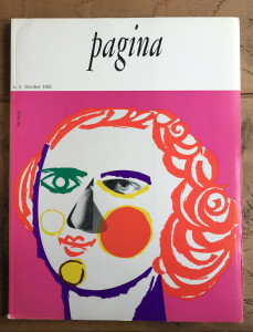
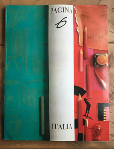
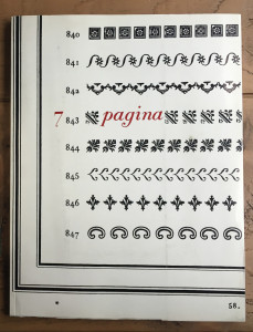
Pagina is an international graphic design magazine, published from 1962 until 1966 in Milan by Editoriale Metro S.p.A, with quarterly (but very irregular) releases. Each of the seven issues was published in Italian, French and English, the layout was designed by Heinz Will while the covers were handled by different designers. The articles inside the magazine included authors such as Leo Lionni, Armando Testa, Bruno Munari, Saul Bass and Albe Steiner (just to mention a few).
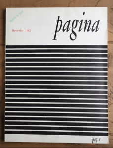
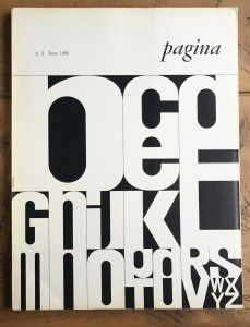
Pag1 Pag2 Pag3

The first three issues of Pagina (November 1962, June 1963, October 1963).
The cover for the second issue was designed by Bob Noorda and for the third issue by Pino Tovaglia.
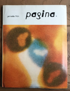
 

Pag4 Pag6 Pag7

Pagina 4, 6 and 7 (January 1964, January 1965, April 1966). Pagina 6 is a special issue entirely dedicated to Italy. and Pagina 7 is dedicated to Giambattista Bodoni. The covers are respectively by Max Bill, who also designed the typeface on the cover, Giancarlo Iliprandi, and Franco Maria Ricci.

Continue reading

Jillian Loves Avant Garde Magazine

Valentine’s Day. The day of love, lust, and crushes. Maybe the first time you saw the object of your affection was across a room, at a party or a bar or on the street. Your heartbeat quickened, your palms began to get slippery, your mouth went dry … because you were in the presence of something that spoke to you, that you felt a chemical connection with, something that made you feel understood and less alone in the world. Well, that’s how I feel when I find a piece of beautiful printed type.

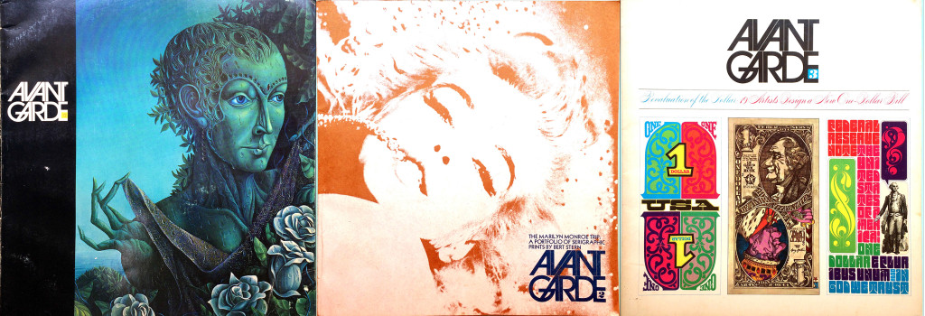
When you visit a flea market, there is great furniture, handmade wares, and delicious street food … and then there are the antique booths. If you’re anything like me, the paper ephemera portion of these booths create the same effect as if I was to see David Beckham across the room. Once upon a time, when I lived in Williamsburg, Brooklyn, I visited the Brooklyn Flea just to encounter such a corner of such a booth. I can’t remember exactly how the conversation began as my memory isn’t what it used to be, but I ended up in a deep conversation with the owner of the booth about some copies of Avant Garde magazine she had for sale.

3covers

Continue reading

Mariko Loves the Chinese Oracle Script

Shortly after my arrival in Hong Kong in the year 2010, I visited the Hong Kong Art Fair. As the name indicates, it is a commercial event, a trade fair, selling and buying art. Towards the end of walking aisle after aisle through the fair, I found myself in front of a large-sized calligraphy by the internationally acknowledged Japanese calligrapher Inoue Yuichi. My heartbeat changed, rising, and on that very same day, I decided to take calligraphy lessons.


InoueYuichi_ryu

Inoue Yuichi, 龍 (dragon), 1960. 130,5 x 180 cm

Continue reading

Tânia Loves Stamps

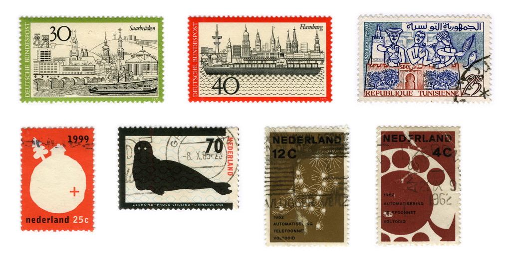
I was not one of those stamp collector kids that inherit the hobby from their grandparents. I started collecting stamps (as well as riding a bike) while studying Graphic Design in Portugal.
Where I grew up there weren’t a lot of antiques fairs, at least I don’t recall going to any. While studying at University in Caldas da Rainha there was an antiques fair at the city park every second Sunday of the month, and it was there I came across this affordable hobby.

Some of the first stamps I bought.<br /> From right to left stamps by: Heinz Schillinger (2), Hatem El Mekhi, Willem Henri Lucas, Anthon Beeke and Otto Treumann (2)

Some of the first stamps I bought.
From left to right stamps by: Heinz Schillinger (2), Hatem El Mekhi, Willem Henri Lucas, Anthon Beeke and Otto Treumann (2)

Continue reading

Liron Loves Henri’s Type Strips

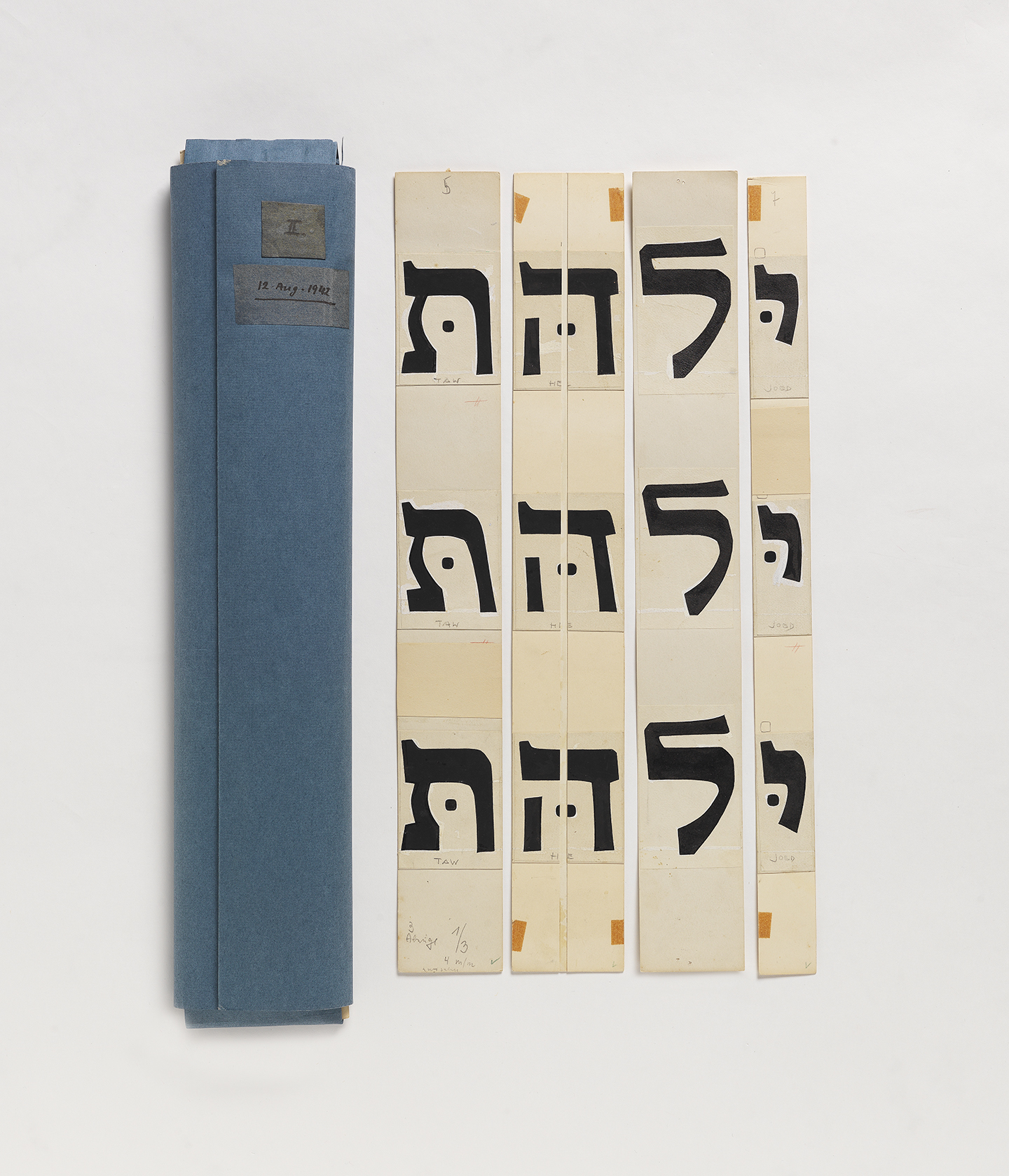
Henri Friedlaender designed the legendary Hadassah Hebrew typeface. While doing extensive research for an exhibition that included his work, I was lucky to get a glimpse of his design process. Until the revealing of his personal archive (donated to the Israel Museum), his design process was only known through an article he wrote with few rather “clean” images of sketches. In the museum’s basement, wearing cotton gloves, we were taking out item by item from large drawers. The Hadassah material was intriguing. So much was said about this typeface, so much guessing on the design process was done. And here we are, seeing traces of Friedlaender’s own way of designing.

hadassah3

From Friedlaener’s archive. Photo by Eli Pozner, the Israel Museum. This refers for all images in this post

Continue reading

Tiffany Loves Graveyards

For as long as I can remember I’ve enjoyed going to graveyards. Why? Because I’m a romantic at heart. You see, in my view, headstones are the final opportunity for the living to write a love letter to the deceased. Of course, the loved one didn’t carve the actual letters but I like to think that choices were made that allowed the individuals to put their personal stamp of pride and uniqueness on the headstone.

Ferndale Historic Cemetery in Ferndale, California

Ferndale Historic Cemetery in Ferndale, California

Continue reading