Remember December: Providence

My Providence! What airy hosts
Turn still thy gilded vanes;
What winds of elf that with grey ghosts
People thine ancient lanes!

–H.P. Lovecraft

Overlooking the RISD Beach. Can you spot the State House?

Knowing the risks, I drank from the mythical fountain.* The legend says: anyone who drinks from it will always return to Providence. Seems more like a self-fulfilling prophecy to me: if you like Providence enough to drink from a magical fountain, you’ll probably keep coming back.

The fountain sits in front of the Providence Athenæum, around the corner from College Street, home to both the Rhode Island School of Design and author H.P. Lovecraft. The deep affection he felt for the city is unmistakable. I remember walking down that same street for the first time, rounding the corner of the quad, and the state house—“a delirious marble dome,” as Lovecraft wrote—loomed into view, towering over the city.

Continue reading

Remember December: Type faces at TypeCon

TypeCon2017: Counter! was filled with female faces this year, and I thought that Alphabettes readers would be glad to see some of them.

Grid of headshots of female speakers at TypeCon

Faces of 16 of the 35 female presenters at TypeCon2017: Counter! – (top left to bottom right)
Andrea Leksen, Petra Dočekalová, Catherine Leigh Schmidt, Linh O’Briant, Aoife Mooney and Jillian Coorey, Ming Wei, Geri McCormick, Reneé Seward, Elizabeth Carey Smith, Ana Monroe, Frances MacLeod, Amelia Hugill-Fontanel, Rachel Elnar, Charlotte Yue Qin, and Ina Saltz.

In our most accurate count, 48.6% of our presenters were female this year – this includes workshop leaders and speakers in the main program and education forum. You can read more about our 2017 speakers and programming on our website.

Our speakers are chosen via a blind selection process – meaning that the speaker’s name, gender, company, product name, or any other identifying information is removed from their proposal before it is read and ranked by a panel of reviewers. We’ve taken this approach in an attempt to reduce bias and to level the playing field for everyone submitting.

Continue reading

Remember December: The typefaces of Tikhvin Cemetery

I got the chance to travel to Saint Petersburg, Russia in June earlier this year for pitercss conference. It was my first time there and I absolutely loved the city. I have a soft spot for stone engravings and if I find out that the location I’m at has some sort of cemetery or burial ground that is open to the public, I will go check it out.

Saint Petersburg was one such location. I was staying near the city centre and at the end of Nevsky Prospekt (the main street of the city), was the State Museum of Urban Sculpture. There are four historic cemeteries in this area, Lazarevskoe, Tikhvinskoe, Nikolskoe, and Kazache (Cossack).

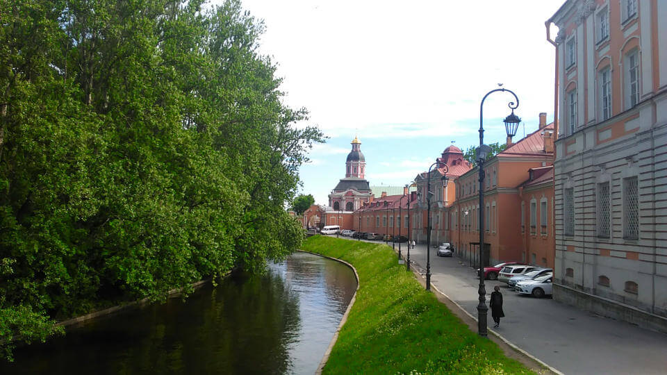
View of the Alexander Nevsky Monastery
Continue reading

Remember December: Typewriter Wonderland

Things rarely happen the way you planned, that’s is why improvised trips are never disappointing. My visit to the Museu de la Tècnica de L’Empordà last summer was full of unexpected events. It all worked out at the end, but I need a second and less troublesome visit in the future.

Many of you have probably read this thread on Twitter from Marcin Wichary, who is among other things a researcher on the history of keyboards. That’s is how I got to know about one of the most important exhibitions of typewriters in the world.

I was planning to spend a few days in Girona and just before I travelled there, my friend Álvaro, who is also passionate about typewriters sent me a message. He had just moved from Rio de Janeiro to Barcelona and he wanted to visit the Museu de la Tècnica. He suggested going together. It was perfect timing! We would meet in Figueres, the town where the museum is located. Everything fit together until the day of our visit.
Continue reading

Remember December: Making Room at the Table

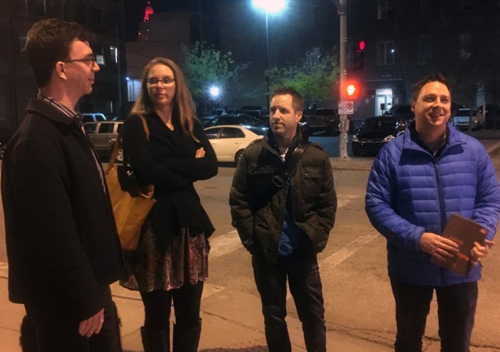
Type designers standing on a street corner at night in Kansas City

Four very hungry, law-abiding type designers, who definitely did not jaywalk against a red light.

This is a recent Wednesday night, spent in the company of some very wonderful people.

We are all standing on a freezing cold and somewhat abandoned Kansas City street corner waiting for the light to change, so that we can squeeze into the Mission Taco across the street where we will stuff our faces. Also on the agenda: chat about the state of type as well as commerce. And belly laugh.
Continue reading

Remember December: The Art of the Protest Sign

Here in America, 2017 was a bit of a trash fire, even from my liberal bastion of Brooklyn, NY.
It seemed like every day there was a new attack on something (or everything) I love, and there wasn’t much to be happy about this year. (I did get engaged in July, in Iceland, on a mountain top, while I was wearing Quidditch leggings, to my high school sweetheart.)

But other than that, something that has given me hope this year is the outpouring of protests and resistance and support from so many citizens of America and the world.

On January 20, 2017, the day of the Women’s March on Washington, I was in my childhood bedroom, recovering from having my wisdom teeth removed, so most of my memories of that day are of the images of incredible spirit and impactful posters.

When we show up to protest, and have our voices heard, we bring signs. And signs mean letters. And I love letters.
There was a lot of crying.
And a lot of FOMO.

Continue reading

Remember December: Submerged in Type

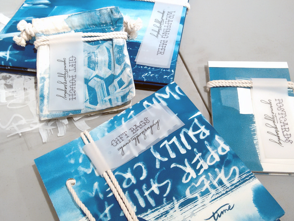
cyanotypography

Set by Sharon Chu

The fall semester started that week. Someone mentioned in passing that there’s a lot of rain on the way as a hurricane was building. I call Houston my home since 17 years and have lived through a couple of stormy situations, so, my thoughts were focused on projects just handed out to my senior graphic design students, more than on whether rain would cause us any harm.

We started out with an assignment titled The Sound of Letters is the Face of Letters. The premise was to exercise the writing of the Humanist historical script, then move into experimenting with contemporary scripts and lettering, while developing a concept for unique wrapping paper, cards, bags, etc., themed for a special purpose with the intention to coax the students into producing large scale calligraphy and lettering. Getting on with the first part, the students got up close with letter construction, anatomical proportions, and stress while exercising writing with a broad nib pen. We made it through two studio classes when Harvey stalled over the city.

Continue reading

Remember December: Tipoteca with Legacy of Letters 2017

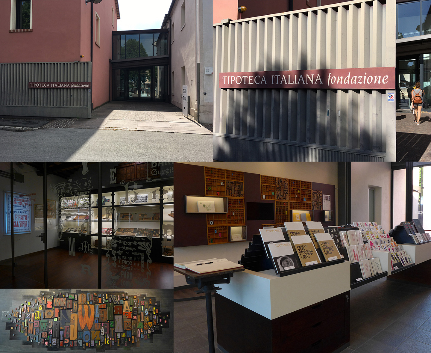
The typographic highlight of my year was a July workshop at Tipoteca in Cornuda, Italy. The workshop was the culmination of the 2017 Legacy of Letters tour lead by design historian, writer and educator Paul Shaw and publishing consultant and translator Alta Price. Anyone lucky enough to visit Tipoteca Italiana Fondazione is rewarded with a vibrant and immersive connection to the history of printing and type. For lovers of type, Tipoteca is a bucket list must, for lovers of type and lovers of Italy, Tipoteca, and the Legacy of Letters tours, can become a bit of an addiction.
Continue reading

Remember December: We are being read!

Traveling is one of the best things in life and something I will remember 2017 for (just like my fellow Alphabettes as we have seen in the past December posts so far). Not only do we get to see friends from afar, document funky lettering, foreign scripts, or drink crazy cocktails, we can also exchange PRESENTS!

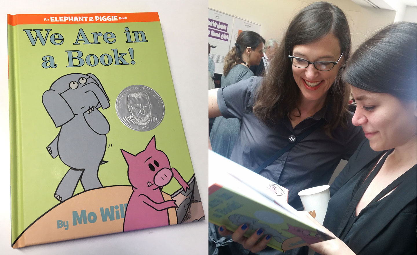
Let me show you both the best book and most touching gift I got this year:

Elephant, Piggie, Indra and Sahar (plus Marina and a bit of Matthew Carter in the background)


Continue reading