My connection with the Peter Pauper Press cookbook series started during the first years I was living in California.
I recall the first time I found a book from the collection was at the Recycle Bookstore in San Jose, CA — one of the best second-hand bookstores in the Bay Area. During the years living in California I found so many great books in this bookstore and they also have two great cats.

Recycle Bookstore, Ender the cat taking care of business and my friend Calvin browsing through books, San Jose, CA. Photos by Frank Grießhammer
The first book I got was Simple French Cookery. I was in awe: from the colour combination to the type choice and the effective and simple illustrations.
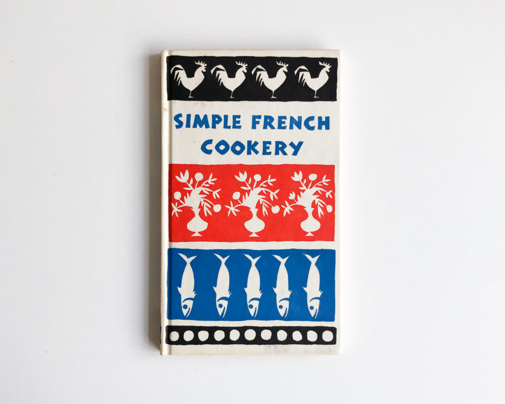
Simple French Cookery (1958)
Peter Pauper Press
Peter Pauper Press was founded by Peter Beilenson in 1928, in the basement of his home in Larchmont, New York. Peter had studied with Melbert B. Cary and Frederic Goudy, and later wrote a book about the early years of Goudy’s career.
The first book published by Peter Pauper Press, J. M. Synge’s With Petrarch was also designed by Peter and was considered one of the 50 Books of the Year by the American Institute of Graphic Arts.
In 1932, Peter’s wife Edna Beilenson joined the press as a partner and in 1935 they moved to Mount Vernon, New York. From the 1930s to the ’50s they published mainly prose and poetry. Their goal was to offer quality books at an affordable price. There was always something that made the book special, such as two/three colour printing, slipcovers or handmade paper. They worked with many different graphic artists to illustrate their books and gave a lot of work to artists that had recently arrived in the US, escaping from Germany during World War II. Artist like Fritz Kredel, Richard Floethe, Fritz Eichenberg later became acclaimed artists and illustrators in the USA.
In 1949 Edna created Peter Pauper Press Gift Editions. The books had a small format — 11,5 by 19 cm — with a wallpaper like cover. Each book sold for $1.
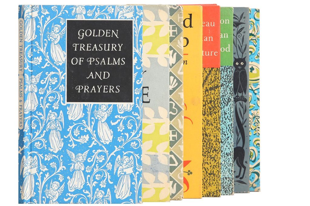
Image from www.chairish.com
Similar series were already popular in Europe, for instance the beautiful Insel-Bücherei series started in 1912 in Germany (still in existence today), or the Penguin book series A King Penguin Book which was published between 1939 and 1959. These were also the first Penguin volumes with a hard cover and printed in colour.
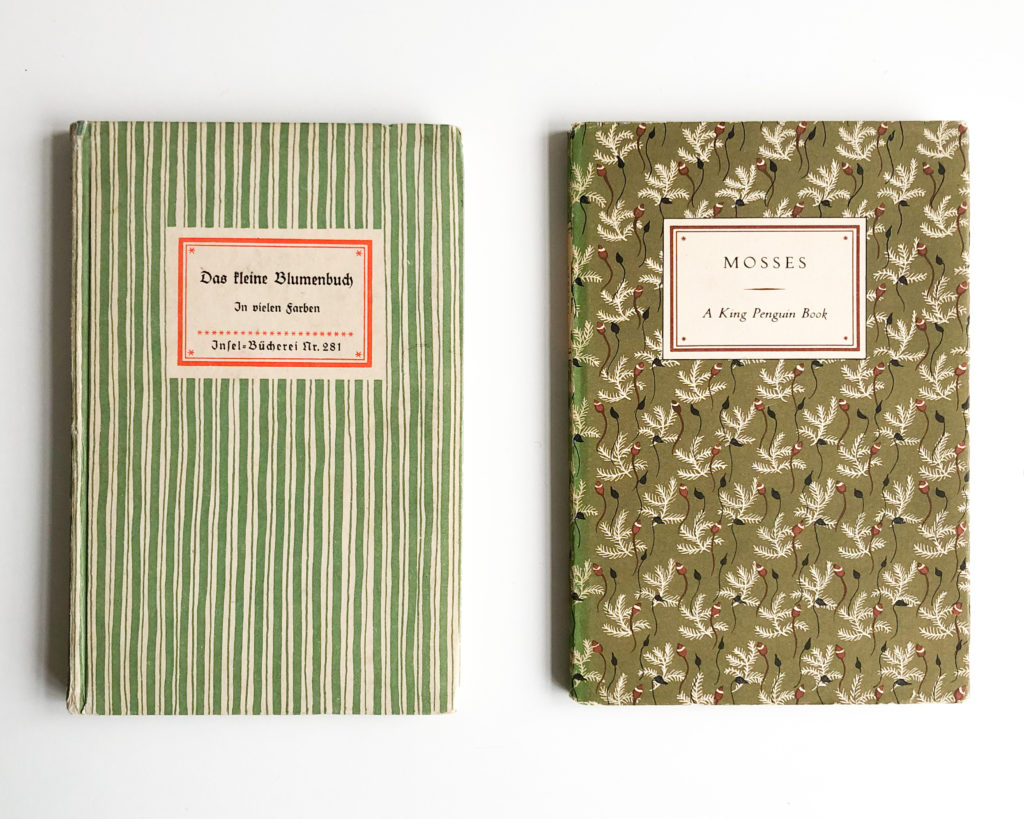
“Das kleine Blumenbuch”, Insel Bücherei №281 (1933) and “Mosses”, A King Penguin Book (1950)
Peter passed away in 1962, at the age of 56, leaving Edna in full control of the press until her passing in 1981. Apart from all the work she did at the press, she was also the first female president of the American Institute of Graphic Arts and president and chairman of the Board of the Goudy Society. In 1968, she was named Who’s Who of American Women Outstanding Business Woman of the Year.
Cook Book Series
Based on the same format, in the beginning of the 1950s Edna started a cookbook series. These too had a price tag of $1. They were special in various aspects, some already mentioned. It was a true labor of love from Edna. She compiled the recipes for the majority of the books, which alone shows how great of a passion she had for cooking. All the books I have from this series have been illustrated by women. Most of them by Ruth McCrea but also some by Maggie Jarvis and Chrystal Corcos. Having a full book series illustrated by women is quite an amazing achievement, specially since we are talking about the 1950s and ’60s. Unfortunately not much can be found about these women, with the exception of an obituary about Ruth.
Ruth McCrea
Ruth worked closely together with her husband, James McCrea. They authored and illustrated several children books in the 1960s such as The Birds, Olaf and The King’s Procession, published by Atheneum Books.
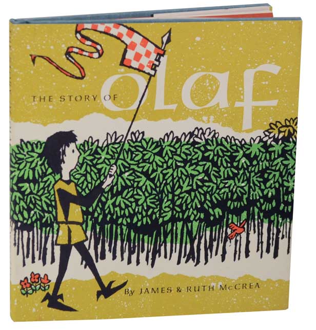
“The Story of Olaf”, James and Ruth McCrea (1964). Image from www.jhbooks.com
The McCreas worked on book covers, with the most known series being the covers for Hemingway’s books published by Charles Scribner’s Sons, for which they painted an oil painting for each title that was reproduced on the cover.
The books I have from the Peter Pauper Press cooking collection illustrated by Ruth run from 1953 to 1965, meaning that Edna collaborated with Ruth for at least 12 years.
Book design
The cookbook series is comprised of two main sub-series, The ABC and Simple Cookery and other books that exist on their own without being part of a sub-series.
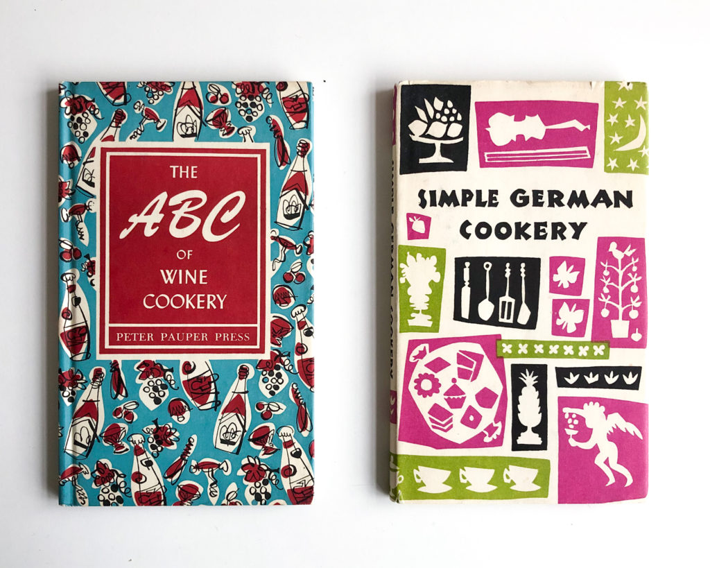
The ABC of Wine Cookery (1957) and Simple German Cookery (1965)
Simple Cookery
The covers from this sub-series have the title always in the same location and horizontal divisions that bring the collection together. It’s through the change of colour combination and the elements that are illustrated that you recognise the different volumes. During the 1950s the covers always had repeating elements. In the 1960s, even though the horizontal divisions of the cover area still exist, the repeated elements are substituted by a more randomised layout.
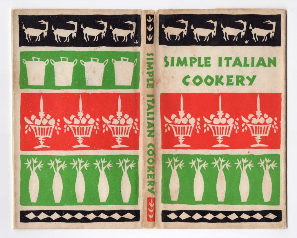
Simple Italian Cookery (1959)
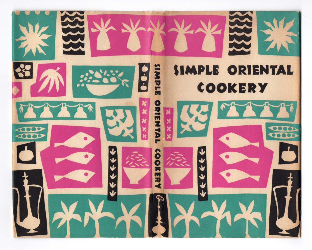
Simple Oriental Cookery (1960)
All of the covers and spines of this series have the title lettered in a style that is very much inspired by Rudolf Koch’s Neuland.
One would imagine the use of Neuland to continue throughout the book, but no.

On the title page we have a change of typefaces. The title is now set in Lydian, author, illustrator and complementary information is set in Linotype Baskerville and the press name set in Hobo.
The type combination of Lydian, Hobo and Baskerville continues throughout the book. With main recipe divisions set in Lydian, recipe titles and page numbers set in Hobo and the recipe text set in Baskerville.
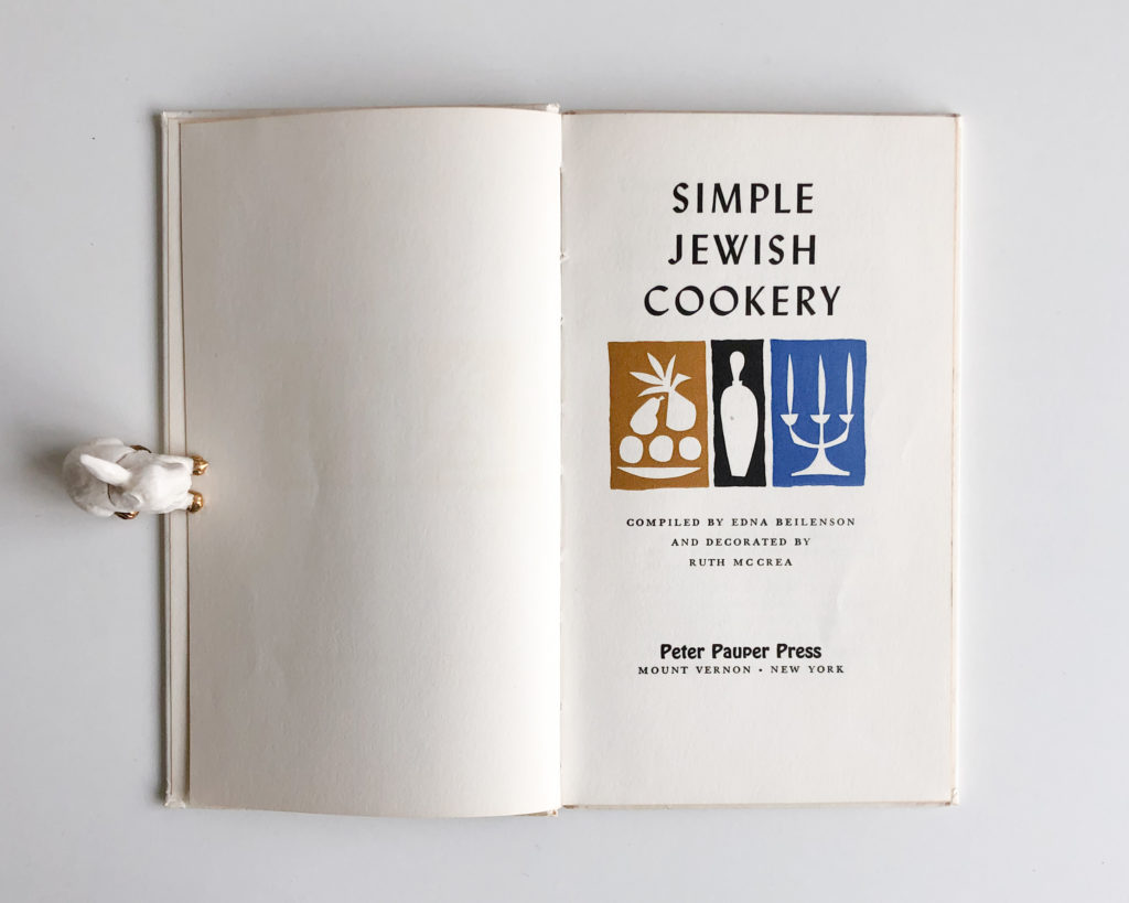
Simple Jewish Cookery (1962)
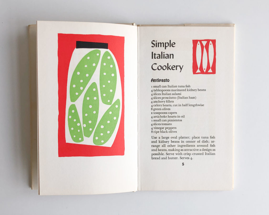
Simple Italian Cookery (1959)
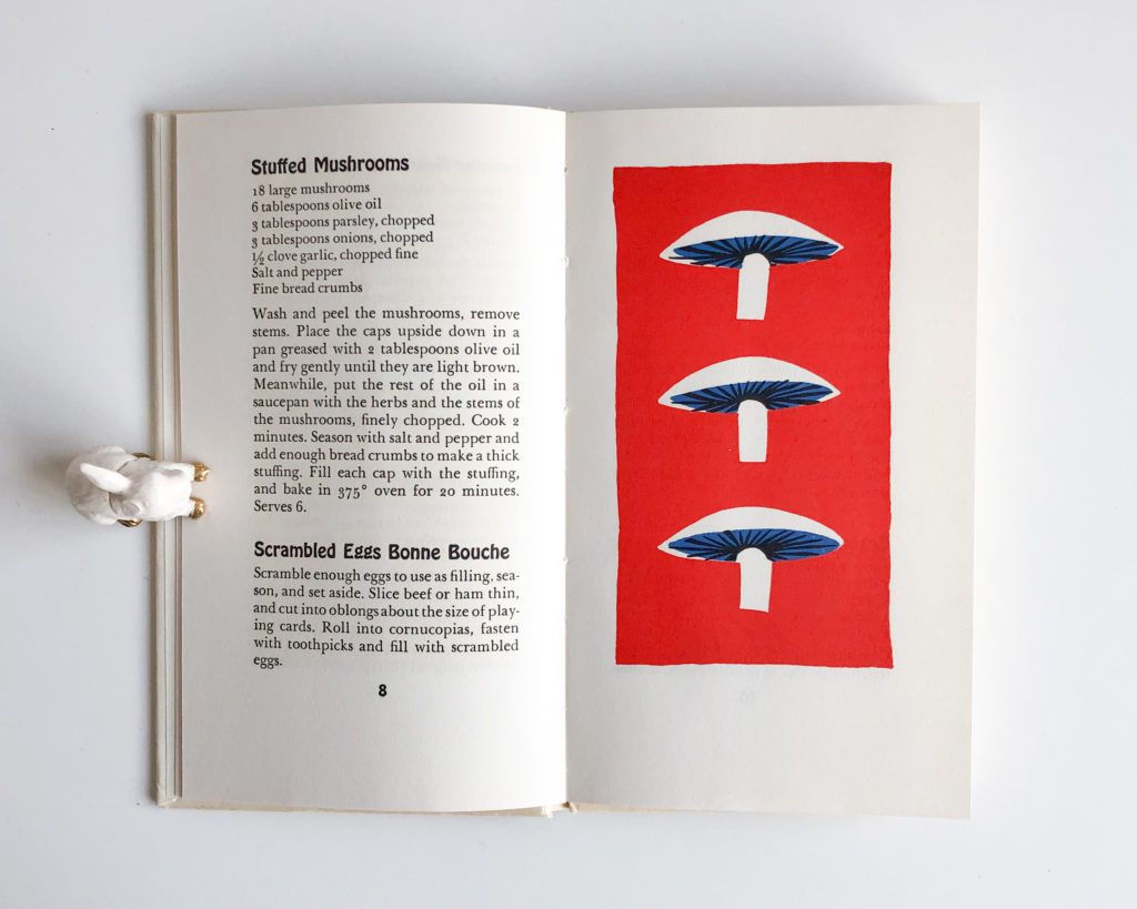
Simple French Cookery (1958)
The ABC
The covers of this sub-series have a three-colour wallpaper-like pattern that wraps around the book. The title is enclosed in a coloured frame that uses the secondary colour in the patterned illustration.
This series started earlier than the Cookery one and you can see some type evolution throughout the years. The two older books I have, The ABC of Canapés from 1953 and The ABC of Casseroles from 1954, have a hand-lettered ABC and the rest of the title is set in Beton Medium Condensed.
The ABC of Gourmet Cookery (1956) shows a different type choice for the cover, and this design continues until the latest book I have, the ABC of Cookies (1961). It uses Brush Script for ABC and Lydian as a complementary typeface for the rest of the title.
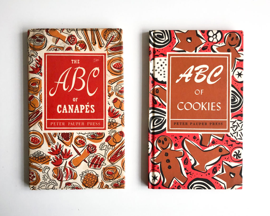
The ABC of Canapés (1953) and ABC of Cookies (1961)
What is somehow strange is what is happening on the spines. The majority of the books I have will continue to have the title on the spine set in Beton, with the exception of ABC of Wine Cookery (1957) set in Lydian and ABC of Cookies (1961) set in Cairo.
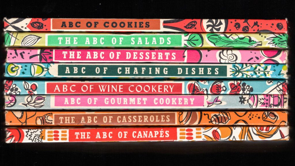
Cairo is an Intertype release heavily inspired by Memphis. It appears also in the interior of all the books as the typeface used for recipe titles together with Linotype Baskerville for the text.
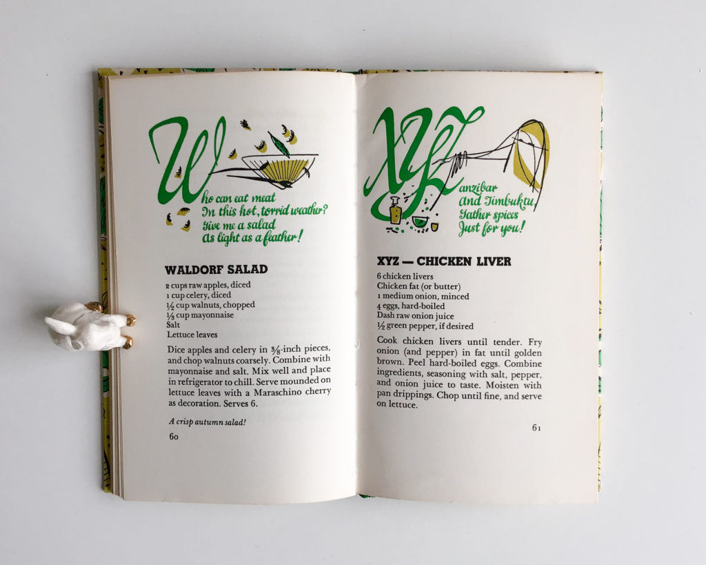
The ABC of Salads (1958)
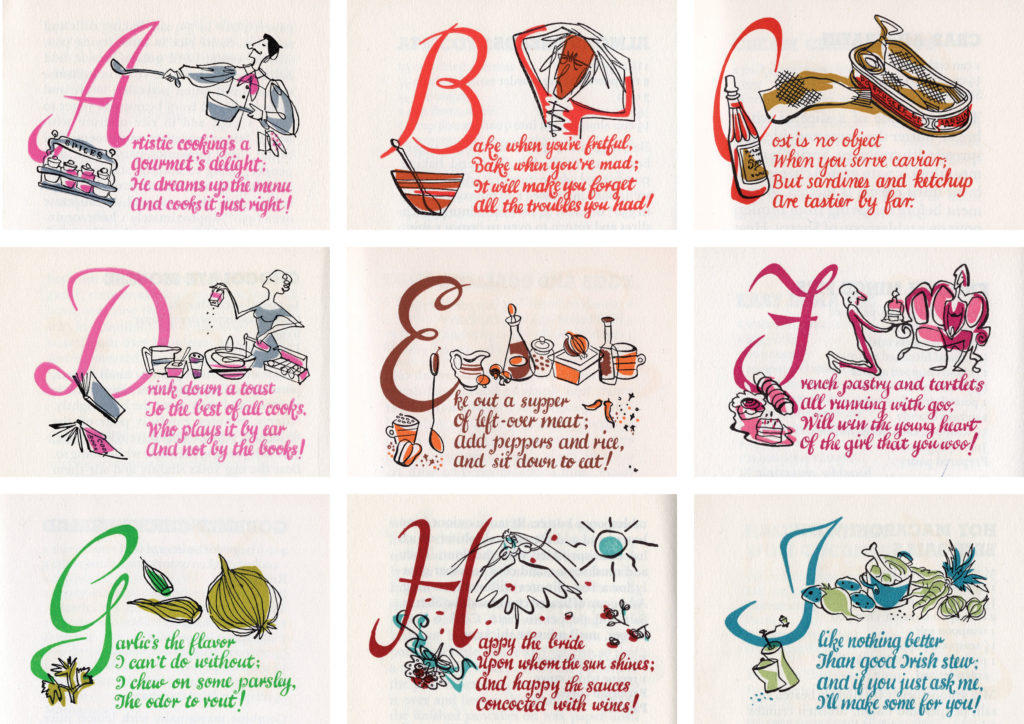
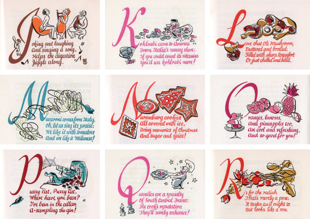
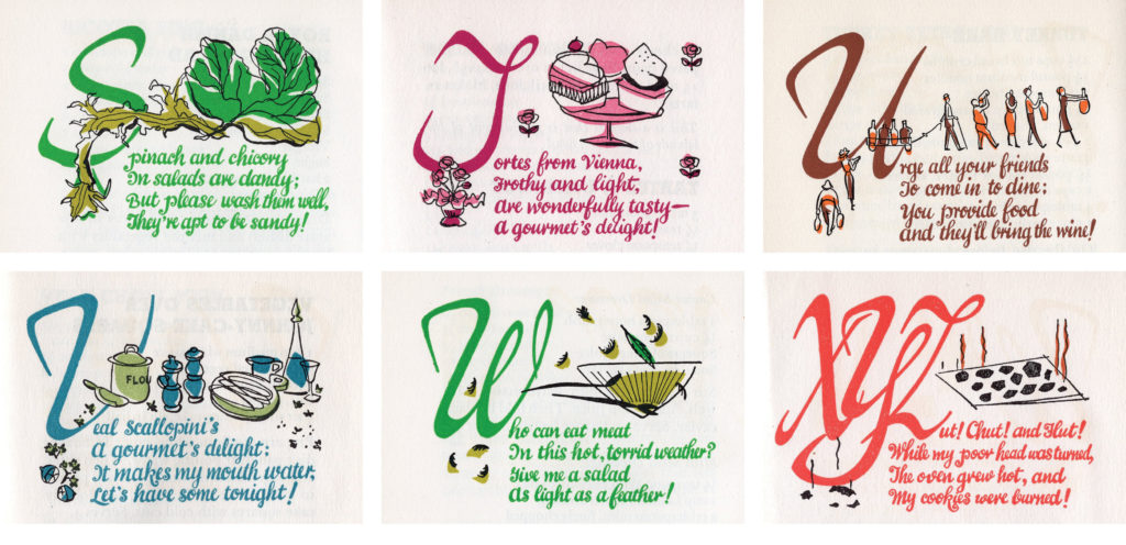
In this series the recipes are arranged alphabetically and each character of the alphabet is hand-lettered together with a funny illustration and little verse.
Other Books
In this section, I’m including some books that I have that don’t belong to any sub-series.
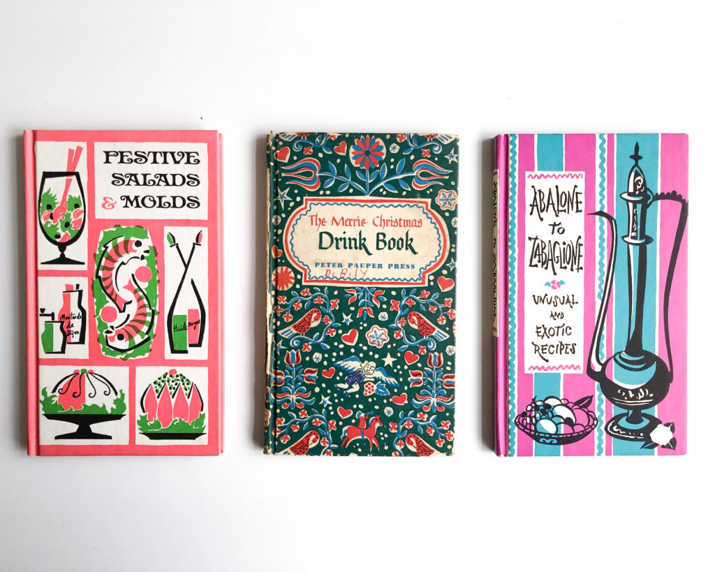
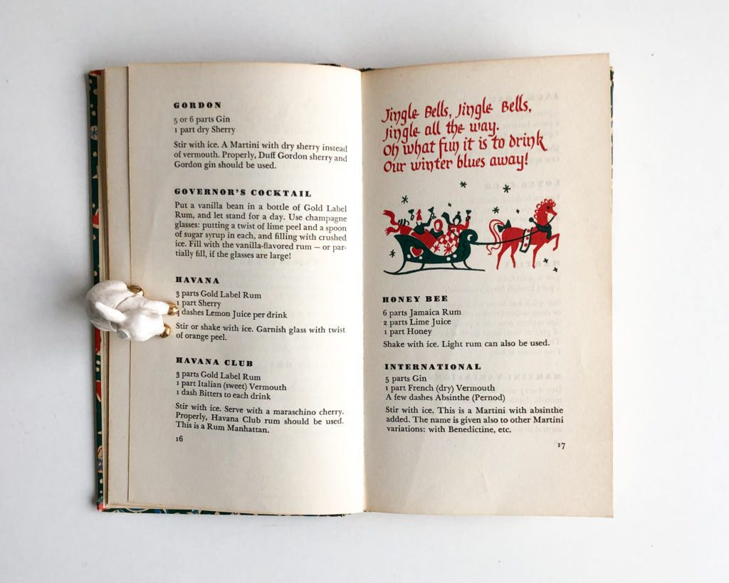
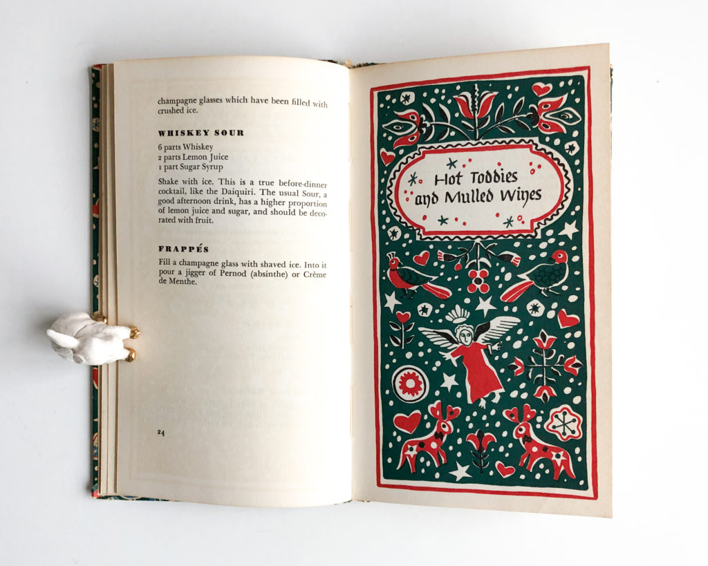
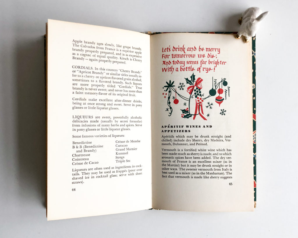
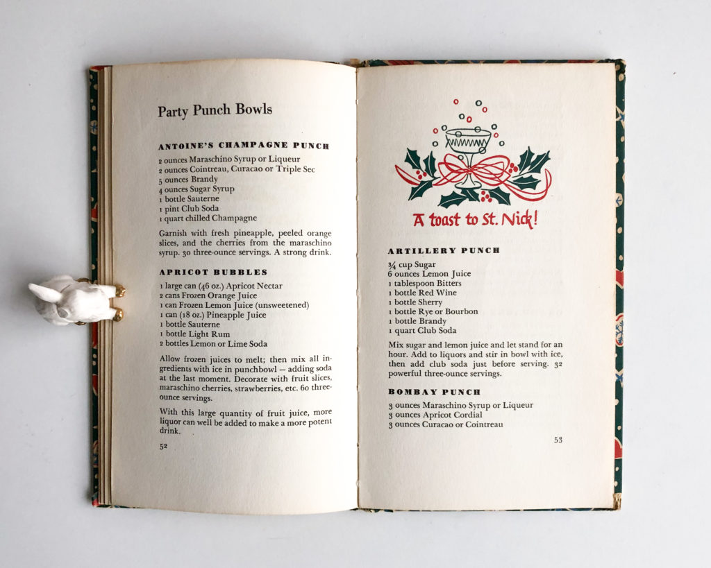
The Merrie Christmas Drink Book (1955)
Hand-lettered blackletter for the cover and title pages inside. Paired with Poster Bodoni for recipe titles and Baskerville for the text.
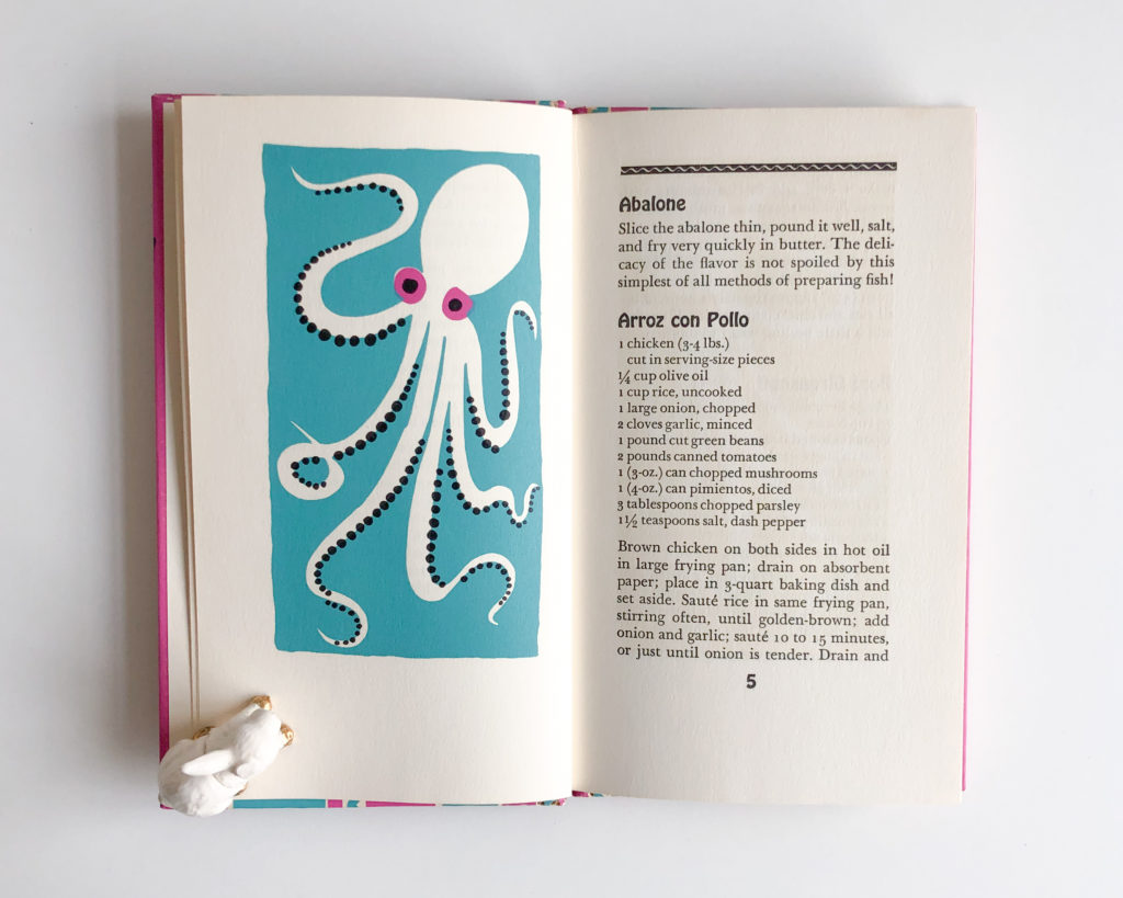
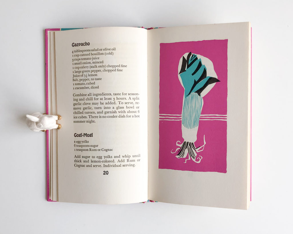
Abalone to Zabaglione (1957)
Hand-lettered cover with Hobo used for recipe titles and Baskerville for the text.
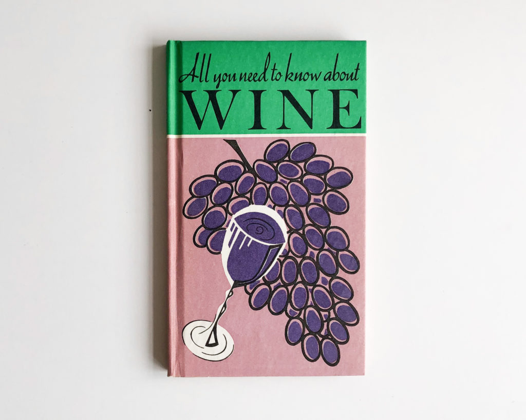
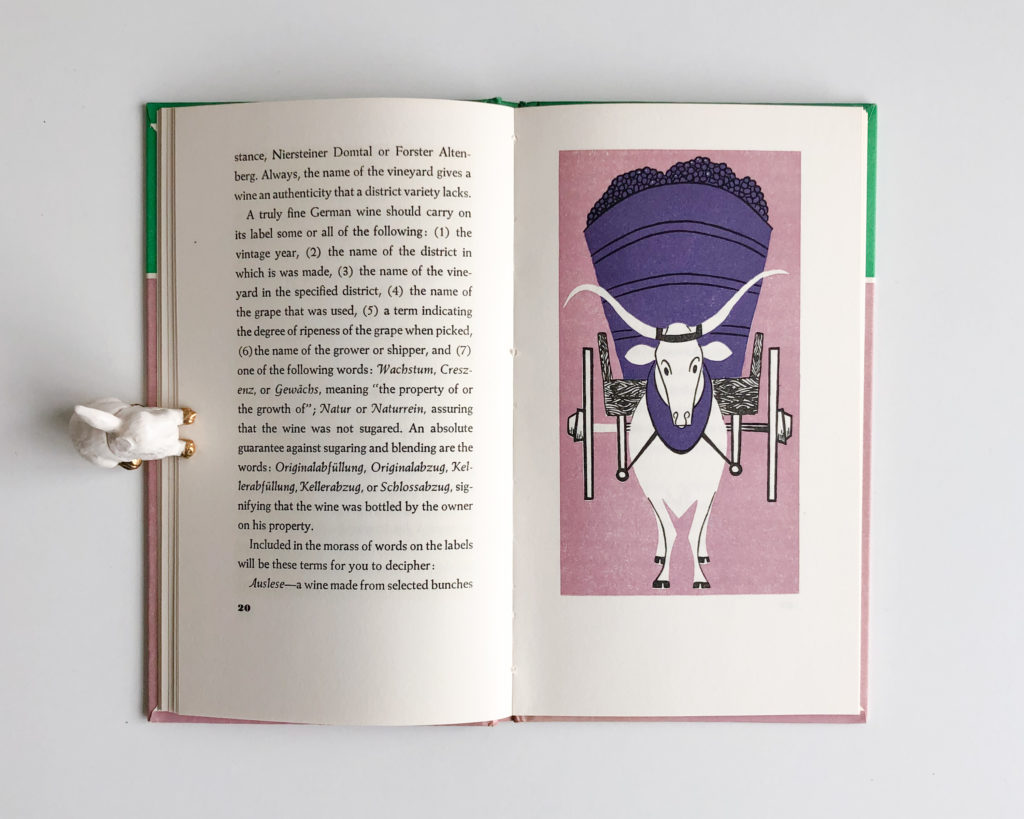
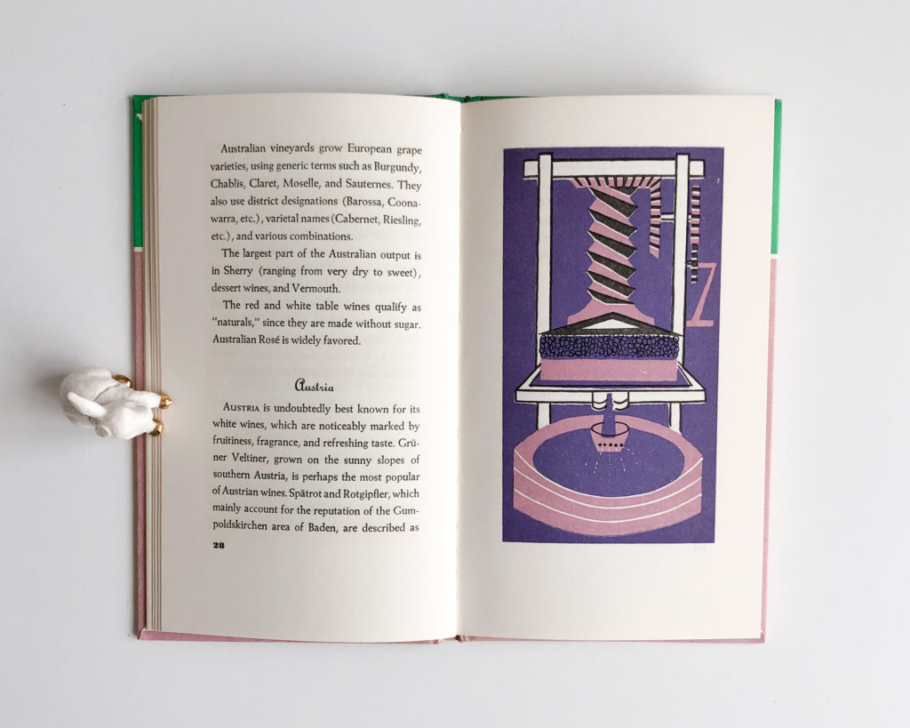
All you need to know about Wine (1969)
Title set in Trafton Script and ATF Baskerville. Inside we find on the title page the same typeface for the title together with Linotype’s Garamond for supplementary text. Inside we have Typo Upright from ATF for titles and Weiss Roman for text.
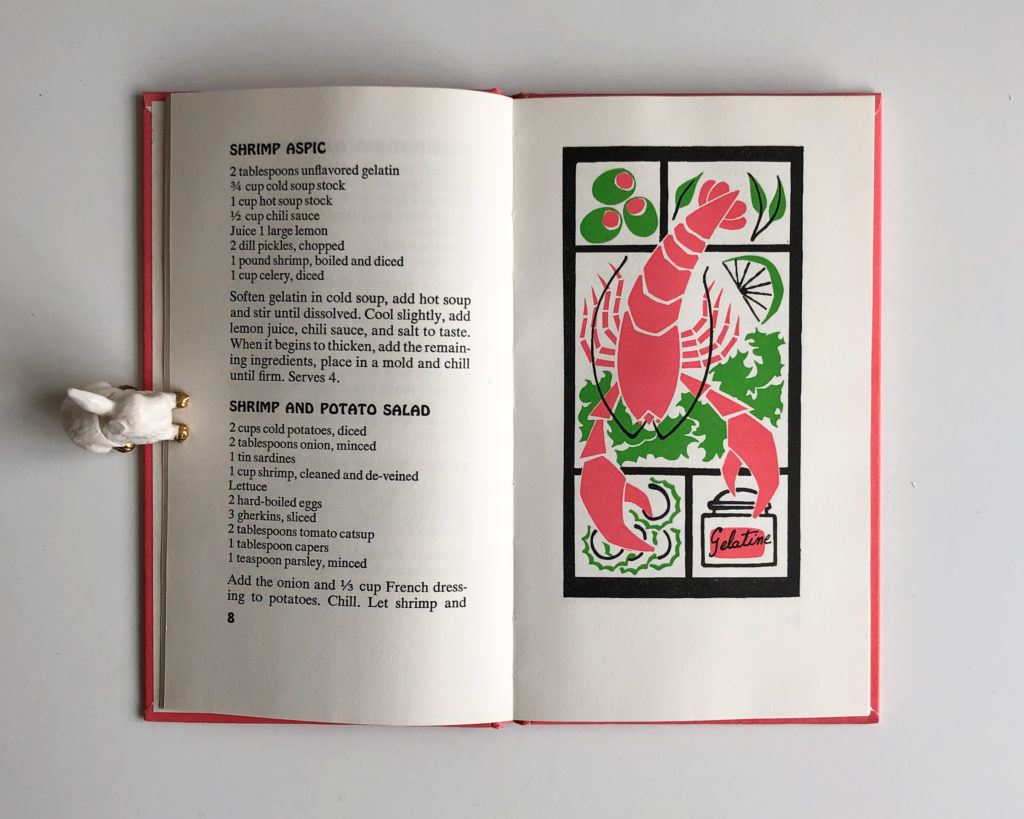
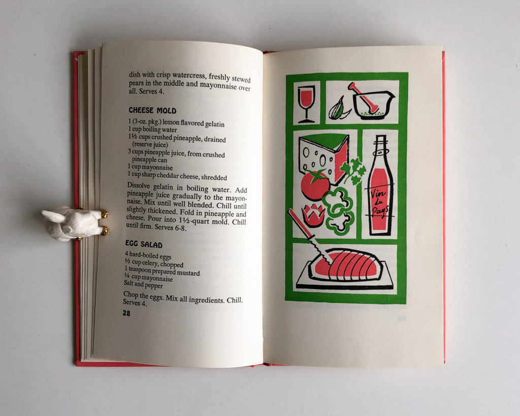
Festive Salads & Molds (1966)
Cover title set in Xenotype 3536 2 by PhotoLettering. On the inside, we find Hobo used for titles and Times New Roman for text.
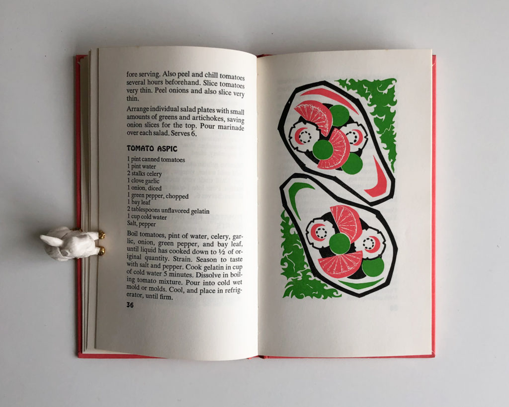
I have been collecting these books for around seven years, and don’t buy them online, as with most of my small collections, I enjoy the physical encounter, the moment you browse through a second-hand bookstore and you find one more book to add to your small collection. I don’t do it for having them all, like Pokemon. I love the surprise, the not knowing if I will find something anytime I go to a second-hand bookstore or a book market. Even the days I leave empty handed I leave with a smile. Finding lost gems within piles of books is my favorite thing to do in the world. So go out there and support the second-hand book market in your town or visit that bookstore that is perhaps about to close. The moment you find a book in a bookstore and the smile it gives you is something that the internet will never be able to provide.

Thank you for this article! I love the woman-strong presence in these books, and the visual art is so fine. Edna also was active in The Distaff Side, which published books from 1937 until early 1950s. The group was “born out of a righteous indignation that sufficient recognition had never been accorded to woman’s place in the history of printing.” (Quote from Edna Beilenson, “A Children’s Sampler,” The Distaff Side, 1950.) In this enterprise she partnered with Bertha Goudy, Dorothy Abbe (Dwiggins’s assistant), and Margaret Evans (Overbrook Press), among others.
I love this article. Of course, I love book design, and good writing about book design; but I have also long been a fan of those little Peter Pauper books, when I can find them. I hadn’t been aware of the cookbook series, though, nor of the wonderful fact of them all being illustrated by women. So: thanks for sharing all this! And thanks to the little one-eared rabbit for carefully holding down the pages.
Oh, and Recycle is one of my favorite used-book stores, too. A couple of friends of mine live just a short walk away; I always browse in the store whenever I visit. Now I know why I don’t find any Peter Pauper books on the shelves…
Ah so wonderful! I have the Queen of Hearts Cook Book and the King of Hearts Drink Book, both illustrated by Josephine Irwin. It was a delight reading your article!
Oh wonderful. I must add her name to the list of illustrators. Thank you.