After attending Typolabs a few weeks ago, something kept on rolling around in my mind. Variable fonts—the main topic in type conferences since the announcement at AtypI Warsaw in 2016—was again at the heart of the debate in Berlin. If sliders generated some controversy one year ago, I would say ‘design space’ was one of the most repeated concepts this year. The opening talk by Gerry Leonidas pulled the trigger with a thoughtful presentation: ‘I am now in an environment where the design space is by default way bigger than my ability to imagine it, not just my ability to do something with it’.

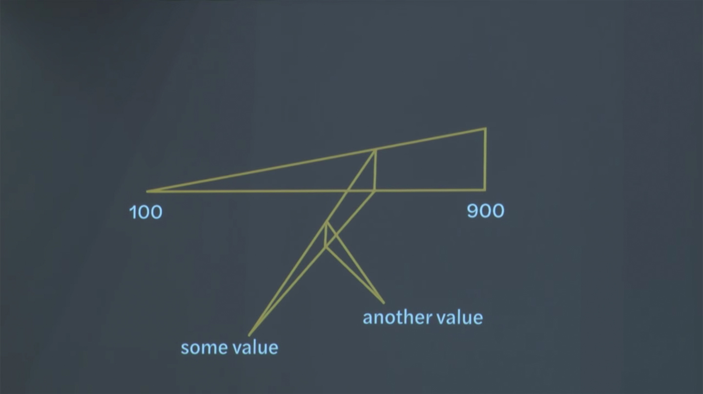
This figure, included in the presentation by Gerry Leonidas, is the visual representation of a font with three main axes.
Visualizing the design space of a variable font in our 2D screens can be tricky. Our imagination can take us far, but decoding a figure with more than 3 dimensions is still a difficult task for our brain. We can find great explanations of the 4th dimension online, and we can probably understand the idea behind it. Variable fonts can be much more complex than that, sometimes we need to represent 6, 7, 8 or who-knows-how-many-more dimensions.
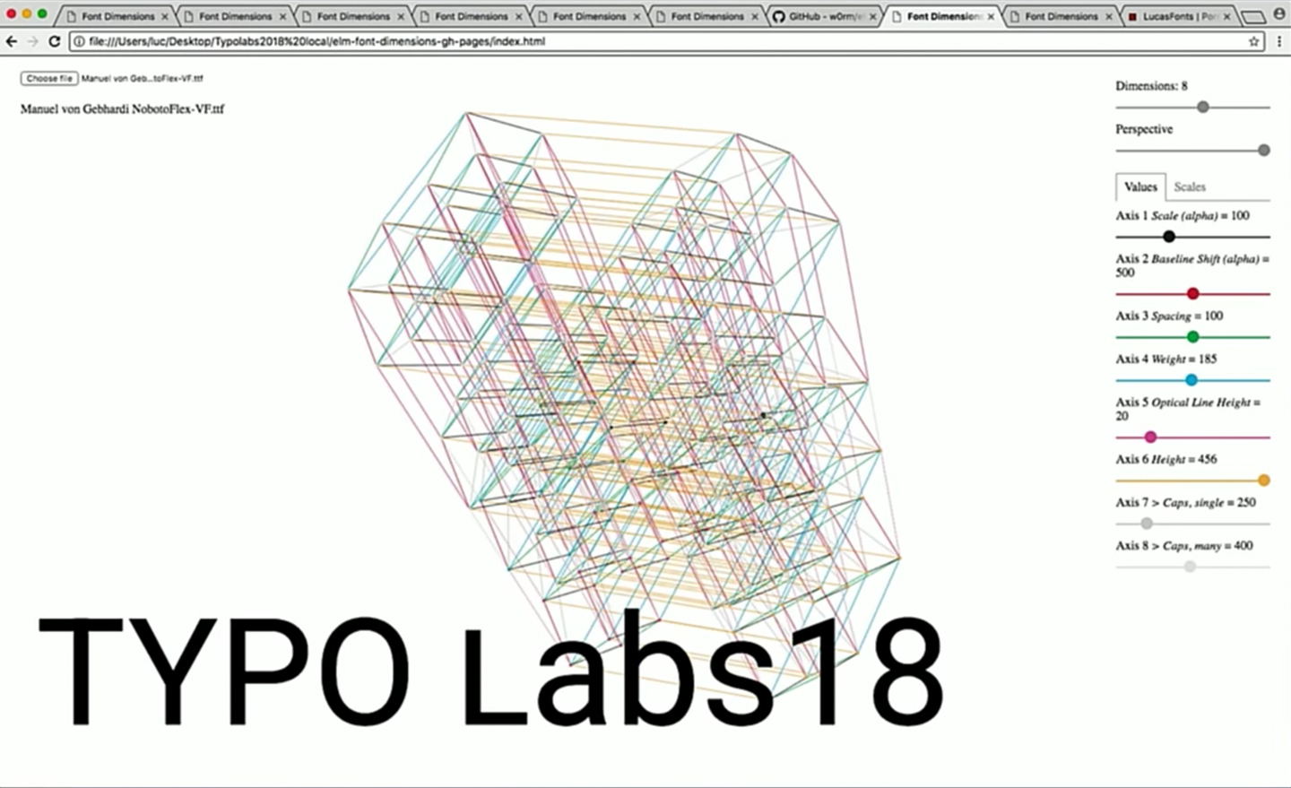
Our brain is trained to identify width, height, and depth. We are used to seeing two-dimensional images presenting a fake impression of a three-dimensional space. The problem comes when we have more than three dimensions/axes. Lucas de Groot showed us a tool developed by Andrey Kuzmin that is able to create multi-dimensional figures, which display the many axes in a variable font. They are beautiful representations of the design space. The question that comes to mind is ‘Are those graphics functional for a user-friendly interface?’.

Multi-dimensional figure representing the variable font Noboto Flex by Manuel Gebhardi, which includes 8 axes
Perhaps there will come a time when we work in virtual reality and move through the design space in a random number of dimensions. Until then, we should find an easy and simple way to represent a multiple-axis design space in a two-dimensional screen. One single point floating on a multi-dimensional space figure doesn’t seem to be very helpful, it is really hard to identify coordinates and values at first sight. We are talking about the representation of something much more complex than a unique value.
Let’s take a step back and think of something different. We are trying to make things simpler. Animals and plants are very good at that, they adapt to the environment for an easier existence. Think of spiders, for example. Their webs include many axes, all departing from a central shape. All those axes are not necessarily the same length and their connections do not always happen the same way. There is a general pattern, but there is also freedom for some deviation. Now you can borrow the spider method and easily imagine how to represent the design space in a variable font.
We are creating two things at once: a tool for selecting the instances in our variable font, and a visual representation of the design space in a two-dimensional figure. If you still cannot see it, here are a few random examples.

Each font instance is represented by a different shape. It can be a zero-dimensional shape (a point), a one-dimensional shape (a line), or a two-dimensional shape (a polygon). The shape depends on how much the values move from the central point—let’s call this the neutral instance of our font.

The web allows us to make clear connections between axes and easily locate our pre-defined instances in the design space. Axes do not need to be all the same length and they can extend in just one direction.

By scaling the shape that represents our font variant, we can also get other instances with proportional values to the ones of our first choice. Maybe, we want to keep the same value for one axis, like the optical size, and proportionally scale all the other values. We can get that by deselecting the optical axis before changing the size our instance-shape. The scale tool works a ‘master slider’, it changes the values of all axes at once.
It is easy to get lost in the complexity of design spaces. Creating easy-to-understand graphics and intuitive tools will help us to engage with font users, so we get their support and involvement in the development of the variable font format.

Excellent, thought provoking article!
I am currently studying this area for a undergrad project, if anybody has any further thoughts/sources I would really appreciate it.
Thank you David!
Axis Praxis includes a great list of resources on variable fonts https://www.axis-praxis.org/resources
I guess you already know https://play.typedetail.com/ and https://v-fonts.com/
Here an animated demo by langustefonts of a web space for variable fonts https://twitter.com/langustefonts/status/1024321286414233601