Above: Brooke Hull. “Overlay of Fat Letterform Illustrations on Type Anatomy Guide.” 2023. Type Anatomy guide image via Material Design. “Understanding typography.” nd. https://m2.material.io/design/typography/understanding-typography.html#type-properties
How can we disrupt design canons & fight fatphobia intersectionally through embodied typography?
This research began as I discovered and accepted my own fat, nonbinary body for the first time at the age of 23-24. I was in graduate school having to not only expand my knowledge about the systems within the world around me but having to understand how those systems impacted my own body. As a person who has been fat my whole life, I never accepted this reality until I learned about the system of oppression known as fatphobia.
Fatphobia, as defined by Dina Amlund, is “the name of the structure and the social hierarchy that place people of size, or fat people, beneath slender people” (2017).
Fat people face proven discrimination at work, in relationships, in healthcare, and in the media (Cooper Stoll 2019). Fatphobia, like all other systems of oppression, is intersectional (Crenshaw 1989), further harming folks who embody multiple systems of oppression, like race, gender, sexuality, and disability. While learning about these intersecting systems of oppression, I wanted to use design to relate these systems to my own body and bodies like mine. This is where the idea of fat typography began.
After reading the incredible black feminist author bell hooks’ book, “Feminism is for Everybody,” this quote stuck with me:
“There should be billboards; ads in magazines; ads on buses, subways, trains, television commercials spreading the word, letting the world know about feminism” (2000).
As a designer, this call to action felt personal. Designers are responsible for the billboards, ads, television commercials, and much more that often perpetuate systemic harm through reinforcing capitalism and focusing on the most acceptable bodies within that capitalistic system (i.e. white, thin, male, cis-gendered, able-bodied). Recognizing this issue, I used the method of speculative design to subvert what design has been historically used for.
My fat letterforms came from my own passion for typography. I became a designer because I fell in love with the art of communication, and a key part of communication is the letters we use. Through my own research, I found typography to also reify the systems of oppression through its focus, or lack of focus, on bodies.
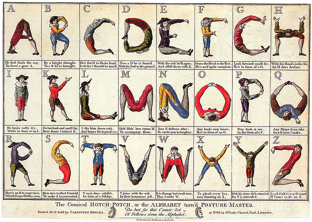
Above: Richard Deighton. “The Posture Master.” 1780-1800. Carington Bowles, London, England. Letterform Archive. https://letterformarchive.org/news/letterforms-humanforms/?srsltid=AfmBOopea19wLkLM8YtLbBJJuO1tDcoVJN0v_TWLQqAlNy3xhou4MT7a
Let’s look at this example. Above, we see an illustrative alphabet created by Richard Deighton. This example, referenced from the article “Letterforms/Humanforms” by the Letterform Archive (goetz 2020) is just one of many historical type examples based on the body. However, absent from these examples are any bodies that are fat, disabled, queer, and not white.
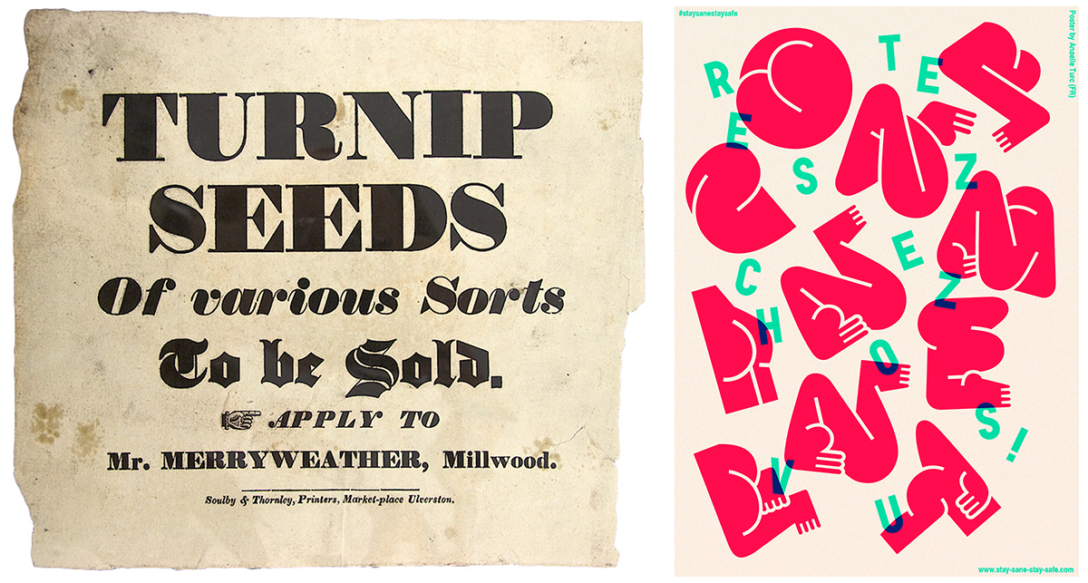
Left: Early 19th-century advertising handbill from the John Soulby collection, University of Reading. Source: Michael Hochleitner. Found via: https://fontsinuse.com/uses/5578/the-story-of-our-friend-the-fat-face
Right: Velvetyne. “Typefesse in use.” 2019. https://velvetyne.fr/fonts/typefesse/
We can also think of the Roman fat face: a typeface whose extreme width has been renamed to fat. While I appreciate the use of fat as a neutral descriptor, in this case there does not seem to be any direct correlation to fat bodies. A similar idea can be seen in the contemporary typeface, “Typefesse;” a typeface based on butts and curves. While both examples begin to point toward an idea of body neutrality, neither seem to be direct in their statements about human fatness being neutral. Thus, while helping to normalize the word fat and curves in bodies, the overall intention is not entirely fat positive.
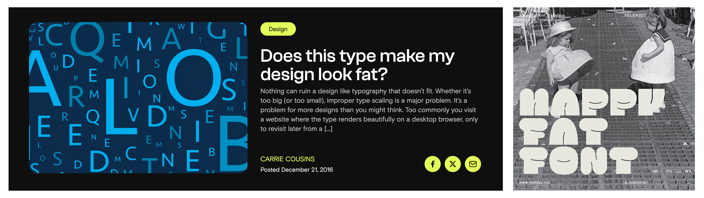
Left: Carrie Cousins. “Header of article titled ‘Does this type make my design look fat’.” 2016. Web Designer Depot. https://webdesignerdepot.com/does-this-type-make-my-design-look-fat/
Right: Jazlyn Fung. “Happy Fat Font promo image.” 2020. It’s Nice That. https://www.itsnicethat.com/articles/jazlyn-fung-graphic-design-120422
Continuing, we can see more evident fatphobia present within design. Looking at the above example of an article titled, “Does this type make my design look fat?” we see the idea of fat bodies being used pejoratively. Next to this is an example of a typeface based on fat bodies. However, instead of fat bodies being used to represent the typeface, two children in inflated dresses are used. How can a typeface claim to represent fatness without showing fat bodies?
I want to add that in no way do I mean to demean any of these creators. Systems of oppression, like fatphobia, are insidious and require painstaking critical thinking and recognition to begin to dismantle. I point out these examples to demonstrate this insidious nature and show how design has continued to reify harmful stereotypes about bodies, both subtly and overtly.
So, what would it look like if the bodies we based typographic forms on were not normative bodies, but bodies that are different and diverse? Using speculative design (Neeley 2024), I began illustrating letters primarily with the idea of fat bodies in mind.
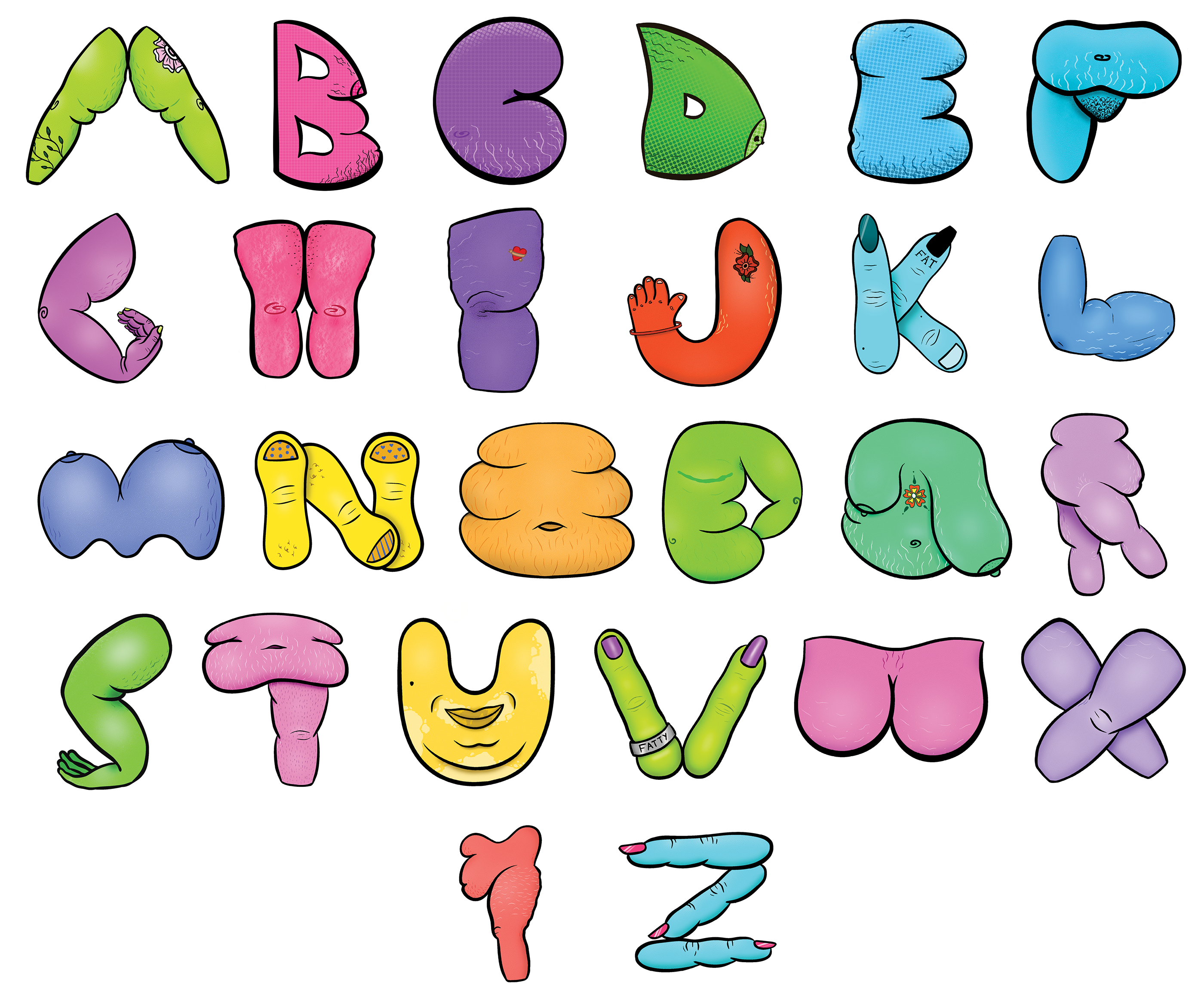
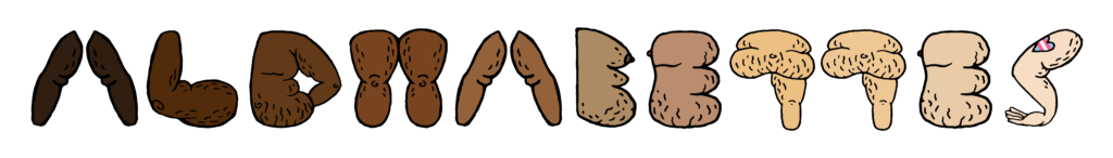
Above: Brooke Hull. “Illustrated Fat Letterforms.” 2023.
Thus, as a side project during grad school, my first illustrated alphabet was created. I focused on arms, legs, and joints; terms we are familiar with regarding type anatomy. I played with tattoos, uneven breast sizes, top-surgery scars, and lots of stretch marks and fat bellies. The result was a colorful rainbow of diverse bodies creating letterforms that are at times, almost unrecognizable for how much they differ from the type we are familiar with.
After creating these illustrations, I moved into more speculation based on how far we can push type anatomy terms to better relate to different kinds of bodies.

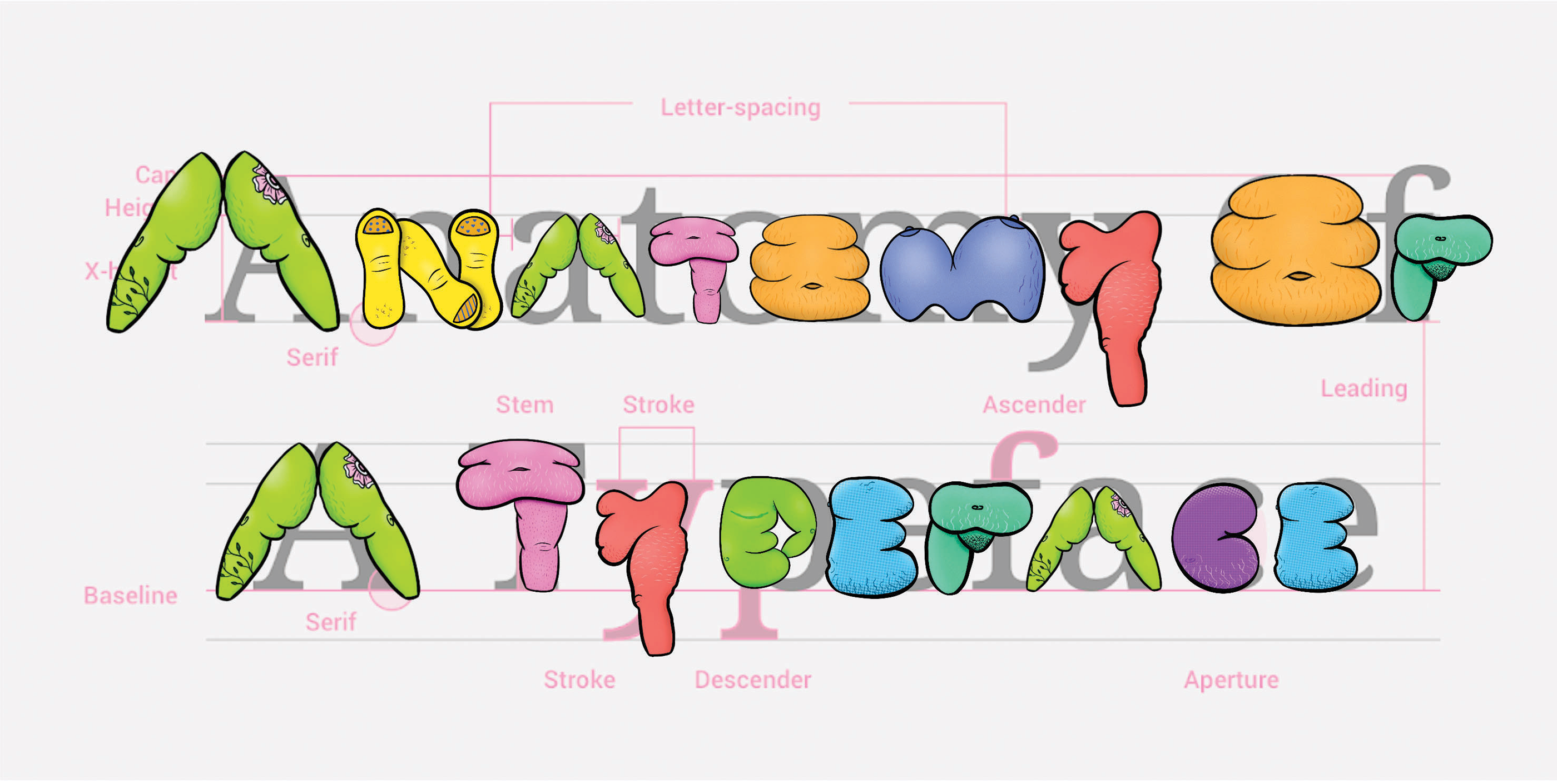
Left: Brooke Hull. “Canonical Type Anatomy annotated on Fat Letterforms.” 2023.
Right: Brooke Hull. “Speculative Type Anatomy annotated in Fat Letterforms.” 2023.
I experimented with renaming terms to better represent the bodies present in my illustrations. Instead of kerning, we have the term step. Instead of counter, we have the term hug. Instead of baseline and cap-height, we have the terms floor and ceiling. All of these terms focus on better relating typography to the body as a way to recognize fatphobia within design.
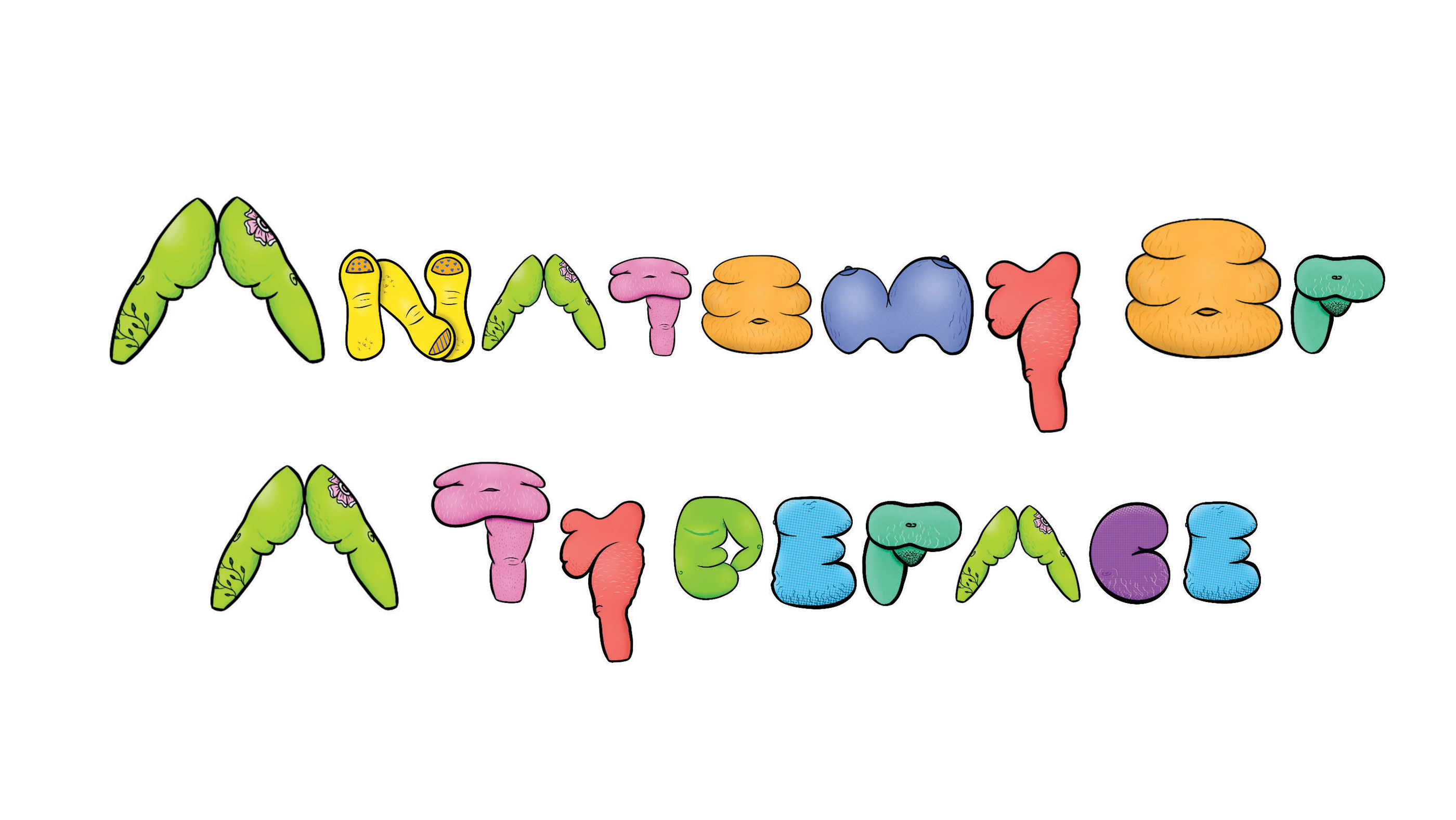
Above: Brooke Hull. “Fat Letterforms arranged to typical type anatomy guide found online.” 2023.
After recognizing the potential of this research idea, I placed my illustration in a format recognizable to designers everywhere: type anatomy guides online. Leveraging something recognizable would allow an audience of designers to be drawn in by the familiarity and then, hopefully, struck by the differences.
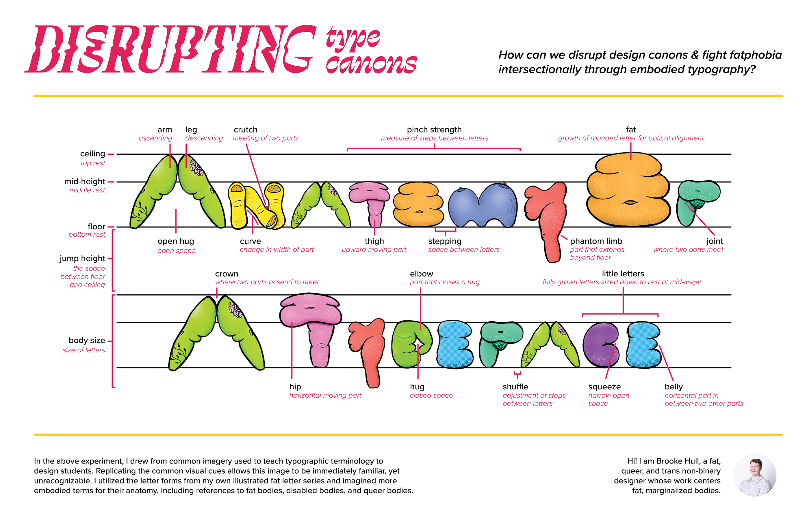
Above: Brooke Hull. “Disrupting Type Canons.” 2023. Poster.
The outcome of this grad school project became a physical poster, titled “Disrupting Type Canons,” that brings awareness to the systems of oppression present within design. I further renamed even more type terms, such as kerning to “pinch strength.” By speculating design futures that better embody diverse bodies, this research challenges designers to think deeply about their design histories and how the systems of oppression can insidiously creep their way into our work.
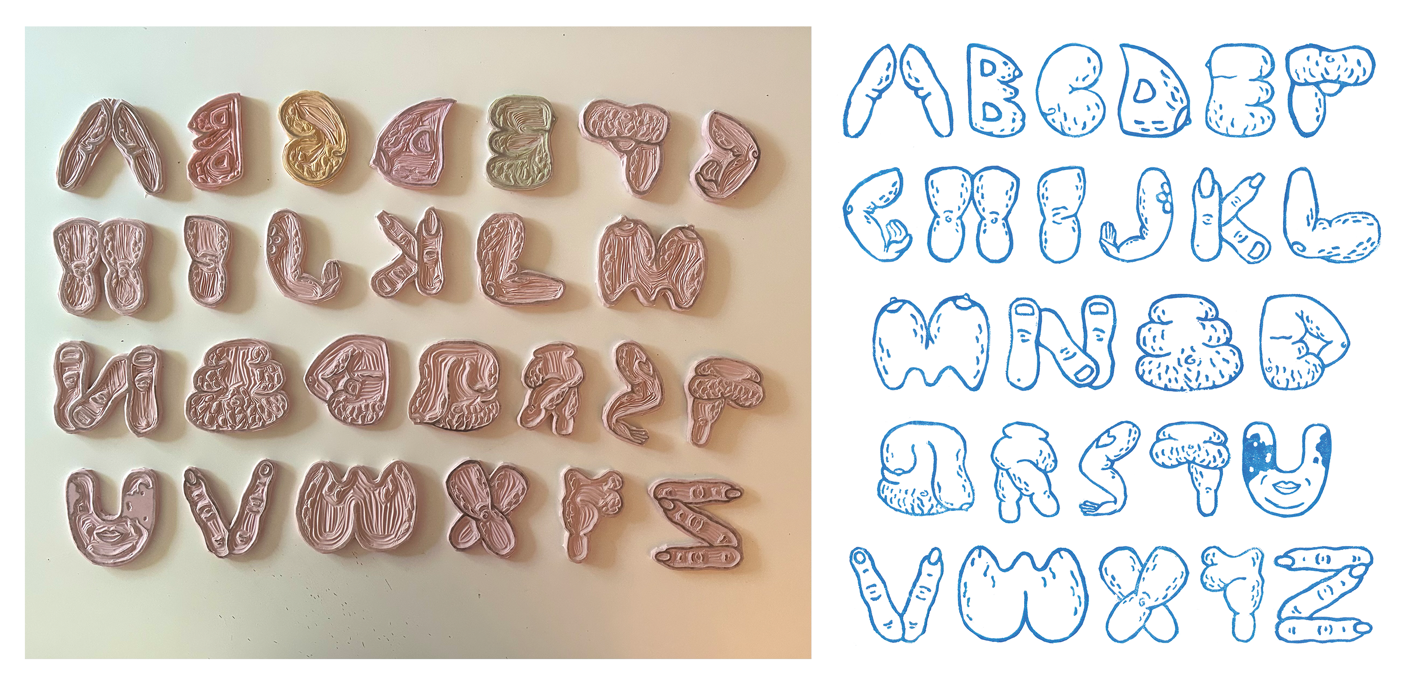
Left: Brooke Hull. “Linocut Blocks of Fat Letterforms.” 2023. Photograph.
Right: Brooke Hull. “Linocut print of Fat Letterforms.” 2023.
To push the embodied creation of this work, I further undertook another side project in grad school using these letterforms. As I wanted to learn how to linocut, I simplified these forms in Illustrator and spent a semester carving them into linoleum blocks and printing them.
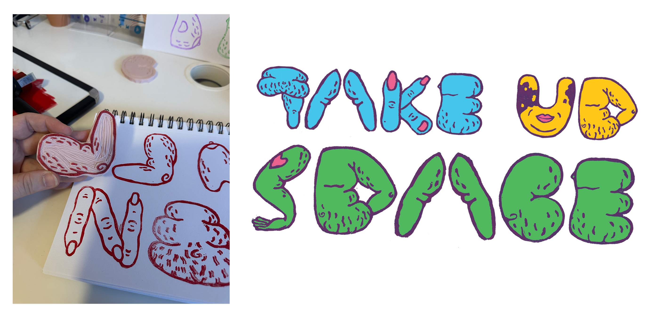
Left: Brooke Hull. “Test Print of Letter L that was Upside Down.” 2023.
Right: Brooke Hull. “Take Up Space.” 2023.
The final product allowed me to demonstrate a more human aspect in the creation of the fat forms, created by a fat person no less! I also turned these linocut prints into small decorative prints showcasing fat-positive messages which as I sold at a maker’s market geared toward sharing work centering diverse bodies. I share this aspect of the work because it was joyful and allowed the work to gain more embodiment through its creation.
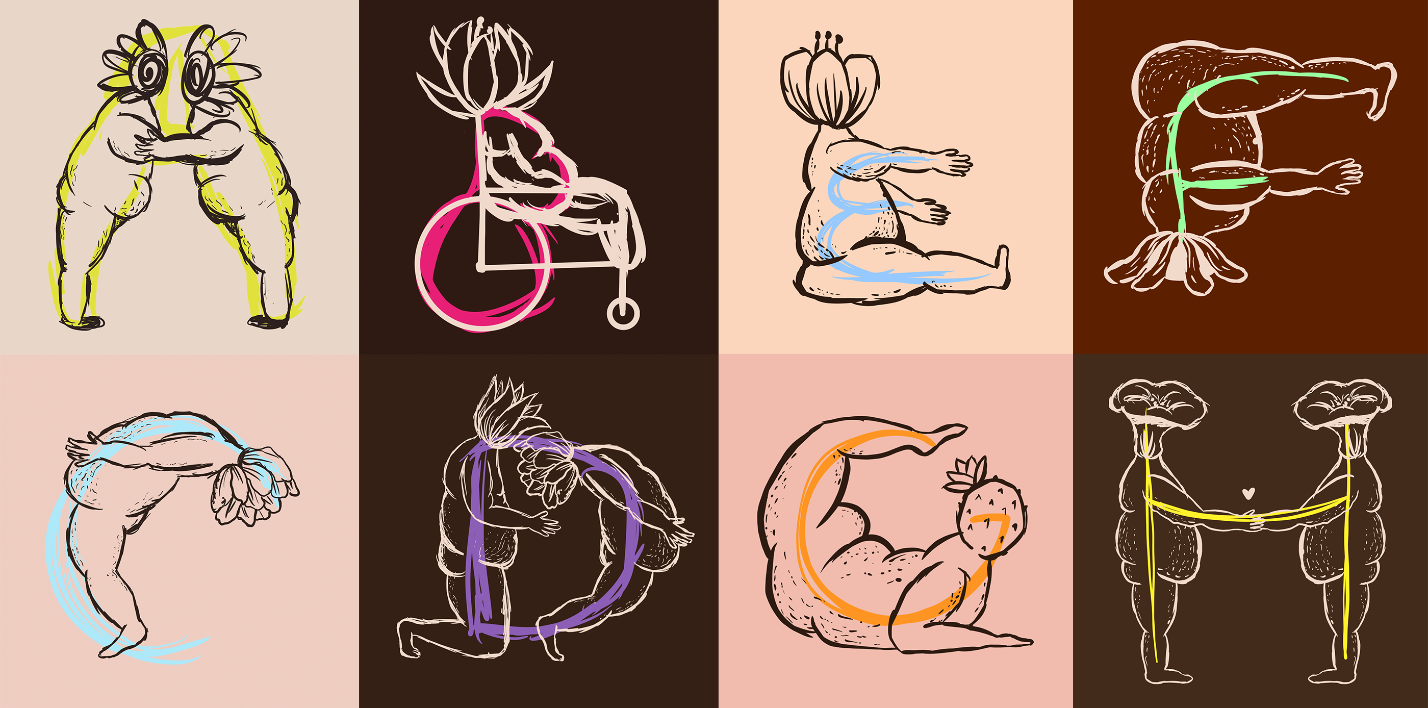
Above: Brooke Hull. “Speculative Experiment of Letterforms Using Racialized Bodies.” 2024.
This research continued to evolve through grad school with feedback from peers. I leveraged bright colors above as an homage to my queer identity but recognize the missed opportunity of centering race as a system of oppression in my previous work. Thus, the above images show a sample of a second alphabet I have illustrated focusing on whole bodies and using skin tones for the lines and backgrounds. I also included multiple bodies when creating certain letters to reinforce ideas of community.
My work continues to change as I am now a full-time tenure track professor of graphic design. My next step is to think through how this typeface can take a more systemic approach to its creation. I will begin with some control letters, like “n” and “o” to decide my straight and round body parts, and then systemically piece those body parts together in a way that allows the work to become more consistent and easier to critique. I hope to then share this typeface with designers and that it becomes something usable by others.
With this, I leave you with a call to action like bell hooks did for me: How might you recognize systems of oppression within your own design work, and how might your work challenge those systems?
Sources:
Amlund, Dina. 2020. “Everyone Should Be Fatactivists or Fat-Allies.” Conjunctions 7, no.1: 1-14. DOI: 10.7146/tjcp.v7i1.119859
Cooper Stoll, Laurie. 2019. “Fat Is A Social Justice Issue, Too.” Sage Journal of Humanity & Society, Vol.43(4): 421-44. DOI: 10.1177/0160597619832051
Crenshaw, Kimberle. 1989. “Demarginalizing the Intersection of Race and Sex: A Black Feminist Critique of Antidiscrimination Doctrine, Feminist Theory and Antiracist Politics,” University of Chicago Legal Forum 1989 (1): 139-167.
goetz, sair. 2020. “Letterforms / Humanforms.” Letterform Archive. https://letterformarchive. org/news/view/letterforms-humanforms
hooks, bell. 2000. Feminism is for Everybody. Boston: South End Press.
Kennard, Jennifer. 2014. “The Story of Our Friend, the Fat Face.” Fonts in Use. https://fontsinuse.com/uses/5578/the-story-of-our-friend-the-fat-face
Neeley, J. Paul. 2024. “What is Speculative Design?” School of Critical Design. https://www.critical.design/post/what-is-speculative-design
Velvetyne. 2019. “Typefesse.” Typeface Design. https://velvetyne.fr/fonts/typefesse/
About the author:
Brooke Hull (they/them) is an Assistant Professor of Graphic Design, and Women, Gender, and Sexuality Studies at Pennsylvania State University. They are a white, fat, queer, nonbinary person whose research focuses on intersectional fatness, design ethnography, and design pedagogy. Contact them at bxh5541@psu.edu or follow them on Instagram @artandgrowth.