
Designed by Diana Ovezea
Distributed by Blast Foundry
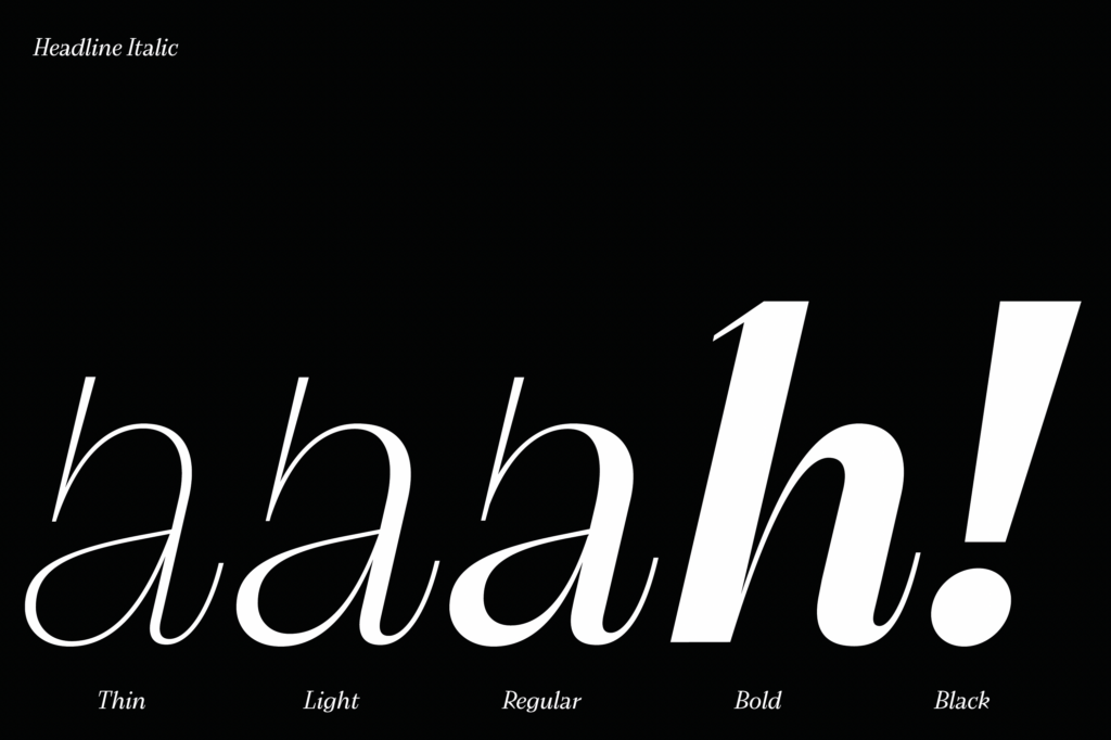
Typeface family: 6 weights, 2 styles (upright + italic), and 2 optical sizes. 24 fonts
This text was originally written in German, a language with more than 90 million speakers worldwide. The English version (Thank you Dan Reynolds!) of the review is below.
Ich hasse einkaufen. Ausgenommen Schriften.
2021 bin ich via Future Fonts über die Schrift »Bizzarri« von Diana Ovezea/Blast Foundry gestolpert und war sofort schockverliebt. Wenn ihr eine ausgefallene Schrift sucht, die eigenständig, eckig, laut, egozentrisch und detailverliebt um die Ecke kommt, dann liegt ihr mit der »Bizzarri« auf dem richtigen Kurs.
Im ersten Moment ist es vielleicht nur eine weitere Antiqua in dem großen Feld der klassischen traditionellen Konkurrentinnen, aber weit gefehlt. Ich denke, sie ist ein ziemlich extravaganter Wolf im Schafspelz!
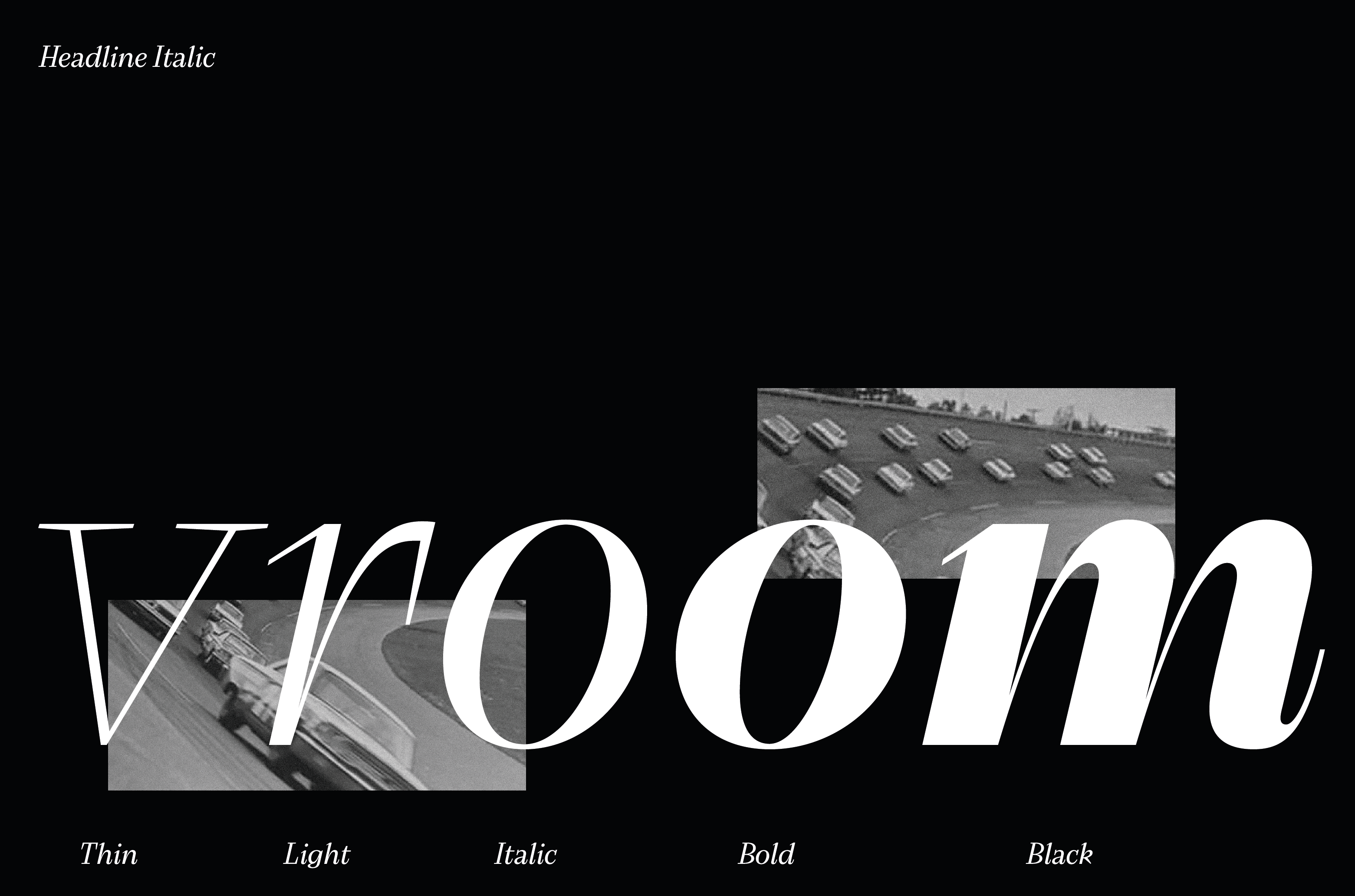
Erst beim zweiten Blick habe ich erkannt, dass bestimmt auch die schönen Visuals dazu beigetragen haben, mich zu verlieben – aufgewachsen in einer Formel-1 verrückten und in schöne Autos vernarrte Familie in den 60-Jahren des letzten Jahrhunderts, blieb mir gar keine andere Wahl!
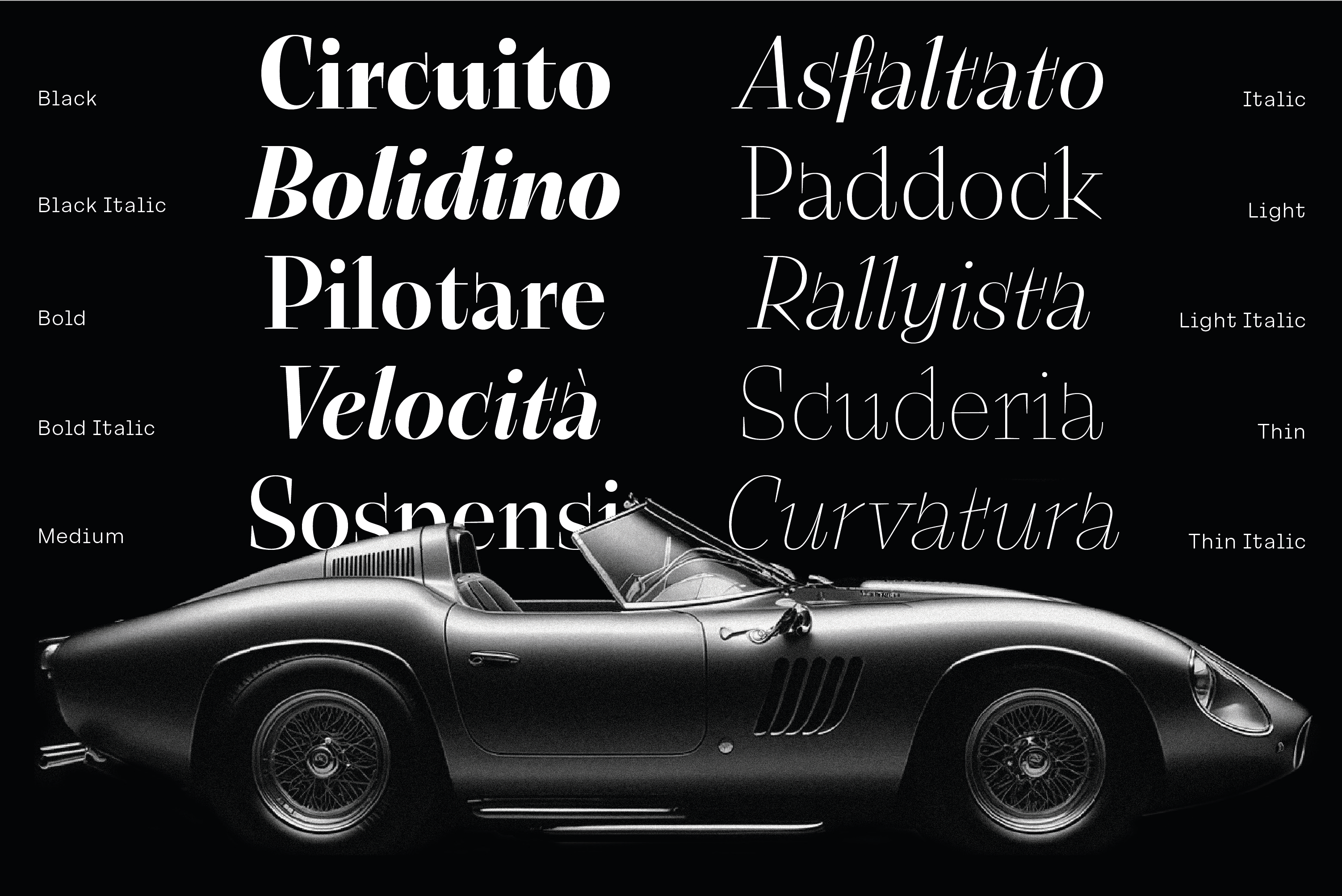
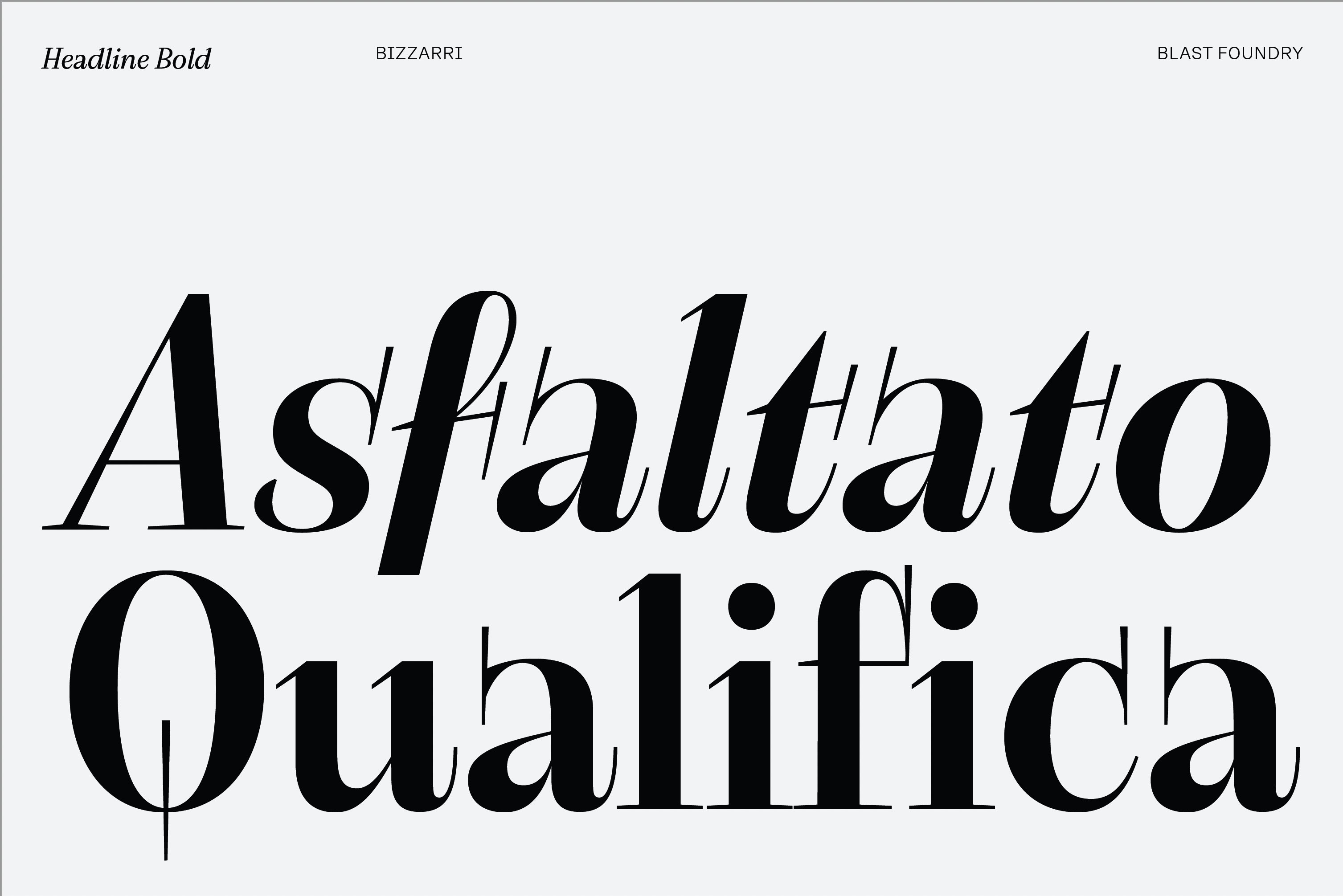
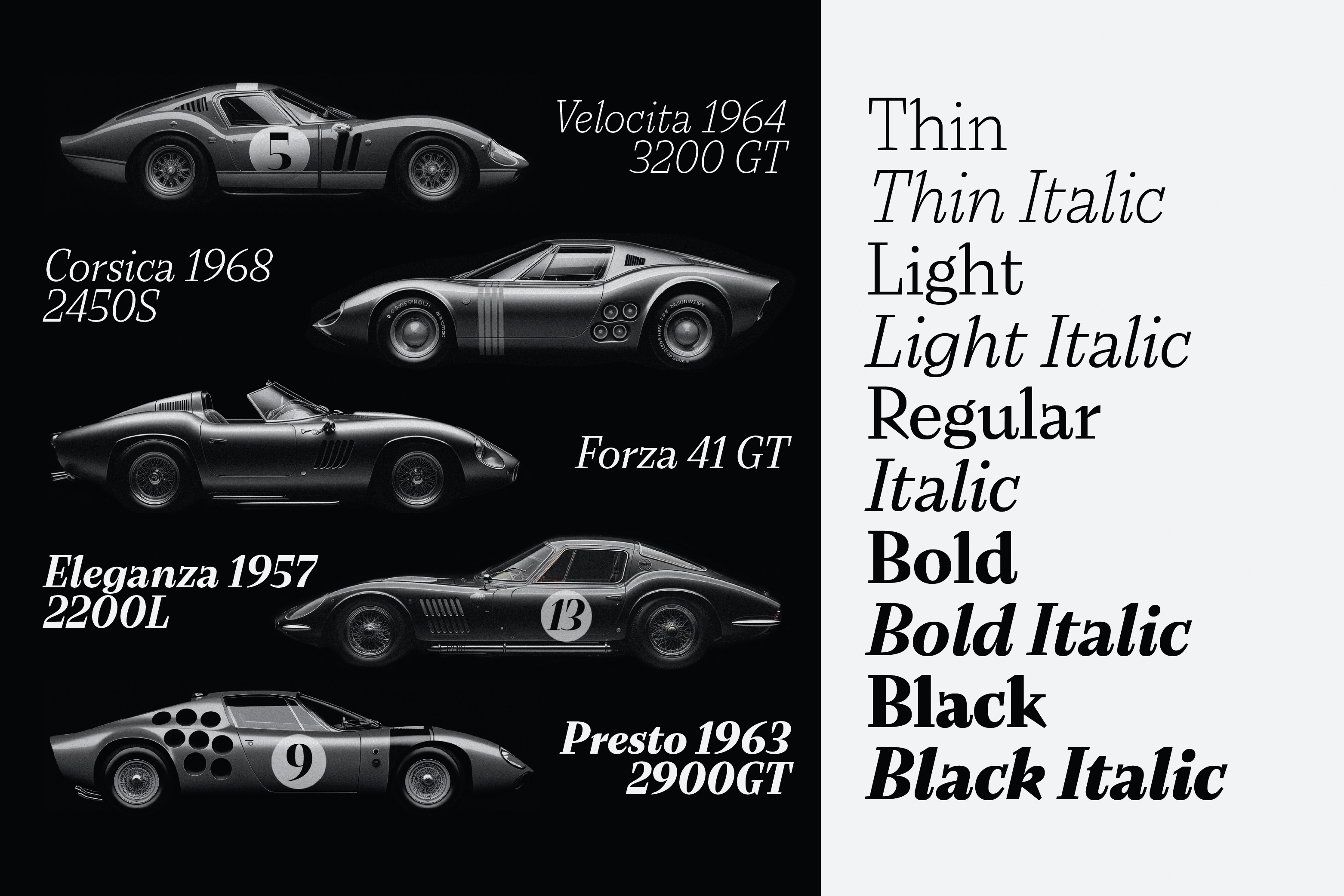
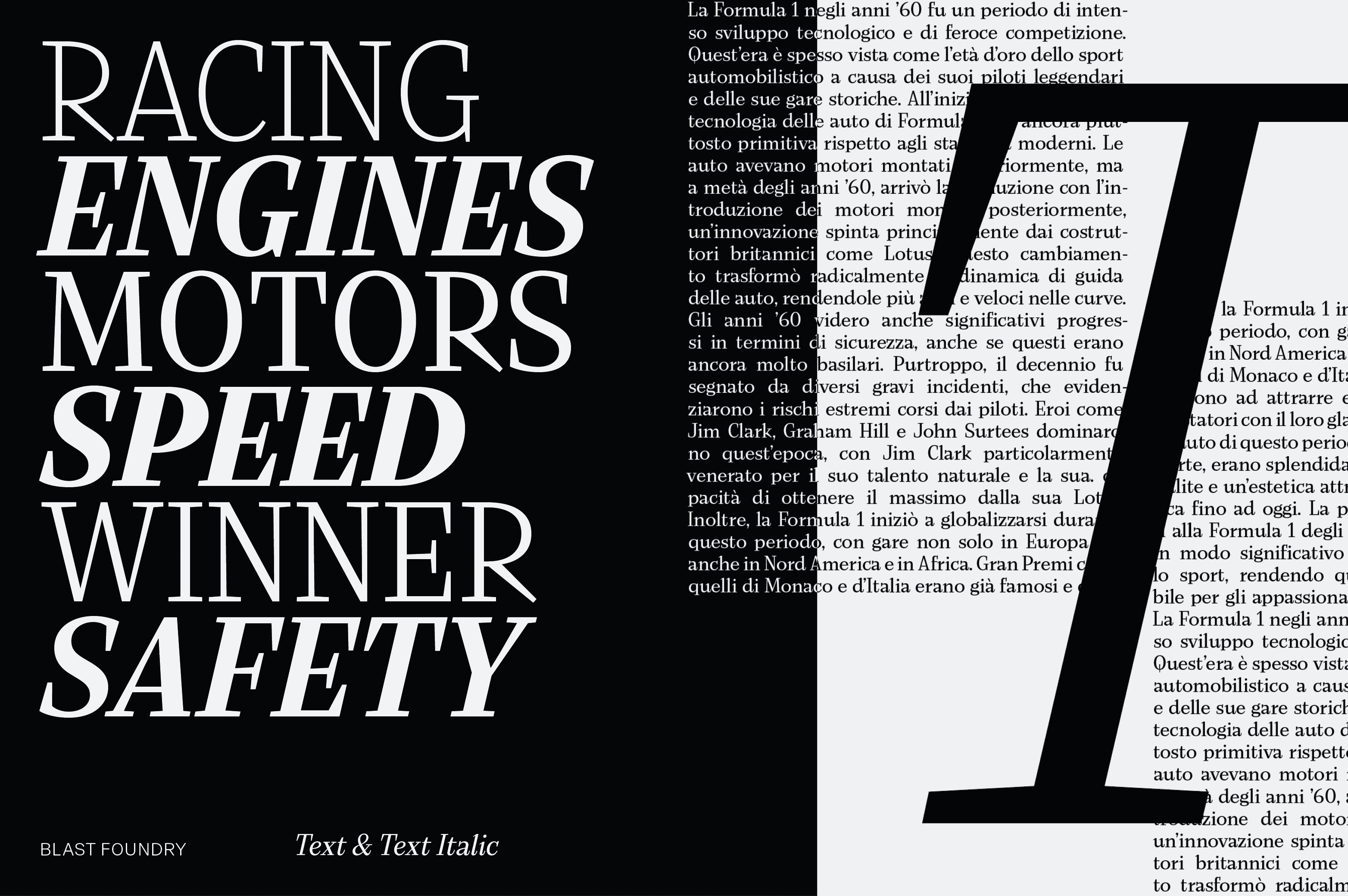
Habt ihr diese ausgefallenen Buchstaben entdeckt: das Versal-R, das Versal-K, das Versal-Q und die tolle Italic-Variante … diese Serifen der Display-Variante … Im Bereich der Magazingestaltung ist die »Bizzarri« auch super variabel einsetzbar, denn es gibt nicht nur den Headline-Schnitt, sondern auch einen gut lesbaren Text-Schnitt. Und sie ist wirklich großartig bis ins kleinste Detail ausgestaltet, vergesst nicht euch die Punzen der Buchstaben und den Negativ Space anzusehen.
I hate shopping, except for fonts.
In 2021, I stumbled across the ‘Bizzarri’ typeface from Diana Ovezea/Blast Foundry via Future Fonts. It blew me away. If you are looking for an unusual design that’s independent, angular, loud, and egocentric with attention to detail, you’ll be on the right track with ‘Bizzarri’.
At first, it might seem like just another serif in the large field of neoclassical/traditional rivals. But far from it. I think it’s a pretty extravagant wolf in sheep’s clothing!
It wasn’t until I took a second look that I realized that the beautiful visuals certainly contributed to making me fall in love – growing up in a Formula 1-crazy family during the ’60s of the last century that was crazy about beautiful cars, I had no other choice!
Have you discovered these unusual letters? The capital R, the capital K, the capital Q, the great italic variant, those serifs of the display sizes … When it comes to magazine design, ’Bizzarri’ can also be used in an extremely versatile way because there is not only the headline cut but also an easy-to-read text cut. And it’s really great down to the smallest detail – don’t forget to look at the letters’ counters and the negative space.