
Designed by Laura Messeguer
Distributed by Type-Ø-Tones
This font review was written in English and translated into Portuguese (BR—below). The Community of Portuguese Speaking Countries (CPLP) is expected to have an additional 110 million inhabitants in 2050, rising to around 357 million people, according to United Nations (UN) estimates.
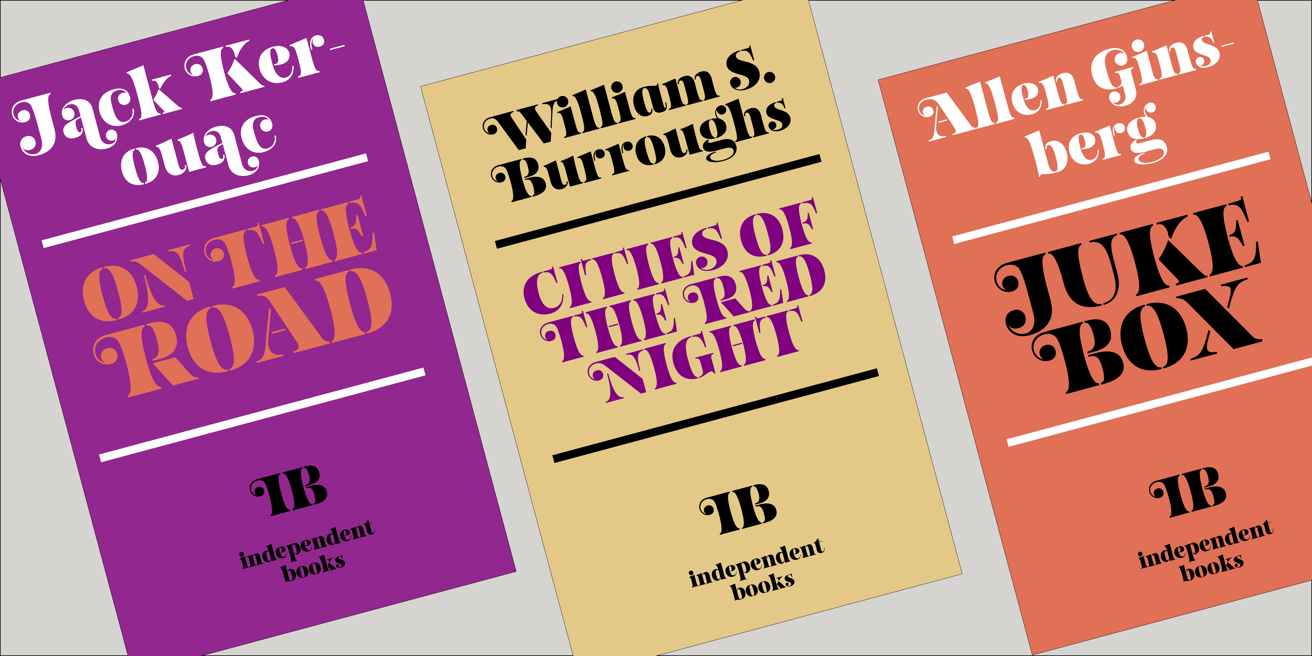
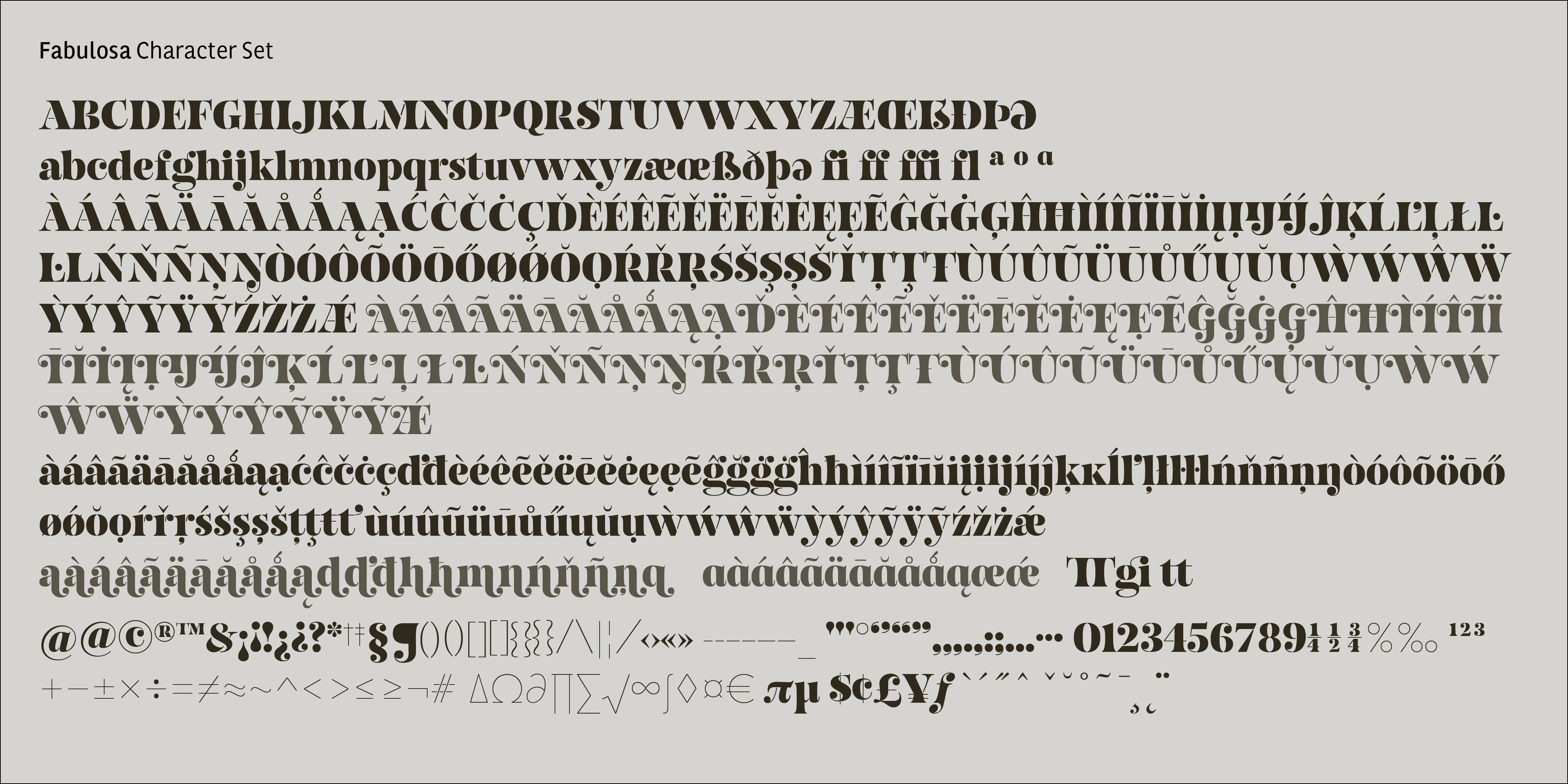
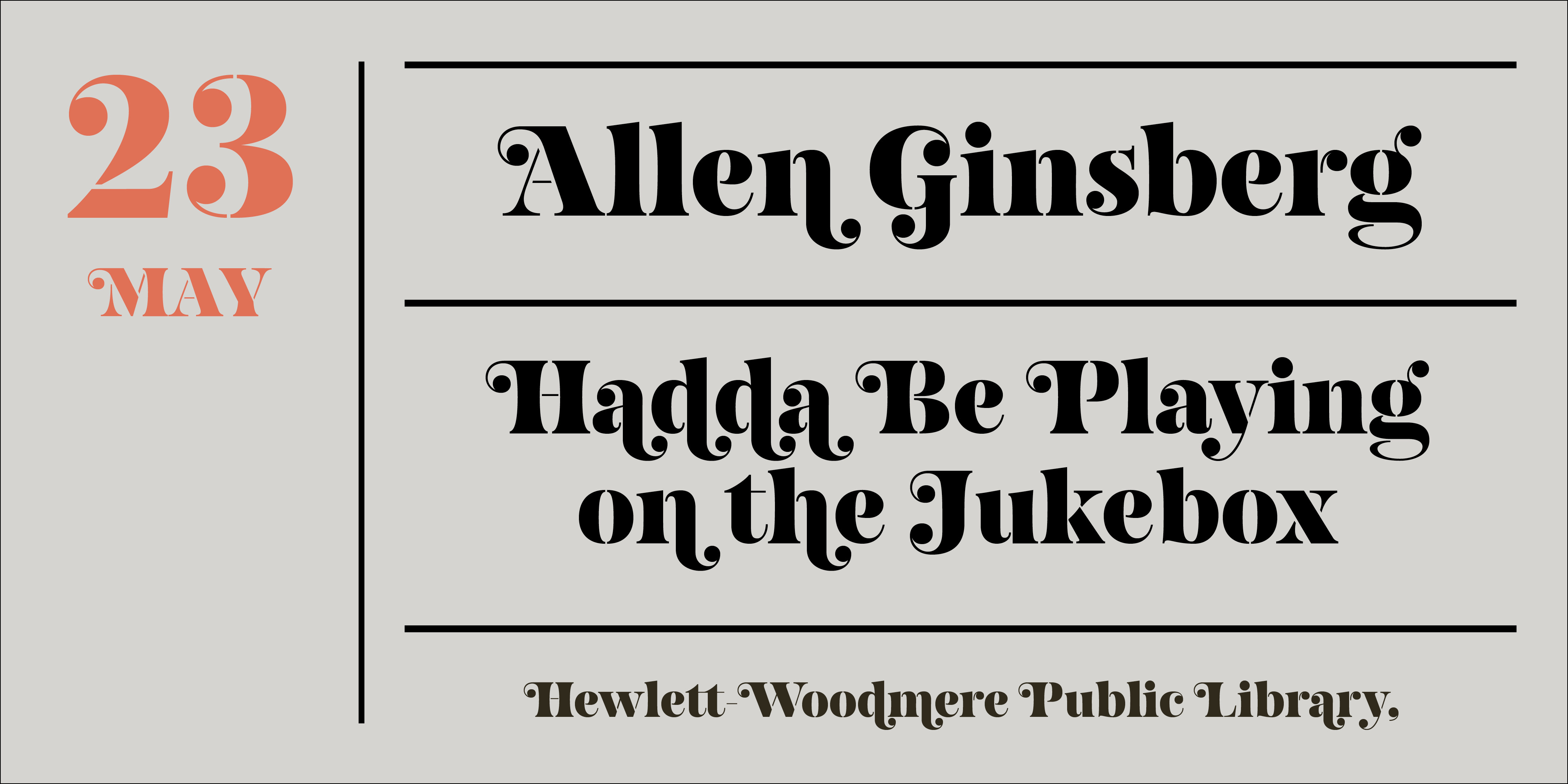
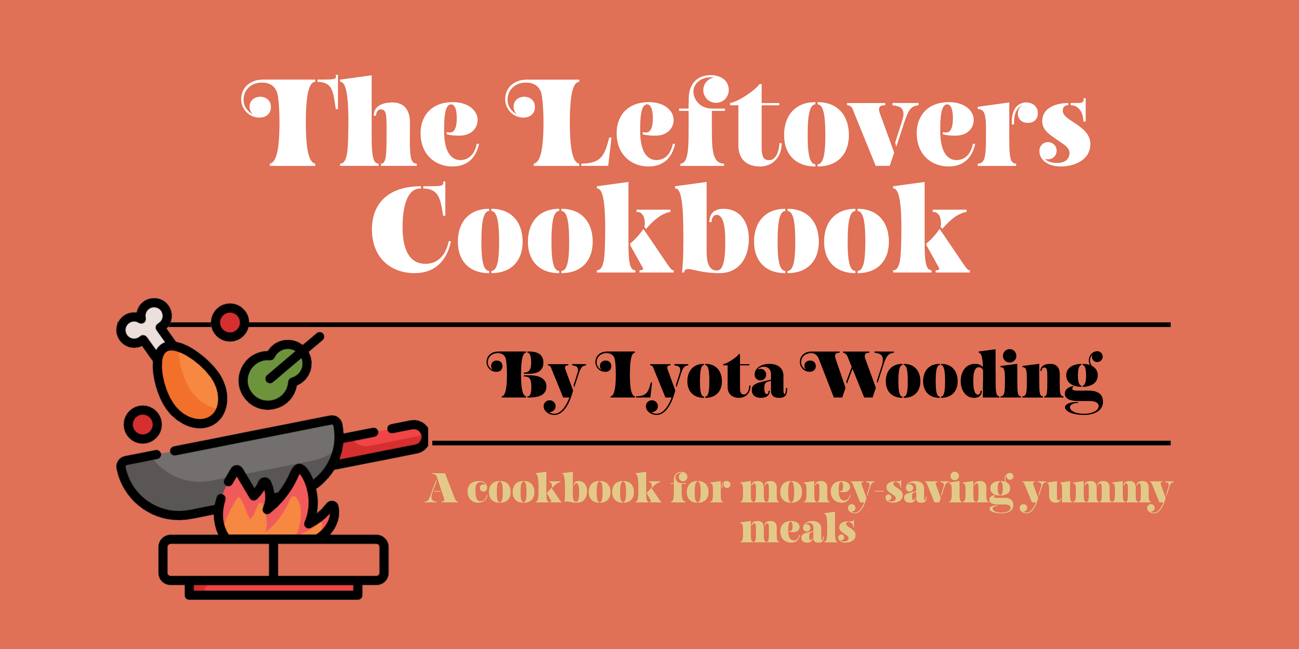
I am thrilled to feature Laura in the Women in Type series finally. She has been on the list since day one. While I originally planned to group 5 pioneer designers of her generation—like Veronika Burian, Zuzana Licko, and Laura Worthington—I can’t leave Fabulosa off my best of the year. A node to the Fat Face style and Ed Benguiat’s Caslon Swash (two of my all-time favorite historical references) that would immediately teleport us to the glamourous 1970s graphic scene if it wasn’t for the surprising stencil twist (which in my mind carries a more edgy look)—a bold, striking, yet retro serif typeface. It’s like colliding Philip Roth paperbacks with the Bauhaus.
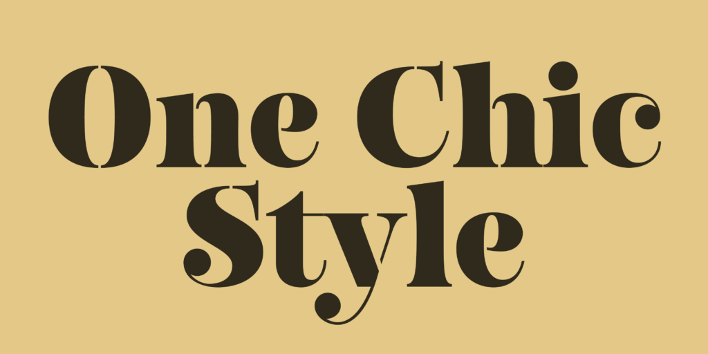
Certainly a statement piece. If I were still working in fashion magazines, I would 100% use Fabulosa in all its decorative glory, with flourishes in upper and lowercase forms. Or Sisters, another beautiful slitted design in Laura’s library. It feels like Laura is in a “stencil phase” as she published another wip typeface on January 6th that has what? You guessed, unconnected strokes. And of course, I couldn’t let slip the double award-winning Ella.
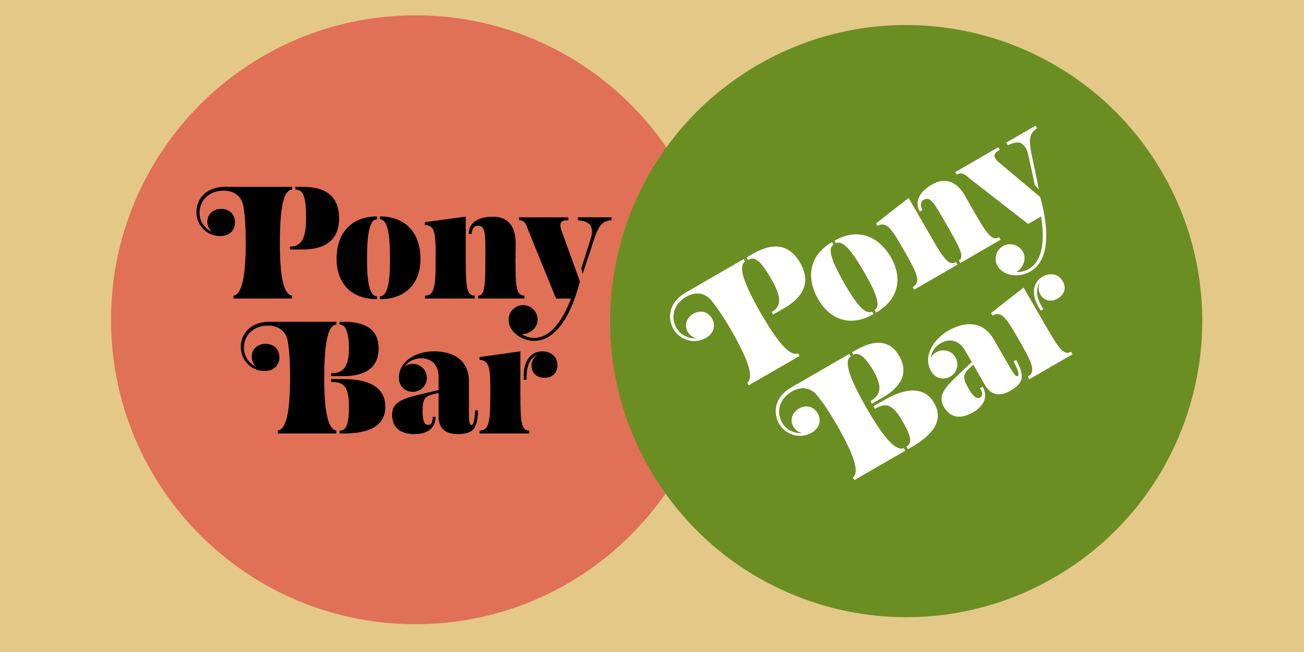
Estou muito feliz de finalmente incluir Laura à minha série Women in Type! Obviamente, ela está na lista desde o primeiro dia, mas mesmo que inicialmente eu tenha planejado agrupar 5 designers pioneiras de sua geração—como Veronika Burian, Zuzana Licko e Laura Worthington—Fabulosa não podia ficar fora das melhores do ano. Um flerte com o estilo Fat Face e a Caslon Swash de Ed Benguiat (duas das minhas referências históricas favoritas), que nos transportaria imediatamente para a glamourosa cena gráfica dos anos 70 se não fosse pelo inesperado recurso stencil (que na minha cabeça dá um ar mais ousado)—uma tipografia serifada marcante, robusta e cheia de atitude, mas com um charme retrô. É como se juntássemos as capas dos livros de Philip Roth com a Bauhaus.
Definitivamente uma peça de destaque. Se eu ainda trabalhasse com revistas de moda, certamente usaria Fabulosa, explorando todo o seu lado ornamental, com floreios em letras maiúsculas e minúsculas. Ou Sisters, outro belo design com fendas da biblioteca de Laura. Aliás, parece que ela está em uma “fase stencil”, pelo post de um novo projeto in progress do dia 6 de janeiro, que tem o quê? Acertou: traços desconectados. E, claro, não poderia deixar de mencionar a duplamente premiada Ella.