
Designed by Bea Korsh
Distributed by Future Fonts
This font review was written in English and translated into Portuguese (BR—below). The Museu da Língua Portuguesa, in São Paulo, is the venue of diverse exhibitions with hands-on activities about Linguistics and Portuguese language developments.
Fellow Type@Cooper alumni Bea Korsh probably graced us with the freshest type release of 2024. Where to start? That I’ve never seen anything like it. Or the fact version 0.1 already has 70 interlocking ligatures. Or maybe the foresaw standalone Inline style—that’s simply dazzling. Let’s take it from the top, Henmania is a stencil typeface with meshed warped strokes and a slightly forward-leaning feel planned to grow to a 5-weight family—a playground of pure creativity!
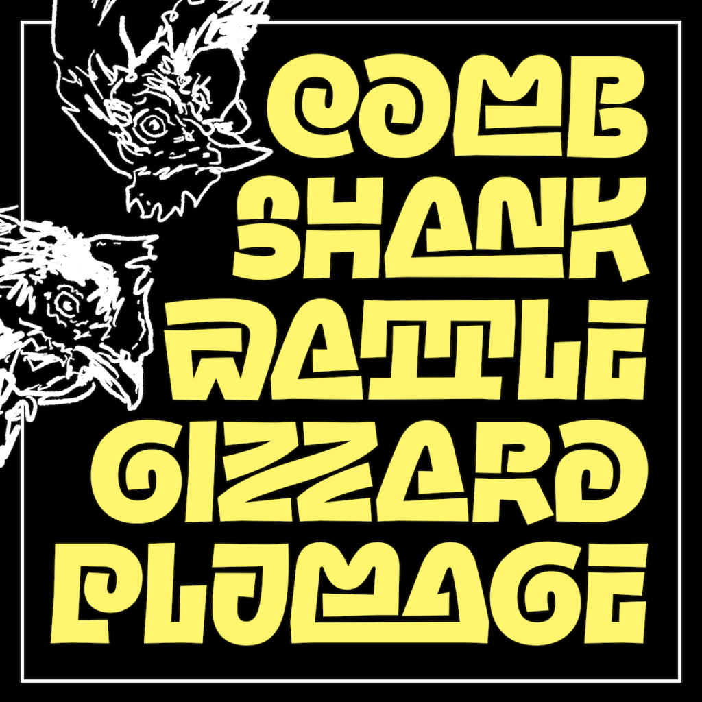
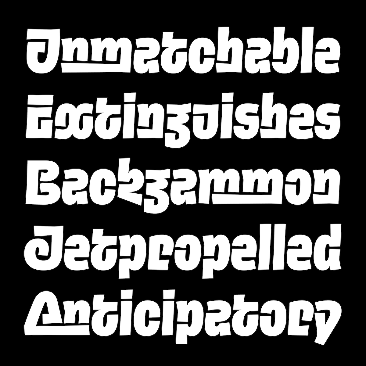
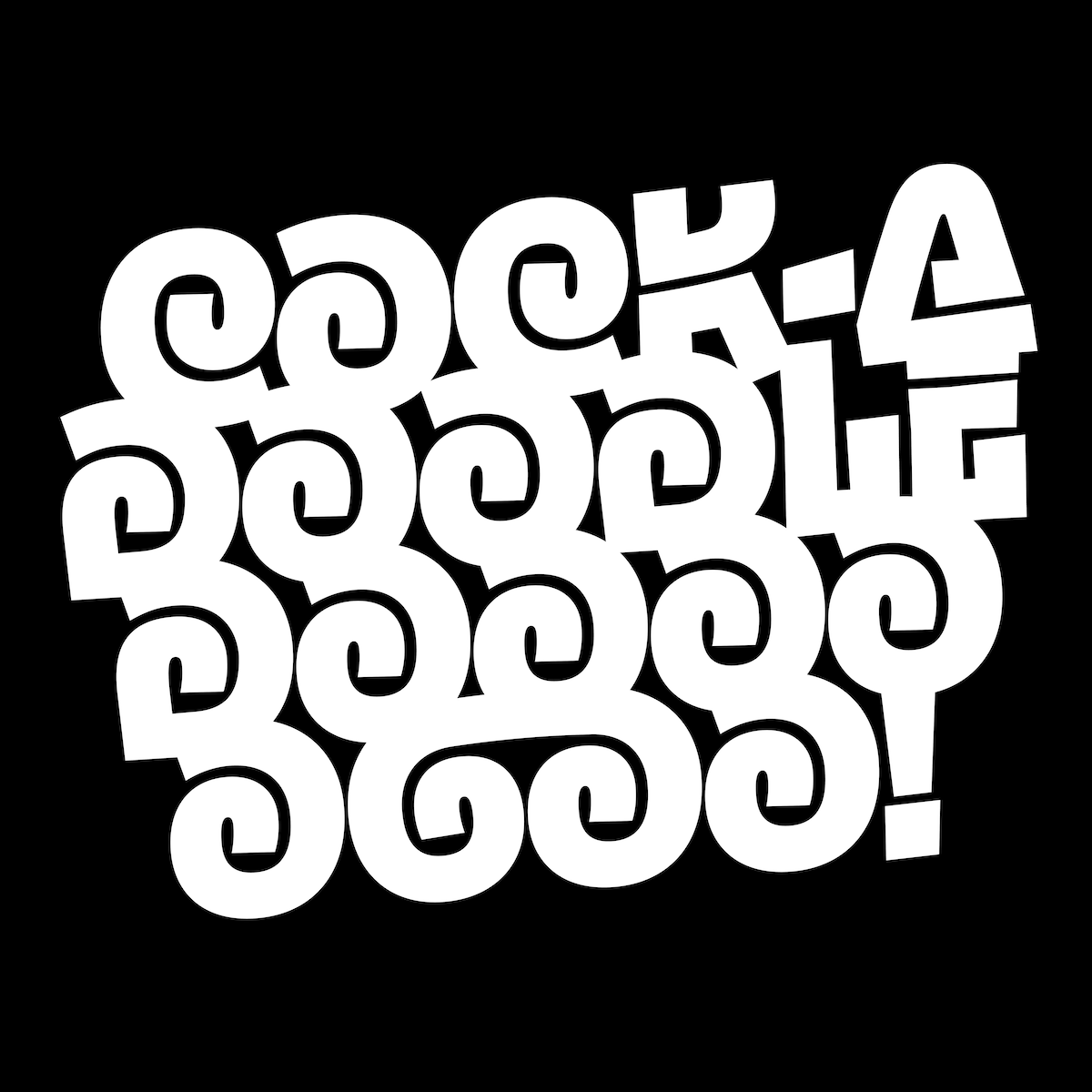
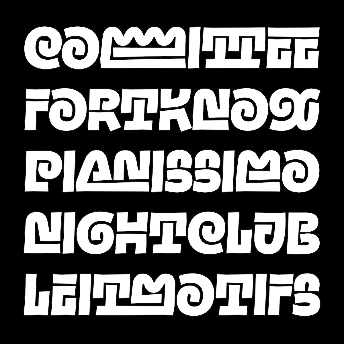


While the all-caps setting is undeniably flashy, with a somewhat pictographic quality (am I the only one who sees a connection to indigenous alphabets here?), the lowercase letters offer pretty interesting solutions as well. The way a and e are almost a flipped version of each other, the inward bottom bar in h, m, n that resembles an italic construction (similarly but opposite in v, w, y), and the continuous stroke in g and k are chef kiss. Crazy headlines? You’ve got it. Pattern machine? Nailed. Glyph pick? Hmmm… ZZ lig is quite high on the list. MM too. Wanna take it for a spin? Find the type testers on her website.
Também formada pela Type@Cooper, Bea Korsh provavelmente nos presenteou com o lançamento tipográfico mais inovador de 2024. Por onde começar? Pelo fato de que nunca vi nada parecido. Ou que a versão 0.1 já conta com 70 ligaturas. Ou talvez pelo futuro estilo Inline—simplesmente deslumbrante. Vamos do começo: Henmania é uma tipografia stencil com traços arqueados interligados e uma leve inclinação, prevista para crescer à uma família de cinco pesos—um verdadeiro playground de criatividade!
Embora o uso em all-caps seja inegavelmente extravagante, quase pictográfico (eu sou a única a ver uma conexão com alfabetos indígenas aqui?), as minúsculas também trazem soluções bem interessantes. O jeito como a e e são quase versões espelhadas um do outro, a barra inferior virada para dentro em h, m, n que lembra uma construção itálica (de forma parecida, mas oposta, em v, w, y), e o traço contínuo em g e k são chef’s kiss. Quer títulos vibrantes? Tá na mão. Máquina de criar padrões? Acertou. Escolher um glifo favorito? Hmmm… a ligatura ZZ está no topo da lista. MM também. Quer testar? É só correr para os type testers no site dela.