
Designed by Veronika Burian, José Scaglione
Available at Google Fonts
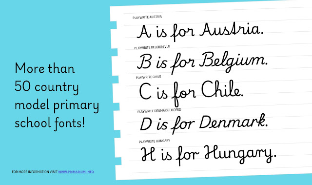
Font family: 4 weights for every handwriting model. 68 handwriting models from 40 countries.
This font review was originally written in Spanish. In Colombia alone, there are more than 43 million native Spanish speakers. English translation below.
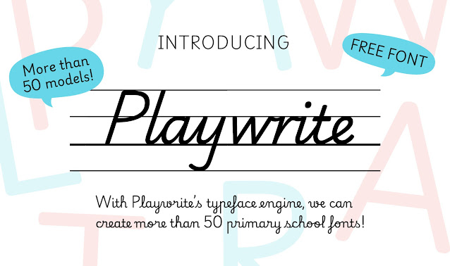
Las fuentes tipográficas suelen pasar desapercibidas, pero su impacto es profundo. Como demuestra Playwrite, pueden trascender su función estética para convertirse en puentes educativos. Detrás de cada trazo de lápiz hay un mundo de conexiones neuronales, memoria y creatividad. Aunque vivimos en una era digital, aprender a escribir a mano sigue siendo un pilar formativo esencial. El desafío surge cuando cada región del mundo enseña este arte con estilos y métodos distintos. La solución llegó de la mano de Playwrite. Diseñada por Typetogether y disponible en Google Fonts, Playwrite es más que un conjunto de letras. Es una herramienta pedagógica que se moldea a las particularidades de más de 40 países, desde la cursiva vertical de Francia hasta la escritura simplificada de Finlandia.
Todo comenzó con una paradoja: mientras las escuelas insisten en la importancia de escribir a mano, muchos estudiantes luchan contra métodos obsoletos o recursos desiguales. Veronika Burian y José Scaglione, sus creadores, descubrieron que no existe un estándar universal. Tras investigar durante 18 meses en colegios de cuatro continentes, diseñaron Playwrite como un diálogo entre tradición y ciencia. Cada versión respeta los rasgos culturales locales, pero incorpora bases neurocognitivas que favorecen la motricidad y la retención.

Lo revolucionario está en su accesibilidad: al ofrecerse gratuitamente, esta tipografía rompe barreras económicas y geográficas. Un niño en México o Vietnam encuentra una letra familiar, pero optimizada para sostener el lápiz sin fatiga o escribir con claridad. Así, algo tan cotidiano como una fuente se convierte en un acto de empatía global: reconocer que, aunque nuestros trazos sean distintos, todos merecemos herramientas dignas para dar forma a las ideas.
Para comprender el alcance total del proyecto visita el sitio web: Primarium
Fonts often go unnoticed, yet their impact runs deep. As Playwrite demonstrates, they can transcend aesthetics to become educational bridges. Behind every pencil stroke lies a world of neural connections, memory, and creativity. Though we live in a digital age, learning to write by hand remains an essential educational pillar. The challenge emerges when every region of the world teaches this art with distinct styles and methods. The solution came from an unexpected place: Playwrite. Designed by Typetogether and available on Google Fonts, Playwrite is more than a set of letters. It’s a pedagogical tool shaped to the nuances of over 40 countries, from France’s upright cursive to Finland’s simplified print.
It all began with a paradox: while schools emphasize the importance of handwriting, many students grapple with outdated methods or unequal resources. Veronika Burian and José Scaglione, its creators, discovered there is no universal standard. After 18 months of research in schools across four continents, they designed Playwrite as a dialogue between tradition and science. Each version honors local cultural traits while integrating neurocognitive principles that enhance motor skills and retention.
What’s revolutionary is its accessibility: by being free, this typeface breaks economic and geographic barriers. A child in Mexico or Vietnam encounters a familiar letter style—but optimized to hold a pencil without fatigue or write with clarity. Thus, something as everyday as a font becomes a global act of empathy: recognizing that even though our strokes may differ, we all deserve dignified tools to shape our ideas.
To understand the full scope of the project, visit the website: Primarium