
Designed by Robin Mientjes
Distributed by Tiny Type Co. & Fontstand
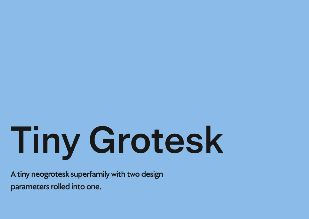
Typeface family: 4 weights, 3 widths, and 3 optical sizes. 12 fonts
This font review was originally written in Spanish. English translation below.
Tiny Grotesk es la superfamilia neogrotesca sans serif de Tiny Type Co, la fundidora de Robin Mientjes. Tiene dos estilos o parámetros extremos que la definen y aggiornan este estilo, con raíz en principios del siglo XX, a la contemporaneidad. Tiny Grotesk toma su inspiración del linaje neo-grotesco marcado por referentes históricos como Helvética, Univers y Folio.
Es de destacar las decisiones de diseño que la vuelven única: las formas compactas de sus signos; el trazo uniforme y el particular cuidado en sus proporciones. Las estructuras de los signos minúsculos son más regulares y quizás hasta más racionales; pero los signos mayúsculos presentan características y detalles que los vuelven más orgánicos sin perder funcionalidad. Aún con mucha personalidad no deja de ser una familia pensada para usos muy definidos, como identidades corporativas, sitios web, aplicaciones mobiles e infografías, entre otros. Esto se debe a que usualmente estas sans son catalogadas como neutrales. Pero Tiny dialoga con sus referentes y presenta una propuesta propia tanto para su estilo condensado como el expandido, sus extremos.

Las decisiones ejecutadas en el estilo condensado, como pueden ser sus trampas de tinta y la optimización en ciertos caracteres, fueron tomadas para que sea altamente legible en tamaño pequeño. Un detalle que concierne al espaciado es que sigue otro linaje histórico, el de Ludovico Arrighi, de la Divina Comedia en la edición de Aldo Manuzio. Retoma el ritmo del espaciado de esta itálica buscando un paisaje visual que le aporta un twist. La versión expandida explora el otro extremo, los usos display o en gran tamaño. Se ve una pronunciada exageración en el contraste de los detalles de los trazos y remates. La familia también presenta gran versatilidad para usos en una variada cantidad de idiomas y posee un set amplio de dingbats y símbolos especialmente seleccionados, otro detalle que la hace sobresalir.
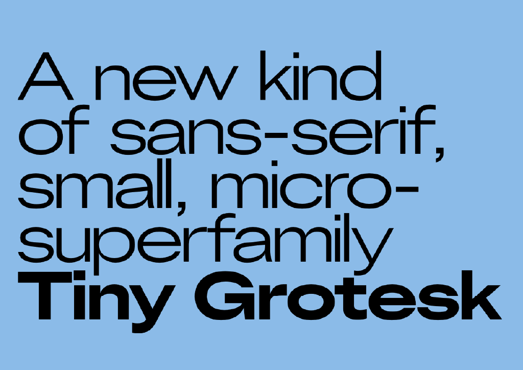
Tiny Grotesk is a superfamily with two design parameters rolled into one, bringing traditional features to contemporary needs. The consistency of the lowercase compact shapes and the rhythm of the uppercase characters create beautiful lines while writing.
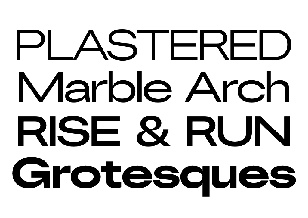
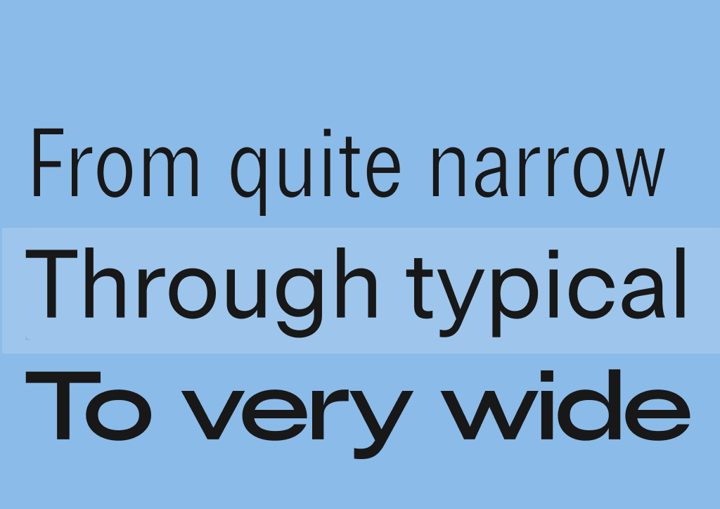
Rooting its inspiration in mid-20th century neogrotesk designs that follow the tradition of Helvetica, Univers and Folio. The family has almost no contrast, giving the feeling of a monolinear. It also follows tradition when looking at proportions and the structure of the characteres: rational and calculated to the detail, yet organic and functional. Usually considered a modern style, grotesques are catalogued as neutral. The typeface has a bundle of personality, a grotesque design that’s been re-birthed and follows flawlessly on its historic Influences, making it a great choice for corporate projects, web design, mobile apps, infographics, digital publishing, advertising, text, and more. The superfamily entertains a range in width, that also behaves as optical sizes: Narrow is meant for small use, and Wide is intended for big use. The family also has a lot of typographic depth with language support, diacritics and mark to mark positioning features available, making it a bold yet solid choice. The family also features a very nice selection of dingbats and symbols.
What stands out in the narrow style are its details. Ink traps make the letters readable and distinct at ‘tiny’ sizes. The spacing has also some powerful decisions that make the textural rhythm stand out. According to Robin, the lowercase follows closely the rhythm of Aldus Manutius’s and Ludovico Arrighi’s italics as seen in Dante’s Divine Comedy. This clever decision brings the textural rhythm of 1500s italic handwriting to a neogrotesk system reinforcing its uniqueness. The wide style is optimised for big sizes. Decisions here like the compact spacing and exaggerated connections with high-contrast stroke details, make this style show off in display uses.