Since the design and lettering of the ‘lowly’ American penny has already been well-documented and researched by honorary Alphabette Tobias Frere-Jones, I’ve settled on an even lowlier topic: the penny tray. If you’re American, or have spent time in the clusterfuck that is currently the United States, then you know what I’m talking about. Found at the cash registers of gas stations, diners, and other small businesses, the object serves as a convenient place for customers and cashiers to dispose of, or acquire, a penny or two (but c’mon deadbeat, don’t even think of taking more than a few).
The basic tray features the phrases “LEAVE-A-PENNY / TAKE-A-PENNY” in subtly extruded shouty-caps that flank the top and bottom of the main bowl. A promotional logo adorns the front of the tray, promoting things like a local newspaper, state lottery, or community bank.
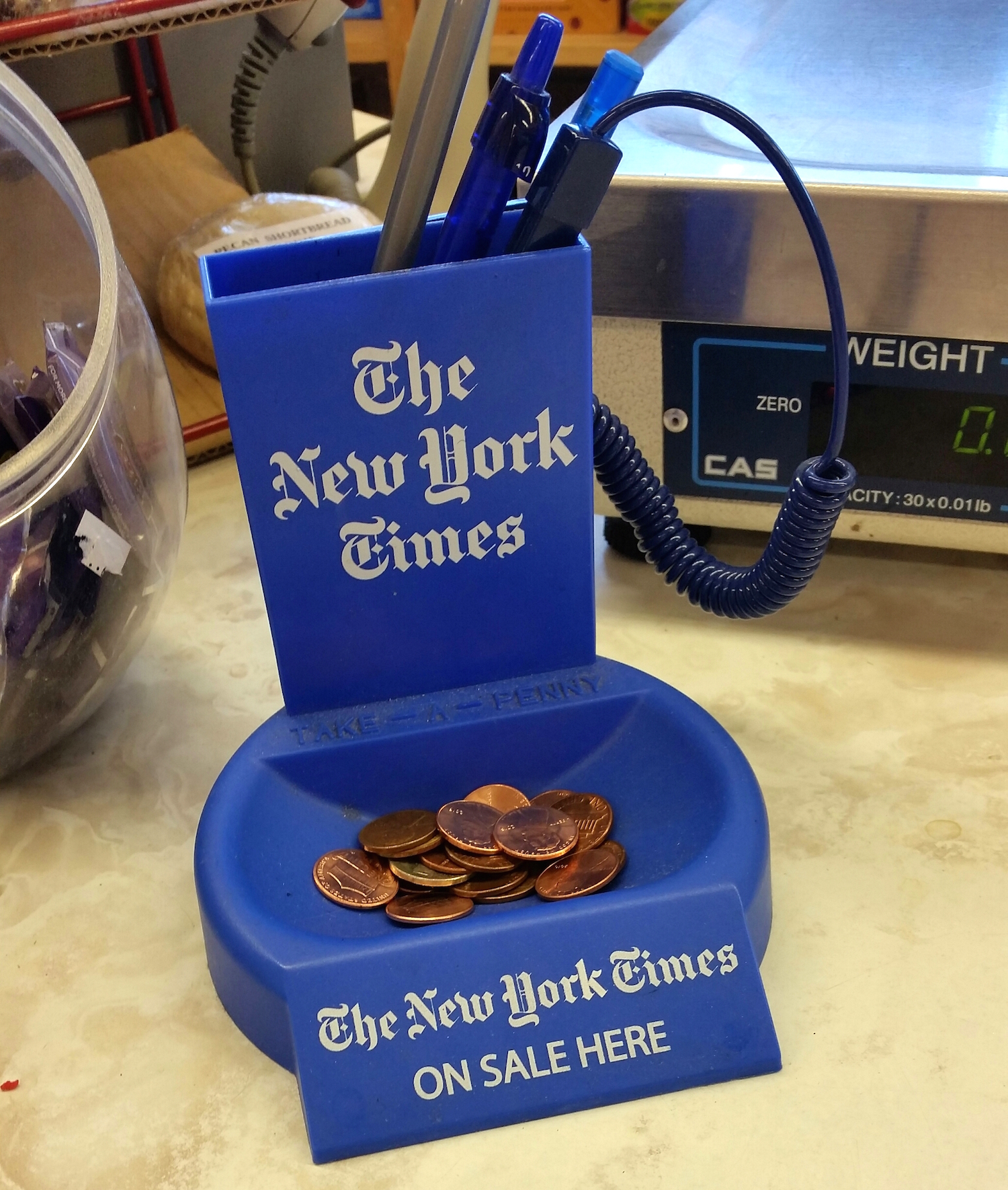
The fancy one at my local pharmacy includes a pen holder, but drops the LEAVE-A-PENNY from its façade. It knows that you know what to do if you’re a decent human with an extra penny to spare. No pressure or anything. I like that passive aggressive energy in my penny trays.
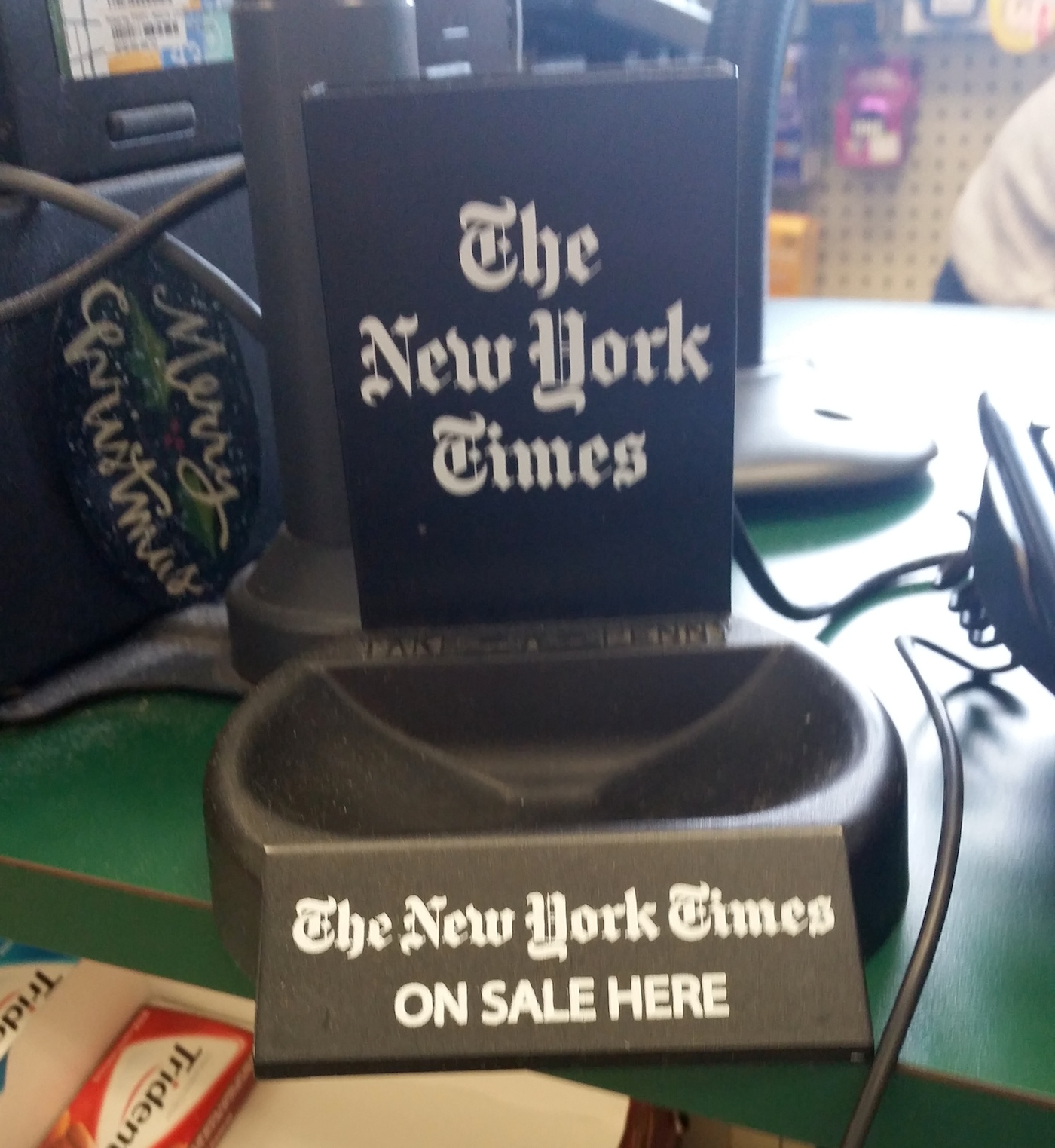
Fancy tray at the local pharmacy cash register. This tray seemed a bit neglected and, um, penniless. Apologies for the blurry image, I was trying to not look like a weirdo taking a photo of a penny tray.
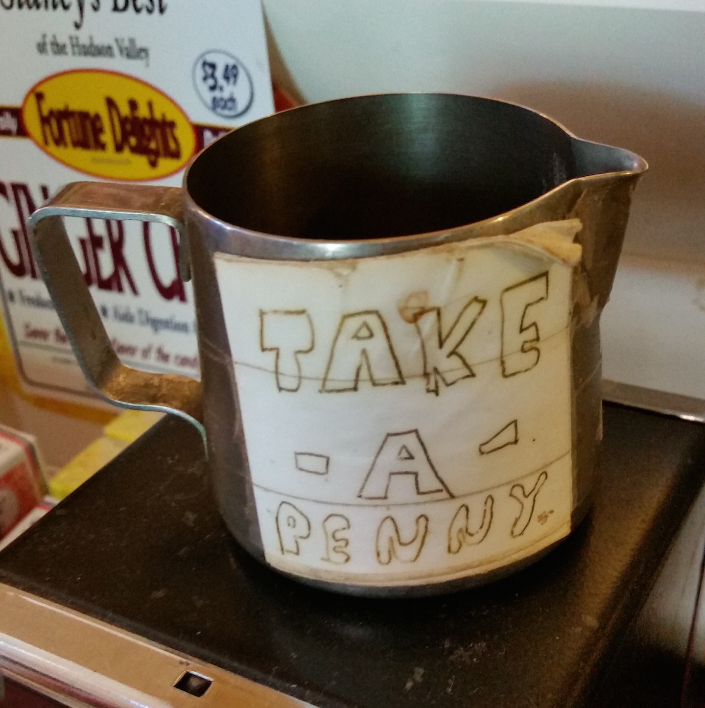
Not all penny trays are created equal. And frankly, why would we want them to be? When small businesses go rogue and decide not to purchase one of these standard trays, things start to get fun, at least from a vernacular visual communication standpoint.
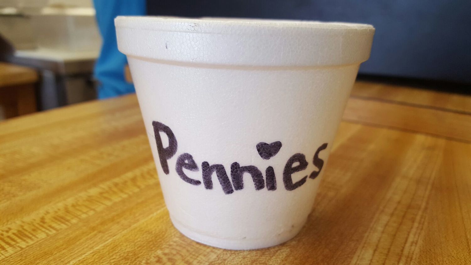
Penn♥es. I love the friendly nature of this homemade penny cup. The heart over the ‘i’ makes it feel compassionate. You’ll always know those pennies will be loved, long after we’re all dead and that styrofoam cup is still sitting in a landfill. And by the way, when are type designers going to get their act together and start including an alternate i with a heart for the tittle?
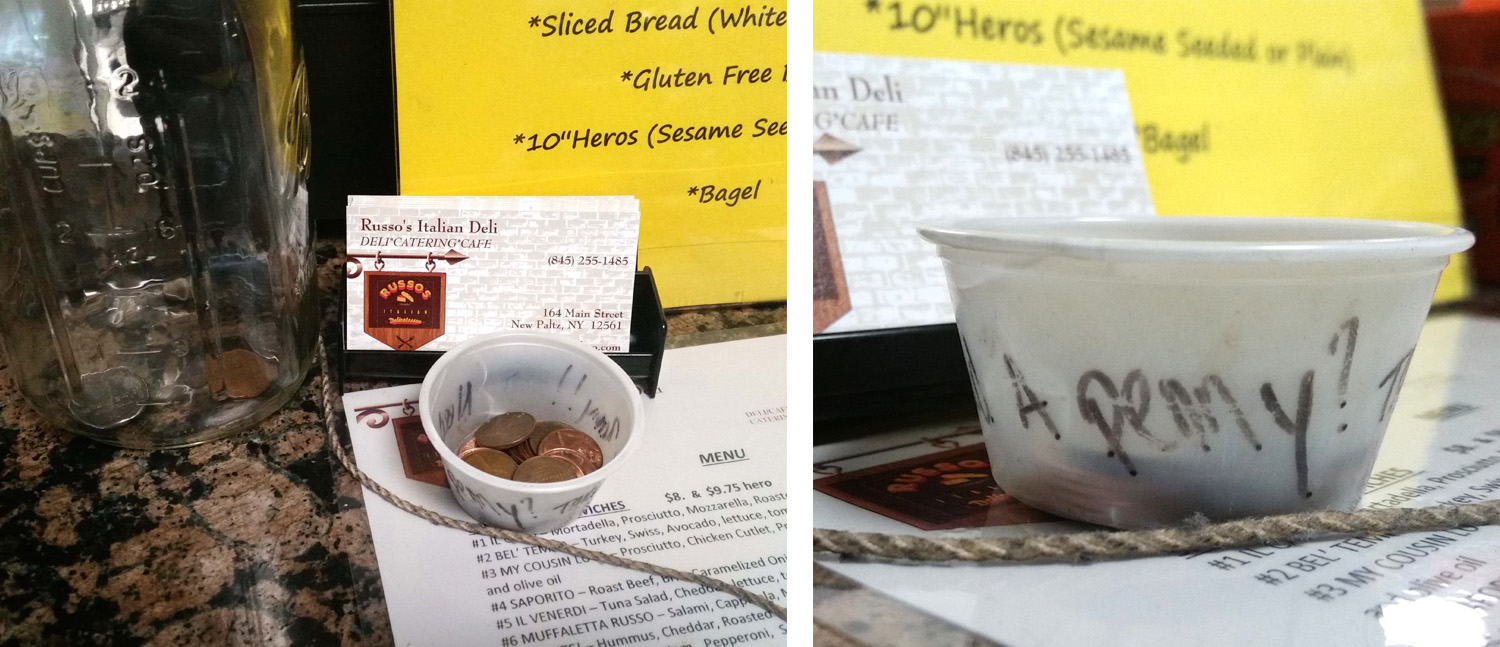
Found at one of my favorite lunch places, this little plastic cup, intended for takeout helpings of salad dressing or ketchup, uses the entire circumference to ask and offer: Have a penny? Take a penny!! Honestly, the visual presentation of this penny cup leaves much to be desired, but I’m glad they’re focusing their attention on making the best focaccia bread instead.
*UPDATE* Found this one, today (several weeks after this post was originally published):
Penny trays are relatively easy to spot in my small town that prides itself on a ‘shop local’ culture and practically breaks out in riots everytime a big box store tries to settle anywhere near its borders. However, the penny tray is becoming an endangered species. They have already disappeared from Canadian checkout counters, since the Canadian penny was discontinued a few years ago. One wonders about the penny tray’s cultural relevancy these days, as more people pay with plastic or phones and our checkout counters are filled with frustratingly complex touch screens. One shop owner told me that a college student recently asked why there was a cup of pennies sitting on the counter. Sigh.
Now that I’ve been spending the past few weeks noticing penny trays in my surroundings, I hope you might do the same. And if you come across an interesting one, please confuse your cashier by snapping a quick photo for me (comments are open).
I thought I’d end this post with some corny analogy about how the penny tray is a reflection of small-town American culture, take something if you need it, leave something if you can. About how it signifies a resistance to the faceless corporate retailers and soulless debit or credit cards. About how it embraces the ethos of the little mom-and-pop store that cheerfully, and sometimes creatively, offers its patrons a few pennies when in need. But I’m sitting here watching this steaming pile of garbage, otherwise known as the Republican National Convention, and feeling pretty hopeless. Maybe we’ve all just become too cynical, too fearful and too divided to keep our collective penny trays filled with these small gestures of kindness. The next time I’m at the pharmacy, I’m going to make it a point to leave a penny or two. It’s time to make the penny tray great again, or something.
This post is part of My 2¢, a short series on money-related type and lettering examples, stories and thoughts. You can read the rest of the series here.

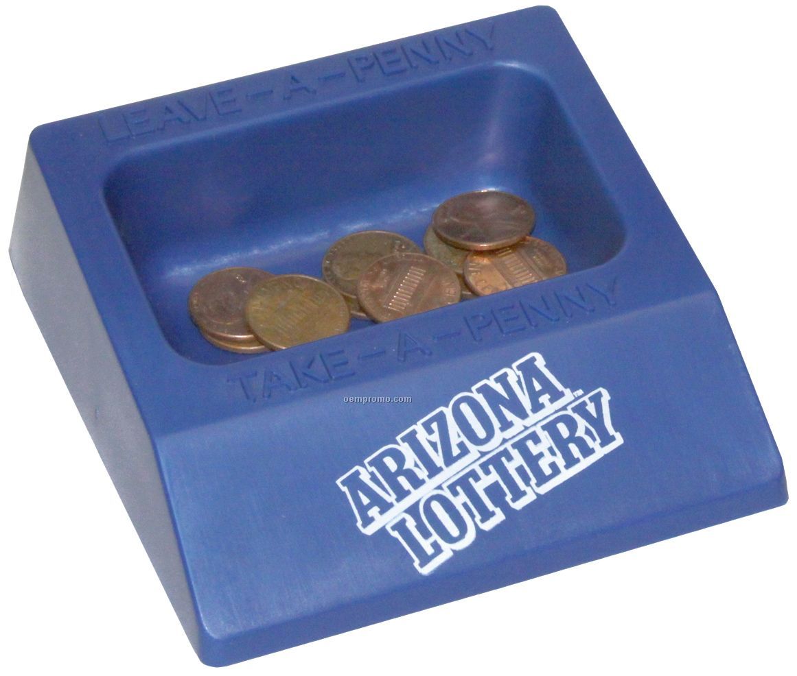
Ones around here (Detroit) often have:
NEED A PENNY?
TAKE A PENNY
HAVE A PENNY?
GIVE A PENNY
Love the article- Have been trying to convince my boss to put one at the register of our ‘small-town’ bakery outlet store. People eye-ball the area for a place to toss their ‘penny-or-two’ change,& just leave them on the counter. (I use one when she’s not there; it varies from a red custard cup, tea cup, & a 4 inch mini pie tin. I couldn’t believe I actually found an article. I’m printing it & hope your article will warm her up to the idea once and for all. She thinks they’re tacky and stupid…
Thanks for reading, hope it helps!