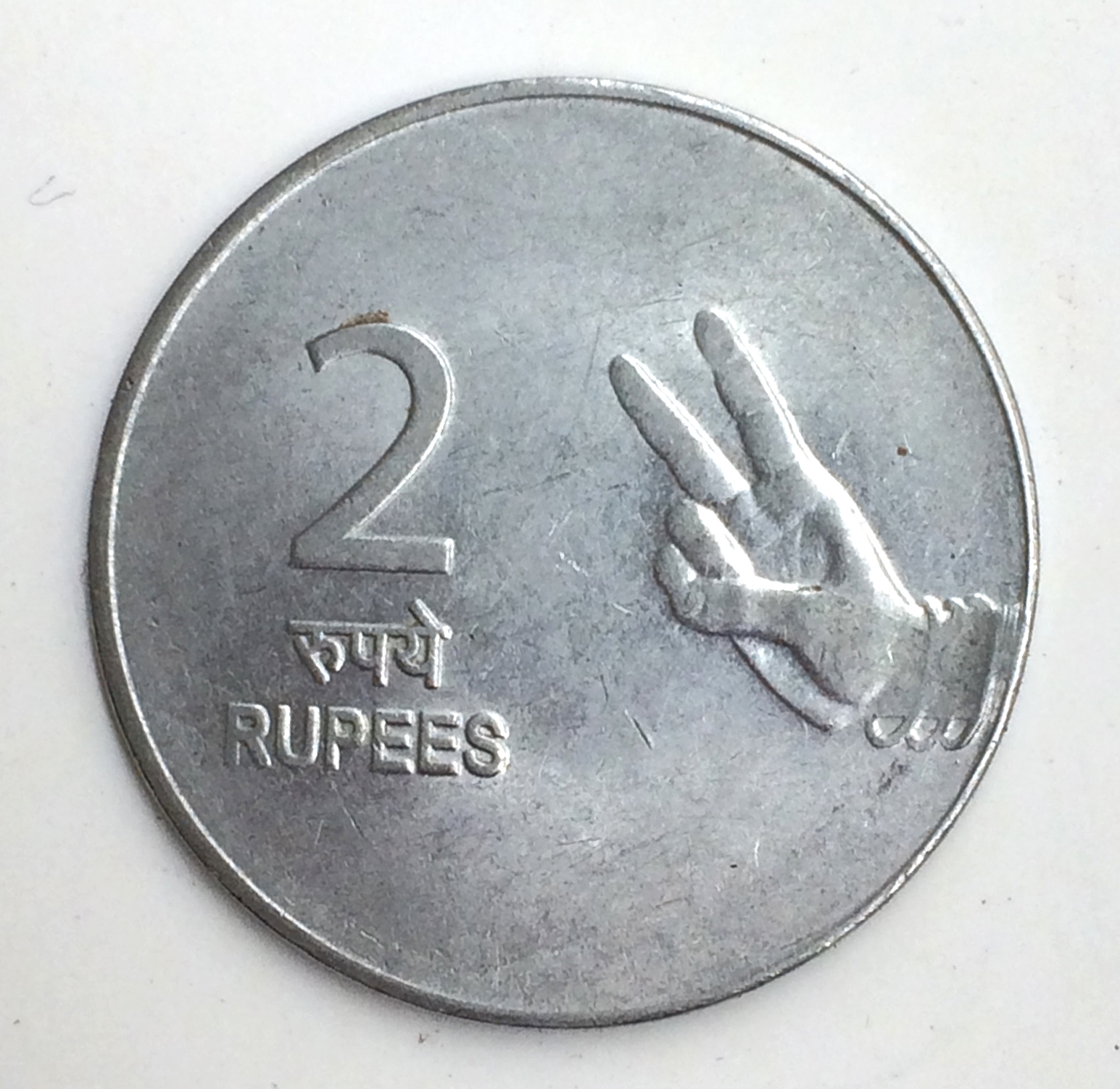
Travelling to India changed my relationship with money. When there, I am suddenly in possession of wads of bills in denominations of multiple zeros that I could never hope to ever see, let alone hold. Rupee coins are not as much a part of my experience there, and use them as other Indians do, to give money to people on the street or tips to drivers.
This coin is a design from the past 20 years or so, although I doubt it is is still being minted. Instead of a scene, or nationally-flavoured object or animal, one half of the back features a large numeral ‘1’ or ’2’ with ‘RUPEES’ in both English and ‘रुपये’ Hindi in the Devanagari script. The other half features a ladies’ braceleted hand with a ‘thumbs up’ on the One or two fingers in a ‘v’ shape on the Two. As a fluent speaker of sign language who thinks of words in hand shapes just as much as the shape of the letterforms, it is an interesting approach to accessibility, if that was the intent. I’ve never seen anything like it, that is, combining coins and literacy efforts.
But I don’t know if it actually works. One of my closest design colleagues in India hates this coin. She remarked that illiterate people would probably memorize the shape and color of the coin, rather than look at the hand. She has a point, and I just might agree with her. Or then again, I might not and just marvel at a country that in trying to address illiteracy issues, changed how an everyday object communicates to all people.
This post is part of My 2¢, a short series on money-related type and lettering examples, stories and thoughts. You can read the rest of the series here.

