I often find myself looking at things that go unnoticed or that people just don’t care about. Coins are invisible design items for most people. We often use size and color to differentiate one from each other, but we rarely look at them closely. I have heard once that the design of a stamp was one of the most challenging and uplifting commissions a graphic designer could get. There are probably many more constraints in the design of a coin, but you would agree with me that it would be a really interesting project for a type designer.
I would like to share with you some thoughts on the design of a particular coin, the extinct Spanish peseta. It was the currency used in Spain from 1868 to 2002, when the euro was introduced. As a side note, it is one of the few examples of a coin with a female name. I was able to collect some historical models of the peseta coins which took me to dark times in our country. The coins became a symbol of political power and the images and text engraved on them were used to reinforce the establishment.

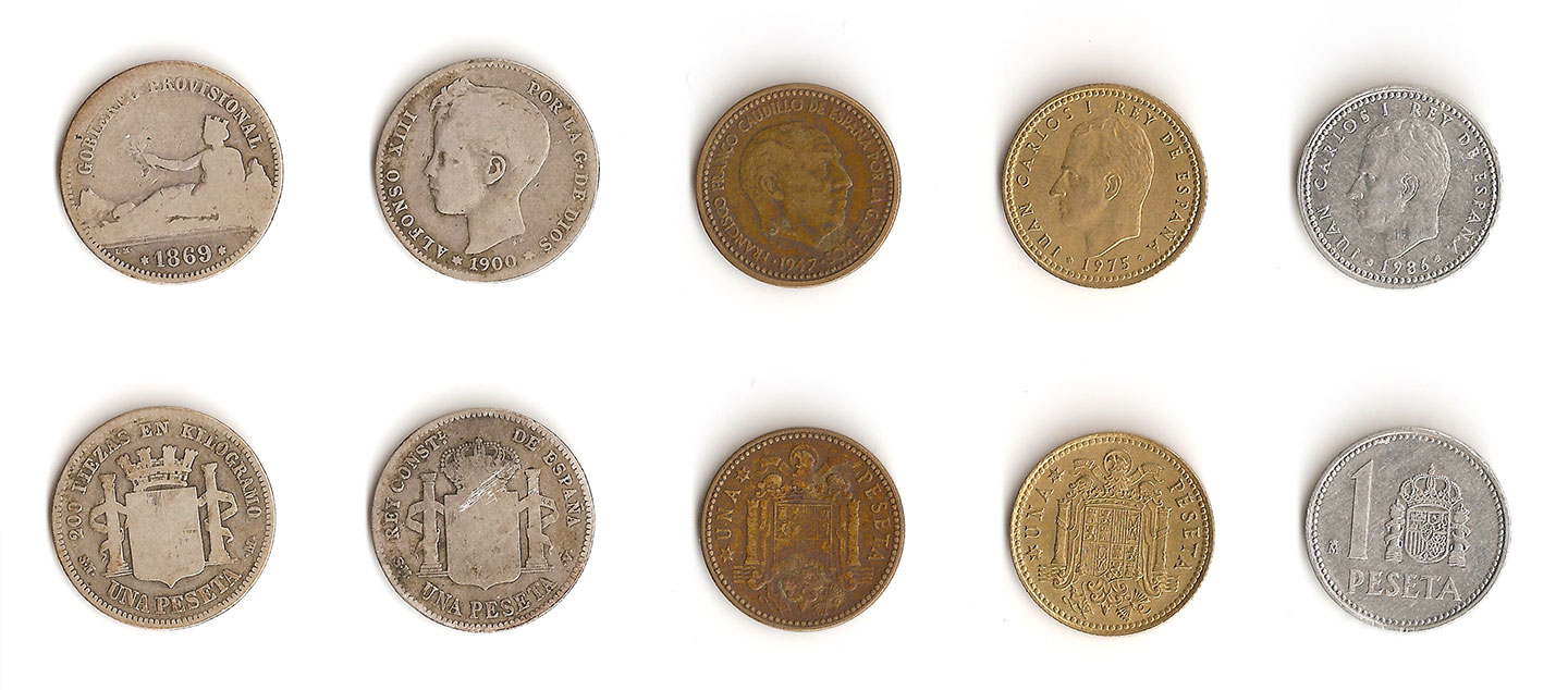
The two sides of 5 historical models of the 1 peseta coin. From right to left, peseta from 1869, 1900, 1947, 1975 and 1986
The first models of the 1 peseta coin included high-contrast serif typefaces, which were substituted after the II World War by a glyphic style. This was probably a good alternative for saving space, but they could also be seen a as symbol of authoritarianism —the laws, as letters carved in stone, were permanent and immutable.

Text engraved in three models of the 1 peseta coin from 1900, 1947 and 1986
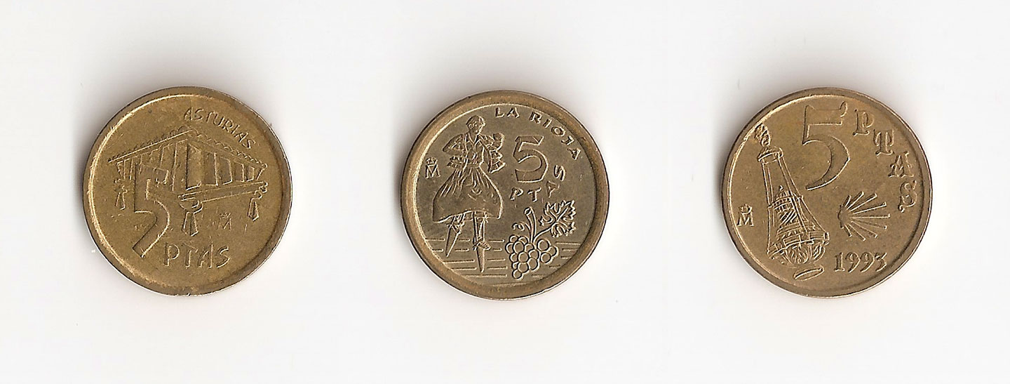
It was not until the late 1980s that the last models of the peseta coins showed more typographic diversity. The layout was less rigid and the typefaces more informal. We could argue, though, there was a lack of consistency in the design.

The new 5 ptas. coins portrayed scenes of the 17 Spanish regions and displayed different typefaces. From right to left, samples of the Asturias, La Rioja, and Galicia coins.
The last model of the 1 peseta coin was very light and small. It weighed less than 1 gram and it was 14mm in diameter. This new coin was highly criticised, people complained about its size and weight because it was really easy to lose. The new standard defined a direct link between value and coin size. The least valuable coin was the smallest and the most valuable one was the biggest.

Comparison of size between different international coins. From left to right, Danish krone (1992), British penny (2014), American cent (2009), Hungarian forint (2004) and Spanish peseta (1996)
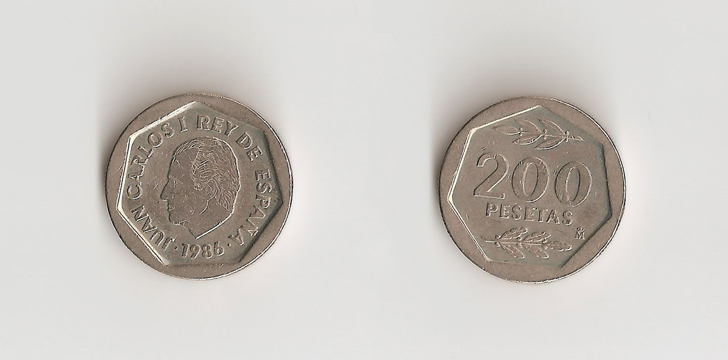
Coins and paper money emphasise figures over letters. Numbers are usually set in big sizes, so they are visible at first sight. I remember the 200 ptas. coin being one of my favourites. I am not sure if it was because of the clean design with a big bold 200, or because it was one of those coins you rarely got.

The two sides of the 200 pesetas coin (1986)
When we look at historical samples we can learn from the rights and wrongs and try to create something better different. We can think of money as a superficial topic, but if we take some distance from all what is behind it, coins can tell us a lot.
This post marks the beginning of My 2¢, a short series on money-related type and lettering examples, stories and thoughts. Stay tuned!
