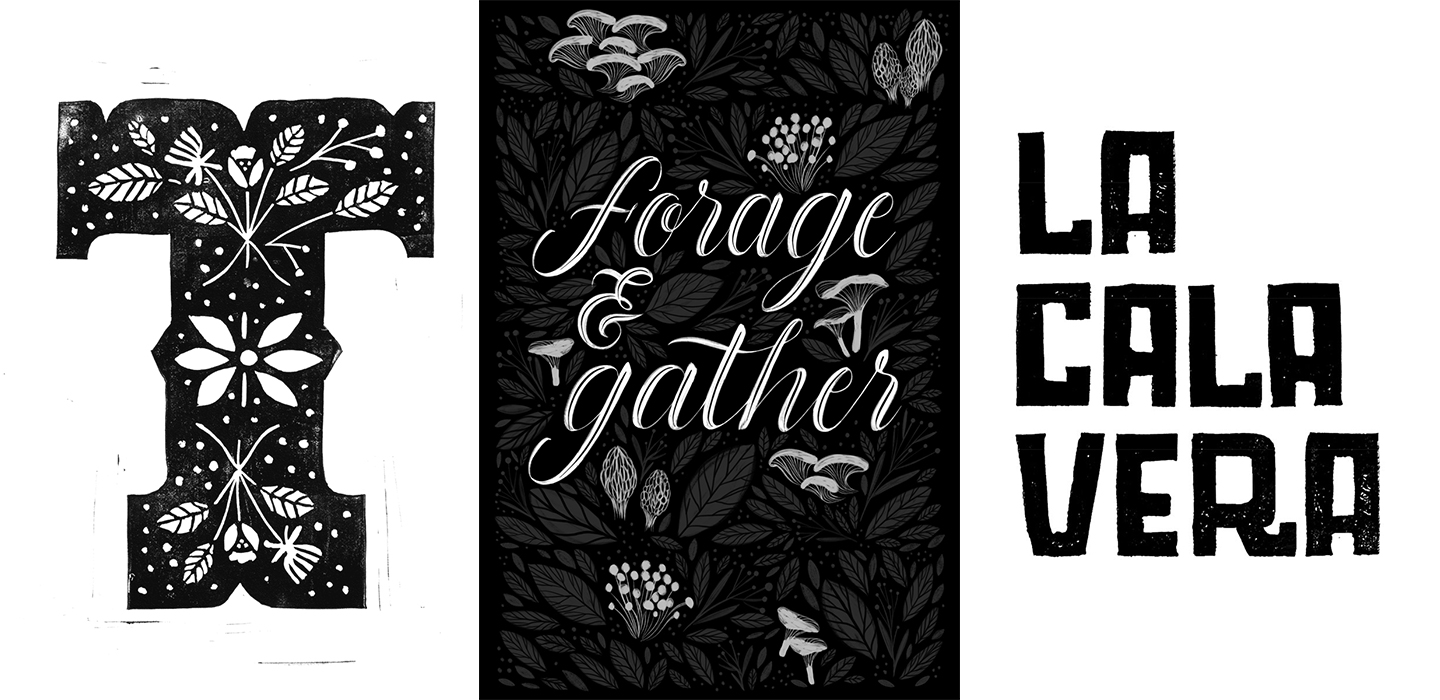
Despite our political turmoil this year I was determined to stay focused on positivity and ultimately, the things I could control. A long season of learning more about lettering and type design has been one of my professional goals for some time now. I’ve always had an interest/love affair with letters but often find myself in a state of imposter syndrome with it. I focused on exploration, finding communities where I felt comfortable creating work and asking questions, and more importantly, I wanted to keep it relatively casual. I didn’t want to go back to this idea of not knowing what I was doing and feeling like it didn’t count as real lettering or type design.
I’m fortunate enough to work for a company that offers five days of creative renewal, and when I looked at the offerings, I jumped at the opportunity to take a couple of lettering workshops and a Type Design workshop co-lead by a fellow Alphabette, Lila Symons.
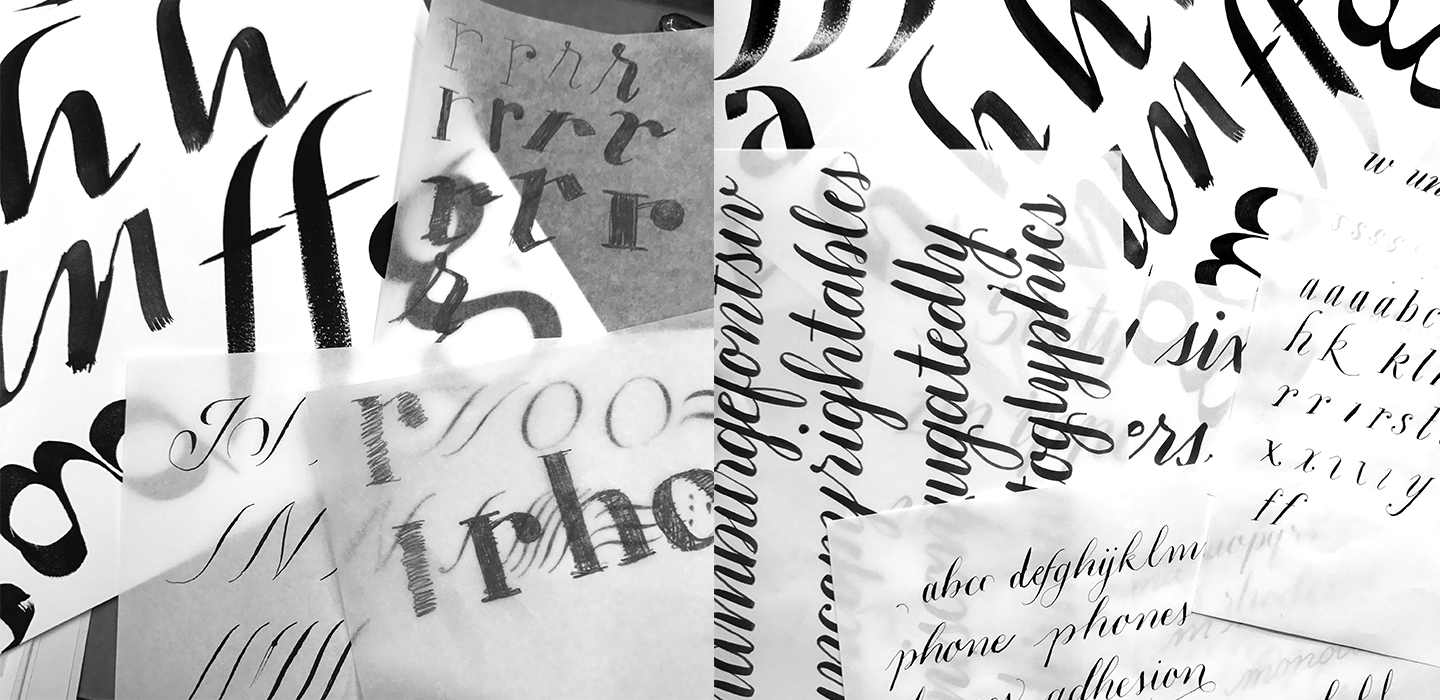
First up was the Type Design workshop held in April. It was a two-day workshop, and day one focused on exploring with different writing tools and different styles. I tend to always get stuck in a rut when I have to think about “how many different ways can I draw a letter?” So this was a perfect exercise to face my uncomfortableness head on. Eight hours of practicing and exploring were both equally amazing and really hard. Lila and Josh were excellent teachers, and I’m thankful especially to Lila for taking the time to offer up suggestions whenever I felt stuck and/or frustrated. I ended up with several pages of potential material for a typeface.
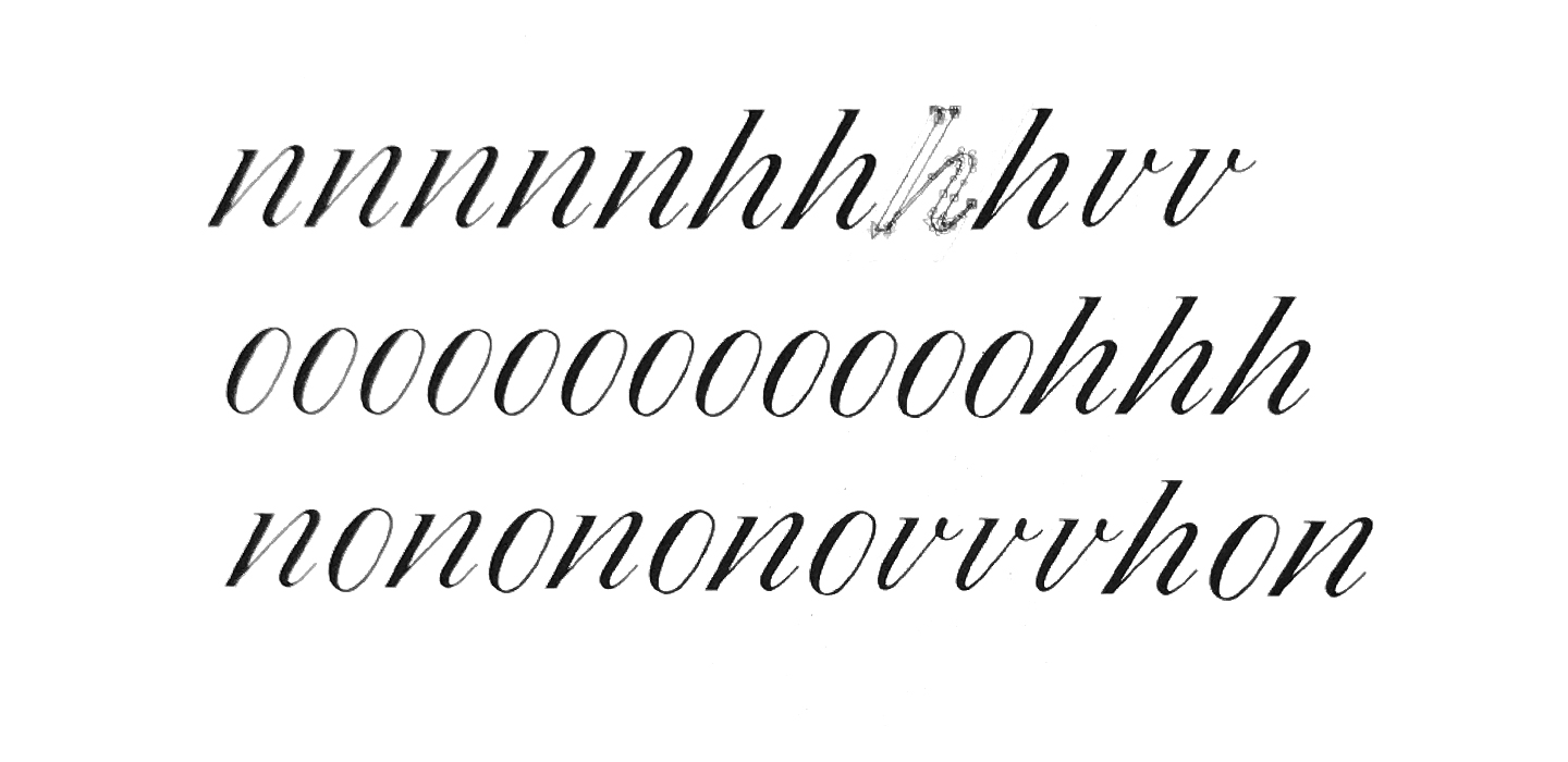
Day two was turning these analog pieces into a skeleton where we then took them into Glyphs to vectorize them. I learned how to identify the characteristics of multiple letterforms to design a typeface. Eight hours of this was not enough and merely the tip of the iceberg but what I learned in this workshop was super valuable. It’s helped me identify the ingredients to make a typeface, and at the very least I learned about patience. Patience with myself in an area that was new to me. It got me super excited about the possibility of designing a display font for 2018.
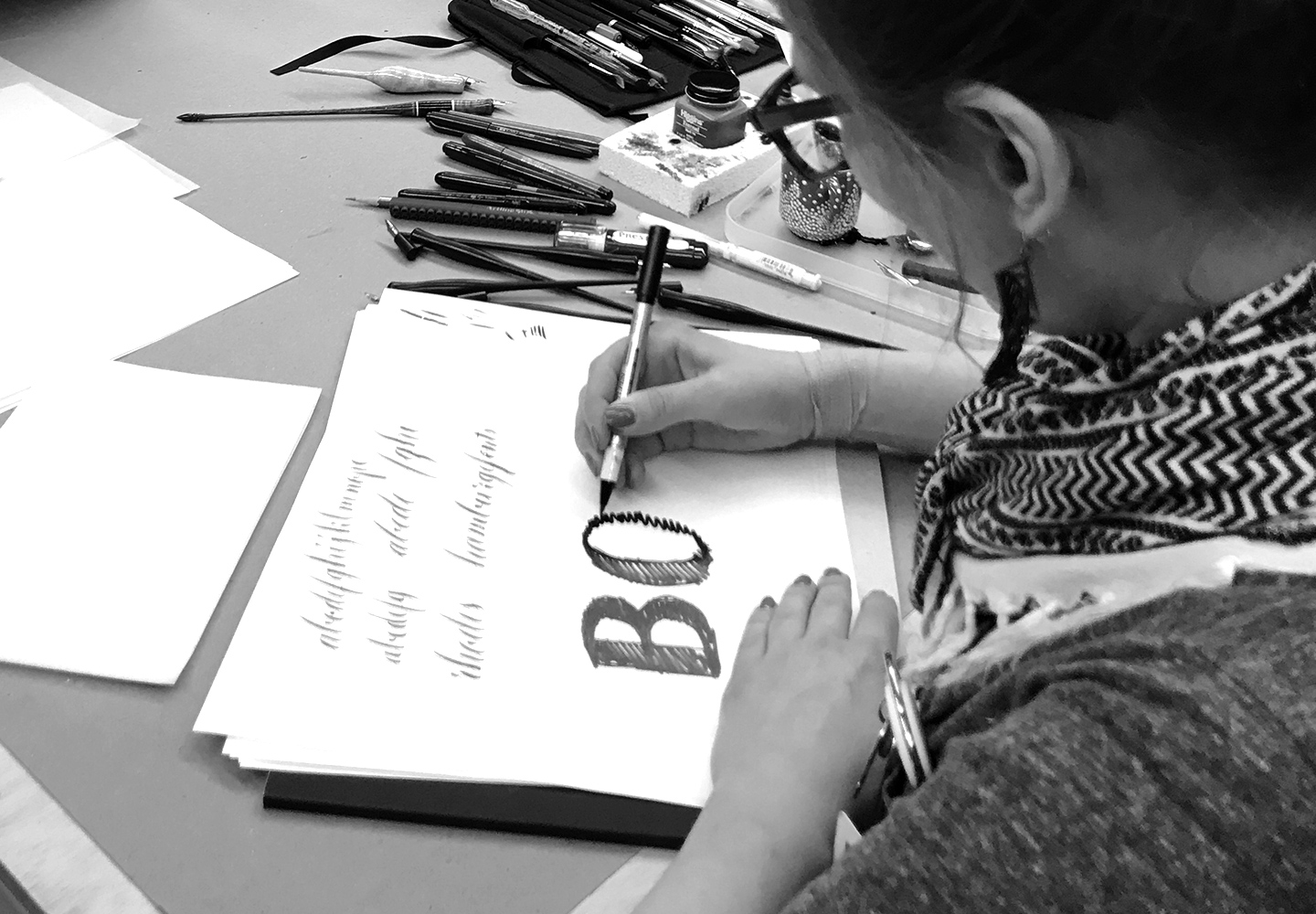
My second workshop was on brush lettering. There were five instructors during the eight-hour slot. The benefit of this was that every lettering artist tackled a different tool in their own way. The workshop provided exercises and examples by each artist and was right up my alley as it is something I could wrap my head around since it was the most familiar. I saw a lot of parallels with illustration, and I quickly became comfortable with it. Also, it’s tough to spell correctly when you’re so focused on the brush strokes!
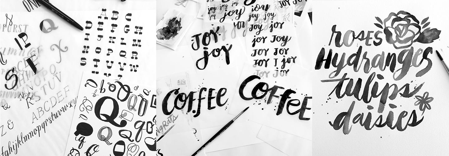
All of these exercises and workshops wouldn’t come to fruition unless you use them in practice. This year I also joined Letterzine, a free online lettering zine. There is a theme and color palette each month, and it allows a whole month for each contributor to finish their piece, should they choose to participate for the month. Reaching out was terrifying, but if I’ve learned anything this year, it’s that throwing myself in the midst of uncomfortableness can be a good thing and often necessary for personal growth. I’ve made more of an effort to reach out to my fellow designers to share my work in progress and if anything just to get used to the idea of sharing my work. I’ve also made an effort to try different styles of lettering with some illustration especially in my daily sketchbook. Sometimes I only focus on decorative elements of a letterform rather than words, and it helps break up the learning journey–one I hope to continue well into 2018.

