I have always had a fascination for Arabic literature; I say this not as a native speaker but as a Lebanese francophone who studied in an American university. The multilingual education system in Lebanon gave us the privilege of reading literature classics in three different languages. But Arabic has always had its unique aura, enchanting me with its subtle grammar and with how the interplay of short and long vowels, along with other rhetorical elements, can overhaul its semantics and enrich its rhythm.
This literary enchantment has indirectly played a significant role in my life by drawing me into calligraphy when I was a design student. I used to keep a notebook in which I collected quotes that piqued my interest. The words I had once noted down started taking different shapes in my calligraphy copybook. The desire to bring these eloquent words to life, through beautifully entangled strokes, fueled my discipline and commitment towards doing–and sometimes overdoing—my homework. Only then was the euphoria of reading matched, if not surpassed, by that of writing.
This skill has inevitably seeped through my work and steered my focus towards typography and later on, typeface design. I remember thinking, every time I read an Arabic book, “I wish I could have typeset it myself!”. Even though I’ve worked on many English and bilingual publications (as this was the standard practice in Lebanon), I have never had the chance to design a book entirely in Arabic.
But 2017 was the year when my creative wanting was fulfilled. The timing couldn’t have been better as both the typographer and the typeface designer in me were rewarded, and I finally had the chance to art direct and typeset an Arabic publication based on my typographic vision, which included a headline script font I had just finished designing.
Typesetting in Arabic
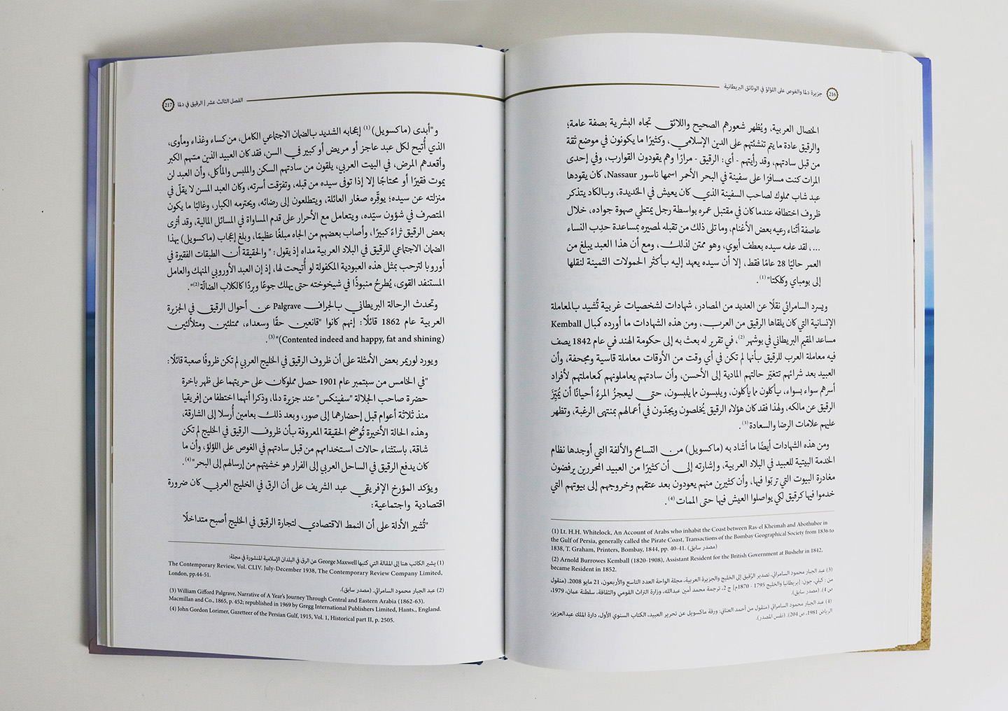
The book, titled The Island of Dalma, unravels the intricate history of one of many islands of the Abu Dhabi Archipelago and it consists of 310 pages.
The challenge in typesetting in Arabic is choosing a suitable, and authentic, body text font with a comprehensive character set consisting of contextual alternates or ligatures, as well as efficiently positioned diacritics. But designers face many problems on this quest, starting with the scarcity of well-designed Arabic text fonts, to the lack of Arabic typography and design handbooks. The faint communication among Arabic typographers and designers doesn’t help either. In fact, establishing a dialogue where they can share their experience and expertise, as well as their frustrations and recommendations, would be a constructive start.
I hope this post makes an effective contribution to this dialogue.
Body Text
As an Arabic reader and type designer, my choice of font for the body text fell on Adobe Naskh, and the reasons were twofold.
First, traditional Naskh fits well within the historical content of the book.
Second, the font is well designed for justified text, a standard feature of classical calligraphy.
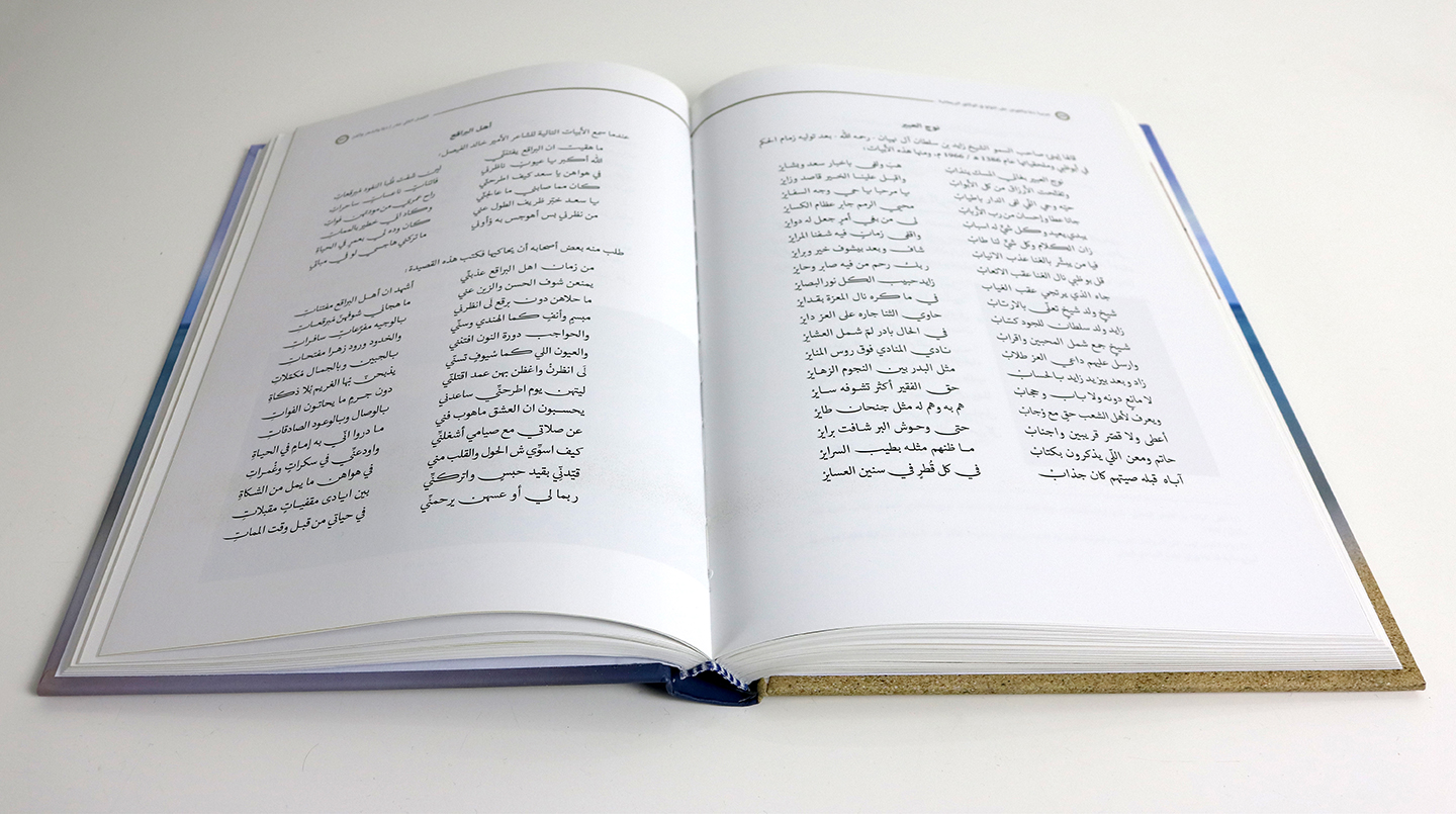
Justification is used even more prominently in classical poetry where verses are set in equal widths, one pair on each line, forming equidistant waterfalls; and poems have had their fair share in this book. The problem with most Arabic typefaces though is inadequate justification, especially with the straight kashida, a hideous elongation that distorts the fluidity of the Arabic script. Adobe Naskh’s elongations, however, flow organically. This along with stylistic alternates of certain letters like ‘ya’ and ‘kaf’, give the designer much greater flexibility, especially with poems.
For smaller text, like footnotes and captions, I used Adobe Arabic because of its wide counters and generous spacing.
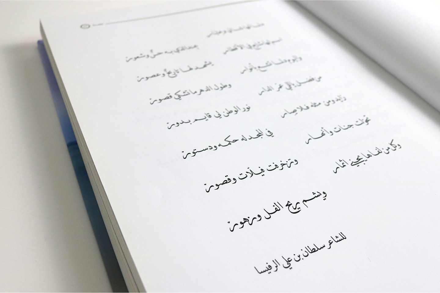
There is also another distinctive typographic choice I was happy to make. The opening spread was initially reserved for a poem that was meant to be written by a calligrapher. But having worked with DecoType’s Tasmeem, I tried a sample layout in DecoType Naskh, and it did just the job thanks to significant efforts made by DecoType to replicate the classical Naskh style.
Chapter Titles
Now comes the choice of a headline font to complement Adobe Naskh.
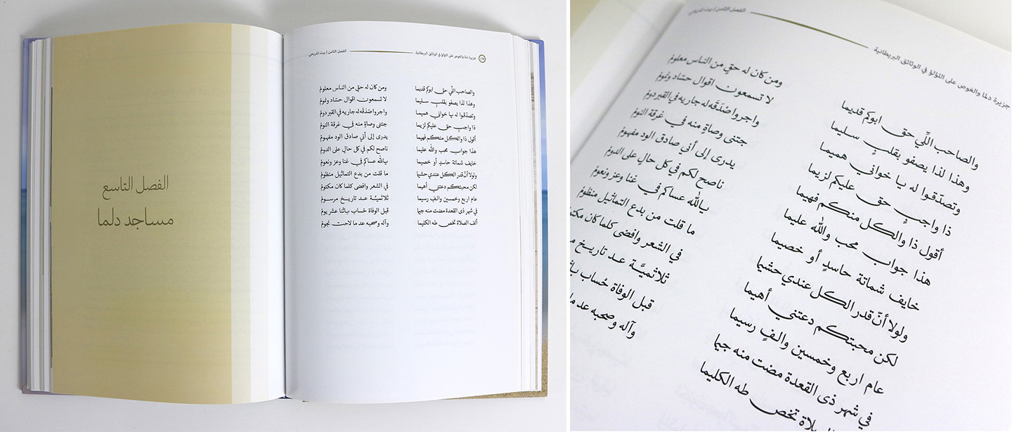
I have seen many publications where a Naskh typeface is used in titles, which I find to be an uninformed and ill-advised decision. The Naskh style of calligraphy has originally been conceived for long passages of text. Its proportions were meticulously set for that purpose, and you would never find a manuscript with Naskh titles. Thuluth was the script for larger text, mostly used in surah (chapter) headings in the Qur’an and monumental inscriptions in mosques.
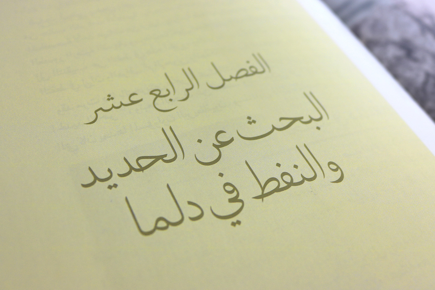
However, the Naskh/Thuluth pairing wasn’t a suitable choice for a contemporary publication because of the association with religious texts. To break away from the classical look, I set the chapter titles in Boutros Aura, a font I had started working on in 2016. To my convenience, the font was almost done by the time I was working on the book.
Aura came as a response to my frustration towards the misuse of Naskh in titles. Aesthetically, it is based on the latter, but structurally it borrows the proportions and elegance of Thuluth: elongated ascenders, wide counters and tight spacing. This fusion of styles created a contemporary script typeface for headlines, which was the ideal choice for the chapter titles.
On Making Fonts
I finally received a copy of the book in March, and I’m sure you can imagine my excitement then. A nostalgic feeling took over me as I was flipping through the pages, thinking to myself ‘I’m so glad I typeset the text!’. This thought threw me back in time, to my family home where I would be immersed in a book, enjoying its content and weaving a typographic dream.
But seeing the font I designed in use was a completely different experience.
There is something inextricably fulfilling in creating a font and witnessing it give shape to meaning. Even when we write down our thoughts, there is something intrinsically personal about it; it’s as if a part of us has come to life. For a typeface designer, this tinge of the personal persists in a digital font, which is usually born out of our handwriting or drawings, to later become everyone’s writing. In that sense, the font holds a part of me, or in ‘McLuhanian’ terms, it is now an extension of me. Hence this uncanny yet satisfying feeling when you read a text typeset in your font. It’s a romantically flattering idea: someone vicariously expressing their thoughts through your writing.
The Island of Dalma
First published in 2017
Limited edition
Copyright © 2017 Khalid Al Meraikhi

