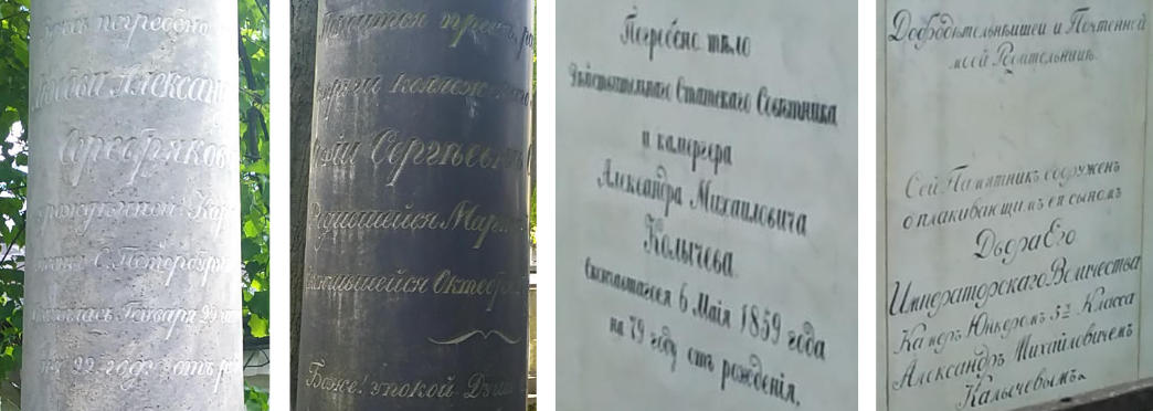
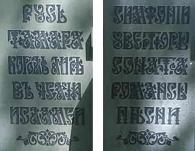
I got the chance to travel to Saint Petersburg, Russia in June earlier this year for pitercss conference. It was my first time there and I absolutely loved the city. I have a soft spot for stone engravings and if I find out that the location I’m at has some sort of cemetery or burial ground that is open to the public, I will go check it out.
Saint Petersburg was one such location. I was staying near the city centre and at the end of Nevsky Prospekt (the main street of the city), was the State Museum of Urban Sculpture. There are four historic cemeteries in this area, Lazarevskoe, Tikhvinskoe, Nikolskoe, and Kazache (Cossack).
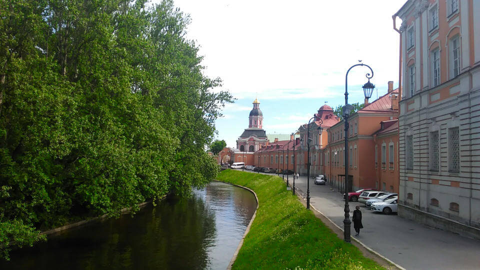
The Lazarevskoe cemetery is now known as the Necropolis of the 18th century and it has more than 1000 gravestones from the 18th to 20th century. The Tikhvinskoe cemetery is now known as the Necropolis of Artists and houses the graves of famous artists, musicians and scientists.
Many of these graves were adorned with crosses and winged angels, in addition to a bust or statue of the artists themselves. There were a number of columns as well. It is a contrast from the Chinese cemeteries I’m familiar with, where the tombstones generally looked the same, with slight variations in the shape of the gravestone. Here, almost every tombstone was unique and personalised.
Typographic observations
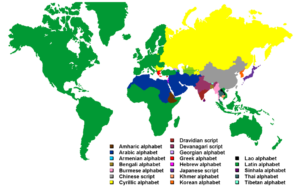
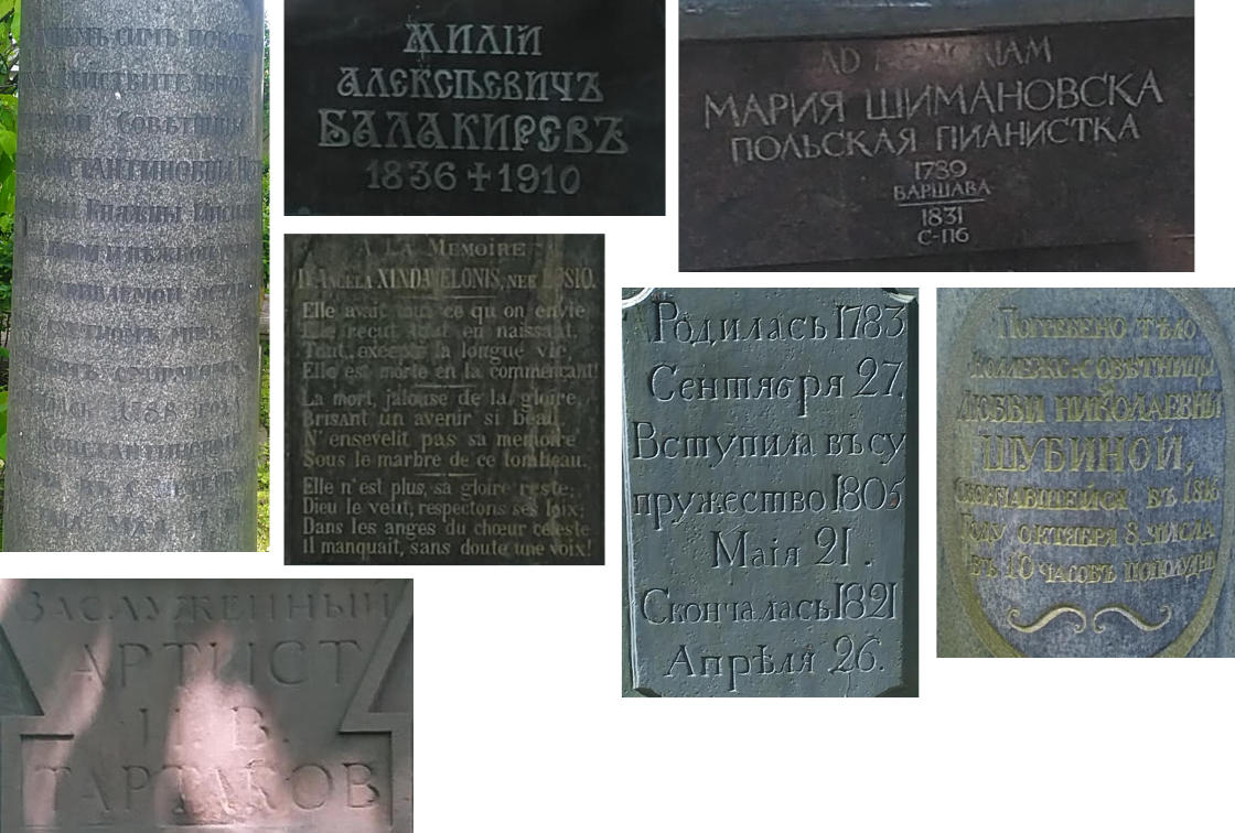
The main writing script in Russia is Cyrillic, and as someone who has never been to a region of the world that uses that script, I was particularly interested in the Cyrillic letterforms. And those on the tombstones were beautiful.
Serifs on stone engravings seem like the most natural combination, like wine and cheese or tea and mooncakes. There have been several theories proposed on the origins of serifs. The inking theory suggests serifs were added to repair extra ink instances on straight lines, while the carving theory posits that widening the ends of straight lines on engravings compensates for the illusion of bulging in the middle.
And tombs, being mostly made of some kind of stone, have serif inscriptions in spades. This was similar to the Recoleta cemetery in Buenos Aires, where the typeface of choice was usually serif. There were engravings in relief as well, but those were less common than the inset ones.
There were sans-serif typefaces being engraved as well, but they were either on more modern designs, or resembled the earliest Etruscan mono-line engravings, which provided an interesting visual contrast as I explored the area.
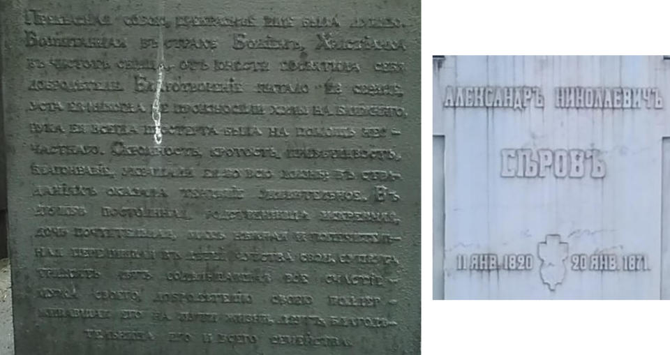
As mentioned, I had visited the Recoleta cemetery earlier in the year, and I didn’t remember seeing that many script fonts on the tombs there. But there were a number of tombs that used script fonts in Lazarevskoe and Tikhvinskoe, and they were for long-form text.
Even though I didn’t understand the text, it felt regal and elegant, suitable as a memorial to somebody who has passed. Again, I have no idea what the actual words meant.
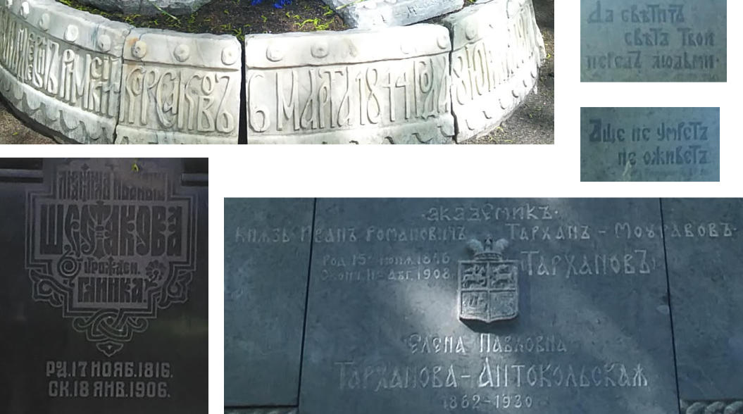
Then, there were the ornamental type fonts, that weren’t common at all. But I suppose tombstones are also a medium for creative expression, and there’s no hard and fast rule as to how a tombstone should be designed.
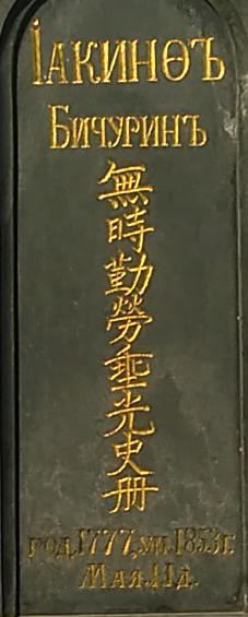
Lastly, the most memorable tombstone I saw on this trip was one which had Chinese characters on it, simply because I did not expect it. The Chinese words on the tombstone read 無時勤勞,垂光史冊, and it was upon googling this phrase that I found out it was the tombstone of one of the founding fathers of Sinology, Nikita Yakovlevich Bichurin, better known by his monastic name, Hyacinth.
If you can read Chinese, there is a write-up about Nikita Yakovlevich Bichurin’s life and accomplishments.
Most people probably associate cemeteries with death and sorrow, but they have a peaceful calm that encourages quiet introspection. Cemeteries also hold a wealth of historical, social and cultural information about a place and its people.

