I have been fascinated by the ways design layout is governed by a structured grid or set of rules. My curiosity extends to the exploration of typographic designs guided by specific grids. Navigating the delicate balance between creativity and legibility presents a challenge I wanted to tackle.
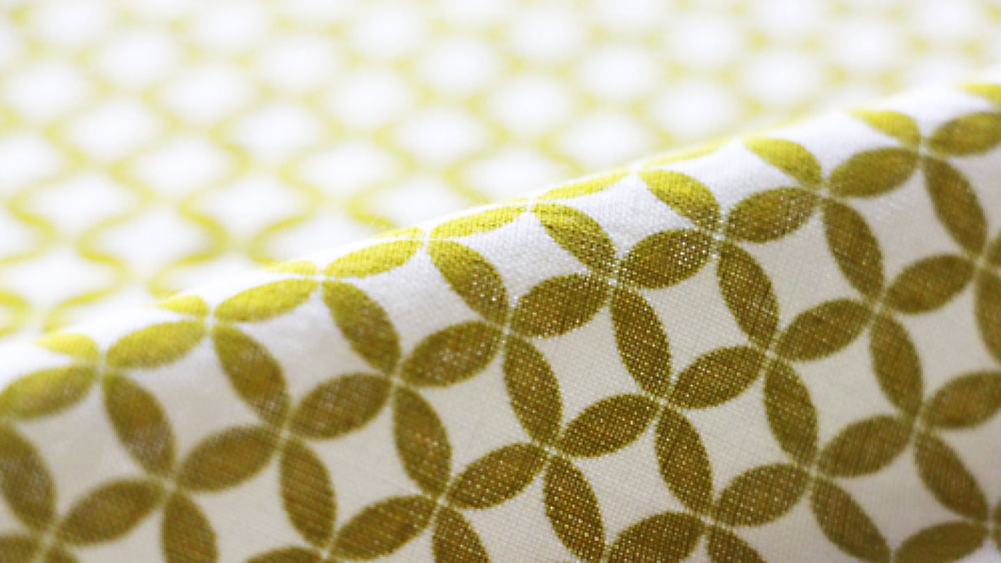
With my heritage in Japan, I realized that Japanese patterns on textiles consist of different ranges of shapes, which I decided to take inspiration from. One of the patterns is called “shippo” meaning “seven treasures” in Japanese. The Shippo pattern consists of endless circles overlapping each other.
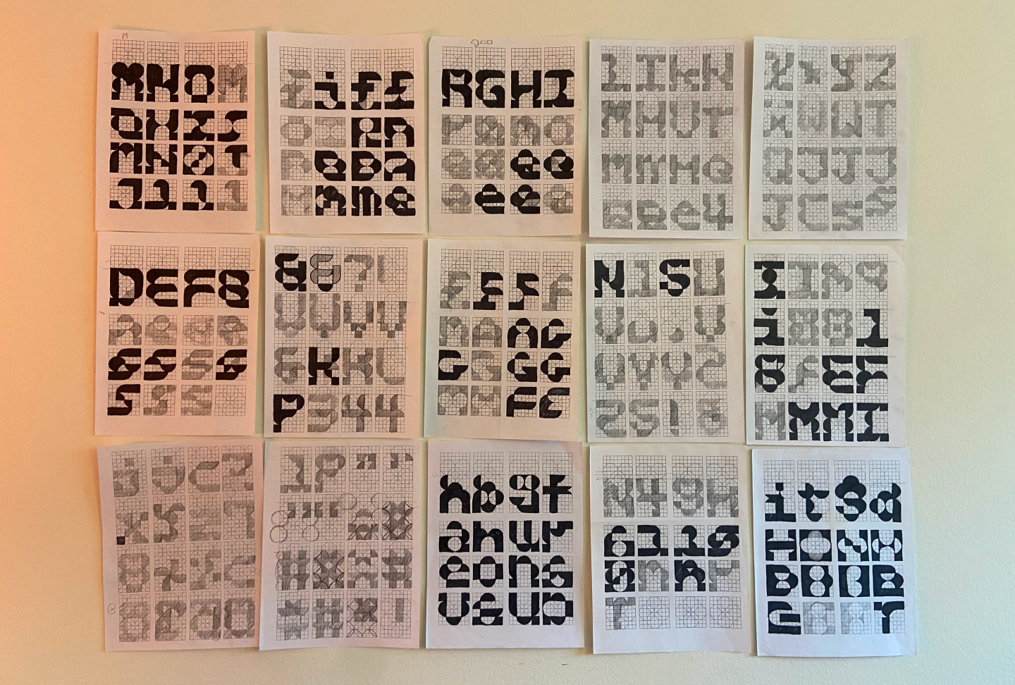
First, I set up an 8×10 grid and overlapped shippo patterns on top. Making rules on the grid was the most important and hardest part of the process. As there are hundreds of ways to create each letter using the grid, it was very challenging to make the letters all cohesive.
There were so many rounds of sketches, digitizing and proofing.
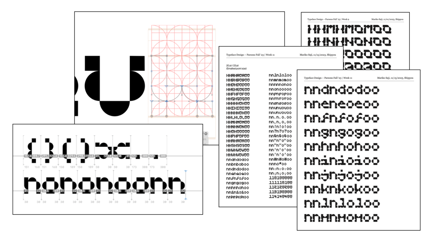
Here are the rules and adjustments I decided on at the end:
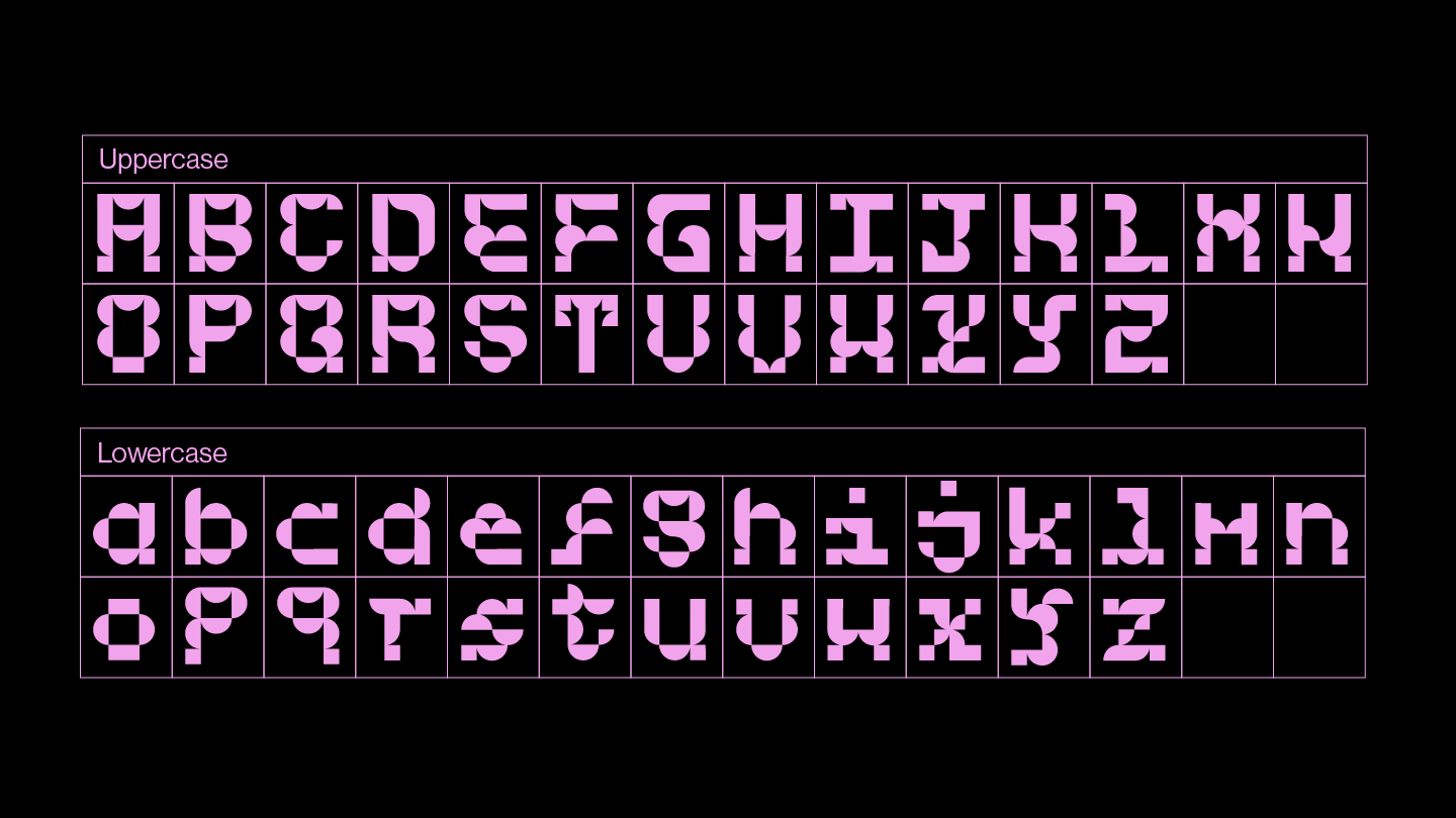
- The letter only contains 4 types of shapes: 2×2 square, half circles, ¼ circle and waning moon shape.
- Mono-spaced
- Same size grid for both upper and lower cases
- Balance the weight of the letter
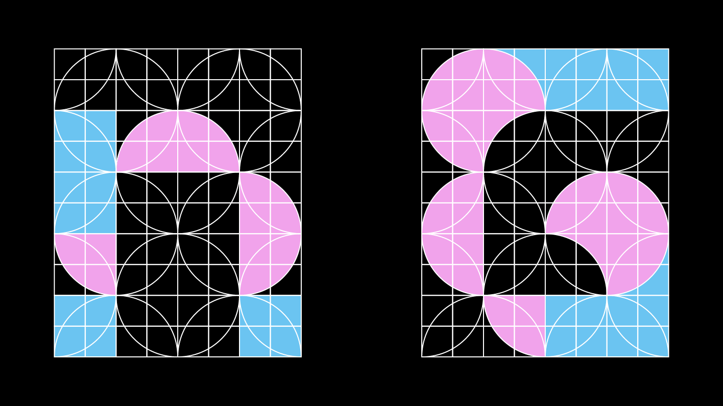
This is the final set for Shippo, a grid-based, mono-spaced typeface.
I also made a small type specimen. While shippo patterns are used for kimonos and other traditional textiles, I wanted this typeface to have a modern and innovative impression. I chose risograph printing because it harmonizes with the method I used to design my typeface. The process involves matching & overlapping colors in risograph printing, which mirrors the way I combined various shapes to create the typeface. The type specimen also includes a section showing step by step how the letter is constructed and presented using transparent paper.
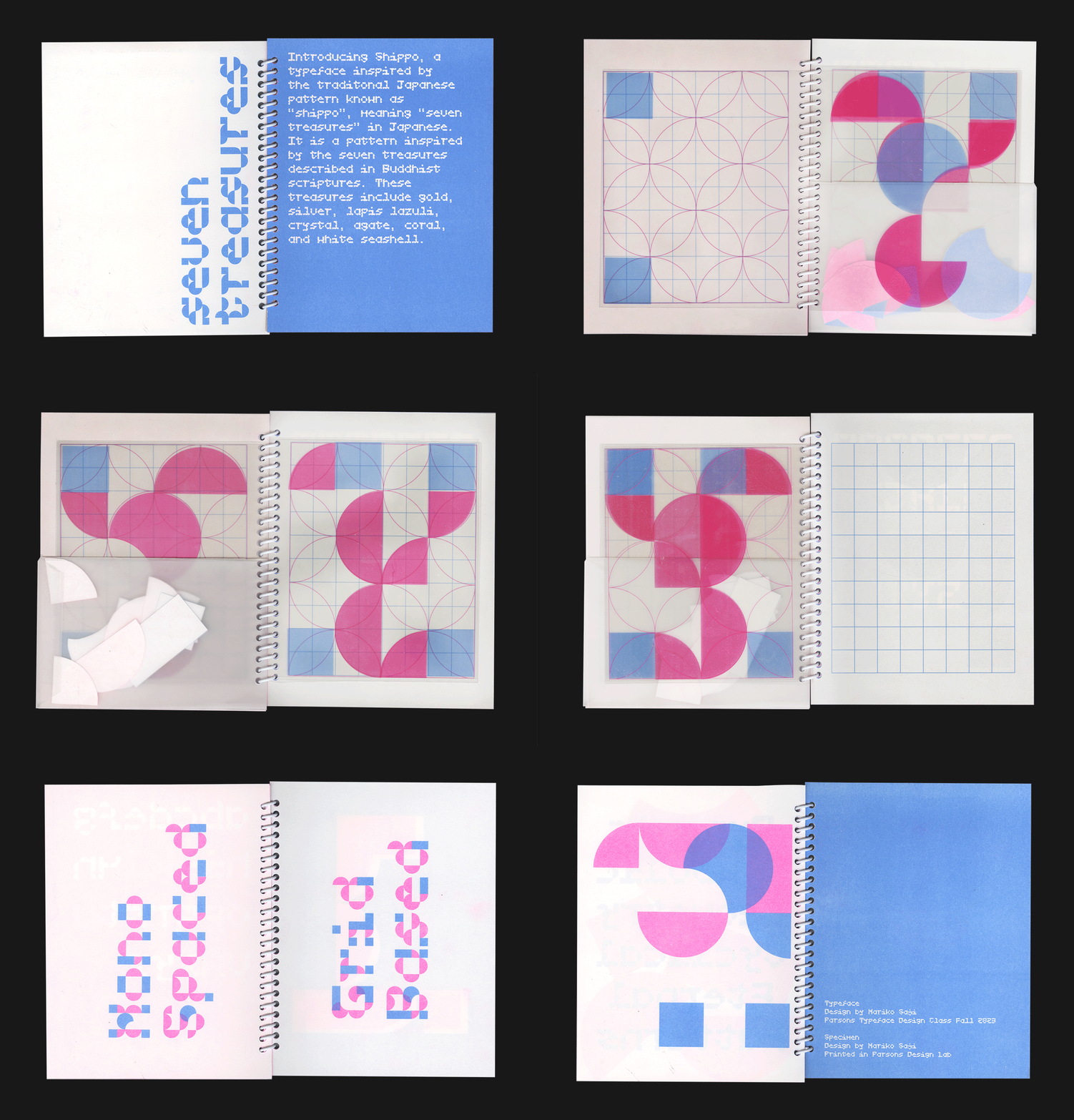
The most intriguing aspect of this typeface is its distinctive character—each letter possesses its own unique personality. Yet, when scaled down and used in sentences, it remains remarkably legible and easy to read.

Looking back on the ‘Shippo’ project, one of the most significant takeaways was the power of having a well-defined system. Despite its simple structure, the systematic approach played a crucial role in creating a cohesive and unified set of designs. I found the importance of proofing throughout the process, ensuring the cohesiveness with the overall vision.
