Have you ever been called a type snob? Font nerd? Typomaniac?
If you use, make or draw type / letters, it’s your job to care. I’m personally guilty of using this kind of language. However, when we act like our work is somehow above the mental capacity of typographic plebeians, are we giving ourselves a bad rap?
Who’s worse: wine people or font people?
— Josh Barro (@jbarro) June 5, 2015
(original tweet appears to have been deleted)
Wine people. They’re popularly (and unfairly) characterized as snobby, condescending, and pompous. Oenophilia is defined as “the disciplined devotion to wine, accompanying strict traditions of consumption and appreciation ” (thanks, Wikipedia). If we replace a few letters, we arrive at Typophilia, a term Ellen Lupton uses to describe “an excessive attachment to and fascination with the shape of letters‚ often to the exclusion of other interests and object choices. Typophiliacs usually die penniless and alone.” This wouldn’t be the first time a comparison was made between wine paraphernalia and typography, but I digress.
So, what are you?
Snob?

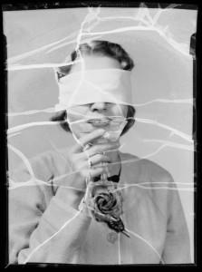
Champagne blindfold test, Southern California, 1935.
Nerd?

Lewis Skolnick, from the 80s movie, Revenge of the Nerds.
Maniac?

Mad scientist from the bizarre horror film, Maniac (1934).
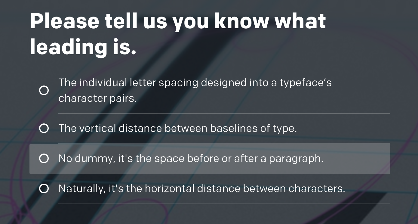
AIGA’s recent Ultimate Typography Quiz challenges takers to test their typographic knowledge, especially if they’re someone who “weep[s] when a designer looks baffled at your ever-so-subtle suggestions to use proper ligatures”. Here’s a question from the quiz:

Notwithstanding the debatable definition of leading in the correct answer (no spoilers!), the tone of the entire quiz exudes a condescending and patronizing voice. Quizzes like this one, sponsored by a national organization for design, do little to help communicate the actual value of good type.
Efforts to promote typographic knowledge as some sort of superpower or unhealthy obsession can also alienate potential users and future makers of type. For students learning the ropes, early-career designers new to the field, and even seasoned professionals not weighted down by awards and accolades, entering into the discourse — at conferences, in online discussions, or in practice — can be daunting.
We might feel good about ourselves as gatekeepers of typographic snobbery, but how do we help others through the door?
I’d love to hear your suggestions. After all, it’s not rocket science.

Nothing new here but Zefrank is one of my favorite reality checks to go back to: https://www.youtube.com/watch?v=4xSW_NlrVBY&feature=youtu.be&list=PLpOgGfkVc1t_qI5R5hSxnBV6hWG8ts-zh&t=48
I hear you, Amy. I am guilty of complaining about snobby difficult language, frowning upon typography books calling serifs “little feet”, and being particular about type terminology all at the same time :/ Gotta sleep on this and gather some thoughts and writing energy. Until then, here’s a great old piece by Nick Sherman in a similar vain I can very much relate to: https://myfonts.wordpress.com/2006/07/24/let-them-eat-comic-sans-typographic-aristocracy-democratization/
Thank you for this Amy, I think it’s a great point to raise. While I’m gratified about how popular caring about type has become among designers and even people-at-large, I find it frustrating that it’s often viewed (and even presented) as some kind of eccentric fixation that gives you nerd cred. Like I said on Twitter, some of us of course do care in an excessive nerdy way, and personally I’m definitely a nerd, but I find it a bit problematic if this permeates the general image of the whole field too deeply.
I think we should definitely work on making type knowledge accessible, and by all means radiate enthusiasm and show that it can be fun – but not to the point of dumbing it down so we just get to talk about “little feet” (thanks Indra) and how much we all hate Comic Sans. Dudes & dudettes, it’s craft – serious, boring, fiddly, meticulous, and actually relevant craft, and it’s ok if it takes some work to learn and understand, because, well, it does. To me taking type seriously and getting it out of the ha-ha-I’m-a-crazy-nerd-look-how-much-I-care corner also has something to do with respect for this as a field that, like, actually matters.
Nobody objects to a mechanic who uses the correct terms for each piece of a car’s engine, a doctor who uses the names of the bones in the human body, or a botanist who uses the correct terms when explaining the structure of a particular plant. I’m completely baffled as to why people think it’s either nerdy or snobby to use the terms of whatever craft or profession one is in. I completely agree with Nina that we should avoid dumbing typography down, and that, as a field, it is entitled to use the terms of its craft. 🙂
Dumbing things down to “little feet” and talking in privy typographic academic language is a spectrum with many options, not an either or. I do see a tendency for demarcation through language and terminology that seems not entirely unintentional, and which exudes an atmosphere of arrogance that is unnecessary if not silly, in my opinion.
Thanks for all of the comments thus far, some great points made by everyone. I’m incredibly torn about my own personal use of the word “nerd” on twitter, my website, my bio (geez, I do use it a lot, don’t I?). As a design educator, a lot of my job is spent trying to get students excited about typography and letting them know, hey, it’s ok to get deep into this stuff. And my other work is not really about designing type or even designing *with* type, it’s more about understanding the cultural, historical and technological contexts within which type is made, used and understood. Now that is pretty nerdy.
An interesting definition/distinction between geek and nerd in this episode of Roderick on the Line, at ~40:00 minutes: http://www.merlinmann.com/roderick/ep-156-the-dumbest-guy-i-ever-met.html