Type Revival for Film & TV

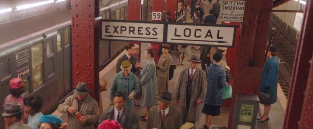
Screenshot of subway scene in the Marvelous Mrs. Maisel looking down stairs at crowd of people coming off train.

“The Marvelous Mrs. Maisel,” Season 5, Episode 2.

The Job

As a Graphic Designer for Film & TV, I work in the art department and create anything that is seen on screen with text and or imagery, such as storefront signs, food packaging, patterned wallpaper, stacks of bills, newspapers, lost cat flyers, or even children’s drawings. The range of items we create is incredibly broad, and the cool thing about that is it reframes graphic design from an exclusive, professional pursuit into a universal human activity. If everything is design, everyone is a designer. So instead of creating as “Leah Spencer, graphic designer,” I have to create as a shopkeeper, as a sign painter, as a college student, as an accountant, and so on.
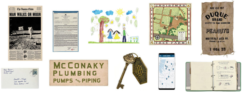
Array of graphic designed items: newspaper, contract, kid's drawing, map, burlap bag, mail, plumber sign, hotel key, phone map app, binder

Some of the many items considered graphic design in the context of film and TV. In addition to designing these items, the graphics team is also responsible for physically making them in-house or sending them out to a vendor for fabrication.

Considerations for Typography

In addition to the challenges of forgery, I specialize in graphic design for period productions, and when you approach period typography, you wind up with several restrictions. Firstly, many typefaces that were used for letterpress or used in typewriters were never digitized and only survive today in their original forms or in their printed materials. Secondly, there are lots of existing digital period typefaces like Futura or Garamond, but they too have issues. We lack (or are logistically unable to use) historical production methods, such as mimeograph, Letraset, offset printing, Linotype, etc., so the kind of roughness you expect of period graphics is lost. We also have legal restrictions on font foundry use, so each production’s clearance team will tell you, for example, “you can only use Adobe fonts on this movie.” This can be restrictive, particularly for period or highly stylized productions where only a small portion of the available fonts are appropriate. And thirdly, there are lots of instances of lettering that were never a typeface in any sense, such as sign painting or handwriting.

Continue reading

Part 4: What does a feminist graphic design history in the United States look like?

This is the last part of the series, “What does a feminist graphic design history in the United States look like? Read Part 3 here, Part 2 here and Part 1 here.

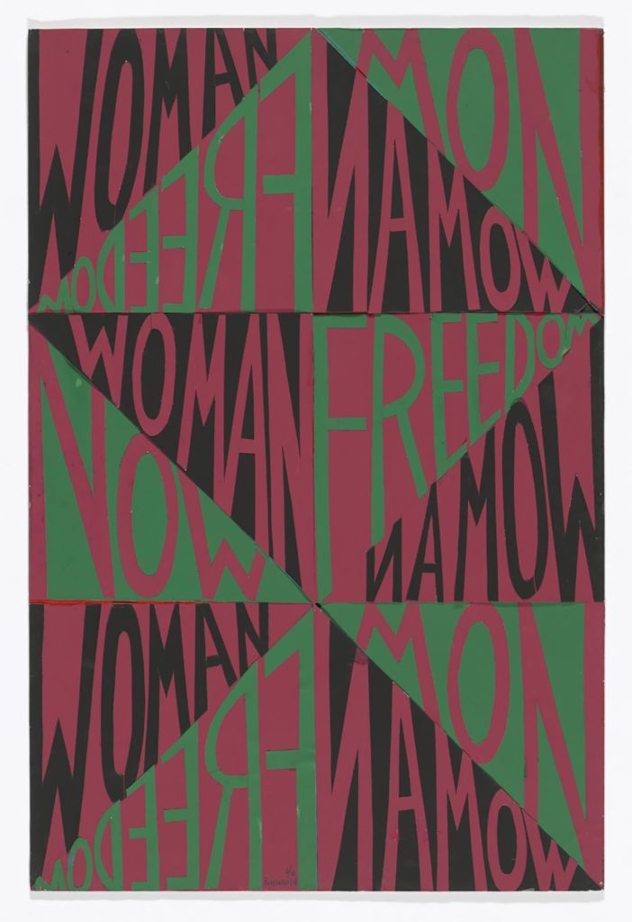
Because the assumption of universal and pseudo-neutral design is ultimately blind to nuances, visual alternatives emerged from countercultures. During the second wave feminism movement in particular, feminist design aimed to engage and connect in an experimental, interdisciplinary, participatory, non-hierarchical and non-authoritarian way, which broke the principles of the existing male value-constructs of “good” design. It is exciting to think of how design could be more egalitarian by discovering these alternative universes with those who were left out of design history.

Modern Typography

Cut-and-pasted paper on board, Woman Freedom Now, by Faith Ringgold
Faith Ringgold, Woman Freedom Now, 1971, Accessed March 21, 2020: https://www.moma.org/collection/works/202866

Continue reading

Part 3: What does a feminist graphic design history in the United States look like?

This is Part 3 of the series, “What does a feminist graphic design history in the United States look like? Read Part 2 here and Part 1 here.

Early moderns from design reform to new typography created and followed rigid guidelines to define “good” design. When researching women in typography, I found that Elizabeth Friedlander is considered one of the first women to design a typeface, Elizabeth Roman and Italic, commissioned by the Bauer Type Foundry in multiple weights in 1927. In addition, she produced multiple geometric patterned prints and covers for Penguin Books inspired from nature. Just like Friedlander, more women have had their work obscured to put forward those who followed the sacred words of Tschichold.

Proto-modernism

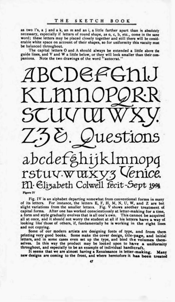
Excerpt of Elizabeth Colwell's Typeface in The Sketch Book
Elizabeth Colwell, Notes on Hand-lettering, September 1904, Accessed March 14, 2020: http://alphabettenthletter.blogspot.com/2016/03/creator-elizabeth-colwell.html

Continue reading

Part 2: What does a feminist graphic design history in the United States look like?

This is Part 2 of the series, “What does a feminist graphic design history in the United States look like?” Read Part 1 here.

In the 19th and early 20th centuries, technological advancements helped information spread fast and far. The industrial revolution led to the creation of mass media as well as romantic and revolutionary outcomes. The mechanization of print culture facilitated the geographical spread of belief systems and information as well as offered the possibility to critique, question and reject established models of society to serve women’s rights.

Information Design

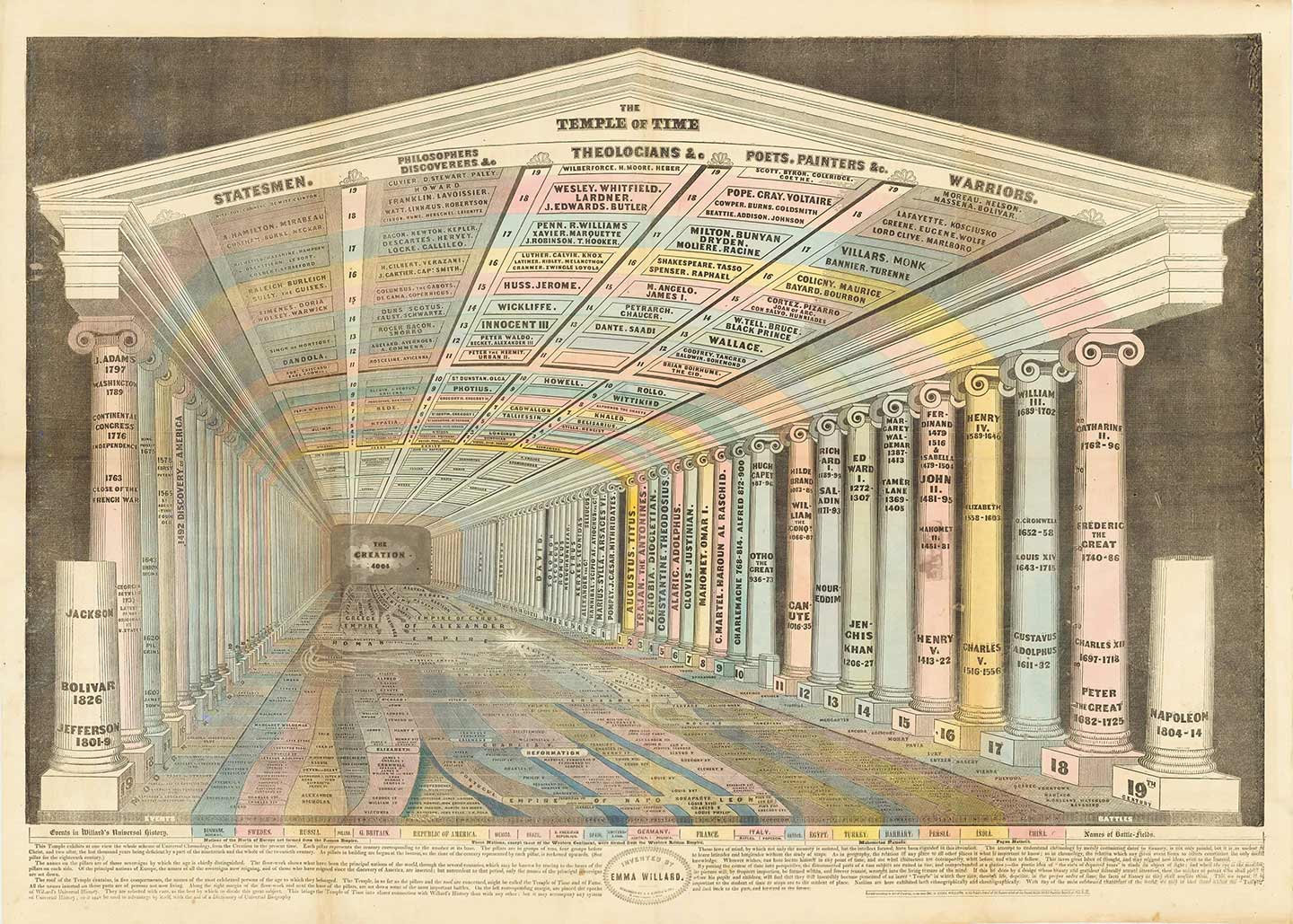
Emma Willard’s Map Temple of Time

Emma Willard, Temple of Time, 1846. Accessed March 8, 2020: https://bostonraremaps.com/inventory/emma-willard-temple-of-time-1846

Continue reading

What does a feminist graphic design history in the United States look like?

Why are women’s contributions to society systematically overlooked and obscured? Design is no exception to the rule. There is a disturbing lack of literature on women’s impact in the history of graphic design. During this year’s Women’s History Month, I will share a curated collection of twelve artifacts, from the fifteenth century through the twentieth century, that offer, from a feminist perspective, a counter visual story to the traditional white male and widely received narrative in graphic design history. Before diving into contextualizing this work, I want to briefly explain my position and how I came to focus my research on illuminating female narratives.

As individuals, we are all irradiating complex systems defined by society along with our nuanced multilayered identities. When I walk into a room, at the most superficial level, one can read that I am a woman. I am light skinned. I have tattoos. When I start talking, my French accent suggests that I am from another country than the United States. I am indeed from Morocco and I am Arab. Living in Morocco was violent in many ways. My gender was enough to be constantly harassed since I was a teen, judged on every single thing I did and ultimately made me feel like an outsider every day. I came across the word feminism in high school. It made me feel somewhat normal that my mindset was not unique. But I did not understand the divide within feminism at that time until very recently. I just knew I did not want to be subject to anything or anyone. Freedom (from patriarchy) has always been a fight to be my own person and fulfill my own purpose. As a result, my work will always have a feminist point of view. 
Continue reading