Designed by Bea Korsh
Distributed by Future Fonts
This font review was written in English and translated into Portuguese (BR—below). The Museu da Língua Portuguesa, in São Paulo, is the venue of diverse exhibitions with hands-on activities about Linguistics and Portuguese language developments.
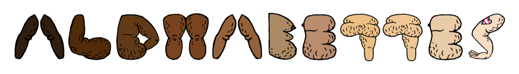
Fellow Type@Cooper alumni Bea Korsh probably graced us with the freshest type release of 2024. Where to start? That I’ve never seen anything like it. Or the fact version 0.1 already has 70 interlocking ligatures. Or maybe the foresaw standalone Inline style—that’s simply dazzling. Let’s take it from the top, Henmania is a stencil typeface with meshed warped strokes and a slightly forward-leaning feel planned to grow to a 5-weight family—a playground of pure creativity!