Dear Alphabettes: Legal protection of typeface design

Dear Alphabettes,

I have a question about the legal protection of typeface design. Is registering a typeface design (in addition to its name) something that should always be done? After asking different lawyers, some would advise doing it each time (more work for them), some say that registering the name is already a protection that can be considered enough, although not 100% protection.

Lisa (France)

NOTE: The answers below are comments from members of Alphabettes. The information shared here is based on their own experiences, and may not necessarily accurately reflect the law in the countries being discussed. We always recommend getting legal advice specific to your situation.


Continue reading

Multiscriptual Typesetting

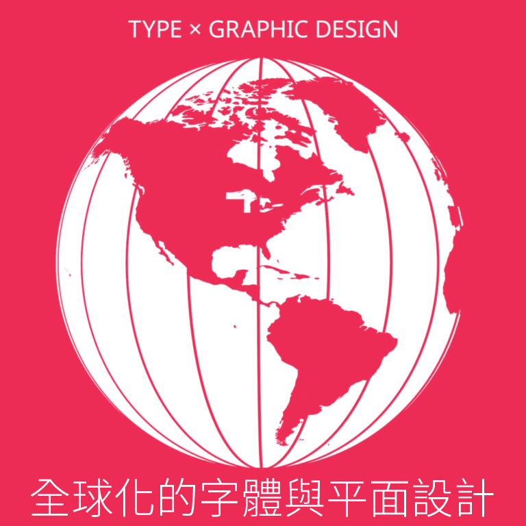
image of globe showing north and south america


Last month I had the honor of creating the graphics for Designing without Borders, a three-part lecture series hosted by AIGA NY and the TDC. The design process was a collaboration between myself and the event organizers; Caspar Lam, Juan Villanueva, and Lynne Yun, which led to an ambitious undertaking of designing with a dozen languages. This experience was equally rewarding as it was challenging. It inspired me to continue pushing my understanding of typography by going beyond what is linguistically familiar. 

Continue reading

Alternatives to Gill Sans

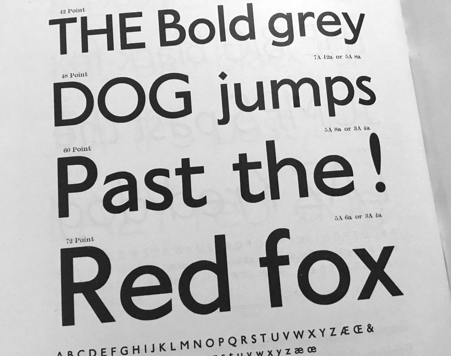
Granby by Stephenson Blake (1930). From: Specimen of Printing Type, Stephenson Blake / The Caslon Letter Foundry Sheffield, 1953

If you are looking for a humanist sans-serif with a slight English flair, here are some less overused and ambivalent alternatives:

Agenda, Greg Thompson, Font Bureau
Apres, David Berlow, Font Bureau
Astoria, Alan Meeks, Alan Meeks Collection
Bliss, Jeremy Tankard, Jeremy Tankard Typography
Cronos, Robert Slimbach, Adobe Type
Documenta Sans, Frank Blokland, DTL
Dover Sans Text and Display, Robin Mientjes, Tiny Type Co
Edward, Hendrik Weber, formally Ourtype
Granby, Stephenson Blake, Elsner + Flake, Scangraphic
Halifax, Dieter Hofrichter, Hoftype
Johnston, Edward Johnston, David Farey, ITC
(Johnston) Underground, Edward Johnston, Richard Kegler, P22
London, Henrik Kubel, A2-Type
Mallory, Tobias Frere-Jones, Frere-Jones Type
Metro Office, Akira Kobayashi, Linotype
Mr. Eaves, Zuzana Licko, Emigre
New Atten, Miles Newlyn, Newlyn Type
Relay, Cyrus Highsmith, Occupant Fonts
Rowton Sans, Julien Priez, Hugo Dumont, Jérémie Hornus and Alisa Nowak, Font You
Seravek, Eric Olson, Process Type
Today Sans, Volker Küster, Elsner + Flake
Yoga Sans by Xavier Dupret, Monotype
Zeitung, Akiem Helmling, Bas Jacobs, Sami Kortemäki, Underware

Alternatives to Prokyon

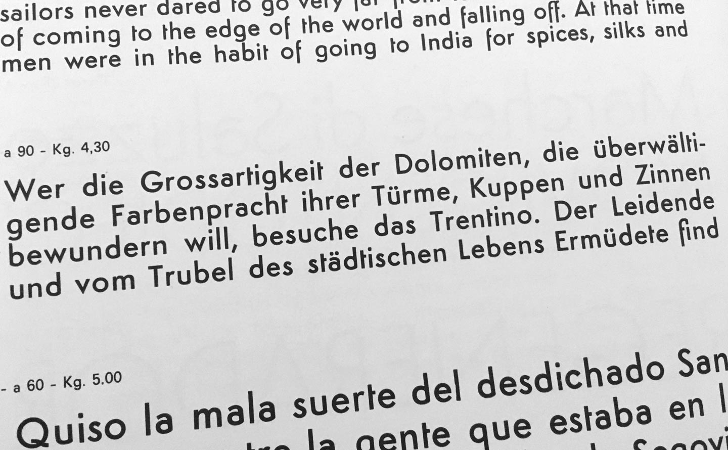
Semplicità by Alessandro Butti (1930). From: Campionario caratteri Nebiolo, ca. 1962

Spurless humanist sans-serifs were all the rage in the early 2000s, but not anymore. If you still really have to use one, try one of these:

Aad, Aad van Dommelen, Font Font / Monotype
Aller Typo, Marc Weymann, Dalton Maag
Barmeno, Hans Reichel, Berthold
Branding, Alfonso García, Daniel Hernández, Luciano Vergara, Latinotype
Beau Sans, Panos Vassiliou, Parachute
Bega, Sabina Chipară, Diana Ovezea, Fontstore/ITF
Co, Bruno Maag, Ron Carpenter, Dalton Maag
Conto, Nils Thomsen, Type Mates
Dax, Hans Reichel, Font Font / Monotype
Daxline, Hans Reichel, Font Font / Monotype
Diodrum, Jérémie Hornus, Clara Jullien, Alisa Nowak, Indian Type Foundry
Etelka, František Štorm, Storm Type Foundry
Generis, Erik Faulhaber, Linotype
Karbon, Kris Sowersby, Klim
Kuro, Jonathan Hill, The Northern Block
Legal, Hellmut Bomm, Linotype
Netto, Daniel Utz, Font Font / Monotype
Phoenica, Ingo Preuss, Preuss Type
Ribera, Jörn Oelsner, URW
Ringo, Łukasz Dziedzic, Typoland
Sari, Hans Reichel, Font Font / Monotype
Signa, Ole Søndergaard, Font Font / Monotype

Oof, I think that’s more than you ever want to use in this century. Better try a less modisch humanist sans of which there are plenty of.

Alternatives to DTL Fleischmann

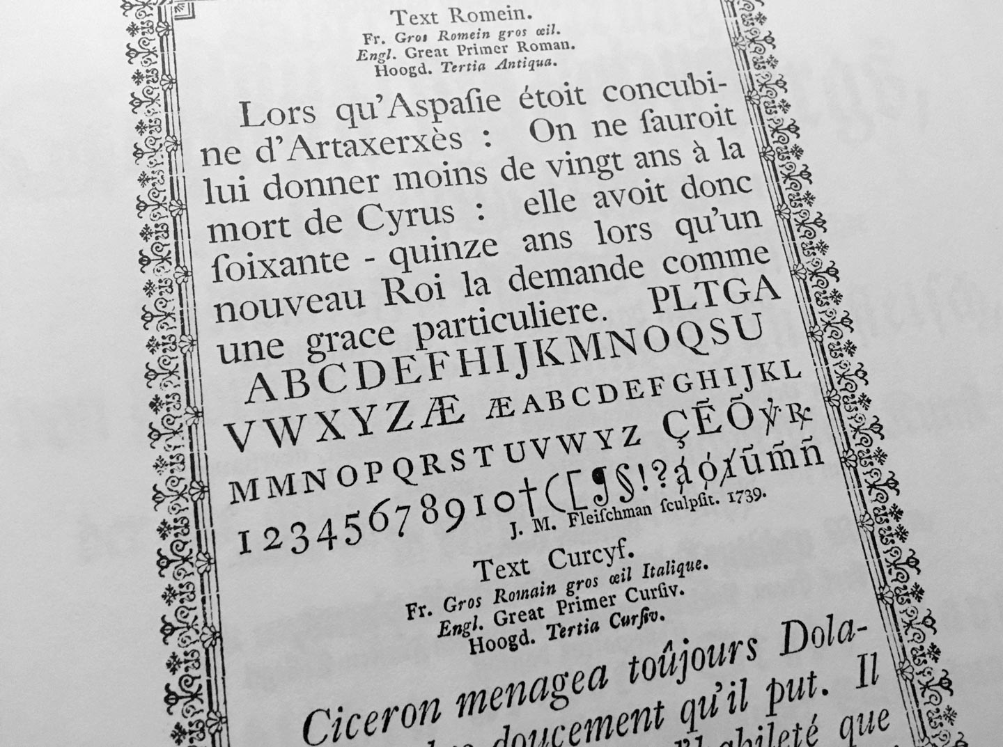
From: Atlas zur Geschichte der Schrift. Das 18. Jahrhundert. Technische Hochschule Darmstadt, 1995

The typefaces of punchcutter Johann Michael Fleischmann have inspired many to design close and not so close revivals of classic Dutch old-style text faces. (A typeface of similar colour and sparkle is the one you are reading right now here on the blog – Dover Text by Robin Mientjes – although she took inspiration from Caslon’s typefaces more than from Fleischmann.)

Adobe Text, Robert Slimbach, Adobe
Berlingske Serif Text, Jonas Hecksher, Playtype
Ehrhardt, Adobe, Monotype
Equity, Matthew Butterick, MB Type
Eudald News, Mário Feliciano, Feliciano Type Foundry
Expresso, Mário Feliciano, Feliciano Type Foundry
Farnham, Christian Schwartz, Font Bureau
Fleischmann BT Pro, Johann Fleischmann, Charles Gibbons, Bitstream
Freight, Joshua Darden, Garage Fonts
Glosa, Dino dos Santos, DS Type
Garvis, James Todd, James Todd Design
Guyot, Ramiro Espinoza, ReType
Janson, Scangraphic
Janson Text, Miklós Kis, from Adobe, Monotype, URW
Kis, Miklós Kis, Bitstream, ParaType, RMU
Kis Classico, Miklós Kis, Franko Luin, Linotype
Mercury, Tobias Frere-Jones, Jonathan Hoefler, Hoefler & Co
Pradell, Andres Balius, Typerepubic
Quercus, František Štorm, Storm Type Foundry
Rosart, Jacques-François Rosart, Katharina Köhler, Camelot
Tyrnavia, Miklós Kis, Gábor Kóthay, T-26