Embracing Britishness: musings on biscuit lettering culture

It all began two or three years after I moved to the UK when I realised that I was living here in contradiction to my host country and not in harmony with it: (my) life was a cultural fight. It was frustrating. At some point, I decided to change the paradigm, embrace Britishness, stop fighting it and learn the culture of the country where I happily live. That journey of learning and embracing the Britishness included, unavoidably, British biscuits.

British biscuits

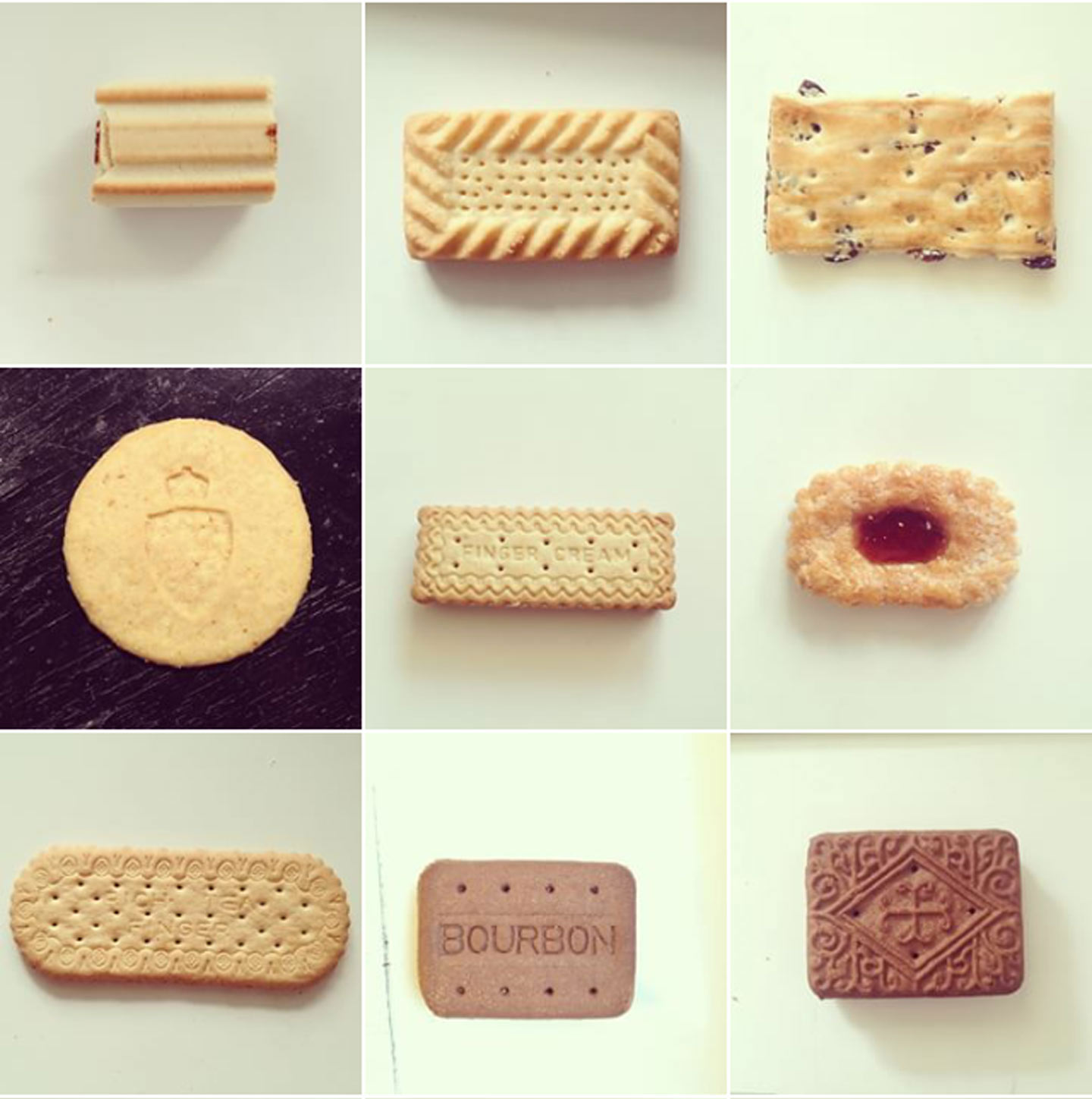
My first biscuits study, in the form of an Instagram hashtag: the Fig Roll, the Shortcake, the Garibaldi, the Duchy?, the Finger Cream, the Redcurrant Puffs, the Rich Tea Finger, the ‘fake’ Bourbon — Bourbons are never square!


Continue reading

The process of lettering a pun

When I first heard about Alphabettes, the name immediately had my attention. As an appreciator of all things punny, I was intrigued. I soon found out it was a place where both women and their opinions were encouraged, and they gathered to talk type. They had lived up to their pun.

While I was savouring this wonderful name and going through the website, I couldn’t help notice the potential for another wordplay. The Hindi word for Daughter is बेटी (beti). It sounds a lot like “bette”. I relished the idea of Alpha bette doubling as “Alpha daughter” in Greek/Hindi. To make it sound more like the plural “Bettes” I pluralised the Hindi word बेटी (beti) using English rules to make it बेटीस (betis). If you’ve spent extended periods of time with me, you might be aware that punning is a serious sport for me and I sometimes tend to go overboard which is why I sat on this pun for about two years. It took me a while and a bit of encouragement to go public with this idea. When I finally wrote to the Alphabettes they green-lit this multilingual pun idea for their header swiftly much to my delight and relief.

Continue reading

Remember December: My Year Learning How to Overcome Imposter Syndrome

Some examples of playing with different tools.

Some examples of playing with different tools.

Despite our political turmoil this year I was determined to stay focused on positivity and ultimately, the things I could control. A long season of learning more about lettering and type design has been one of my professional goals for some time now. I’ve always had an interest/love affair with letters but often find myself in a state of imposter syndrome with it. I focused on exploration, finding communities where I felt comfortable creating work and asking questions, and more importantly, I wanted to keep it relatively casual. I didn’t want to go back to this idea of not knowing what I was doing and feeling like it didn’t count as real lettering or type design.

I’m fortunate enough to work for a company that offers five days of creative renewal, and when I looked at the offerings, I jumped at the opportunity to take a couple of lettering workshops and a Type Design workshop co-lead by a fellow Alphabette, Lila Symons.

Continue reading

Remember December: Brunch Crumbs & the Emotional Hole of Doom

Lettering

This past weekend, I made the most amazing brunch. I wish you could have seen it. But you didn’t. And you can’t. Well, you could if you looked at my Instagram, but imagine you couldn’t. (No cheating!) And also, imagine me after brunch: Sitting on my bed after my friend left, looking at the table (because, yes, I live in a studio apartment where the place that I sleep and the place that I entertain brunch guests are the same thing), stuffed and sleepy, debating whether to nap before or after the dishes…

I looked at the table with great satisfaction, basking in the glow of my impeccable culinary prowess and Grade A hostess skills. Foods that were once organized in straight lines and circles were now crooked and strewn—half on, half off the plate—mixed together, piles emaciated. Bread crusts pushed to the side of plates, crumbs proudly littered where our mouths had been. Cups coated with half-dried coffee and champagne, some with tiny pools at the bottom of the last sip we didn’t need.

If you had walked into the room and looked at the table without any prior knowledge of what had taken place before, you would have known a delicious brunch had happened there. Without ever having seen a scrap of food, the evidence would have given away that a feast had occurred, an experience, a moment that mattered. People were nourished and felt something and then went on with their lives. This is what the most important typographic memory of my year—Hell, probably of my entire career thus far—is like. Because although I can’t tell you about the project or any of its details, I can show you the table afterwards. I can tell you the story.

Continue reading