Reflecting on the past year, we can say the number of new typeface releases was remarkable. The type market has become more diverse and competitive than ever, with new fonts hitting the scene every day. Both amateur and professional designs are eager to be in the spotlight so they can really be seen. In this hectic landscape, we find it valuable to offer insights that help identify excellence and merit within the crowd. This includes evaluating proficiency in crafting letters, the overall quality of the font, and the contributions that a new typeface brings to the table.
Continue readingPosts Tagged → type design
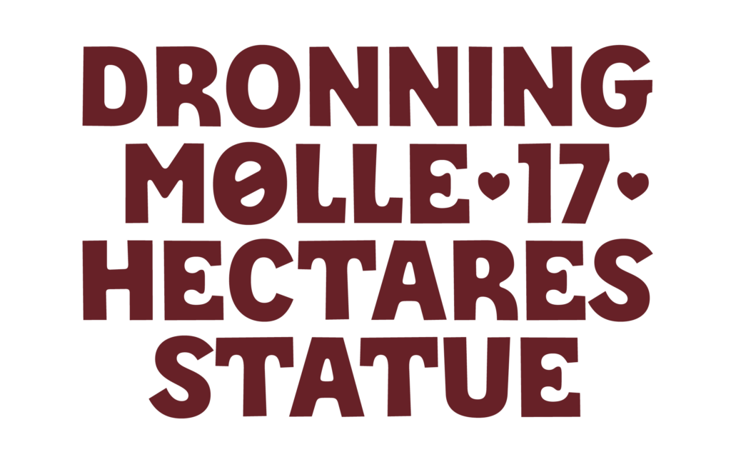
Font Reviews 2024: Playwrite
Designed by Veronika Burian, José Scaglione
Available at Google Fonts
Font family: 4 weights for every handwriting model. 68 handwriting models from 40 countries.
This font review was originally written in Spanish. In Colombia alone, there are more than 43 million native Spanish speakers. English translation below.
Las fuentes tipográficas suelen pasar desapercibidas, pero su impacto es profundo. Como demuestra Playwrite, pueden trascender su función estética para convertirse en puentes educativos. Detrás de cada trazo de lápiz hay un mundo de conexiones neuronales, memoria y creatividad. Aunque vivimos en una era digital, aprender a escribir a mano sigue siendo un pilar formativo esencial. El desafío surge cuando cada región del mundo enseña este arte con estilos y métodos distintos. La solución llegó de la mano de Playwrite. Diseñada por Typetogether y disponible en Google Fonts, Playwrite es más que un conjunto de letras. Es una herramienta pedagógica que se moldea a las particularidades de más de 40 países, desde la cursiva vertical de Francia hasta la escritura simplificada de Finlandia.
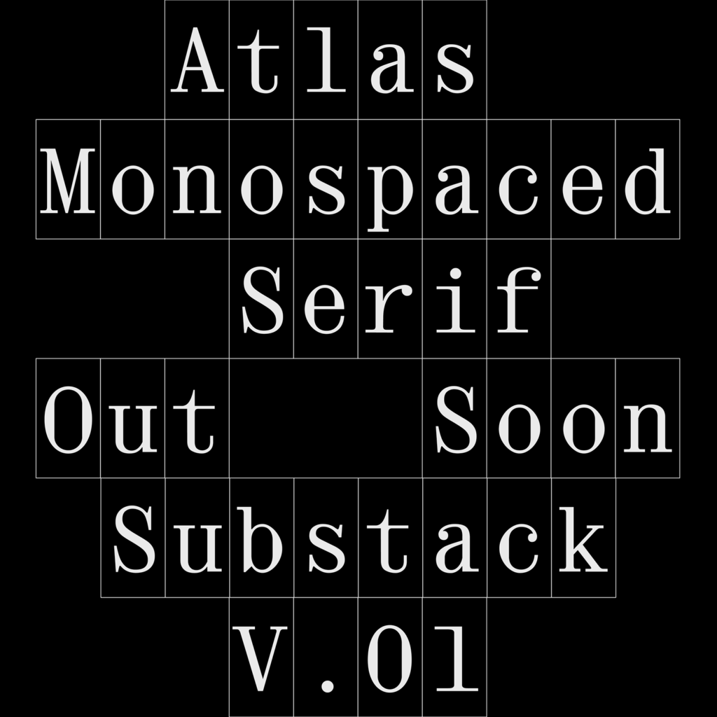
Continue readingFont Reviews 2024: Atlas Mono
Designed and distributed by Giulia Boggio
This font review was written in English and translated into Dutch, a language spoken by about 30 million people worldwide.
Giulia B. is a multimedia designer based in London (UK), focusing mainly on type, graphic, and web design.
Monospaced fonts are a personal favourite and I had to shine a light on this editorial fixed-width for our Alphabettes Font Reviews 2024 segment. Sometimes, it seems that typefaces these days are by default superfamilies, covering every possible weight, width, style, optical size, and taking on any possible typographic application they face. Well—let’s flip that coin for a second and focus on this striking single-style design.
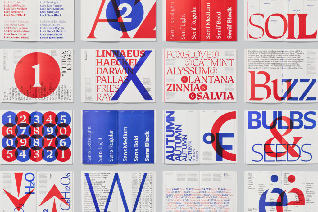
Font Reviews 2024: Lock
Designed by Mark Bloom and Diana Ovezea
Distributed by CoType
Typeface family: 4 sub-families, 6 weights. 24 fonts
This text was originally written in Romanian, the official language of Romania and Moldova, spoken by 25 million people. The English version of the review is below.
Lock, creat de Mark Bloom & Diana Ovezea, este prima superfamilie tipografică în catalogul CoType Foundry, îmbinând stilurile serif și sans-serif, alături de varianta stencil.Conceput ca un sistem unitar, și nu ca stiluri separate, Lock echilibrează contrastul și coeziunea, fiind o alegere versatilă pentru designerii care caută flexibilitate și impact vizual.
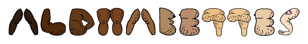
Font Reviews 2024: Henmania
Designed by Bea Korsh
Distributed by Future Fonts
This font review was written in English and translated into Portuguese (BR—below). The Museu da Língua Portuguesa, in São Paulo, is the venue of diverse exhibitions with hands-on activities about Linguistics and Portuguese language developments.
Fellow Type@Cooper alumni Bea Korsh probably graced us with the freshest type release of 2024. Where to start? That I’ve never seen anything like it. Or the fact version 0.1 already has 70 interlocking ligatures. Or maybe the foresaw standalone Inline style—that’s simply dazzling. Let’s take it from the top, Henmania is a stencil typeface with meshed warped strokes and a slightly forward-leaning feel planned to grow to a 5-weight family—a playground of pure creativity!
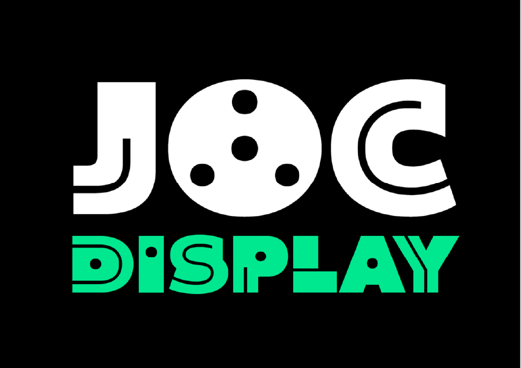
Font Reviews 2024: JOC Display
Designed by Sabina Chipară
Distributed by Type-Ø-Tones
This font review was originally written in Spanish. There are more than 45 million speakers in Argentina. Guarani and Quechua are other important languages in this country. The English translation of the review is below.
Joc Display es una tipografía que propone mucho juego y está inspirada en formas geométricas. Es perfecta para crear patrones y composiciones que necesitan impacto. Podríamos argumentar que nada supera a esta categoría tipográfica para diseñar títulos o encabezados. Su diseño incita a explorar y experimentar al momento de usarla. Considero que su propuesta osada y personal la vuelve perfecta para logotipos y aplicaciones de gran formato.
La estructura y forma de sus signos se desprende de los bloques de madera que fueron el centro de la exposición de Sara San Gregorio: Juguetoría. A l’alçada del Joc curada por Helena Ayuso Moli y Anna Roigé Barrull en el Centro de Arte La Panera de Lleida, España. La exposición proponía a los niños de 5 a 9 años crear sus propios juguetes combinando esos bloques de madera. La lógica propuesta por este juego y sus formas han sido traducidas por Sabina para crear JOC. El espíritu del diseño gráfico de principios de los años 70 también es una gran influencia en las formas geométricas que caraterizan a esta tipografía.
Font Reviews 2024: Kalnia Glaze
Designed by Frida Medrano
Available at Google Fonts
Font family: 7 weights. 7 static fonts + 1 variable font.
This font review was originally written in Spanish, the official language of 20 countries. English translation below.
¿Kalnia Glaze es Color Font o fuente Variable? La respuesta es, Sí.
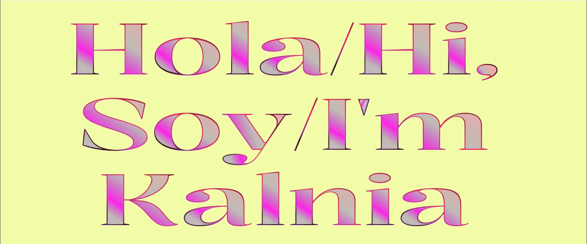
Frida Medrano, diseñadora gráfica originaria de Monterrey, Nuevo León, México, es una de las figuras más destacadas en el mundo del diseño tipográfico. Especializada en tipografía y conocida por su enfoque innovador, Frida ha logrado combinar de manera magistral la tecnología y el diseño, llevando sus creaciones a nuevos horizontes. Su trabajo con fuentes variables y su investigación para optimizar gráficos entre impresión y web reflejan no solo su talento, sino también su profunda pasión por el diseño.
Continue readingFont Reviews 2024: AM Majella
Designed by Valentina Casali
Distributed by CAST
This font review was written in English and translated into Portuguese (BR—below). Portuguese makes use of five diacritics: the cedilla (ç), acute accent (á, é, í, ó, ú), circumflex accent (â, ê, ô), tilde (ã, õ), and grave accent (à) to mark the contraction of two consecutive vowels in adjacent words (crasis).
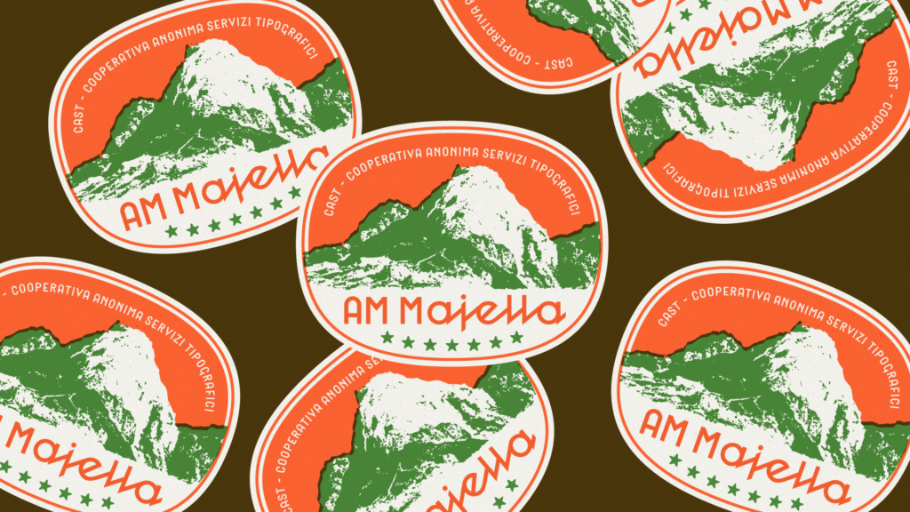
Valentina has been on my radar for a while. It’s no secret how much I hate working on connected scripts, so I will forever be amazed by people who can do it well. Combine that with gorgeous ornamental lettering and sharp letter carvings, and you would be crazy not to watch her work. First, was Pritzious, conceived during the Type Design Expert Class at the Plantin Institute of Typography in Antwerp (2021–2022), and now she is back with AM Majella—a revival of the homonymous wood typeface, Majella (released by Xilografia di Verona between 1937-1939).
Continue readingFont Reviews 2024: Bizzarri
Designed by Diana Ovezea
Distributed by Blast Foundry
Typeface family: 6 weights, 2 styles (upright + italic), and 2 optical sizes. 24 fonts
This text was originally written in German, a language with more than 90 million speakers worldwide. The English version (Thank you Dan Reynolds!) of the review is below.
Ich hasse einkaufen. Ausgenommen Schriften.
2021 bin ich via Future Fonts über die Schrift »Bizzarri« von Diana Ovezea/Blast Foundry gestolpert und war sofort schockverliebt. Wenn ihr eine ausgefallene Schrift sucht, die eigenständig, eckig, laut, egozentrisch und detailverliebt um die Ecke kommt, dann liegt ihr mit der »Bizzarri« auf dem richtigen Kurs.
Font Reviews 2024: Tegner
Designed by Linda Hintz
Distributed by Future Fonts
This review was originally written in Catalan. Catalan-speaking territories are sometimes called the Països Catalans (Catalan Countries), a denomination based on cultural affinity and common heritage. The English version of the review is below.
Per a mi, Tegner* és la definició de simpàtica en forma de tipografia: té una personalitat encantadora i accessible que sembla somriure’t des de la pàgina. Dissenyada per Linda Hintz, Tegner aconsegueix equilibrar la juganeria amb una sofisticació moderna i càlida, fent que sigui alhora amigable i elegant. Això es deu a les seves corbes inesperades, subtils asimetries i detalls que es perceben gairebé naturals. A més, combina minúscules d’estil unicase amb majúscules més petites, fletxes, animals i molt més. És una tipografia que et convida a explorar, com si et digués: “Creem alguna cosa divertida junts.”
* Tegner va néixer inspirada per una visita al Rudolph Tegner Museum. Un pòster d’una exposició a l’Independent Artspace Den Frie de Copenhaguen, datat de l’any 1911, mostrava una lletra única que ressonava amb la cruesa arquitectònica de formigó del museu.