I recently had a revelation. I’ve been staring at reverse-contrast typefaces for the majority of my life, and the fact that it materialized during my year at CooperType was no coincidence.
As a child/preteen, Saturday mornings were spent at my local reform synagogue in addition to one weeknight at Hebrew School (which I begrudgingly attended). At that point in my life, I had no knowledge of design or typography but developed the skills of reading and writing Hebrew in both classic and cursive form. It never occurred to me that the Hebrew characters looked different from other letterforms, the only contrast (pun intended) apparent to me was the fact that Hebrew is read from right to left as opposed to left to right.
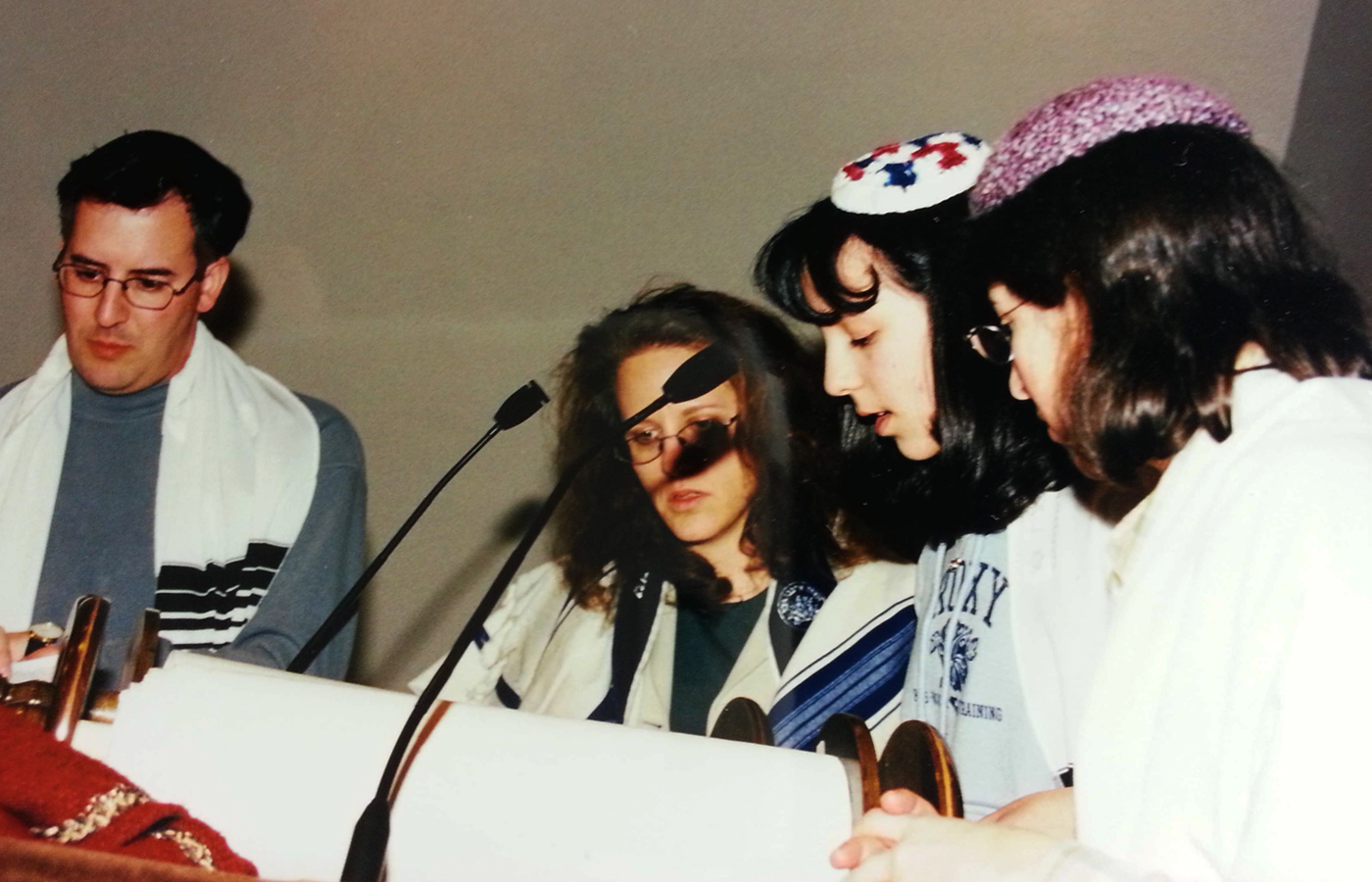
Me reading my Haftorah portion during a Bat-Mitzvah rehearsal with my aunt, uncle and cantor looking on.
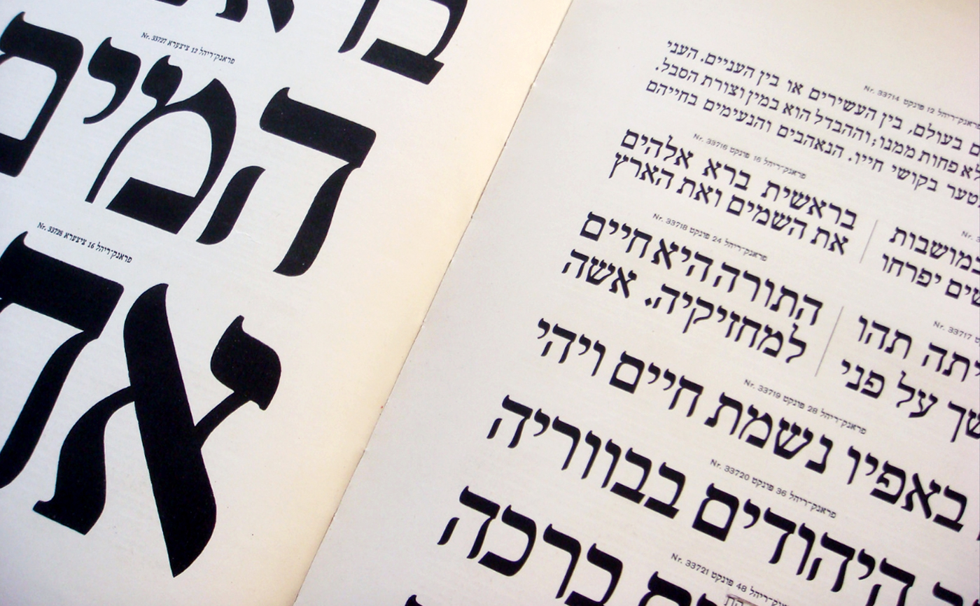
Berthold Hebrew type specimen (Berlin, 1924). Stolen from Nick Sherman’s flickr.
So, when James Edmondson suggested, in our TypeCooker class, to try a sketch I was developing as reverse-contrast, I blanched at the thought. Reverse-contrast was NOT something I had anticipated making in my year at CooperType. Didn’t I need to make a functional text face? A beautiful, expressive serif with ball terminals?
I brought my reverse-contrast sketches to Berton Hasebe and Christian Schwartz, our fearless instructors, at our weekly class and realized that this may be something worth exploring. Backing up to my initial proposal, I had put forward the idea of making a typeface for use by cults. The culture and personalities of cults and the charismatic people who led them fascinates me (I by no means glorify their actions). Seeing all the psychic flyers around the city (particularly the “Keano” flyer one can usually find on the subway) provoked me to wonder what a typeface would look like that truly personified the characteristics of a cult. As I thought more about the concept of a reverse-contrast typeface, it proved relevant not only in its aesthetic, but also in its underlying concept. Reverse-contrast typefaces are consistently considered “unconventional” and, in a sense, rebel against the norm of “regular-contrast”. Similarly, cults, as they were known by the 1930s, were sects created as a result of a religious schism within society. These cults revolved around a novel system of beliefs and practices, resulting in tension with the individuals who maintained cultural and religious tradition. (Thus, a negative connotation and view of cults was born.)
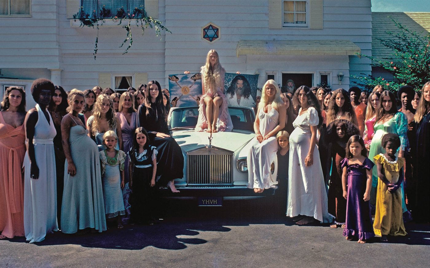
Squad Up: The Source Family, one of my favorite cults.
I started with my regular weight in the Spring semester which, at the time, I thought was crazy. I knew off the bat I didn’t want to use serifs in order to convey my horizontal weight. I felt them too decorative and indicative of a comical and slightly “funhouse” vibe. Instead, I explored the use of flares and how they could be a subtle means of gathering weight at the top and bottom of the letterforms. An effective logic I used throughout the creation of Koresh, hammered into my brain by my TA, Ryan, was the visualization and consistency of a rhythm: heavy-light-heavy, thick-thin-thick. This held the characters together as a system and created a seamless way for the eye to travel from character to character when reading text.
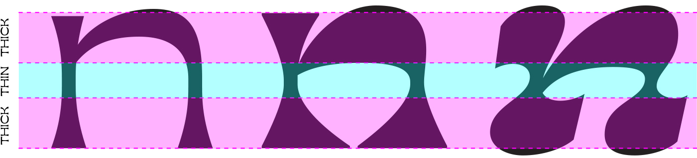
Breaking down the weight distribution.
For my last semester, I chose to continue down the display-face path and make a Bold and Bold Italic. I think it was here that Koresh really began to develop its character and personality. As the extremes were forced upon the letterforms, the flares that I had created previously, swelled and conveyed a more pronounced rhythm that existed not only in the weight distribution but also within the negative spaces that formed between characters. Koresh gained a voice; one that was inviting and intriguing yet unsettling and eerie.
When I began to develop my Bold Italic, which proved to be a whole other puzzle in itself, the expressive nature of Koresh only grew. During one class, Christian called out how “Hebrew” it had begun to look in its calligraphic nature and sweeping horizontals. At first, I smirked as I imagined my Mom’s beaming face when she realized that Jewish culture had successfully, after many years of resistance, made its way into my life. As I continued to work, I began to realize that staring at these Hebrew characters since childhood maybe did have a lasting effect on my subconscious. After all, before even starting my typeface I had scanned and studied Antique Olive specimens without realizing its reverse-contrast nature. I only knew it was something that called to me in some strange, undefinable way.
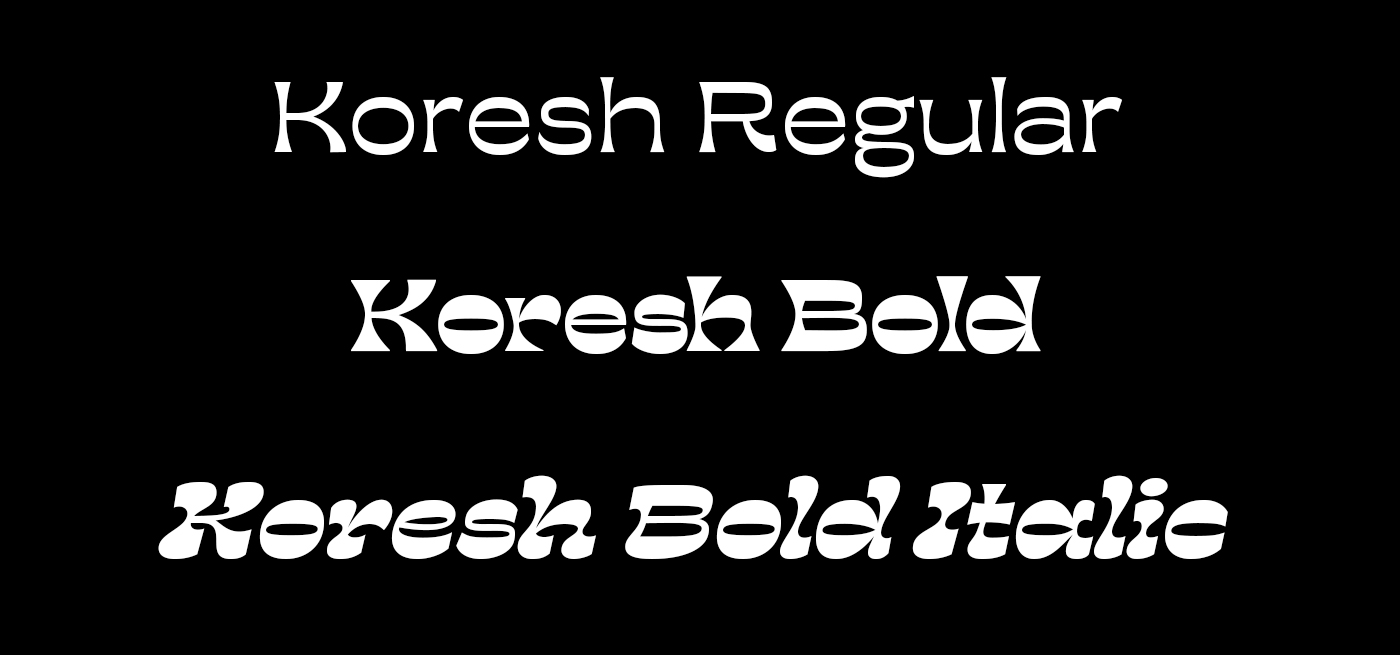
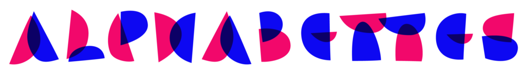
Introducing… Koresh!
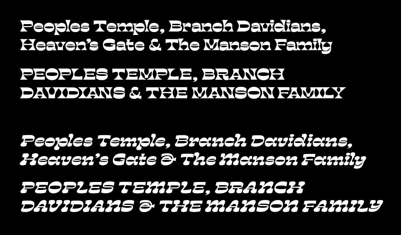
Koresh Bold and Koresh Bold Italic in upper and lowercase.
I can definitely say, that this innate reverse-contrast realization will not affect my practice of Judaism. I will still avoid fasting at all costs. I can, however, say that my view of the Hebrew alphabet and its characters has developed beyond a resentment for studying for my Haftorah portion* and into an appreciation for a beautiful and unique alphabet. However, I do fear I will continue to design all type in reverse.
*Haftorah is a reading that each individual is required to do for his or her Bar/Bat Mitzvah. It usually requires insane memorization and preparation and results in awkwardly singing in front of the entire congregation during your prepubescent years.